iBankCoin
Home / Uncategorized

Uncategorized

Risk Classification

After a lot of work I’ve finally begun creating “risk classifications” like OA talks about.

I basically looked at a combination of variables to give me a risk classification for each variable and a weighted average. I tried to readjust the scores into 5 categoreis based upon the weighted average since it’s rare for numbers to be very close to 5 or 1.

For the time being I’ve ran several numbers factoring into the risk classification such as % off of high, % off of lows, strength vs peers, peers strength vs the market, total float, float short %, risk for what exchange or index the stock is in, risk for total dollar price the stock is. There’s also an earnings composite score which compares: earnings, sales, projected growth and standard deviation of all of the earnings numbers and compares these numbers to the peers. From this I come up with a weighted average factoring in all variables and some others.

There’s a lot more I want to add to some capacity. For example, I still want to add in several other variables going into the risk calculations that will improve this such as: liquidity, beta, beta vs its “peers”, market cap, market cap vs “peers”, and maybe some other fundamentals like ROE, Profit margin, etc…. date since IPO, % institutional ownership. I also want to work on adjusting the weightings until I’m more satisfied with it. Right now it’s more like a working prototype that needs improvement. I think beta and beta relative to the industry is probably one of the more important factors so right now there’s probably significant room for improvement.

For now, here are the the stocks that met qualifying consolidation scores and some signs of falling or sideways consolidation for each “risk number”.
1s.
2s.
3s more 3s.
4s 2nd group of 4s.
5s.
or for the copy and paste crowd:
1s
http://goo.gl/Zr7z4z
2s
http://goo.gl/1E3Kix
3s
http://goo.gl/K1C3Bk
http://goo.gl/DlXNiD
4s
http://goo.gl/MjSChV
http://goo.gl/75CNLx
5s
https://goo.gl/nVwBRc

If you generalize you can definitely see a difference in the names, however you certainly do see some stocks that probably don’t belong in a particular category. For instance, BCEI in my opinion is probably closer to a 5 than a 3 but I think when I add in beta and long term consolidation rank to the weighting it will make a big difference.

An interesting thing I noticed is the 5s tend to be near their lows and off of their highs significantly so that at this point if I switch to rising consolidation patterns the patterns actually improve. Here are rising consolidation patterns which usually are about 95% bearish or crap patterns but completely flipped once I excluded them to just the 5s. I wouldn’t necessarily trade bull flags or patterns of this quality in this location, but certainly the patterns that are more bullish than bearish increase substantially from the usual more than 95% crap and I would rather buy dips in these names than sell rips if I had to choose.
goo.gl/fdBIWw

The 4s was pretty close to the same thing with a few more rising wedge patterns since a stock in a perpetual downtrend most begin to show at least some strength before it will round out a bottom.
goo.gl/4FLfFG

The 3s actually still had a few but you’d have to go through a lot of patterns that are not actionable.
The 2s were almost all running up against resistance after falling or at new highs and so I wouldn’t waste my time.
The 1s were mostly mid trend up near or at the highs so I would need to see some sideways work or a sell off at which point they would no longer be labeled rising patterns.

I decided to narrow the lists using a screen requiring more than 25% earnings growth Q/Q, 10% sales growth Q/Q and institutional ownership over 20% then handpicking the ones I liked.

3s
CUDA,FNWB,HOFT
4s
DL,YY,LULU,BZUN,EXA
5s
ACIA,BVX,MEET

This was just a more efficient way to get through the list but it comes at the expense of potentially missing more setups. This is just one way you can narrow the list, you could also do so manually by looking at charts first, long term charts next and maybe volume profiles if you still need to narrow down the list. You may instead want average daily volume above certain amounts. if I used an over 300k avg daily volume filter I could handpick these as an initial list and try to narrow it down manually from there.

3s
CLR,CUDA,EW,EXPE,AN,CPLP,BCEI,CRIS,DDS,OAS,PBR,PIR,PI,SCHN,SCS,SPG,TRP,TTEK
4s
AKR,BKD,DEPO,DO,DRRX,EGY,GGP,GRUB,HIBB,HLX,HZN,IPI,LILA,LTBR,MAC,MNK,NAKD,MVIS,NYRT,REXX,SHLD,SIMO,SINA,TEVA,TWTR,UAN,WPG,WWE,XCO,YY,YUMC,BRFS,LULU,NVFY,ADHD,APTO,BZUN,CASC,THLD
5S
ACIA,BOOT,CPST,CXRX,DCIX,DLTH,EZPW,EYES,GNC,GSAT,MEET,MEMP,MITL,PEI,PLG,TWLO,VNCE,WAC

Could probably narrow that down slightly to:

3S
CLR,CUDA,EXPE,CPLP,BCEI,CRIS,DDS,OAS,PIR,SCS
4S
DEPO,DO,EGY,GRUB,HLX,HZN,IPI,LILA,LTBR,MAC,NAKD,NYRT,REXX,SHLD,TEVA,TWTR,UAN,WPG,WWE,XCO,YY,YUMC,LULU,NVFY
5S
ACIA,TWLO,BOOT,CPST,CXRX,DCIX,DLTH,EZPW,EYES,GNC,GSAT,MEET,MITL,PEI,PLG,TWLO

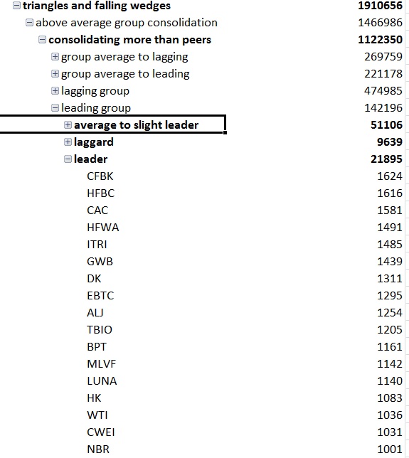
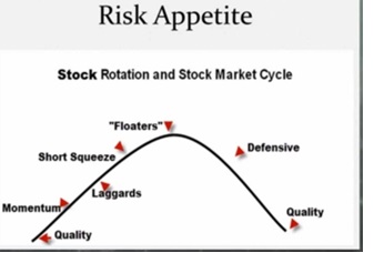
Perhaps the more interesting thing that will happen is when I combine classifications of a stocks peers with the risk cycle and with knowledge of where the market is. For example if I look for industries that are leading the market after this market run is extended I wouldn’t want the 1s or 2s or 3s but the 4s and 5s. If I looked at the industries lagging the market I might want the 1s and 2s because I’m looking for them as a group to begin showing some strength starting with the lower risk names… If I found the industries only slightly leading I may want the 3s and 4s. If I only looked at slightly lagging the market I may want the 3s. When a market first finds its footing off of a correction then I might like the leading stocks in leading groups. The ability to generate dynamic lists is something that will be useful in generating better lists.

(the below image I think is a couple weeks old)
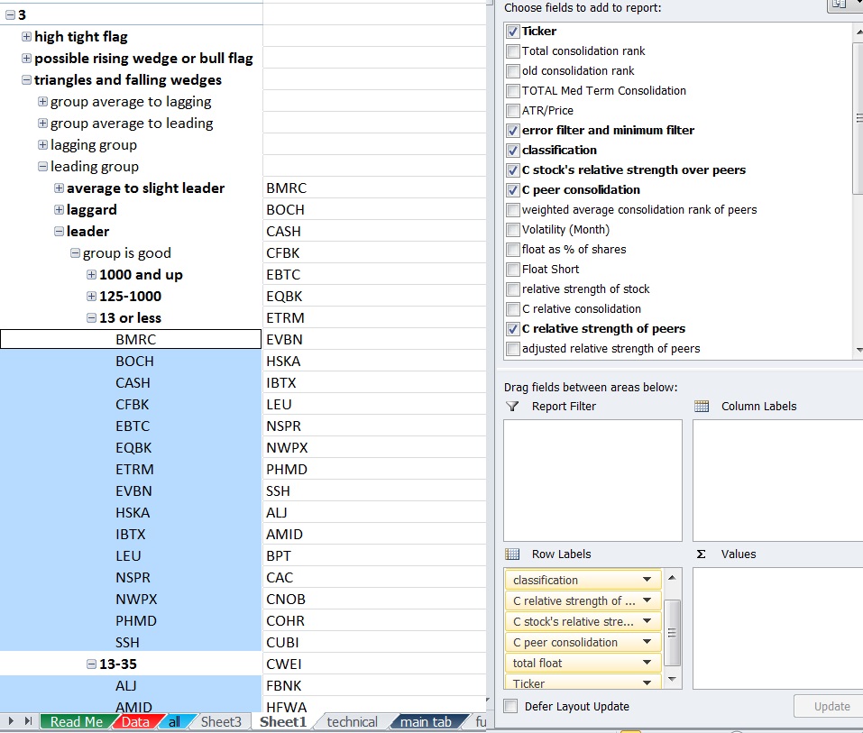
There’s also the balance of trying to include more information such as what themes are seeing increased buying on increased volume and what themes are working on various timeframes without complicating things too much. Ultimately I want this to be a very simple process and I’m not the most organized person, but I also want to be able to weight all relevant factors at one time and no irrelevant or conflicting ones.

For example, it wouldn’t make sense to average a momentum ranking and value ranking since the best value stocks are the worst momentum stocks and the best momentum stocks are the worst value stocks. A composite average would be pointless. Keeping stocks isolated in various categories and only looking at the relevant categories for the time being is probably the way to go or dynamic programming that will adjust the scoring method based upon group.

Comments »
Climbing The Risk Ladder

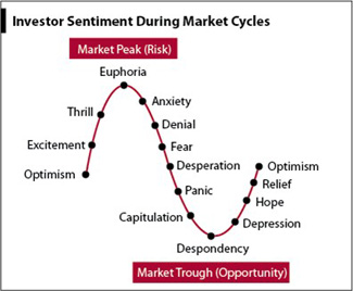
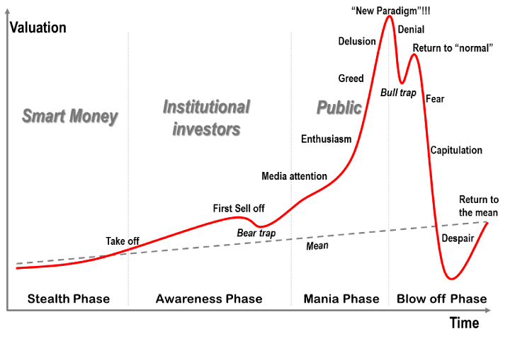
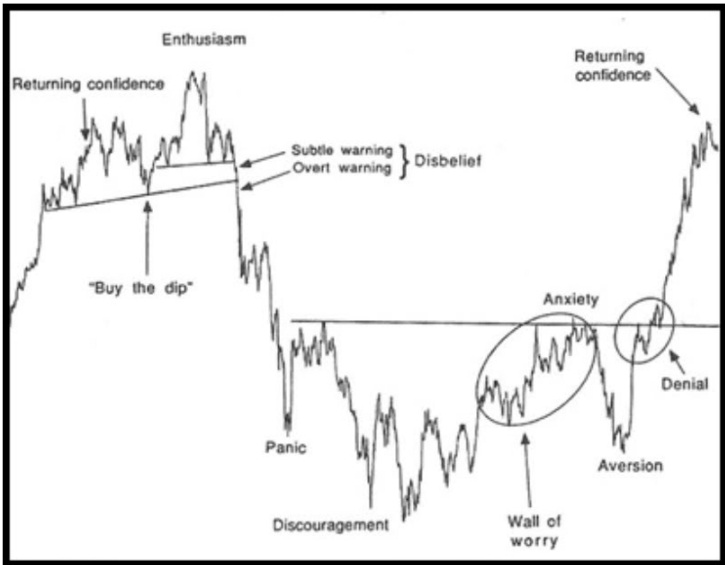
The human nature of man is to avoid pain (loss) and seek pleasure (gain). This is an inherent trait that causes individuals to make irrational decisions. We try to make the best decisions but individuals are prone to biases due to emotion.

One of the ways the market reacts to conditions is to look for confirmation of existing emotions and beliefs and ignore information that contradicts those emotions. When collective emotional extremes are met that creates a mispricing due to the way human nature seeks to swing from avoiding pain and seeking pleasure.

risk cycle

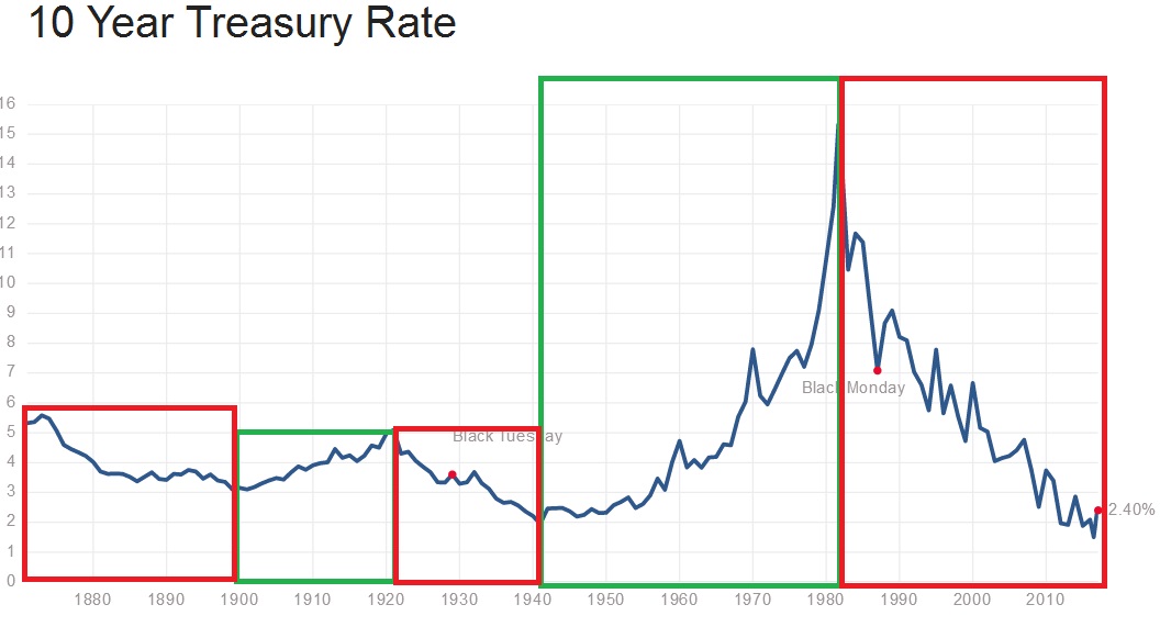
One layer of how markets climb the “risk ladder” is the longer term generational time frame shift from savings and bonds to stocks. This is a very, very long process as you can see by the history of 10 year interest rates.
10yr

Note that because assets are priced in relation to each other and the total amount of capital and credit available changes, drawing anything in isolation based upon where interest rates are is probably not a great idea. Speed or rate of change and trend may tell you something about the conditions of the market, but not the pricing itself. Interest rates compared to valuation metrics of the market adjusted for inflation and compared to pricing mechanisms of other assets can potentially tell you which assets are being neglected and which assets wealth has concentrated in. But the point of the illustration is to get an idea of the time frame and to understand how capital shifts and interest rates change.

Side note: There are generations of investors and traders who have never really experienced an uptrending rate of interest rates. That’s the pain trade because a declining number of people have experienced it as market participants, especially from the low point like in 1940’s and 1950s. That requires you to have been in the market for 65-75 years

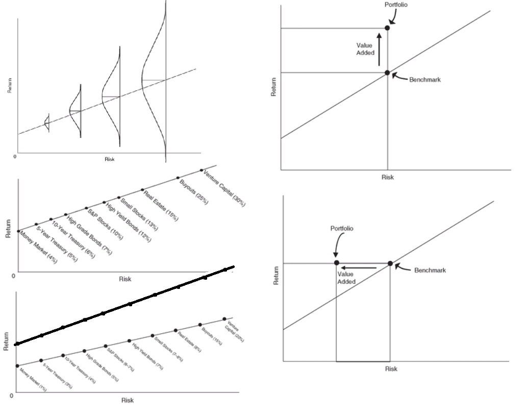
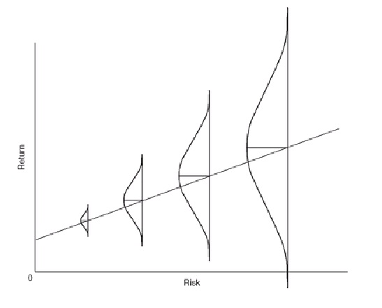
risk reward

This image is more of a mostly “efficient market” graphical representation (with normally distributed mispricings). I believe there is more of an irrational component. When stocks are underowned and based upon emotional fear of loss, they represent lower risk AND higher reward. When stocks are overowned and priced based upon a manic seeking of gains, they represent higher risk AND lower reward. I believe the markets swing from extremes not only adjusting to interest rates, but also adjusting to the emotional component and using confirmation bias to rationalize their choice after the fact.

It’s not that people make rational decisions, it is that they like to think of themselves as rational creatures who are in fact behaving totally irrational most of the time. Rationalization is the explaining away of a thought in a way that seems legitimate enough to satisfy the ego. Their precious egos won’t allow themselves to think humans are incapable of seeing truth as it is so we literally invent ways to think acting according to our emotions is justified.

Sometimes emotions align with rational decision. For example, someone feels good when they get a good deal so they may choose a lower priced item when the decision is not complicated and there aren’t different features. Or they may avoid the emotional annoyance of traveling too far away to get a better priced one and it happens to be financially better. But when emotion is involved and there are multiple variables, you can be sure that a lot of people will make the emotional decision over the rational one.


sentiment chart

Take for example valuation investing. It seems totally rational to invest in securities with the lower P/Es. It seems totally rational to avoid the markets where the P/Es and P/Bs are high. But I think it’s a mechanism to rationalize herding.

Imagine there’s only $1,000 in circulation because of a huge deflationary vortex. Earnings have mostly gone negative and companies are going bankrupt. The P/Es are either enormously high or negative. Is it rational to buy? According to the “logic” of P/Es it is not rational at all. However, you have the stocks that everyone has been forced to sell and the economy where deflation has kicked in and maximum fear. My irrational filter that says everyone is irrational most of the time would say this is a great time to buy because everyone else is acting irrationally. And in fact 2008-2009 is a great example of when emotions ran high, deflation set in, Lehman went bankrupt and Bear Sterns was bought out for $1 per share. Then price action lead the way higher after several bear market rallies convinced people that there would only be short lasting bounces.

Now let’s say the opposite. The markets have totally inflated future growth expectations as well as most of the current earnings are due to a massive capital concentration into the US. Because of all the capital inflows, there are businesses raking in the cash as people have the highest amount of disposable income they’ve ever had. But the disposable income is based upon cash and credit available due to an inflated market. So any valuations that seem rational are not. Certainly in 1998-2000 there was a period where irrational got more irrational in internet stocks. No longer were prices driven by institution, but instead by the masses crowding into the idea. Because of a history of valuation no longer mattering, and the thesis that the internet would change the world economy (yes eventually it did but only after 15 years of pain) that people convinced themselves was rational, we had a period that extended beyond.

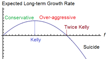
I also believe that at a certain point risk looks more like this:

IMG_0956

But that’s more a component of how you construct your portfolio than the availability and pricing of market securities. You can take the highest risk assets (like stock options) and make them work if you position size correctly. However, this also applies to global economies and how capital is allocated across the world. Initially increased allocation in riskier assets is healthy for a market. But there’s a certain point where allocation is too large and capital concentration becomes a liability, particularly as participants seek risk. Pushing prices to a point where it takes increasingly large percentage of the world’s capital to support it is what results in major tops in assets.

But this climbing of the “risk ladder” occurs on different wavelengths of time and correlates to sentiment.

risk cycle

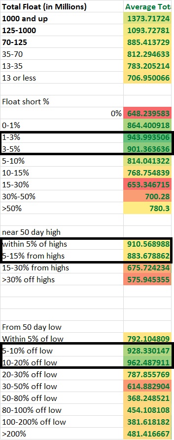
I am working on slicing up the market into different layers to see what is consolidating. I also want to look at breadth of these ideas in the future to see what is happening now as well as what is setting up. I’ve noticed a bit of a shift happening where the scores have improved in the higher float short %. You can’t necessarily see it completely since I haven’t given you the context of history and while I’ve seen each update I’ve made I haven’t been able to show you how it has changed over time. But anything with a consolidation score above 500 seems to be where there are still stocks worth considering, although it usually seems like only the historically volatile names with the lower scores matter and the lower beta names seem to always score well due to how I’ve constructed the score. Some of that also has to do with the financials and transports and others making a large move and the rest is comparably less volatile than the move in Novemeber.

risk

So far it seems the market is not quite ready for the highest risk stocks, but I have noticed a shift taking place that’s hard to really articulate. It seems that stocks near their highs are coiling (possibly for a second leg up) while the stocks that have sold off and are near the lows are starting to set up while the stocks that have really advanced off their lows have either been resting or have been behaving more wildly, it’s hard to really say without combining the date with performance stats. Meanwhile the market has gained an appetite for slightly higher short interest names and the low float stocks that were once not at all showing signs of consolidation are starting to consolidate more than before.

I’m hoping development of indicators like this will allow me to get a better feel for what’s working, what’s setting up, how the market behaves, and ultimately what’s next.

There is another big project ahead in the future of automating the risk classification of stocks. I don’t know the details but stocks near the highs, higher float, higher market cap, lower short interest, greater institutional ownership higher profit margins and ROE, more consistent earnings, positive earnings and less beta and lower volatility on the long term time frame with a positive trend will provide sort of a “risk profile” and average “risk” level which then can be adjusted by sector and industry average and compared relative to the sector and industry average as well. I want to spot more in detail how the market goes through this risk cycle and when each layer is setting up. I want to look at sectors by risk cycle and look at the consolidation score, and of the industries with enough qualifying stocks I want to identify the setups by risk level and performance by risk level. I want to know what specifically to set up for and whether or not I can identify themes.

Comments »
Short Term Consolidation Score – Daily

Consolidation Rating The Heart Of The OABOT2.0 –

If the heart of the OABOT is the consolidation score, than the short term consolidation score are the aorta and other major arteries, and the intermediate term is the blood, with the long term being the veins.

Although there’s not too many possible data points that go into a daily score, there’s a surprising number of pieces of the formula that can be applied by combining these variables. The short term consolidation rank helps punish stocks that are breaking down or breaking out, while rewarding stocks that are moving less today than recent average movement over various periods of time. When combined with high intermediate scores, this generally allows you to identify stocks that are closer to the apex. The stocks that show an “inside day” tend to rise to the top a little more often with all other things being equal. It also avoids looking at stocks that may be consolidating, but either are breaking out or aren’t “quiet” today, potentially suggesting they may need more sideways work, or that it may be too late to chase.

Before I get into the nuts and bolts of how I am preparing the daily score, I want to show you how this spreadsheet will be “cleaner” than the last one, and thus, much easier to tweak.

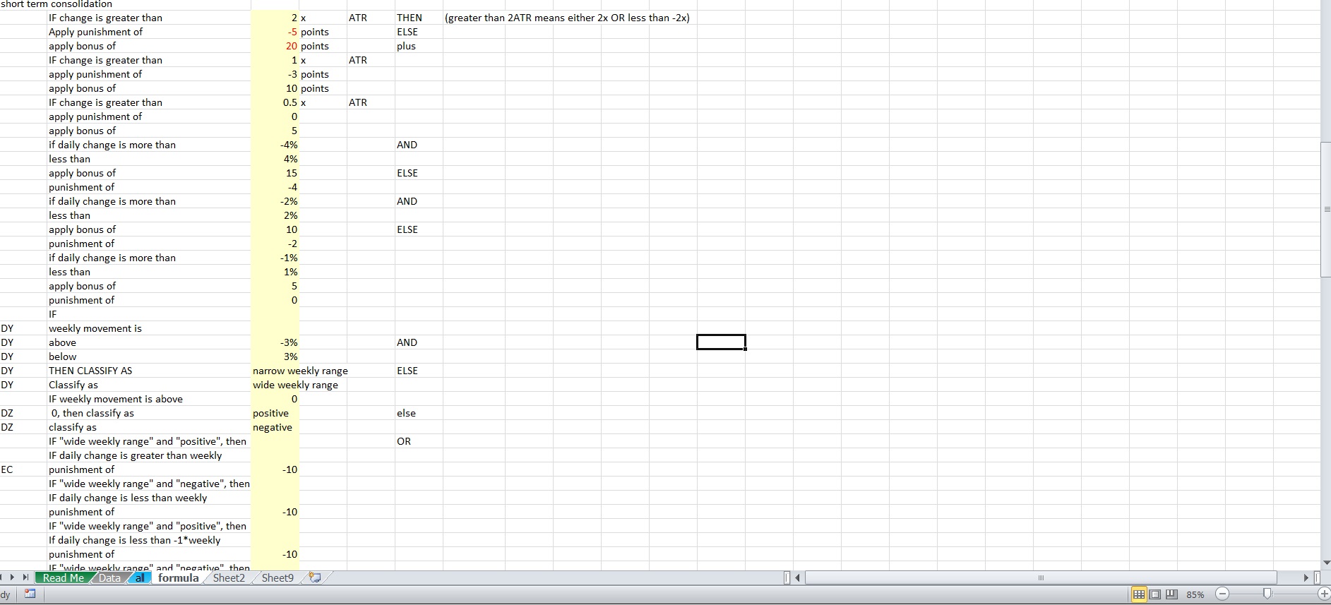
I have a “data” tab (where the data can be updated and replaced with new data completely), an “all tab” where all the data is repeated so that formulas can be applied, scores can be added (and re-added if/when I put the summary tab back on), and the “formula tab” where specific numbers and details within the formula can be tweaked.

Rather than looking at some nonsense like:

=IF(OR((all!BO2*BN2)>(formula!C43*all!AX2),(all!BO2*BN2)<(-formula!C43*all!AX2)),formula!C44,formula!C45)+IF(OR((all!BO2*BN2)>(formula!C46*all!AX2),(all!BO2*BN2)<(-formula!C46*all!AX2)),formula!C47,formula!C48)+IF(OR((all!BO2*BN2)>(formula!C49*all!AX2),(all!BO2*BN2)<(-formula!C49*all!AX2)),formula!C50,formula!C51)

and then having to interpret the nonsense and substitute certain variables and change the formula itself, I have instead set it up so the “all” tab pulls from both the data and the formula tab where necessary. Even though the formula still looks like crazy nonsense, I don’t have to look at it and deconstruct it.

If I want to make tweaks, I look at this clean version where I can read what’s happening, and I can make adjustments without adjusting the formula entirely. If I want to make structural changes to how the rule is applied or apply a different rule, I can more easily read what’s actually taking place and what cell on the all tab contains this formula.

formula

Now we can resume talking about the short term consolidation rank tab….

For the time being, I broke the short term consolidation range into 3 subsections. Ultimately I am combining them all, but if later I decide I want a weighted average so that one of them count more towards the final score I can do that.

The categories are:

1)Changes as a multiple of the ATR (A stock that moves less than 0.5 times the ATR will score more than a stock that moves more than 2x the ATR)

2)Absolute Changes (A stock that moves somewhere between -1% and 1% will score more than a stock that moves between -4.5% and 4.5%)

3)Changes relative to the weekly performance.

The 3rd variable is the trickiest, but important. To avoid confusion, I chose to classify the weekly performance as “narrow weekly range” for a smaller weekly move in either direction or “wide weekly range” for a larger weekly move in either direction. I also classify it as “positive” for a stock that is up on the week, and “negative” so I don’t get in trouble with the less than and greater than sign when negatives get involved.

This helps me avoid confusion in making the formula since you may have a weekly positive but a daily negative or vise versa and writing the formula without separating these gets tricky.

Let’s say you want the daily range to be within the weekly move. Let’s say a stock moved a positive 1% on the week. If a stock moves less than 1% but more than -1% it represents consolidation. However if instead the number is negative the same formula would say less than -1% but more than 1% and represent the opposite of what you are trying to express. So by setting up separate formulas for positive and negative numbers it makes things a bit easier.

If a stock is not moving strongly on the week, and is showing signs of the stock moving less today than that weekly action, it’s probably looking like a better target. This is more true if the daily action is less than half of the weekly move, and more true if the daily action is less than 0.25 of the daily move.

While it’s possible a stock started the week moving up 10% and then went down 8% to finish only up 1.2% suggesting less volatility than there actually is, if the stock on the day is only moving 0.30%, you are still looking at a stock that is less volatile on the day than over the course of that week.  Not all stocks that show less movement on the day than the week will be consolidating, but most stocks consolidating will see less movement on the day than the week.

When backed by weekly (last 7 days) being less than a multiple of the ATR, it begins to paint a picture of stocks that are in narrowing ranges, even if that contraction may not be orderly.

volatilty compression2

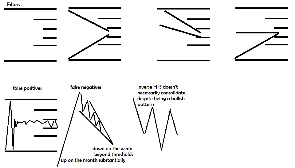
The above graphic shows that inverse head and shoulder patterns as well as the really steep moves with significant declines on the week in falling wedges may not always pass with a high consolidation score. Also there may be some stocks that pass within the thresholds set but don’t actually show a pattern.

We can try to get the falling wedges after significant increases in price to have a boost by relative comparisons of monthly volatility relative to weekly volatility and movement relative to others.

Capturing the inverse head and shoulders look from a low can actually be done by classifying stocks properly ahead of time so that it’s near the low but has started to see recent strength, but there will be a lot of false positives and a few false negatives. For example, if you have a stock that is close to the low, has seen some movement from the low, is above 20 day moving average with recent weekly move not surpassing a certain amount and hasn’t declined too much and a very mild boost for weekly volatility being less than monthly, and daily volatility data doesn’t matter, you may capture a few that have that look… However, I won’t be using OABOT to try to create a special formula to try to find these patterns at this time.

We are looking for stocks that have not passed certain thresholds on different timelines and getting a bit more strict about the movement as the time range decreases, and using different criteria and different measurements for volatility and movement.

We are looking for contracting volatility. That doesn’t necessarily imply there will always be a pattern of contracting volatility just because volatility on the month is less than the week and the day is less, and the ranges are contained, and the ATR is small, and the beta adjusted movement on all time frames is low. But it’s an excellent start.

This is also why we must look at the same question in different ways. It’s not enough that a stock passes a filter of not breaking out to the upside, but also that the daily movement relative to absolute terms, recent average volatility on the day, and relative to the week suggests consolidation. As the data suggests more consolidation we continue to improve the value of stocks with a high consolidation score.

A  stock may have started it’s consolidation awhile after the cutoff. For example a high tight flag will see the stock advance for 3 months straight before it consolidates so both the quarterly and monthly performances may not be suggesting consolidation. If the consolidation has only just started midway through the week, the weekly may not even capture it.

Nevertheless, in terms of finding stocks in consolidation patterns with good setups near the apex, I was able to get about a 40% hit rate on stocks with very high consolidation scores the first time around, and that’s when I wasn’t as nuanced with the short term, intermediate term and long term consolidation scores. However, the VIX at that time I believe was under 12 so setups were abundant.

That was when I also started to included separate criteria to evaluate stocks near the high differently than near the low, but I actually think I can eventually get it to where I have a higher hit rate than that.

This means in the right conditions can look through the top 100 stocks and find around 40 that are at least starting to set up or show some kind of consolidation. Not all of these 40 are going to be worth trading, and certainly many of them won’t trigger a trade, but they at least capture the “look” I was going for.

I don’t really need it to be that high, even in low volatility environments. However, starting out that high gives me the flexibility to be strict about other data that will represent other things I like about the stock such as being in an industry with a good score as well, or being in an industry that has performed well in the long run that is starting to show weakness AND a high setup score, or focusing on the higher beta stocks or better swings in the past, or looking at a separate filter to evaluate a stock’s “risk” and compare it to the phase of the risk cycle.

Reducing the workload from 7000 stocks to 400 or less nearly automatically is the intention, while also tracking a few things that may be useful in providing a “market overview”.

Comments »
Trading Marubozu Candles

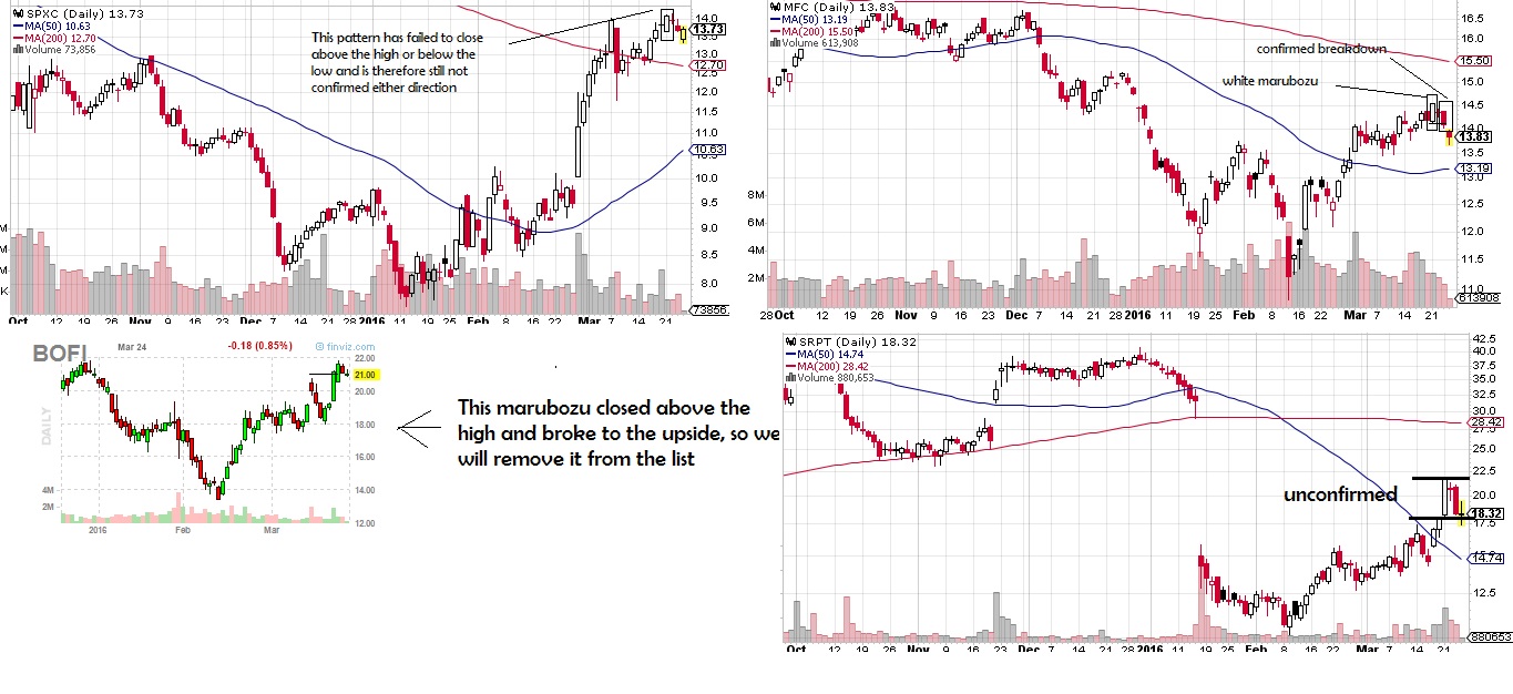
If you are leaning too strongly bearish or bullish and want to find a quick hedge in the opposite direction once things begin going against you, you could do a lot worse than a marubozu pattern. A Marubozu pattern is candlestick pattern where a stock trends from it’s open to the close without reversing directions long enough to take out the low or leave a “wick”. If it’s a white candle, and without taking out the high if it’s a red candle.

White Marubozu – bullish.
Although more than 50% of the time the stock continues upwards, the real trade works when it actually fails to follow through and then breaks down. This is because the strong move upward indicates a lot of capital tied up chasing the stock higher, and once this capital is underwater, stops begin triggering and selling continues. It is a confirmed “breakdown” once it takes out the low, which is also the open the day of the marubozu. It also often creates a measured move downwards pattern on the intraday chart. Look to trade it within the last 5 minutes before the close if it’s below the marubozu candle’s low rather than waiting until the next open where a gap down may cause you to miss out.

marubozu

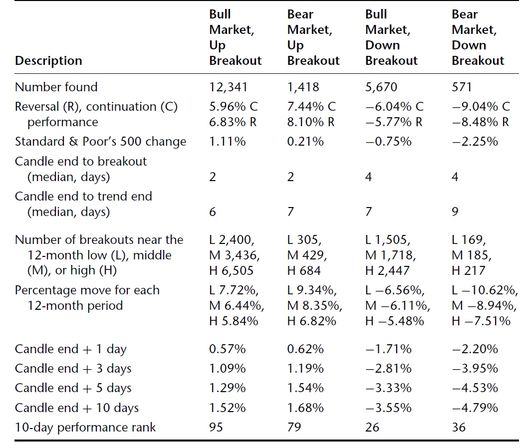
White Marubozu stats:
white marubozo

You can see the stats show an edge even when you’re trading against the current market environment, making it a good hedge in bull markets. It also is very common to find this “bullish candle” in bull markets and likely you’ll be able to grab a put on a big down day intraday or at close if there’s a selloff.

Black (red) Marubozu – Bearish
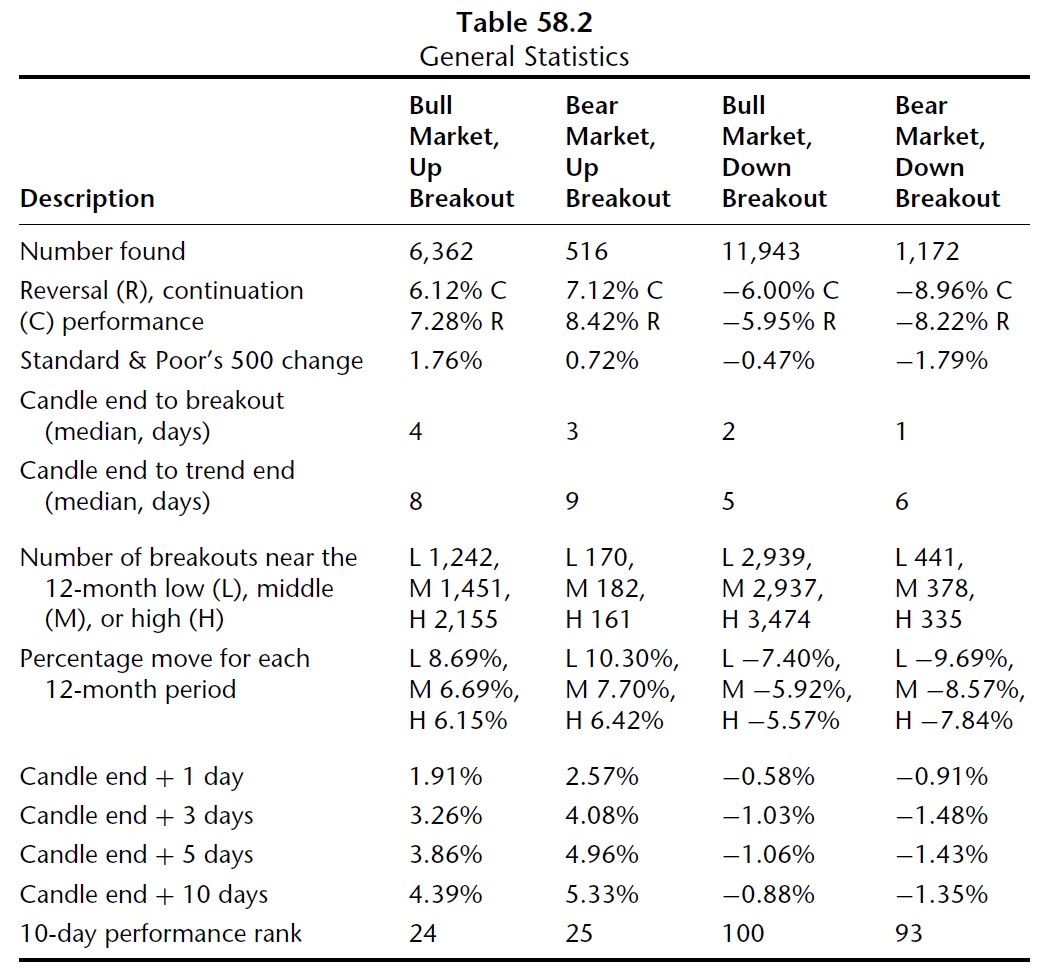
The black marubozu indicates a bearish breakdown that likely continues, but when it takes out the highs, you potentially have a short squeeze and sellers who are under exposed and want back in. Also, the strong trend down and movement required to reverse both requires a change in sentiment as well as it tends to create a measured move on the intraday chart.

Black Marubozu
black marubozu

This is actually a trading system that can be very straight forward, and is especially useful if you focus on weekly options for a 3 day move or so on stocks with historically cheap premium.
How it works:
Black Marubozu watch list:
1)Save a word document as “marubozu” and enter today’s date.
2)At the close of the day, use this screen and convert the list to tickers http://finviz.com/screener.ashx?v=111&f=sh_avgvol_o50,sh_opt_option,sh_price_o10,ta_candlestick_mw&ft=4
3a)Save the list of tickers under today’s date.
OR )Enter the tickers into finviz and save the link that links only to those tickers in your document
OR )Set a price alert at the low of the day for each stock
4)Each day, remove tickers that have followed through or already triggered the trade and repeat the process.
Using the watchlist
1)View: Either click on the link you created in the doc or copy and paste the tickers (or wait until you get a price alert.)
2)Once the order is triggered, evaluate for a trade, in the last 5 minutes in normal conditions. (potentially you may consider a system that trades intraday if there’s a correlated sell off or negative breadth, or market index just took out the days low or if you have some sort of additional confirmation)
3)Optional:If the close is back above the low, exit the trade.
4)Otherwise sell in ~3-5 days or when price target is met.
—————
5)Also consider anticipatory trades by running the scan 10 minutes before close and trading in the last 5 minutes, or taking an unconfirmed marubozu near the marubozu high. Stop on a close above the marubozu high. You will need to wait longer for pattern to confirm, but have a better risk/reward.
6)Also consider anticipatory trades IF the stock has failed to break out in 5 days with stop above the 5 day high.

———————————————

Comments »

Bond

tlt
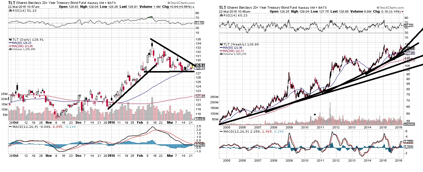
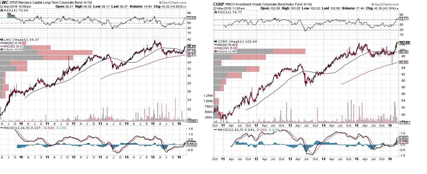
On the “weeks to months” time frame, TLT may be making a topping pattern. You have a huge concentration of capital culminating in a enthusiastic type of move. You have an equal low made, and the next rip offers a manageable entry. You’ll know pretty quickly if you’re wrong, and it’s possible it’s just setting up for the next leg higher as you could interpret it as a wedge pattern as well. The enthusiastic move above makes me think lower for now.

However, the longer term time frame shows the makings of a developing parabolic market with a steepening trendline. Maybe that topped out in 2015 and simply retested that top in early 2016. Maybe not.

Meanwhile, corporate bonds are breaking out, seeing capital inflows

corp

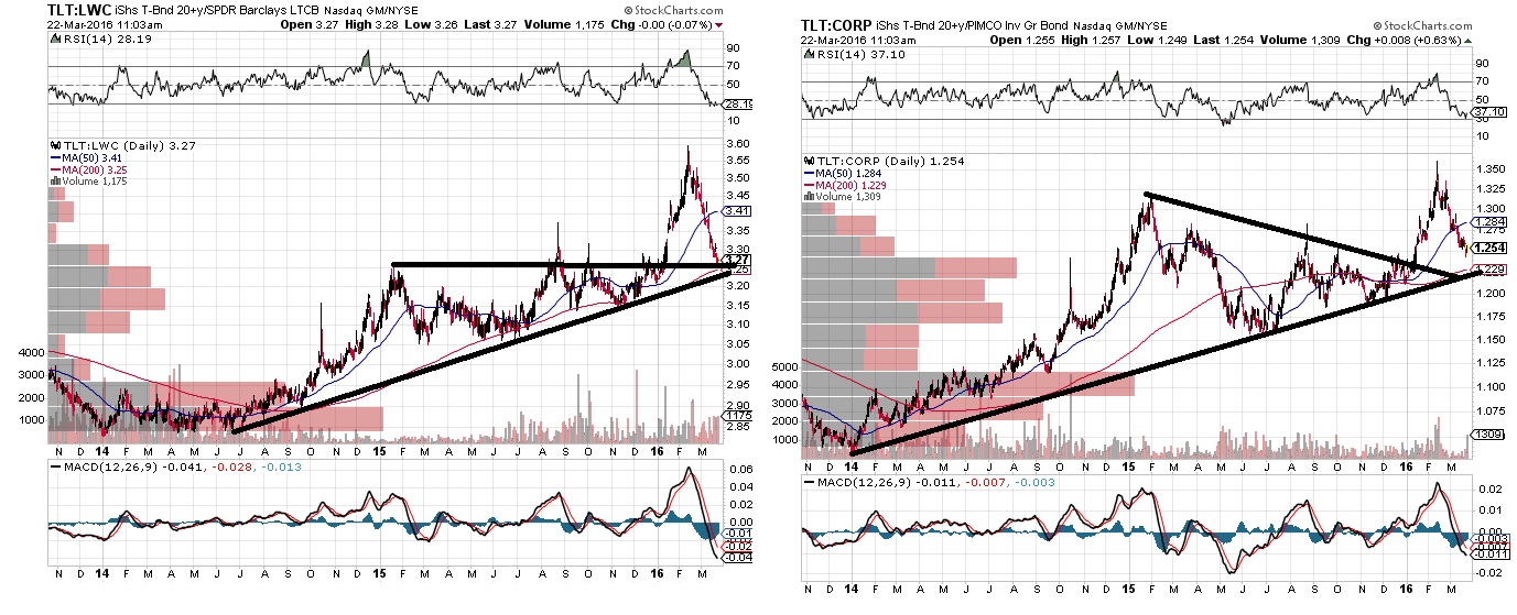
The ratios of TLT to corporate bonds shows it may just be temporary, and pulling back to the trendline. If the trendline holds, you would see TLT outperform corporate bonds as the ratio trends higher.

tltratios

Nevertheless, there’s a huge amount of capital that is moving to and from bonds, depending both on capital flows as well as potentially indicating inflation of capital and leveraging up, or deleveraging, so it will be an important development to watch.

From time to time bonds flips correlations with stocks as well. Either both bonds and stocks trade up in a bull market of growing wealth and increased leverage in the system. Or bonds is the “flight to quality” or “risk off” trade during tough times, while stocks tend to be the “risk on” trade. If the treasury bond markets gets too saturated on this generational cycle, it’s possible that everything we know about the relationships between stocks and bonds will eventually flip for the first time since the early 1980s. The flip would be the first time bond yields reversed a downtrend and began an uptrend since the 1940 low. 1942 was the first higher low since the 1933 low. Both stocks and bond yields trended higher (bonds prices lower) from 1942 to around 1969. A bull market with rising interest rates may result. Corporate paper or just cash may be the flight to quality trade instead… But perhaps that doesn’t happen for longer still.

Comments »
The Unconfirmed Top

I believe the market provides superior risk/reward for the bears than the bulls at this time, even if the current momentum is in the bull’s favor, and even if there is no confirmed bear market yet. The IWM shows about $25 potential reward to $5 risk. I don’t think the full $25 potential will materialize, but even if you only get $10, the trade has profitable expected value as long if the market produces a win more than 1/3rd of the time.

unconfirmed

unconfirmed2

On an intermediate time horizon, the trendline starting from the 2011 low created a 1-2-3 topping signal which set up sometime around November 2015. This was also a retest of a triangle top which probably moved too fast for most to react to.

Unfortunately, the decline failed to take out the prior low in every market, on both a weekly and daily closing basis, so there’s some confusion as to whether we have entered bear market or bull market.

For now we actually have a couple bearish trend channels that have begun to form and either remains a viable sign of a bear market. However, the more conservative bullish trend channel has not been breached, nor has the trendline starting from the 2009 low. Additionally, the other possible bullish channel was breached briefly, however in the rally we have regained support.

So that leaves us caught between a rock and a hard place as far as predicting price goes. Fortunately, there are still clear areas from which the risk reward favors one side over the other, and risk/reward is the name of the game.

Right now we are overbought entering supply zones where the bears who sold will defend the break even and the bulls may look to sell while they have a buyer in positions that are underwater.

The areas of supply are at 205-212 range in the SPY, 110-117 in the IWM, 107-110 in the QQQ (not top heavy) and the 175-180 range in the DIA.

The QQQ actually has a more bullish volume profile in that it has history of volume from 101-106 where the bulls directly below seem to outnumber the bears directly above. Nevertheless, with the other markets suggesting greater risk of running into resistance and selling off, the nasdaq bulls could quickly end up under water and the bulls could pile on and if prices move below the 101 level things could very quickly shift to where the sellers are in control.

The overhead supply provides an easy out for sellers to get back there shares at a slightly higher price while the gap below provides potential for gains. Past price history and volume suggest the amount of future transactions that take place as well as the speed of the price movement away from volume clusters and towards price discovery through volume pockets until new transactions are found.

Apply this principal to the IWM.iwm

You can see there is risk of a fast move below. There was very few transactions as the IWM rose above 85 to 110.. There are enough transactions at and above 110 that are underwater and bears that may look to reinitiate at similar prices. This creates the conditions for selling, and without much history of transaction below, prices move until it finds new buyers. The volume profile suggest that unless new money that wasn’t interested in buying on the way up in the 85-110 range suddenly decides to on the way down, or unless short sellers begin to take profits and establish a bid, you could see the market continue to move downwards as there will likely be more selling supply than buying demand.

Even if the profile won’t tell us what will happen, it can establish an objective measurement of risk and reward locations. For selling to be a bad idea, you’d have to be wrong a much larger percentage of the time than 50/50 if you manage risk so that you have the markets moving as much as $25 down when you’re right and no more than $5 upwards when you’re wrong. Certainly it’s possible that the market catches a bid and you have to close out your gains short of the $25 reward at the $5 risk, and certainly you may be right less than 50% of the time, but the odds are in your favor that you have a profitable trade on the bearish side.

Comments »
3/11

I’m short on time. I will need to take another closer look at these but for now here are a few notes for next week.
bullish: ACHN,AMBA,ARNA,CYH,ESRX,GNW,MNK (on pullback),V (bullish @70, bearish @75?)
VMW
BCEI consider stop buy @ 2.50-2.65 or limit near $2.00

bearish:
TSLA,COF,BBY,CRM,DOW,WBA,DWA,NVDA,TXN,WMT,WY,xlnx,
(MBI)
(WTW?)
AAPL(105)
[amzn]?

Comments »

Chart Blast 11-24

12

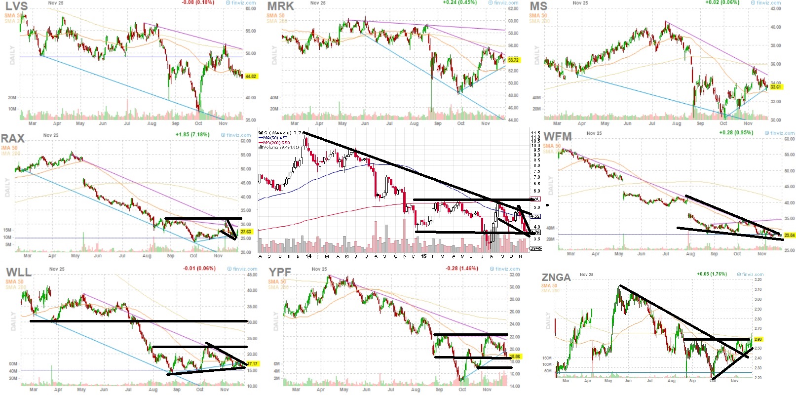
Ideally looking for a stock consolidating (contracting volatility) following a break of the prior down trend, a 1-2-3 bottom, with an equal high being made and another low or consolidation range being met. Simply quality patterns or notable long term consolidation is enough to trigger interest as well. Looking for “risk aversion”.
sentiment chart

Scan method: Manually looking over charts (stocks only) that trade weekly options and looking for anything that catches my eye.

I came up with these names on 11/24 but I’ll post them now for reference.

Ticker symbols:achn,amba,amrn,btu,data,dvn,exxi,flr,gild,gpro,joy,kndi,lvs,mrk,ms,rax,s,wll,wfm,ypf,znga
finviz link here.

Comments »

Pros And Cons of Cheap Commodities

prosncons

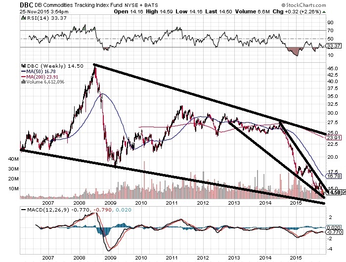
After this post about commodities, I thought I should look at the pros and cons of declining commodity prices.

Pros:
-Cheaper commodity prices helps consumer and allows for cheaper production.
Low prices may provide for discouragement to develop in the sector and provide good opportunities.
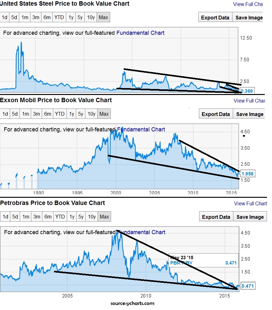
-The valuations are being neglected and the volatility in P/B ratios are consolidating. The technical setup of the price/book suggests a big move most likely higher in the price to book developing. (Unfortunately, high price/book could just mean declining book value rather than increasing price.)

-The economy is perhaps less dependent upon commodity prices than it used to be. We’re not in the agrarian or industrial ages when the economy ran on food output and oil prices. We’re somewhere between the services and technology era (or information age if you prefer).

side note: I suspect the “cybernetic age” is ahead where the old rules correlating employment rate and economic growth begin to diverge as robots/machines can do more and more to take over a lot of the old tasks. Meanwhile the economy becomes less about how the major institutions are doing and more about the individual company using crowd sourcing to fund projects and compete with the big companies as the creme rises to the crop.

-Any future increase may help commodity stocks and may lift the market.
-1998 had notoriously low oil and gold prices which matches the analog of having a roaring market ahead.
Cons:
-The speed of decline may signal deflation is hitting the overall economy even if it hasn’t effected stocks yet. Even if it is similar to 1998, the other side could be devastating.
-If I potential rise in commodity IS coming then all the pros about low prices helping consumer and businesses may in the future actually hurt everything that it should help. As a forward pricing mechanism, then markets may price in a rise in commodity prices soon.[[[However, since more attention is being paid to the negatives of declining oil/commodities, then rising would be seen as good. Either way, you should look at the uncommon or contrarian view in this manner.]]

-A complicated implication that I won’t get into too much detail about is that the impact of low oil on countries like Russia may have influenced events that create the conditions to lead to WWIII.

I tend to actually place greater weight on the bearish side, but the good news is, none of the reasons you should be bearish are necessarily immediate. In other words, we could continue to match the 1998 analog of having a roaring market ahead before the impact is felt.  

We could easily have 6 months to 3 years of upside in stocks before the deflation hitting the oil market effects the stock market. The 2005-2007 period saw deflation of housing market, inflation of energy markets. It wasn’t until long after the losses from the banks and subprime, that it really began to spill over into the global economy…. Even if there’s a similar effect, that doesn’t necessarily mean the speed of the 2015 decline has any immediate impact in stock prices even if commodity prices don’t bottom soon. And if they do, we still could very easily see the markets continue higher until they reach their extreme while commodities and companies in that space quietly begin to pick up steam as an investment.

It’s also worth looking at 1998-2000 as energy prices and commodity prices swung to their extreme lows as the market rose, before rising in sync with the stock market, and continuing upwards without ever taking out that low even during the 2000-2002/2003 decline in the economy.

source: http://www.financialsense.com/

Nevertheless, 1998-2000 was a great time period to invest in commodities. That doesn’t mean that trading stocks short term was a bad idea, or even holding if you could get out before the top. However, for asset allocators and long term buy and hold investors, it may be a decent time to look at commodities and continue to watch that space for opportunities.

wtic

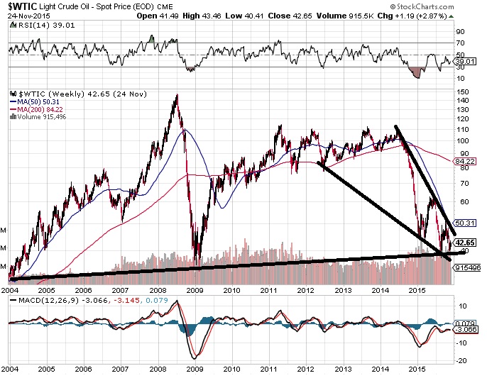
The initial speed of the 2014-2015 decline from $100 to $50 is what concerns me a little moving forward
DBC

Comments »

Commodities Are Screaming? Are You Listening?

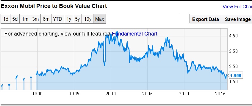
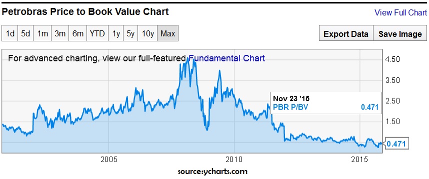
I’m not a fundamentals guy, but does the fact that commodity based companies seem to be pricing in Armageddon concern anyone? US Steel price to book value has not been this low in the 25 years of data that I just looked over as an example. XOM price to book this year hit levels not seen since early 90s. PBR hit levels this year not seen in 15 years of data.

source:Ycharts.com

x xom PBR


update: Just noticed the interesting technical setup in the price to book value. Technical analysis isn’t usually done on a fundamental chart like this, but I thought it was interesting.

valuation squeeze


Comments »