iBankCoin
Home / Tag Archives: oabot

Tag Archives: oabot

Groups Setting Up

I set up the main tab in Neo to filter out most rising patterns. Bull flags and rising wedges are mostly gone and have been set aside to their own patterns if you should choose to scan for them. I haven’t really optimized this setting. For now anything with week AND monthly movement both up, or day AND week up more than 1%, stock 15% above 20 day moving average or 50% above 50 day moving average is classified separately for scans. Also, anything that has moved more than 60% from it’s 50 day low and has declined less than 50% from the 50 day high with a medium term consolidation range of 1.2x higher than the market is a “possible high tight flag”

I also filtered out exchange traded funds and any “errors”

The “consolidation score” now only relates to stocks that are consolidating sideways to downwards so if a bunch of stocks from the same sectors have higher scores they are much more likely to have a similar correlated setup going on.

As the Option Addict teaches, when you have an uncorrelated market and suddenly a group starts correlating that usually signals stocks ready to move as a group.

So for the first time since implementing these new changes I want to test out OABOT2.0/ Neo’s ability to spot groups setting.

neolearns

If a stock doesn’t have at least 10 names that qualified I chose not to bother looking at it. Perhaps 5 is enough in some cases.

groups

Aside from industries, I can also look at sectors, exchanges, and in the future I hope to be able to look at “short interest” “groups in similar ranges from highs to lows” and by institutional ownership. Some of these I may also add on by group so you can see the average short interest of a group and average institutional ownership… but that’s later down the road.

There’s a little bias towards stocks that generally do not move as I have not yet added in a system to reward stocks with higher than average movement just yet (I do that on my own when I run scans sometimes) The first number is the consolidation score of all those that qualified. The remaining numbers are the short term, medium term and long term for the entire group including those that were filtered out (I haven’t changed these yet). The next number is the average RSI of the group and the final number is the total number of stocks that qualified.

Now we can use pivot tables find the industries and highlight all of these stocks and paste them into finviz. I decided to also include all stocks of that group, not just those with a consolidation score over 1000.
see here.

Since I sorted them by industry, you can just page through the list and if you see any groups with several setups that look kind of the same you can focus on that group.

Apparal and Property Casualty & Insurance seem to be setting up together, but I’ve certainly seen more actionable themes. I’d say these groups may need a little bit more time to consolidate, but that doesn’t mean you can’t be early and find some individual names setting up. I could look down the list.

One potential problem I’ll have to fix that I just realized is I made a huge punishment to sort out stocks that are likely in an M&A situation (buyout offer) so that they don’t show up in my list. I’ll probably need to instead classify them as “possible M&A” and if they’re classified that way they won’t show up in the “falling wedges and triangle patterns” classification.

Aside from that you can just scan for individual setups .

I’m going to put in a slight bias for high short interest.

What I did was take short interest times 1,000 and then if any are above 1500 I capped the score at 1500. I added this to the total consolidation score. Here are the top 400 names in the “possible triangles and falling wedges” category. There may be some other false positives because I haven’t optimized and out of 400 some setups aren’t going to be perfect. Last time I found a record high of 107 names out of 400 that looked interesting enough to put on a watchlist.

Here’s the list. From this list I like to go through it manually. If I wanted to reduce this step I’d crank up a lot of the scoring methods and only look at the top 50… but in the process of eliminating false positives I’d also eliminate a lot of good setups because it didn’t pass one threshold.

Normally I’d post a condensed version of my own manual scan from that list but today I wanted to illustrate the results and provide a reference so I could check them later this weekend.


Comments »

Automatically Sorting Stocks By Patterns

One of the false positives I’ve been getting is the “rising wedge” pattern. This pattern represents upwards consolidation which is more of a bearish setup. While one can certainly trade this pattern, I want to separate it from the bullish patterns at a minimum.

I also currently don’t want to trade the bull flags just yet, although I want them to be available should I need them.

However, I may wish to trade “high tight flags” so I want to keep these separate.

Both patterns show at some point significant price rises so if I scan for significant price rises over a particular period of time or combination of periods, I may be able to filter some of these out and be left with mostly triangle and falling wedge patterns which is mostly what I want to trade.

If I do trade bull flag patterns, I want to start with the high tight flags.

High tight flags are technically defined as a doubling in price over 3 months or less followed by a consolidation period where it falls less than 20% from the high. These I would consider trading and want to know about them independent of bull flags and rising wedges. While I don’t have a 3 month period, I have a 50 day low and high which I can use to define a stock that is up 80% or more and falling less than 20% PLUS I will also want a 20% higher consolidation rank than the market average at the time to qualify. I set this up for high tight flags.

filters

The -1,0 and 1 represent stocks that I omit due to errors or lack of liquidity. While stocks like DRAM and GSAT and PHMD are satisfactory, there are still others that I wouldn’t touch. I could probably bump up the consolidation rank to 30% higher than average to filter some of these, but for now it works.

When done, I should be able to look among those labeled “not high tight flags” and have a separate filter from there to “rising wedges and bull flags” or “remaining stocks” (falling wedges and triangles). This way I can look at the patterns I want and ignore the ones I don’t.

As mentioned before, now I want to work on coming up with a filter for rising wedges and bull flags. The key here is I don’t want falling wedges and triangle patterns showing up as “bull flags and rising wedges”. Even if I have to leave a few rising wedges and bull flags in the remainder, that’s more acceptable to me than having tradable falling wedges be filtered out. I’m okay with keeping bull flags and rising wedges together because it is a challenge to separate them from each other since both consolidate upwards and move from high and low established ranges.

I intend on coming up with a few formulas and changing the details of the formulas to increase the amount of patterns that get filtered until I see a clear falling wedge or triangle show up as a “bull flag and rising wedge” and then tightening the filters so they’re gone. In this case, I probably want to filter out stocks that have no clear pattern but also happen to have been rising since the goal is not to clearly identify rising wedge and bull flags, but instead eliminate stocks from contention from the patterns I am actually looking for.

This should help me narrow down the list and then I can sort that list by consolidation rank and I will be left with triangles and falling wedges that are liquid enough and have the look that I like to trade…

Should I choose to also look through possible rising wedges and bull flags for patterns I can, but the goal is to reduce the number of bad and untradable patterns without removing any trading opportunities. After filtering the high tight flags, the rising wedges and bull flags I want to look for other patterns that I don’t want in the remaining. If I can filter out some bear flags or something that will improve the quality of what I’m looking at.

The perhaps more important reason behind doing this is that I want to know which industries have multiple falling wedges and triangle patterns because these are the industries I want to trade. Of those industries with multiple falling wedges and triangle patterns I want to be able to sort by average consolidation rank of these patterns. Stocks that set up together in a low correlation environment tend to break out together.

While the original OABOT did a pretty good job of compartmentalizing the setups by where relative to the highs and lows they were and adjusting based upon industry, the inability to rapidly split test variations in formulas prevented me from being able to make improvements quickly. THe new OABOT will eventually be much better once I go through every layer I want to.

The next step after this will probably be “risk factor” which will attempt to handicap a stocks level of “risk” by looking at beta, ATR, monthly volatility, change (over 1 quarter, 6months and 1year), distance from highs and lows and industry metrics vs the market and the individual stock vs it’s peers in sector, industry, market cap size, exchange or index its trading in and other variables.

I could also look at classifying stocks within 10% of highs, 10-25% below highs, 25%-40% below highs and stocks near lows and run a count by number of stocks in each category and consolidation rank of each of these categories and other variables to help me better understand what is setting up right now.


Comments »

A Peak Behind The Curtain

So when it comes to picking stocks, OA teaches that there’s certain points of the market where the appetite for risk is different. Right now I don’t have a great way with the OABOT 2.0 to capture that without making some changes. However, I am experimenting with a way I can modify the score of the screen I ran to make a quick list that approximates some higher risk names. So far it worked pretty well as I will demonstrate.

The original OABOT was designed to mostly focus on where a stock is in relationship to its highs or lows (and in some cases what the short interest and fundamentals were) except you could only classify it once, and because the stocks were ranked according to a limited amount of factors, the classifications were not all that good. However, what the classifications were good at doing was an adaptive scoring model that graded stocks near the highs with a different criteria once they were classified as “laggards” or “trash” so it did some good things.

The current version of the OABOT needs to be changed to somehow capture a measurement of risk. I suppose I could try regularly altering some of the exact numbers. For example when I’m looking for low risk stocks, I’d score absolute low volatility higher than relative volatility. When I’m looking for higher I’d flip that on the head. Or I could add a reward for stocks that have high total volatility relative to the amount of volatility compression. However, for the time being I have another idea.

In order to capture the higher risk names, I decided to make a pivot table and then copy and paste the names that hadn’t been filtered out by liquidity filters and error filters (I’m not real strict about these filters, they’re just to eliminate the stuff that has no pattern or errors in data that prevent me from scoring them)

1

Then I eliminated the worst 1000 or so consolidation score stocks No real reason for this amount.

excluded 3

Then from the remaining 3000 or so I chose to incorporate a stock’s ATR divided by price or average % movement in the last 14 days. Since these are usually numbers like 0.014 or 0.022, I multiplied the result by 70,000 which mostly gives you a number about equal or less than the consolidation score except for a few and combined it with the total consolidation score to give me a total score that favors the stocks who’s relative consolidation still represents a lot of movement.

2


Then I imported a few hundred names it ended up being 276 names (just done randomly). From this list I manually skimmed through looking for setups because there are still going to be false positives. I came up with 52 names that looked interesting enough to think about over the next week and posted them for viewing in After Hours chat. 18.8% of the names from the top 276 I liked enough for a closer look. I could have done more but I’m not really into bull flag patterns just yet and have not tried to filter out rising wedge patterns. For now I don’t mind the false positives because I’m looking to just make this a research tool.Should I choose to make this more about being more of a trading system or process I’ll want to be much more strict and just want a list of a few dozen only and then simply monitor them for some kind of buy signal on the intraday chart or else some sort of buy point.

Sample of list (full list in AH /w OA chat)

final-list


I’m thinking moving forward I may be able to use various indications of how much a stock has moved between beta and ATR and maybe some other indicators to indicate “risk” It isn’t perfect yet, but I basically just arbitrarily picked the standard. I can easily put some formula to create limits and criteria to cap a score or remove it from consideration of “higher beta” names and then seek to optimize those numbers (and this was follow up. I’d probably also create some sort of metric based upon days since it had its IPO which might also be a good method to identify names that represent a higher risk appetite.

Certainly this screen does pretty good at capturing the “4’s and 5’s” of the market that have not yet moved. It didn’t take a ton of additional effort. For now I’m not sure whether a lot of change is needed, but I certainly could send the time as I’m curious as to how the names with certain classifications are doing curently and have in terms of their consolidation score would change as a group.

For now I just have categorized stocks by market cap, indices/exchange averages, sector, industry,etc and am only looking at the consolidation rank on various timeframes and using the old version when I want to run breadth or look at where the capital is moving.

There’s a current small bias due to the way I created the score that favors the lower beta setup and this “hack” eliminates it completely by rewarding the stocks that have moved a lot per day on average in the 14 days but still have a generally high consolidation score.


Comments »

Optimization Process

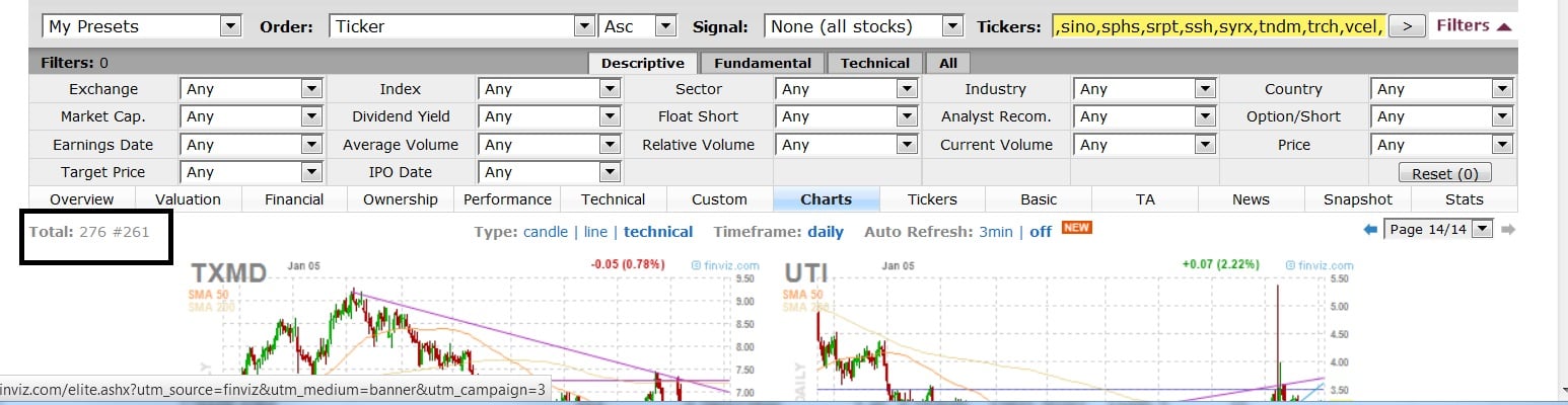
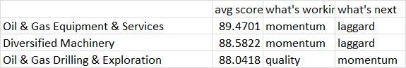
I’ve started to recover the OABOT and recreate the consolidation score. It turns out that subscribing to finviz elite does allow immediate updates on stock scores as long as you are logged in at the time in internet explorer. (firefox doesn’t work for some reason, may be a settings problem) I’m not as mad at them as I was for shutting off the export function without a warning, but it is a little bit of a hassel to log in first and redo things as well as pay the dollars for subscription but so far no one else that I’m aware of has really stepped up and offered nearly as much data to compile and sort through and set up formulas to in a way that I can export to excel and have formulas pre set to adjust the way I want to. Originally http://investexcel.net/ had a spreadsheet that would pull all the data from finviz with the push of a button. Basically I altered it by creating a formula that would pull from the tab that had the data and then I set up my own formulas. I wouldn’t really know how to create a formula to do that automatically with another free or paid data source.

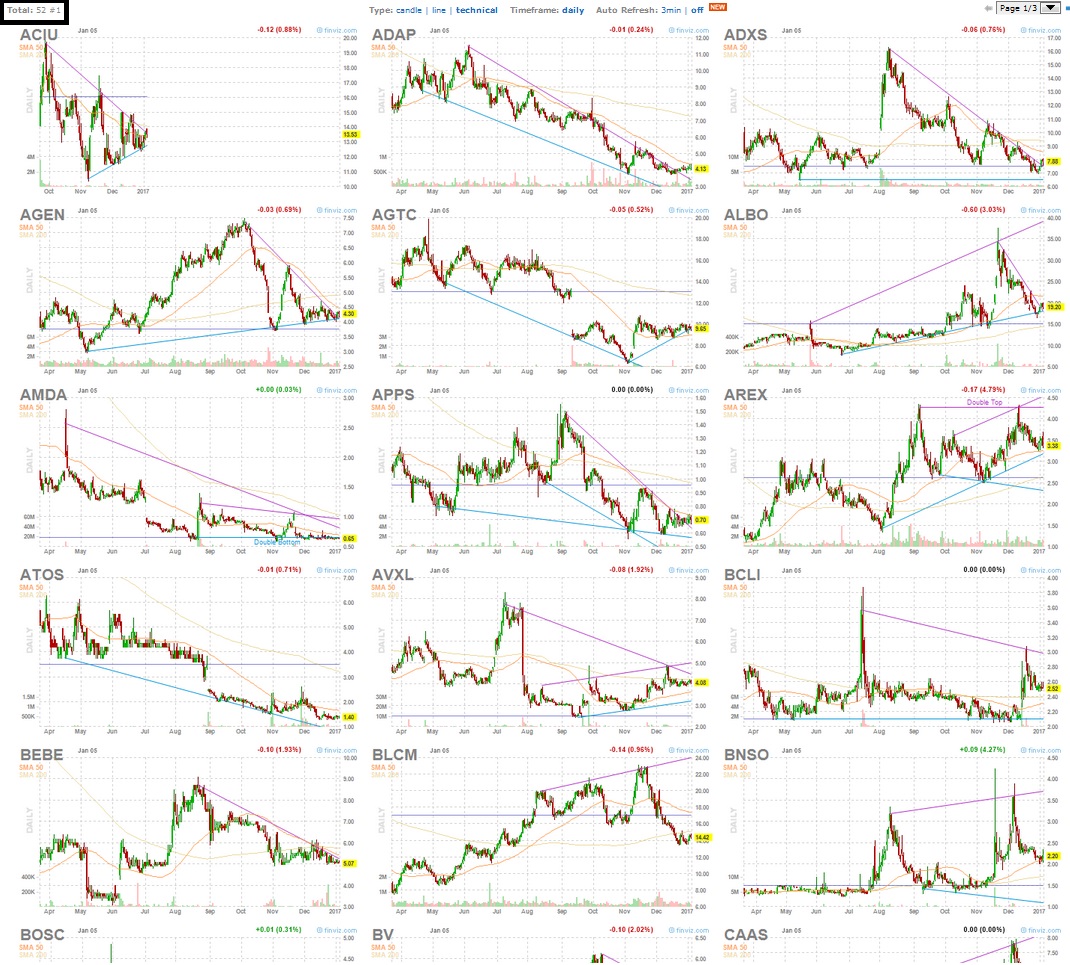
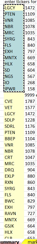
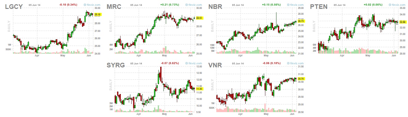
There’s a list of 400 stocks that I pulled based upon the top “Intermediate consolidation score” as I applied via my OABOT spreadsheet. From those I manually scan and pull all the ones I like. I pulled 39 names. I probably could have pulled more if I wanted to grab the ones that all have the similar “bull flag” pattern like WABC, but I decided not to

For some reason I’m having trouble posting the link so for now you have to copy and paste it.

What I will be doing next is going through a process attempting to improve either the quality of the results or the quantity of results from the 400 I list.

The process will look something like this:

1)First run the scan as currently exists.

2)Change something about the scan’s formula.

3)Compare the results and repeat until the results improve.

I want to basically start with the extremes on each end and move towards the middle until I can’t seem to improve it or it no longer is noticeable or worth the improvements.

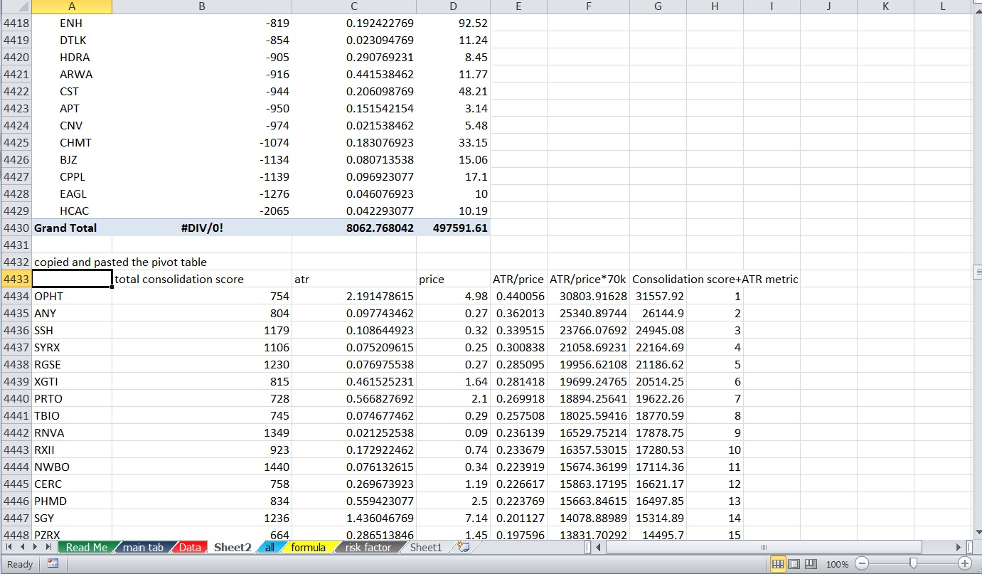
Fortunately the new spreadsheet is better designed for quick adjustments. I created a formula tab that allows me to change lots of numbers in the formula without scanning through computer gibberish to do so.

consolidation

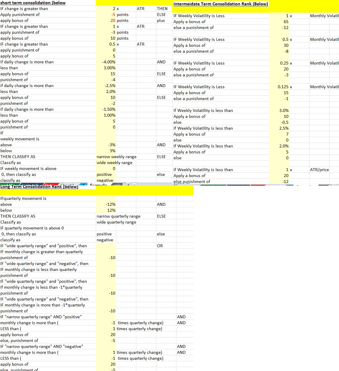
All I have to do is change a number and all the formulas and results change to reflect these changes.

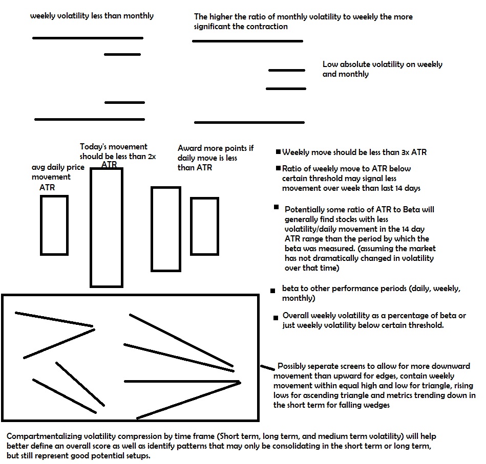
One criteria is that the stocks weekly volatility is less than a multiple of the ATR/price (% daily movement average), it awards points, and if it fails to meet the criteria a punishment (negative points) is applied. I can adjust the reward, the multiplier and the punishment for failing to try to remove stocks or include stocks in the top 400 that wouldn’t otherwise make it. The goal is to change the formulas dramatically and pay particularly close attention to the stocks at the top of the ranking to see how they change if I change the number to zero so no points are rewarded and then change it to 200 or something extreme so it makes up a larger percentage of the total intermediate term score. By doing this I’m better able to see if this criteria is a good criteria to even have at all, or if it should be removed completely, or if it should be one of the primary indicators used. Most likely it will be somewhere between and that’s what I’m after.

The ATR measures a stock’s daily movement each day over the course of 14 days to come up with an average. In theory if the weekly volatility is less, it means the last 7 days are less volatile than the previous 7 but that may not necessarily always be the case depending on how the volatility is calculated…

That will be the first criteria I test. For now I have 4 separate scores so that a stock that has weekly volatility less than 1x ATR/price is awarded points. A stock that has less than .75x ATR, .5x ATR and .25x ATR are given additional accumulative awards.

Initially as is I got 400 stocks narrowed down to these 39

http://finviz.com/screener.ashx?v=211&f=ind_stocksonly&t=ABB,ABT,ACXM,AFL,AMGN,AMZN,ARCW,AVID,BAP,BAX,BDX,BIDU,BIIB,BPMX,BPY,CHEK,CPE,CNX,CRTO,CZZ,DLPH,EGN,EGLE,ERF,FIS,FOX,HDB,HELE,HRB,HSIC,INFO,LVS,MLM,NWSA,QIWI,RDCM,TAP,TEP,TERP&r=21
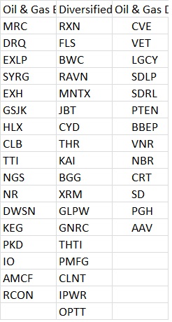
original 400 stocks

http://finviz.com/screener.ashx?v=211&f=ind_stocksonly&t=A,ABBV,ABCB,ABEV,ABT,ACAS,ACET,ADI,ADP,AFG,AIQ,AIZ,ALL,ALV,AMAT,AMGN,AMZN,ANCX,APLE,APOL,ARCC,ARCX,ASML,AWH,AXL,AXS,AXTA,AZN,BANR,BAP,BAX,BBVA,BCH,BCR,BEAV,BGH,BHB,BHE,BHLB,BIDU,BKEP,BKU,BMO,BNCN,BP,BR,BRCD,BRKL,BSX,BUD,CASS,CBK,CBS,CBU,CEB,CFD,CHCO,CHCT,CHMI,CHTR,CHU,CIK,CIM,CLC,CM,CPE,CPF,CPL,CRH,CRL,CRTO,CS,CTF,CVBF,CZZ,DISH,DLPH,DOOR,DTLK,E,EAD,ECF,EDE,EFUT,EGLE,EGN,EQM,ERC,ERF,ESLT,ESRX,EV,EVER,EVV,EWBC,EXAR,FFIC,FFIN,FIBK,FIS,FMBI,FMS,FMX,FOX,FRC,FTS,FUN,GGN,GLO,GLQ,GMED,GMLP,GMS,GNCMA,GTWN,HAR,HCA,HD,HDB,HELE,HES,HNP,HOMB,HPT,HRB,HRC,HSIC,HWKN,IFF,IHG,INDB,INFO,INWK,IQNT,JACK,JRS,KAR,KELYA,KHC,KLAC,KZ,L,LBTYA,LEN,LFC,LIOX,LKFN,LMNR,LOCK,LPL,LRCX,LSCC,LTXB,LUX,LVLT,LVS,MBT,MBVT,MBWM,MCBC,MCK,MDLZ,MED,MEG,MENT,MFS,MHG,MHK,MLM,MMAC,MMM,MMP,MO,MTSC,MTW,NANO,NBW,NCIT,NCMI,NCOM,NEWS,NFLX,NICE,NKX,NMR,NMZ,NNC,NPO,NRO,NSA,NSC,NSR,NWBO,NWSA,NYLD-A,OKSB,OMI,ON,ONB,OPY,ORA,ORAN,ORM,PATK,PBCT,PDCO,PEGA,PHF,PHG,PINC,PLAY,PLXS,PM,PNFP,PRGS,PSX,QEP,QGEN,QIWI,QTS,RATE,RDCM,RDN,RDS-A,RDS-B,REN,RNR,RVLT,RY,SASR,SBCF,SBGI,SCI,SCNB,SEIC,SEMG,SEP,SFL,SFNC,SIVB,SIX,SNBC,SNN,SNY,SPLP,SRLP,SSB,SSL,STAA,STM,STO,STX,SYK,SYNC,SYT,T,TAP,TBI,TCB,TD,TEF,TEP,TERP,TEX,TFX,TI,TI-A,TIME,TISI,TMH,TMK,TRGP,TUBE,TV,TVPT,TWX,TXN,UAM,UBSI,UCBI,ULH,UMBF,UN,UNP,USB,USFD,VAR,VASC,VBTX,VCF,VIP,VLO,VMC,VRTU,VZ,WABC,WBK,WCN,WDC,WDFC,WGBS,WHF,WM,WOOF,WPPGY,WSBC,WST,WTFC,WU,WWAV,XEC,XL,XLNX,AAPL,ABB,ACGL,ACXM,AEG,AFH,AFL,AGO,AIMC,AJG,ALSN,AMBC,AMCX,AMD,AMED,AMN,AMTD,AMX,ANW,AOI,APC,APFH,APOG,ARCW,ASX,AVGO,AVID,AWR,AXP,BATS,BBG,BBT,BCS,BDX,BERY,BG,BHBK,BHP,BIIB,BIO,BK,BKMU,BLE,BLVD,BMY,BNS,BOH,BPFH,BPL,BPMX,BPOP,BPY,BRK-B,BRO,BRSS,BT,BUSE,BWINB,BXS,BYD,C,CABO,CATY,CB,CBB,CET,CFG,CFR,CHEK,CHFC,CHH,CHMT,CIE,CIT,CKH,CLB,CLH,CLSD,CMA,CMCO,CMRE,CNA,CNHI,CNI,CNO,CNV,CNX

The next stage will be to see if the quality and/or amount of names I pull improves.


So  here is the first criteriatest

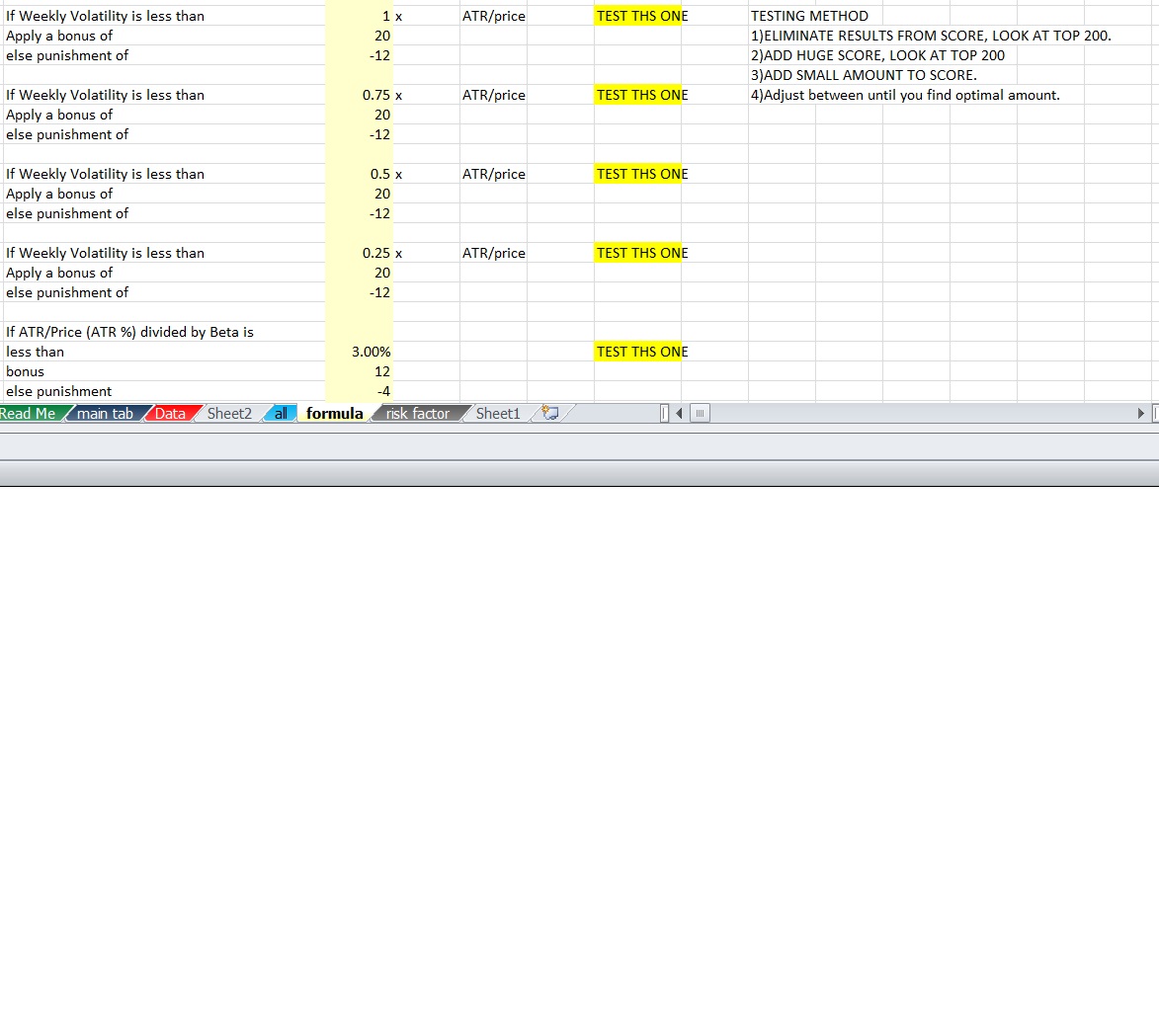
The next criteria I went +200 and -150 for all 4 of these criteria. The one below involving ATR/price divided by beta is a separate metric that I will test another time.

I can see which is more important later and if an even score or exponential score is best and whether scoring something like .10x or less than 2x would be more appropriate. Is it better to use this as something to make sure the recent week isn’t totally out of control or to actively seek weeks that are certainly quiet even if it eliminates some that aren’t super quiet according to this criteria but are still reasonable? We’ll eventually find out. For now we want to know how powerful this SET of criteria is together and then we can make adjustments to figure out which part matters more.

So with 200/-150 as the scores I came up with a new list of 400 and a new grouping. I maybe should have went with 1000/-500 because there was still an overlap of names, but that’s okay.

By doing this I actually got 59 names. I’m not sure if this is because there was a single signal that was more dominant or if this is a sign that this indicator needs to be scored higher or if there’s just more value in multiple scans. Certainly there was some overlap.

http://finviz.com/screener.ashx?v=211&f=ind_stocksonly&t=ABB,ABCD,ABCO,ABM,ABT,ADI,ADSK,AFL,AMDA,AMGN,AYA,BAX,BDX,BF0B,BIIB,BKEP,BLE,BLL,BPY,BSFT,BSAC,CBMG,CHEK,CLSD,CMTL,CPE,CRAY,CZZ,EGLE,FOX,GIB,GNK,GSL,HDB,HELE,HRB,HSIC,KMB,LVS,MANT,MPEL,NEWR,PFE,PII,QIWI,Q,QTNA,RDCM,ROKA,SJM,SSTK,TAP,TDG,TERP,THLD,TEP,TMO,VWR,WPT,WYNN&r=21

I think what I will do is remove the tickers I have in common and compare the ones that are different. After doing this I find that not only does the 200/-150 score develop more names, but I like them better. So that means the best solution is probably closer to 200/-150 than 20/-12. We don’t know if the exact solution should be higher than 200/-150 or more like 115/-85. I also see advantages for multiple screens. Nevertheless, for now the 200/-150 stays and we will look to test something like 400/-300 and 100/-75 to see if either of those improves the results in my opinion. If the results are not significantly better I’ll probably just pick one and stop there. The other thing is, I may circle back to this after I change other variables for the better, so for now I’m just trying to get a quick approximation of about where the better results lie. Later I can test punishing the stocks more than I reward or only rewarding with no punishment for the stocks that fail. I can also test scoring stocks that meet every criteria less than the previous criteria or more than the previous (for example if weekly also is .25x less than ATR do I score 1000/-500 or something like 20/-5.

As you can see there’s a lot to test, so I’m taking sort of a pragmatic/split testing system based approach and trying to quickly move on to other things to keep improving this. I wasn’t nearly this efficient the first time I made the score and making changes was more difficult so I should be able to really improve this tool rather quickly by running a similar process.

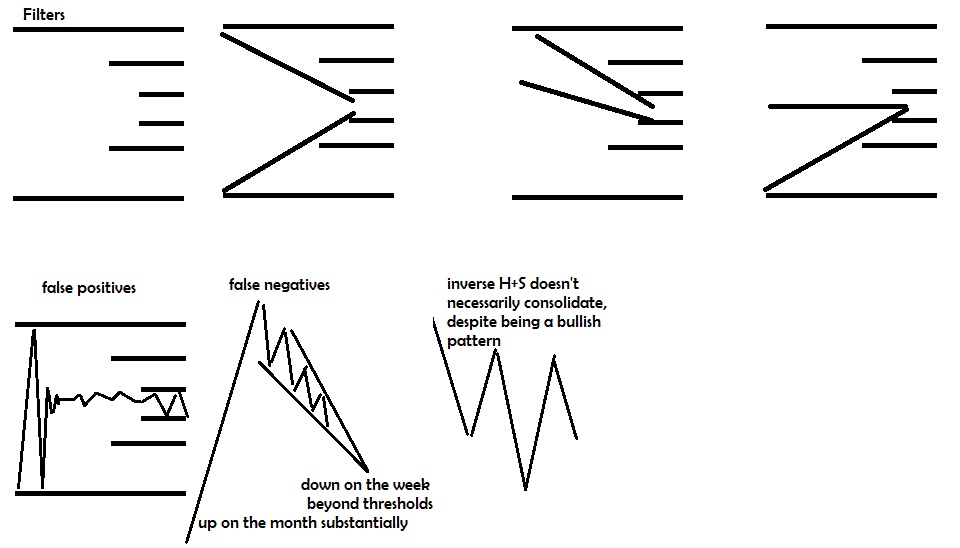
For now the short term consolidation score doesn’t need any changes as it serves it’s purpose of making sure the stock isn’t breaking out or down on the daily basis without any false positives (although there may be false negatives that get filtered out that are still good to trade). But I want to keep improving different variables in the intermediate term and then get to the long term consolidation rank and seek improvements there as well.

Comments »

Intermediate Term Consolidation

The short term consolidation score looks at:
Daily Change
Daily Change Relative To ATR
Daily Change Relative To Weekly.

The short term represents any movement less than 1 week, but really only involves the daily moves because of lack of data between 1-6 days. It also scales the measurements so that as a stock moves less, it gets more points added to the score.

The intermediate term consolidation gives us more data.
Here are a few possible considerations to score:
1)Weekly change vs monthly performance
2)Weekly volatility vs monthly volatility
3)ATR (14 average daily move) ratios…*
4)Weekly volatility vs beta
5)Weekly volatility overall
6)Weekly performance vs beta
7)Absolute weekly performance not too extreme in either direction.
8)Distance from 20 day moving average?
9)Distance from 20 day moving average relative to some volatility metrics**

We can tinker a bit more with how one thing relates to another in different layers to provide a lot more clarity on whether or not the stock is undergoing volatility compression or volatility expansion in the last 7-20 days.
———————-
*ATR divided by price gives us a percentage daily move as an average over the last 14 days. While this only refers to the daily movement, it’s a function of 14 day volatility on daily basis. If the weekly volatility is smaller relative to the ATR (14 day volatility), it tends to represent a stock that is contracting in volatility. If the ATR is smaller than the monthly, it also tends to represent a stock that has contracted in volatility over the last 14 days more so than the last 30. You can also apply a beta adjusted bonus so high beta stocks (stocks with typically more volatility over a longer time frame) that also have a low ATR (less volatility over last 14 days), score well.

**A stock that is closer to it’s 20 day moving average will tend to either have moved less over the last 20 days OR be near it’s “balance” in it’s range suggesting it’s close to the Apex if the chart is fully consolidated. However,a stock with a higher beta, or ATR, or monthly or weekly volatility may be able to tolerate a little bit more movement from the 20 day volatility and still have no confirmed breakout or breakdown. Also, a stock that has moved less in the last 14 days or week than it has over it’s 20 day average may be consolidating. The closer a stock is to the 20 day moving average, typically the less it’s moved over those 20 days, or at least the more likely that it has stayed in an equally proportionally rangebound area or regressed to the mean recently.

Also:A stock in an uptrend with a 20 day moving average under the 50 day may represnet short term weakness and consolidation within an uptrend. A stock in a downtrend with the 20 day above the 50 day may represent a stock that may be consolidating and possibly forming a bottm, particularly if the stock is also above the 20 day moving average. This sort of deduction from data probably won’t be used, but may be a decent idea to pair with consolidation data to find chart patterns. It would best be used in a binary (1 for yes, 0 for no) and as an additional filter (E.G. you can set up a table to show you stocks that score over 80 that also pass this filter of “patterning” from uptrend.) Defining the stock as being in a longer term uptrend can be based upon a stock being above a 200 day moving average or 50 day being above the 200, distance from 52 week low, distance from 52 week high or other data. A little off topic here so I will scratch it.

A volatility measurement tends to measure a stock’s standard deviation of movement over a particular time frame. A stock will move within 1 std deviation ~68% of the time if it is normally distributed. 95% will be contained within 2 std deviations and 99.7% of the data set will be contained within 3 standard deviations. Whether or not stocks movements are actually normally distributed has famously come into question by Nassib Taleb in his books “Black Swan” and “fooled by randomness”, but for the purpose of measuring volatility, this doesn’t matter unless we are going to sell option premiums expecting moves within a particular range.

This is a bit different than looking at a stock’s average movement, but still relate to movement over a time period.

So as long as we evaluate each stock with the same measurement, comparing ATR average daily movement over 14 days) to weekly or monthly volatility (standard deviation of movement over the time period) should still get us an idea of how volatility has changed over time.

By looking for contracting volatility over time and comparing volatility over various time frames as well as the magnitude of the change, we are able to look on a 1 day, 1 week, 2 week, and 1 month period of time and compare volatility relative to a stock’s long term comparative movements relative to the S&P (beta), and not only get a good idea of whether or not a stock is located within normal bounds of a range, but whether or not those ranges are contracting, to what extent they are contracting, and how the recent “quietness” compares to the historical movement of a stock.

volatility time volatilty compression2

The pictures above don’t fairly represent how our scores also consider relative movement, relative volatility, and average daily moves and standard deviations over time periods. Overall, using all the data presented will provide a much greater chance of having consolidation patterns rise to the top than may be represented by the images. I covered this in a different post.

Again– once we gather this data, we can have the spreadsheet sort out the data by certain categories– We then can make adjustments to the final individual score based upon the average of the group. A stock showing signs of consolidation in a group with an amazing consolidation score may be worth more than an “ideal” setup in an average group or worse. When you see multiple stocks in an industry setting up, it’s less likely to just be randomness or a fake. If every single stock in a group is setting up this represents a large amount of capital preparing to rotate into a theme. One or two signals can be wrong, but say 20/25 names in the group setting up? The probability of you catching an idea before it makes a big move is greater.

I feel similarly about seasonal data. Seasonal data on an individual stock may be due to a few quarters of earnings at a certain time that happened a few years and skewed the data. But seasonal data that suggests both the individual stock outperforming the industry and an entire industry will outperform the sector, and the sector will outperform at a particular time of year is more likely due to a causal relationship such as capital moving in reaction to or in anticipation of holiday shopping leading to an increase in earnings and a fundamental reason as to why a particular stock has been more effective at capitalizing on this seasonality than it’s peers in the industry. This is a little off topic here as well.

I don’t necessarily need to understand the cause as long as there is evidence the move will continue to correlate with the timeframe as opposed to it just happened to correlate without cause that will be operationally random moving forward.

If you don’t understand a cycle and are just selecting a point your results will be normally distributed as if it were random. But if instead it were a cycle with waves that expand and contract in duration, and you were able to identify this cycle and buy closer to the low and sell closer to the high, then you would be able to show superior results. Your results would come at the expense of someone on the other side, so again, analyzing the results would show a normal distribution. If you are an outlier to the upside, someone or a group of people will be an outlier to the downside, and overall the data set would be within a range with little evidence that you were actually able to exploit a tendency. That is the nature of a interconnected system where the wins of one person correlate with the loss of another around a collective average. A little off topic again.

So we basically have a good outline for the different things we can consider when making our intermediate term volatility rank which I have begun working on. I have finished the short term consolidation rank unless I decide that something in the intermediate term rank belongs in the short term or I come up with a different idea of what I can add.

Comments »

OABOT Demonstration: Looking For Top Industries

So using the “OABOT” (in development) I wanted to demonstrate how I was able to come up with a few ideas for strong industries.
First You press a button to update the data based upon the most recent FINVIZ data available:
update

Then I wanted to focus on industries with a large number of stocks that have been categorized into risk cycle types (I selected those with 35 or more per industry).
copy2
Next I wanted to look at the metrics provided which include breadth, average individual stock score (before adjusting for group score which provides bonuses for the stock being in favorable industries), and a weighted score that combines those factors.
sort3
Finally, I looked for stocks that either had a high enough absolute average of individual stock score OR a high enough weighted score and 35+ individual categorized stocks, then sorted them by their average individual score and limited the names to a handful.
listsort4


From here it is useful to look at what “risk cycle” the industry is predicted to be in and then “what’s next” in the cycle. Note: Many of the industry don’t have enough stocks in each category to provide reliable information for the time being, the OABOT will still make a “guess” but I will only be listing those which have enough sample size to provide a guess I am confident in.

detailed industry info

NOW… you have 3 industries with plenty of stocks telling you what is working and what is next.

Let’s use the OAbot to give us a list of stocks in each industry AND category of what is next sorted by score.
score1

score2

score3
And the list
list
Finviz list

From there we can narrow down the list a bit manually.
FLS,NBR,PTEN,SD,MRC,EXH,VNR,HLX,LGCY,SYRG,IO,NGS,MNTX,IPWR
Then we can have OAbot sort from highest score (adjusted for things including what’s working in terms of market cap, industry strength, risk cycle classification in the market, what’s working in the industry and sector, and many other things) to lowest score.

score4

Here are the 1000+ adjusted score for the stocks I manually selected

1000

There are other features. You can plug it into portfolio management tool listing a stop and target to compare risk reward on eligible candidates and determine which offers the best R/R,or you can run a position size simulator, or you can sort by any number of many categories among others.

What’s next?

I hope to automate some of this process a bit more so I don’t have to do sorting and comparing and such from the anticipatory group to the “what’s working” scores. By integrating the information it will require less effort to identify the top industries that also have enough stocks to be relevent. A lot of this will need to be updated to provide a large “anticipatory boost” automatically and I want to generalize “quality and momementum” into “early stages” category “laggard” into a middle stages category and short squeeze and trash into a late stage category. This will be in addition to the anticipatory scores but it will help me get more stocks actually graded with an anticipatory boost where I don’t otherwise have enough relevant information.

But beyond that the next phase needs to adjust risk cycle classification based upon the industry so they can be compared on more of a relative basis rather than just how they are compared to the highs. Then I will have two ways to sort of confirm the OAbot’s prediction of “what phase” of the risk cycle each industry is in. This will prevent the greatest moving industries from having a bunch of quality and momentum stock and be able to find which ones are taking longer OF this particular group. I also will run through anticipatory boost for all the other categories I used when coming up with the individual score based upon what “groups” are working.

I have a lot of other plans in store for the OAbot but for now it still functions to assist me

Comments »

OABOT 4/16 info

Overall, in general the market rewarded Momentum today with Quality not far behind. That suggests we may be transitioning from quality to momentum phase with laggards up next.

OAbot rewards stocks with contracting volatility, it classifies stocks, and it grades stocks differently depending on which risk cycle classification it is in (and other data). It then looks over multiple categories and awards bonuses based upon how well each category is doing. (market cap, classification, industry, sector, above/below $10,etc)
The OAbot is not yet set up to anticipate rotations. It can either rate stocks based on “what’s working right now” (and average scores of individual stocks in categories and looking at relative volume) from a multitude of categories. Or it can give you a good picture of what is working and you can manually find some picks based upon that if you do some manual work… it will all be automated eventually so that “what’s next” also get’s rewarded. The easiest thing to improve it will be to adjust and tweak the existing formulas, the difficulty is in finding the time and setting up the formulas to pull from the necessary areas. So as of right now I have not put the required effort into making the ranking perfect just yet.
Right now, OAbot says that momentum is working in every sector today except financials where quality is still ahead by a narrow margin, and basic materials where it’s neck and neck but momentum still has the lead. So laggards as a whole may be a good spot to look, or momentum names that have not yet moved just yet.

OABOT is in the early stages of development to be able to anticipate, and can at least provide guidelines where manual work can be done to both confirm it and look at the names.

I will look at all the stocks names in each industry+category that OABOT highlights based upon it having enough stocks in each category to draw a conclusion, and based upon anticipating what is working next, after looking at what is working now. This is still very incomplete as the current version only looks at the “larger fractal’ by looking at which categories have been “working”(making extreme moves) including daily, weekly, monthly, quarterly, 6mo and 12mo returns. As such, the number of industries that qualify are always limited.

The following industries are popping up as relevant in risk rotation:
(listed by the stock type you should anticipate)
Laggards
Business Services
Medical Appliances & Equipment
Industrial Metals & Minerals
Semiconductor Equipment & Materials

Momentum
Oil & Gas Drilling & Exploration
Credit Services

Short Squeeze
Independent Oil & Gas

Full list of stocks that are in both the risk cycle and industries that you can use to anticipate according to OABOT:
http://finviz.com/screener.ashx?v=111&t=ABCO,ABMD,ACI,ACRX,ADS,AMDA,ARC,ASM,ASPS,BLOX,BTU,CARB,CASS,CATM,CNSI,COHU,CSII,CVG,CVO,CYBX,CYNO,DLX,DNN,DSS,EDAP,ENOC,ENV,ETRM,EXAC,EXLS,G,GMED,GNMK,GPN,GSM,GSOL,HBM,HOLX,INWK,ISRG,IVC,KLIC,KOOL,LDRH,LMNS,LPSN,LTXC,MCO,MDXG,MIL,MMS,NANO,NAVB,NRP,NSP,NSPR,NUVA,NVMI,NXTM,OFIX,ONE,PFMT,PFSW,PKE,PLAB,PLG,PLM,POWR,PRGX,PVG,PZG,REE,REIS,RIOM,RRD,RTIX,SFE,SMA,SNN,SNPS,SNX,SPNC,SSH,STJ,STXS,SURG,TAHO,TAS,TCK,TER,TGB,TISI,TNET,TRQ,TSRA,UMC,UPI,URG,URRE,URZ,USAT,UTEK,VALE,VASC,VOLC,VRSK,WMGI,ZLTQ,GDP,SFY,CLR,PVA,CRK,UPL,KWK,MILL,EOX,END,COF,SLM,DFS,CACC,CSH,AGM,DLLR,CSE,AXP,NBR,BBEP,VET,VNR,CRT,REXX,MHR,PWE,FXEN

When it comes to anticipating, you also have to come up with a way to anticipate a rotation of industry and/or sector…. That is a tricky task because in certain cases, the market should reward industries which are just slightly off high, other times, you want industries that are “working” right now, and other times you want the beaten down industries that have been neglected the most. I don’t know if I am sophsiticated as a trader just yet myself to really master industry rotation or how to put sector rotation into code so I’m not sure how far I can get on this regard. But I have counterbalanced OAbot answering “what’s working? and how much?” with bonuses applied after answering “What industry/sector has a high average (multiple stocks with good setups)?”

I have a feeling I’m not explaining myself very well because I don’t have the time, but ask if you have questions and I will answer when I can.


p.s.LANFORCE (sorry, put here strictly for traffic and page views of lanforce deprived AH members… lol)

Comments »