iBankCoin
Home / Uncategorized (page 4)

Uncategorized

OABOT Demonstration: Looking For Top Industries

So using the “OABOT” (in development) I wanted to demonstrate how I was able to come up with a few ideas for strong industries.
First You press a button to update the data based upon the most recent FINVIZ data available:
update

Then I wanted to focus on industries with a large number of stocks that have been categorized into risk cycle types (I selected those with 35 or more per industry).
copy2
Next I wanted to look at the metrics provided which include breadth, average individual stock score (before adjusting for group score which provides bonuses for the stock being in favorable industries), and a weighted score that combines those factors.
sort3
Finally, I looked for stocks that either had a high enough absolute average of individual stock score OR a high enough weighted score and 35+ individual categorized stocks, then sorted them by their average individual score and limited the names to a handful.
listsort4


From here it is useful to look at what “risk cycle” the industry is predicted to be in and then “what’s next” in the cycle. Note: Many of the industry don’t have enough stocks in each category to provide reliable information for the time being, the OABOT will still make a “guess” but I will only be listing those which have enough sample size to provide a guess I am confident in.

detailed industry info

NOW… you have 3 industries with plenty of stocks telling you what is working and what is next.

Let’s use the OAbot to give us a list of stocks in each industry AND category of what is next sorted by score.
score1

score2

score3
And the list
list
Finviz list

From there we can narrow down the list a bit manually.
FLS,NBR,PTEN,SD,MRC,EXH,VNR,HLX,LGCY,SYRG,IO,NGS,MNTX,IPWR
Then we can have OAbot sort from highest score (adjusted for things including what’s working in terms of market cap, industry strength, risk cycle classification in the market, what’s working in the industry and sector, and many other things) to lowest score.

score4

Here are the 1000+ adjusted score for the stocks I manually selected

1000

There are other features. You can plug it into portfolio management tool listing a stop and target to compare risk reward on eligible candidates and determine which offers the best R/R,or you can run a position size simulator, or you can sort by any number of many categories among others.

What’s next?

I hope to automate some of this process a bit more so I don’t have to do sorting and comparing and such from the anticipatory group to the “what’s working” scores. By integrating the information it will require less effort to identify the top industries that also have enough stocks to be relevent. A lot of this will need to be updated to provide a large “anticipatory boost” automatically and I want to generalize “quality and momementum” into “early stages” category “laggard” into a middle stages category and short squeeze and trash into a late stage category. This will be in addition to the anticipatory scores but it will help me get more stocks actually graded with an anticipatory boost where I don’t otherwise have enough relevant information.

But beyond that the next phase needs to adjust risk cycle classification based upon the industry so they can be compared on more of a relative basis rather than just how they are compared to the highs. Then I will have two ways to sort of confirm the OAbot’s prediction of “what phase” of the risk cycle each industry is in. This will prevent the greatest moving industries from having a bunch of quality and momentum stock and be able to find which ones are taking longer OF this particular group. I also will run through anticipatory boost for all the other categories I used when coming up with the individual score based upon what “groups” are working.

I have a lot of other plans in store for the OAbot but for now it still functions to assist me

Comments »

Breadth: Why Look At Substantial Movers?

Most people look at breadth as advancers vs decliners. You can either look at the ratio of advancers to decliners, or the percentage of advancers vs all stocks (or percentage of decliners vs all stocks) expressed as a percentage bullish or bearish.
I like to narrow that list down by only considering “significant” moves. Why?
Day to day stocks move up and down chaotically for many reasons. Much less often, people are willing to chase a stock after it is moving upwards and continue to bid it higher beyond 1%, or continue to sell a stock after it has declined 1%. Even more rare than that, will you see them chase a stock up 2% or 3% or 4% or more.
Why Look at stocks that have made substantial moves when looking at breadth? By looking at significant movers I am eliminating the noise of day to day emotions to some extent. I am both looking at the percentage of extreme optomism (chasing stocks up) vs extreme pessamism (continuing to sell stocks much lower) as well as looking at positive economic, liquidity, and business cues (substantial earnings surprises for example will drive stocks much higher or lower than a 4% move). Either one when interpreted in proper context is a higher quality sample size then simple “advancers vs decliners”. Also a bullish swing trader’s dream is for stocks down big not to continue to go down and instead reverse and stocks up to continue their upside momentum. By looking at the data, you can determine as the moves get larger if the signals are more bullish as a sign of leadership and ideal swing trader’s conditions. You might also look at it from the perspective of Leaders vs typical market movement and compare a divergence.
Stockbee’s blog has a good article on using market breadth, and you’ll notice that his attention to 4% movers was something I adopted to one of the pieces of my litmus test of the market. But rather than track it at the end of day every day, I like to examine how it changes intraday and the “divergences” between the smaller movers and bigger movers, (and also consider it in terms of the context of “sentiment”).
Take today (06/05/14) for example.


breadth
Above is the image of the excel breadth info that I use and update with a click of a button when I want in which I showed you the typical advancers vs decliners, the 1% or more movers, and the 4% or more movers. An hour prior to the update shown above, I actually saw all (0%+) advancers vs decliners less than 50% bullish while the 1% and 4% movers were more bullish. Look past the noise of just the chaotic range and almost random like behavior of stocks hovering near +1% and -1% and you would see that stocks up more than 1% vs more than down 1% are actually showing more bullishness than all 0% movers. Look beyond that to the names that are being chased for more substantial gains due to things like earnings, leading stocks, significant capital inflows signalling the start of significant accumulation, and explosive returning confidence, optomism and depending on the context of sentiment, could represent euphoria type moves at times, and you will see a DRASTIC shift from slightly bullish to substantially bullish. If you first see 4% over 50% while 1% and 0% movers are not and build on a previous signal to signal that the 0% and 1% have begun to become more bullish, that may signal that the leadership of the big movers is lifting the market.

You’d like to ideally see this kind of action to signal that some leadership is catching on, and that the market is reacting positively to the positive leadership, particularly since this is coming off of an environment where stocks long term have shown bearish leadership on say a 3 month time period until oversold levels were reached. The concern is that some of the strongest short term rallies come in a bear market and if you look past the rotation into the large and megacap stocks that has brought the “market” higher, you actually have bearish leadership that has occurred via significant movers. Now overall stocks are still more likely to be above shorter and longer term moving averages, and near highs than lows, but the market does have the appearance of mostly just upwards grind while a failure to catch a lot of trends to the upside and more likely to catch a trend to the downside. That has not been a very favorable conditions for investors and allocators, so hats off to anyone that has done well or hung on with those strategies, and even those remaining bullish over the last several months had fewer bright spots than usual, and a signal to consider getting to work swing trading.

Fortunately with the VIX lower it signals many of the option players, hedgers and speculators have been flushed out and that attempting to speculate with options is now more affordable. With the lower volatility may come the consolidation needed for the eventual break of the range and trend higher, and confidence in holding and adding to stocks that have trended up to return… Breadth certainly is not the only tool in the tool box, but there are so many ways to use breadth and a lot of information that can be gained by different methodologies of looking at it that it is an important tool. You can use it like most do to neutralize the market weighted indices to see if the bulk of the market is declining or advancing and by effect deduce whether the larger cap stocks are moving more significantly than the smaller cap stocks. Or if you monitor the significant movers, you can use it to identify whether stocks making leading moves are to the upside or downside and what those with a lot of capital are doing. You can then interpret whether the leaders are likely to lift or hold down the market, as a result of divergences and you can see what the underlying sentiment is doing to confirm your look at stocks and what part of the cycle the market is in, and you can use it to come up with a gameplan for the day or analyze results relative to the underlying conditions of the market.

I’m still getting used to learning the language of interpreting the various aspects that breadth can provide, but an active and dynamic breadth monitor as said can be a very important tool in the arsenal.

Comments »

A Primer On Hedging For Your Personal Needs

I plan to buy a house soon, and like many people, I would care for low interest rates. If Interest rates go even lower, it is a win because not only does that mean cheaper borrowing costs, but that also may mean that there is a rotation away from assets into bonds as well as a NEED to ease rates and the conditions from which the need develops means cheaper prices. (in theory, but perhaps not in my particular area). That “win” is not necessary, in order for me to be able to afford a house. Through finding the right deal and saving I can afford the type of house I am interested in.  It is a question of having the stars align and being able to close on the deal in the right neighborhood for the right price with the right features to the house,etc. But if interest rates skyrocket it may be problematic. My borrowing power will decline and the availability of the types of houses I am looking at may decline. In my view, this is a perfect scenario to hedge.

Since a house is affordable based upon current interest rates and it is a matter of me finding the right house in the right area at a reasonable price, it may make sense to hedge. I want to avoid the possibility that interest rates will require me to save more money for a larger down payment or keep less per month, or resort to frugality, so hedging makes sense.

Since higher prices in TLT (treasury bonds) corresponds to LOWER yield and lower interest rates, In order to protect myself from a decline, I would want to profit from lower prices in TLT and higher yield and interest rates.

With the implied volatility in the TLT historically so low, we want to BUY premium.

Time frame? We have to take into account both the actual chart AND the time one anticipates taking before no longer needing a hedge (buying a house). In the short term, the bond futures on just over a 10 year chart shows the following volume profile.

bonds

Timing? The actual timing of the entry is important, but remember, we are currently completely unhedged from a very large cash purchase and about to borrow a lot of money relative to the account size since much of the capital has gone towards saving of the down payment. So what I’m going to do is buy a small TMV position now (3x treasury bear), and consider getting some Jan 2016 puts on the TLT further strength to retest the initial breakdown that I had mentioned may happen.

In theory you could work out what rise of interest rate would impact your affordability and ensure you have a large enough position to offset that and use options and such to try to match your gains to offset your loss as best as possible, but I’m not going to get that carried away. The key thing is that I give myself SOME flexibility so I can be patient on buying a house without having to rush into a decision prematurely without doing my due diligence and so I can make a calm emotionless decision as much as it is to worry about the exact dollar amount.

Protecting Your Home Equity through Hedging

Let’s say I’ve bought my house, lived in it for a couple years and the market has skyrocketed along with the value of my house. I don’t want to sell, but I am concerned about the housing market crashing. NOW how might I hedge? Now I want to actually take out as much equity as I can from the house and I might actually want to put it into TLT. I would have to sell at a rate or collect from dividends and covered calls at a rate at which would allow me to collect the cash needed to make the payment on the refinance mortgage. If the market crashes and Interest rates go lower or even negative, my loan becomes a gift at home equity levels that were at bubble levels, and I’ve locked in interest rates BEFORE they declined in attempts to ease the economy. This will compensate for the lost equity in the house. If more people are aware of hedging and can use it to fit their needs, then the “next 2008” will be less likely to domino into a contagion as homeowners won’t be forced out, foreclosures won’t cause a contagion of forced liquidation of real estate and job losses will be not as steep. Unfortunately I think many people are living paycheck to paycheck unhedged (and the increased taxes and austerity certainly haven’t helped) and they are VERY susceptible to an economic downcycle. Until people learn to hedge, each decline will just cause more volatility and fear, more pressure to leverage the system further. And each up cycle will be filled with panic buying as people are forced to buy while the house is still affordable, or else be forced to wait for the next downcycle.

Say you bought residential real estate ETFs when the cost was low and you weren’t in a position to buy a house and while the borrowing cost is affordable you also hedged vs interest rate increase; then even when market is near extremes near the top, you can still afford to buy. If you become concerned that you bought too late in the cycle, you might still be able to buy some puts and profit from a decline to offset your risks since your profits from hedging plus additional savings will provide you with more capital which you can use to now hedge a decline.

The time to commit excess capital into savings and hedging and investment is before you need to. That way, when problems come up, they aren’t really the problems they would have been. Maybe you want to be long natural gas and gasoline and heating oil futures contracts or options on futures contracts as well to hedge your costs so that if gas prices increase, you still have added capital to draw from from the investment. You don’t have to get too carried away as investment in companies at the right time with some attention paid to your own day to day financial needs and risks, will allow you to make money. However, ultimately taking away the possibility of bankruptcy no matter what life throws at you (within reason) through hedging, may, in many situations be a great form of insurance, and allow you to be more aggressive with the rest of your money and potentially at times with your life path (such as buying a house late in the cycle or quiting your job earlier to take a shot at a business opportunity knowing you have investment in things that will protect against rising food costs, gas prices, and savings that will last you long enough. )

If you want to quit your job and “take a shot” at whatever, you need to buy yourself a specific amount of TIME. Convert your money into “time” and through hedging you can most likely keep that time no matter what prices do. Simply count how much “TIME” worth of expenses you have. Count all the costs you will incur per month. Food, oil, heating, etc. Then multiply the current cost by the number of months you need. You need a minimum of that dollar amount to buy yourself that many months. Say you need at least 12 months. $2000 per month times 12 months is $24000. Now you need to convert that amount of capital or more into hedges. Each item over 12 months in this case will contribute to a specific dollar amount of cost. That is the target amount for which you use to hedge. Say food takes up $10,000 of that $24,000. $10,000 should go into buying food and hedging by putting capital into a basket of stocks and ETFs that profit from food or agriculture, or give you exposure to the food items and agriculture themselves. If you deploy that capital into things that will rise along with food prices, and in non-perishable food yourself, then an increase in food prices won’t disturb the amount of time (months or years worth of savings) that you have deployed towards your food.

Of course, that hedging capital is in addition to whatever OTHER costs you might incur such as the startup capital for trying to build a business in that time or whatever. You also need to consider the lifestyle you will have to live if the plan doesn’t pan out and you can’t get the same quality of job you had before and plan for some contingencies. I would carry at least 6 months of additional expenses worth of capital in CASH for needs that pop up, and at least another 6 months extra in hedges than you intend on using for additional time in which you are trying to find another job if things don’t pan out, or the job you were told you could always come back to isn’t there, but that is just me. Your needs and risk tolerance may be different, and so this article isn’t for everyone, but just a primer on how you might get started hedging. The average joe paycheck to paycheck should actually cut back first on expenses first, pay off debt second, save up cash third, hedge forth, and THEN go back to living their reckless rockstar lifestyle as they were, if they must. At least that way they will have a cushion that will give them an edge as costs increase and their paycheck doesn’t.


Comments »

Days Like Today Are Why I Track Breadth

leadership

This morning people were flipping out. They saw a lot of red across a lot of stocks. Many normal breadth indicators would point to a large percentage of stocks down overall today. But there is a silver lining. A large percentage, even if not a majority of stocks making large moves are going up. This means not everyone is selling. Leadership may be emerging in areas and the buyers aren’t shying away from today’s tape. The longer term perspective of the underlying businesses and/or economy are good, in other words (or at least not as bad as advertised). Another way of saying it, is today’s sell off is largely noise. Certainly, it may be possible, and even likely that at some point the negativity will spill over to even the leading stocks and people want to position so that they can avoid the margin clerks. However, put into context of the initial underlying signal and you may find that to be a good buying point. Conversely, it also is perfectly reasonable for the leading stocks to take the majority as the most beaten down stocks rebound and the entire market goes with it. At any rate, you might either abstain from selling or reducing, or look to buy names that are red now, and possibly consider buying the current 4% movers if they dip and retest their daily breakouts on F.E.A.R. (false evidence appearing real).


Some additional notes. Although we are still near highs and more stocks are near highs than lows, the longer term breadth has not yet shown leadership and only is seen on a daily and weekly basis. Keep in mind that the moves to the downside are adjusted to cancel out the upside move. In other words, a 60% increase is equal to a 37.5% decrease because if a stock increased by 60% it would only take a 37.5% decline to erase the move. Nevertheless this could be interpreted to corroborate sentiment. Alternatively, it could also be used to identify leadership (or lack thereof). Sentiment is more about either identifying extreme oversold levels and/or waiting for a signal that it may be shifting. Leadership is more about waiting until you have some positive momentum in the underlying economy and market developing. With that being said, quarterly data has been oversold for quite some time signaling that there is not “complacency” like the vix may have suggested, but nevertheless, if new leadership does not emerge soon, there is concern that we may see more significant declines from the rest of the market.

You could also use this as a lagging measurement of your odds of hitting a big winner vs a big loser on whatever timeframe. Since it is only on a lagging basis, you can really only use it as a benchmark vs your own performance, unless you have some sort of indication that the momentum/trend is just starting and should continue. If you didn’t snag any big winners on stocks you held the last 3 months, that may not mean that your system, strategy, or abilities have “broke”, just the conditions the market has gone through.

Bottomline:Nothing super actionable, but enough information is provided to develop a gameplan such as buying weakness and waiting for a retest on leading movers… or if you’d prefer to remain prudent, abstaining from any selling and remaining patient until the longer term conditions begin to turn around a bit.


—-

update:Breadth has deteriorated on 4% movers. I did not see a reading of the 4% movers get over 50% which would have actually indicated accumulation overall in leaders. Instead it was just a positive divergence with moderate leadership deterioration that was still much less than the rest of the market, and an early sign that once the fear is out that there could easily be a lot of buying. It’s not uncommon for even the leaders to flush before we begin a stronger rotation into the market, but the early chasing action signals the tape isn’t all that weak and/or complacent as it might look. Correlation still down and volatility low, it is a market of stocks and although tody there may be some mild pressure, I interpret the signals as more likely than not to be short lived.


6/4:Today started off very similar, only this time the 4% movers were above 50% and it pulled up the 1% movers. Looks like yesterday was a precursor to the initial signal. At any rate, so far it appears that interpreting the selling pressure as mostly “noise” was correct. The fear did spill over but today it looks as if things are turning around and leadership again is emerging. Today it is a bit less likely to spill into late day selling because not only are there more bullish movers than bearish movers over 4%, but the bullishness on strong movers is stronger than moderate movers. That translates into leadership pulling the market higher as opposed to still a large amount of chasers showing that the sell off may be short lived.

Comments »

OABOT 4/16 info

Overall, in general the market rewarded Momentum today with Quality not far behind. That suggests we may be transitioning from quality to momentum phase with laggards up next.

OAbot rewards stocks with contracting volatility, it classifies stocks, and it grades stocks differently depending on which risk cycle classification it is in (and other data). It then looks over multiple categories and awards bonuses based upon how well each category is doing. (market cap, classification, industry, sector, above/below $10,etc)
The OAbot is not yet set up to anticipate rotations. It can either rate stocks based on “what’s working right now” (and average scores of individual stocks in categories and looking at relative volume) from a multitude of categories. Or it can give you a good picture of what is working and you can manually find some picks based upon that if you do some manual work… it will all be automated eventually so that “what’s next” also get’s rewarded. The easiest thing to improve it will be to adjust and tweak the existing formulas, the difficulty is in finding the time and setting up the formulas to pull from the necessary areas. So as of right now I have not put the required effort into making the ranking perfect just yet.
Right now, OAbot says that momentum is working in every sector today except financials where quality is still ahead by a narrow margin, and basic materials where it’s neck and neck but momentum still has the lead. So laggards as a whole may be a good spot to look, or momentum names that have not yet moved just yet.

OABOT is in the early stages of development to be able to anticipate, and can at least provide guidelines where manual work can be done to both confirm it and look at the names.

I will look at all the stocks names in each industry+category that OABOT highlights based upon it having enough stocks in each category to draw a conclusion, and based upon anticipating what is working next, after looking at what is working now. This is still very incomplete as the current version only looks at the “larger fractal’ by looking at which categories have been “working”(making extreme moves) including daily, weekly, monthly, quarterly, 6mo and 12mo returns. As such, the number of industries that qualify are always limited.

The following industries are popping up as relevant in risk rotation:
(listed by the stock type you should anticipate)
Laggards
Business Services
Medical Appliances & Equipment
Industrial Metals & Minerals
Semiconductor Equipment & Materials

Momentum
Oil & Gas Drilling & Exploration
Credit Services

Short Squeeze
Independent Oil & Gas

Full list of stocks that are in both the risk cycle and industries that you can use to anticipate according to OABOT:
http://finviz.com/screener.ashx?v=111&t=ABCO,ABMD,ACI,ACRX,ADS,AMDA,ARC,ASM,ASPS,BLOX,BTU,CARB,CASS,CATM,CNSI,COHU,CSII,CVG,CVO,CYBX,CYNO,DLX,DNN,DSS,EDAP,ENOC,ENV,ETRM,EXAC,EXLS,G,GMED,GNMK,GPN,GSM,GSOL,HBM,HOLX,INWK,ISRG,IVC,KLIC,KOOL,LDRH,LMNS,LPSN,LTXC,MCO,MDXG,MIL,MMS,NANO,NAVB,NRP,NSP,NSPR,NUVA,NVMI,NXTM,OFIX,ONE,PFMT,PFSW,PKE,PLAB,PLG,PLM,POWR,PRGX,PVG,PZG,REE,REIS,RIOM,RRD,RTIX,SFE,SMA,SNN,SNPS,SNX,SPNC,SSH,STJ,STXS,SURG,TAHO,TAS,TCK,TER,TGB,TISI,TNET,TRQ,TSRA,UMC,UPI,URG,URRE,URZ,USAT,UTEK,VALE,VASC,VOLC,VRSK,WMGI,ZLTQ,GDP,SFY,CLR,PVA,CRK,UPL,KWK,MILL,EOX,END,COF,SLM,DFS,CACC,CSH,AGM,DLLR,CSE,AXP,NBR,BBEP,VET,VNR,CRT,REXX,MHR,PWE,FXEN

When it comes to anticipating, you also have to come up with a way to anticipate a rotation of industry and/or sector…. That is a tricky task because in certain cases, the market should reward industries which are just slightly off high, other times, you want industries that are “working” right now, and other times you want the beaten down industries that have been neglected the most. I don’t know if I am sophsiticated as a trader just yet myself to really master industry rotation or how to put sector rotation into code so I’m not sure how far I can get on this regard. But I have counterbalanced OAbot answering “what’s working? and how much?” with bonuses applied after answering “What industry/sector has a high average (multiple stocks with good setups)?”

I have a feeling I’m not explaining myself very well because I don’t have the time, but ask if you have questions and I will answer when I can.


p.s.LANFORCE (sorry, put here strictly for traffic and page views of lanforce deprived AH members… lol)

Comments »

Dude, your breadth is bad


yellenteethBad Janet Yellen breath leads to bad market breadth.
One of the features I have implemented into OAbot is a sort of market breadth overview to give me a “big picture” idea of what is going on. Here is what it looks like:

breadth

I took the % advancers divided by the amount of significant movers (advancers+decliners) to get the % of stocks of that particular move that are bullish. I made an adjustment since obviously a stock cannot be down 150% over a year so that it was the equivalent down move needed to bring a stock back to where it started. For example if a stock was 100% a 10% up move would bring it to $110. A $10 loss would take it back to $100 or a 9.09% decline. Therefore when I say “10%+ monthly movers” I am really comparing 10% up movers to 9.09% down movers. When I talk about 50%+ movers I am comparing the number of 50% up movers with 33.33% down movers.

You may notice some deteriorating breadth. It started with a big bearish move on the daily on Friday which continued on Monday on the daily and started turning the weekly bearish. Tuesday showed a lack of conviction on the dip buy and today on Wednesday the Weekly breadth is sharply lower and even the monthly is starting to turn. Various measurements via looking at stocks above their moving average have declined. The market had been overbought for some time and the sharp change on the daily is concerning.

If we are to see aggressive conviction buying it will look like this: The extreme moves will not only make a dramatic shift from oversold to become bullish, but it will be lead by the larger of the two numbers will be signalling leadership. In other words, the 4% movers on the day will be even more bullish than the 1% movers on the day. The weekly 15% will be greater than the weekly 5% and the weekly 30% should be greater than the 10%. That is a bullish divergence in breadth that means business. A lot of breadth moves depends upon the context. Afterall, it really is just looking at movement independent of market cap to see what the market is doing. But put in context it can be powerful. But doing so some times is tricky. Overall breadth is still bullish, but it is difficult to tell if this is just a shakeout to the downside before another leg higher and the longer term signals to get aggressively bought and more overbought, or if the market is showing signs of rolling over.
sectorbreadth

Further analysis can be done to the individual sectors to spot oversold areas, or areas that are leading off of significant lows, or just a more in depth litmus for the market. Unfortunately there is not always enough movers of a particular type within a sector to draw any conclusions. a 0% or 100% signal or an error message may just be a small sample size of movers.

The information may be more valuable if one were to track this data and provide a moving average of sorts over time to smooth out the results over the last 3-5 days or even over the last 10 days.

I am a bit confused, mostly because the bull run has been going on for 5 years so it is hard to interpret a shift off of every signal showing aggressive, perhaps some may say overbought conditions to this sell-off that is spilling over from daily to weekly and even monthly data is starting to shift bearish now. Nevertheless, I will let people know how I see it though.

My interpretation is that one of the bullish things about this is that you are seeing individual leadership with Financials and consumer goods which probably wouldn’t happen if this was the start of a monster correlated rush for the exits pre crash or if this was a MAJOR top. It still could be a high/minor top before a substantial orderly correction, OR there could be a few disillusioned investors in these areas (less likely). The market had been severely overbought in terms of many of the longer term breadth signals, particularly the % of stocks within 1% or 5% of their 52week marks. This could be interpreted as most of the severe laggards on the “larger fractal” (higher time frame) have already gone, which may mean we are setting up for an epic short squeeze and euphoric conditions where the trash stocks start making their explosive moves and the market is just trying to shake people out before the move.

While it easily could go into some kind of euphoric, mania stage as many major tops do, and this is unlikely to be a major high or the top, eventually one of these kind of actions will lead to a lot more pain so it is prudent to be cautious. It is usually aggressive selling of everything that happens before significant corrections and bear markets. Even though you have a couple sectors leading for now, that may still change. Conversely it is the aggressive buying of everything that occurs during the early phases of a bull market (2009 as an example).

There are reasons to be cautious until we see some more significant signals. Healthcare which tends to go near tops had been very strong prior to the last couple weeks action particularly fueled by some biotechs really selling off. Utilities have had the best setups, remain strong and have had some days with large relative volume. Also a danger of nearing the tops…. I don’t want to downplay the risks that exist here.

With that being said, a part of me can’t shake the idea I’ve had since the end of last year which is that there will be a correlated selloff or two in early-mid 2014 which will lead to a breakout in late 2014-early 2015. The idea behind that is that the market is attempting to get the masses to miss out on stocks before even the dow begins to enter the secular trend mode and everything with it in a huge rip higher like the 1980s. The pension funds have to rotate into risk to stay solvent, so large and mega cap companies will have to trend higher, and one would think that the smart money would stay ahead of this move and rotate into some large and mid caps as well, sell into the pension fund buying and rotate into smaller and smaller cap stocks over time. Perhaps this is just a big rotation out of the small and mid caps and into the large and mega caps, and to interpret it as a sign of a correction is wrong. Nevertheless, so many stocks suggesting that the market is selling off is still a very cautionary signal that one cannot ignore.

The trouble of course with breadth is that it is often open to interpretation and is only useful when taken in proper context and when framed according to objectives and risk. Getting the context right is only occasionally easy. I will keep an eye on this as it develops. For now I am happy to be hedged, playing fewer positions and looking to raise a bit of cash when I can while rotating into financials.

Some Financials OAbot likes right now.

http://finviz.com/screener.ashx?v=211&t=AON,AJG,LPLA,RJF,HIG,EGBN,CHCO,ABCB,FBNC,CCBG,HST,BEE


Comments »

How You Are Losing Money Without Knowing It

If you are trading stocks you are losing money and you don’t even know it. How? Mistakes. How much? I can only tell you how much money the average person is leaving on the table.

It is estimated that mistakes cost traders on average more than 4 times what they risk (in a single trade) PER mistake. (1)
What does that mean? Besides leaving lots of money on the table let’s translate it into facts?
If you are to place 20 trades a month or 240 trades a year and risk 1% per trade, and your profit on average is HALF of what you risk per trade…
then 1% per trade yields an increase of your account size by half a percent per trade.
Without mistakes and $15 per completed trade (buy plus sell costs) and 100k starting amount your gain is about 224.09% per year!.

BUT, what if every 20 trades (a trade a month) you made a mistake? Rather than gain one half of what you risked, you lose 3.5 times what you risked for a net cost of 4 times what you risked.
A 3.5% reduction in your account every 20 trades translates into a gain of “only” 98.19% per year!
In this instance, the gain cost you $125,900.30 with a $100,000 account! You would gain 63.52% more in a year without mistakes.
What if you make 2 mistakes a month or once every 10 trades? Now your 224.09% gain in a mistake free system in a year is down to a mere 20.93%. In this case, your mistakes cost you $203157.50 and you would have made a 167.99% increase in your final amount if you were mistake free and a 63.885% increase if you just cut your mistakes in half.

Nobody is perfect. I am not suggesting you can eliminate mistakes completely, but you sure can reduce them significantly.
If you are trading an account of 10,000, 2 mistakes a month makes the system lose about 15% a year due to compounding costs of commissions compared to gaining over 50% a year if you can reduce them to one average mistake a month.

Awhile ago, I was like you having just come across this realization. At some point, I decided I was going to make it my goal to reduce everything down to a science without compromising the strength of the system.

With a mechanical system that is as easy as hiring someone to trade for you or building a bot, or paying someone to program a bot to trade for you. However, some of the best traders are discretionary. I do not trade a mechanical system, but a discretionary one that allows me the individual skill of identifying setups. This method was mostly taught to me by the “Option Addict”. This guy made a fortune and have many trading members that can attest to that fact buying puts in bear sterns during the infamous collapse. He recently got me and several other traders in TWTR for 1000% gain the first go around, the same year he delivered a handful of trades that netted around 500% But his skills are not limited to options. Day in and day out he can identify a handful of stocks, many of which go on to mke some of the most explosive moves in the market. This guy is the real deal and I have spent at least hundreds of hours learning from him and thousands in my trading career trying to trade like him.

Nevertheless, I was determined to automate as much as possible. The first step was to build a position simulator that could evaluate and simulate a thousand trades and repeat that process thousands of times and complete a “Monte Carlo” simulation to evaluate the expected distribution of results given certain assumptions.

The next process was to build a spreadsheet that classifies stocks in several ways, then use those classifications to evaluate the stock uniquely based upon this criteria. The stock is first scored according to it’s own variables. Then the score is adjusted based upon the overall market and strength of its peers and rotation of capital in each of its multiple categories. Finally, based upon what is moving, the spreadsheet will anticipate based upon what is “next” to be “in phase” in a particular “cycle”, and rewards stocks that have timing ratings according to this.

After all adjustments you can use this list in one of two ways.
1)Automating your selection of generating a list of ideas from which to filter down into a small handful….
OR you can generate a handful of ideas on your own and only take the top few highest rated stocks to be added and watched.
Meanwhile, the spreadsheet can also tell you what sectors, industries, cycles, and other categories are currently “in favor” automatically.

In the process I built a spreadsheet that would automate and simplify the process as much as possible without sacrificing the quality. The process then can be redefined:

1)Identify top setups automatically for manual scanning to narrow the field
2)Hand pick the names I like to get maybe a dozen or two.
3)Objectively reduce the number of names by choosing the top 5-10 (or however many you choose) scored stocks after entering the names back in.
4)Enter in some more details (stop, target) and get a risk reward analysis and use that to further reduce the list or identify what sort of price you will have to get for each stock to be “on par” with the others.
5)set your limit/stop buy orders, or else alerts or watch and wait for the trigger.

The structure of the spreadsheet is done, but some minor tweaks will continue to be done to improve the product.

(1)Van Tharp http://www.vantharp.com/trader-test/mistakes-are-the-downfall-of-most-traders.htm

Comments »

How To Study Volume Profiles: TOS “On Demand”

The one problem about using something such as “volume profiles” is that it can be tough to look back on a chart and illustrate what the volume profile looked like “BEFORE” the break to compare it. In other words the volume profile will have changed dramatically since it “filled” the volume pocket. For example, you might notice a similar pattern shaping up and have a small handful of stocks that you think it may have looked like, but you can’t quite remember or even begin to “compare”. You may wish to do a “case study” on volume profiles, or big movers through such profiles. You also may want to look at whether the big moves were an isolated event, or if many chart patterns had similar volume profiles and chart patterns. You also may want to study the daily moves or 30m chart of a setup that happened months ago


Without a time machine, you can’t really study the past. Enter “think or swim on demand”… a “time machine” of sorts.

It is excellent for those who wish to develop more trading experience and revisit periods of time in which perhaps emotions got in the way. It should be much easier to see things objectively, yet relive the trade down tot he minute if you’d like. Built in experience It is excellent for studying stocks that have moved very well in the past to see what the volume profile looked like.

For example, we might look at stocks up over 100% in the last year and come across some names we may want to check out. As of 10/21/2013 this is what CZR looks like.

We can see some big moves and an overall major move from a low of under $5 to a high over 25.

CZR

But what did the chart look like before the moves? How much of the volume profile was filled in by the recent movements? What did the volume profile look like before hand?

1)Determine the date when you want to “go back” to.

2)Click on the “On Demand Button”.

2

3)This message will come up. Click “OK”

3

4) In the top left corner you will see this.

4

Click the “Jump to…” button to select a date for the “time machine”

5)The calendar will pop up… search through to find the date you want.

5

6)In this case we will choose January 29, 2013.

I am not looking for a minute by minute chart to see how the breakout developed today so the “time” doesn’t matter to me.

volume pocket

Now what if we want to see what it looked like as it was breaking through this first pocket? We might go a few days forward to 2/7… when the breakout was really getting started.

volume pocket breakout

You can see the stock performed extremely well in a short amount of time as it broke out right into the volume pocket. Now what do you do midway through a volume profile? Fast forward 2 days

volume profile target

BOOM!. Extraordinary gains as the stock actually carried the stock with plenty of momentum and rocketed right through the reference point. If you sold short of the profile target, you could have missed a monster gain. Of course looking at one volume profile may not dictate what type of behavior you might expect. You also would want to look at what the other casinos were doing at the time. i don’t do this now, but you can if you wish.

In hindsight, we also know the move wasn’t over. The stock consolidated for awhile and then broke even higher to the ultimate high above 25.  So we can go forward some time again.

balance area

We can see that the stock consolidated and ultimately formed a “balance region”. Where there was plenty of supply and demand at current prices, but gaps both above and below. We see a flag or pennant pattern of sorts that usually acts as a continuation pattern so even with volume profile below, the bias should be higher if we can get the move to resume above the balance region. If not, it becomes a potential failed move and potential short.

So fast forward

CZR break 2

This volume profile looks much different than the one before it as much of the thin overhead supply got filled in with more volume. The stock then begins potentially flagging in a short term wedge pattern.


I could go on and continue to study the run to above $25, but I will stop here, to encourage you to do it for yourselves. I would start with all the stocks that have gone up over 100% in the past year, starting with the biggest gainers over 50k volume. Just use Finviz to run a screen as I have done and linked to in the last sentence.

URL:http://finviz.com/screener.ashx?v=211&f=sh_avgvol_o50,ta_perf_52w100o&ft=4&ta=0&p=w&o=-perf52w

Then use TOS On Demand and get to work. To get out of on demand, you must click on the “OnDemand” button again.

Although you could abuse this and use it to develop overconfidence from hindsight bias, I use it to understand price action through volume profiles, and the volume profiles of some of the largest gainers. This way I avoid having to go through years of waiting and watching to develop that same understanding/experience. Sure, the past isn’t always going to be the same as the future… but if you wait for 2 years worth of watching volume profiles until you feel comfortable trading them, it may be too late. You can use TOS on demand to paper trade a 100k account and perhaps selecting from a list of say 20-50 stocks try to run that 100k up to 200k in a year and repeat until you are comfortable doing so and understand the swings in your account and the action in stocks… Try to pick stocks that you don’t know well enough to know what’s going to happen if possible and don’t study the chart before you “go back”. This will more adequately simulate the real experience and allow you to “immerse yourself” in trading.


Comments »

How to Make Over 500% In A Single Trade?

If you are wondering how to make over 500% in a single trade over the course of a day? The answer is simple…

“Google it”

GOOG
If you bought the pre-fed dip you made a $20 move in the stock. In options if you can get an out of the money option on a high priced stock to go in the money when you sell, that’s usually a huge win. Afterall 1% in GOOG is about a $9 move. So if you own an option that hits a 2% move in a day and it goes up around $10 to reach “at the money” status, and another $10 in the money, the potential is amazing.

how to make 500

After Hours With The Option Addict
pays off big time. Each $150 contract ($895 strike) you could have had in the GOOGLE today yields $1000. I think the $900 strike (Maybe you get it around $0.65-$0.75?) would have made like 800% today if you bought around the same time, although obviously you probably don’t get these results every time and higher strike price can equal a lower win rate and even lower returns if you don’t get that perfectly timed move. The “other” $900 stock PCLN was up $25, also mentioned in After Hours offering another huge potential winner.

And for those who didn’t know, he also had you in CRM weekly calls which would have netted around 500% as well depending on if you held through the entire day and also when you were long. Insane.


Comments »

Shockingly Bullish? Why The Dow Could Go to 40,000 By 2020 or sooner.

Every now and then when I get the feeling we may be at extremes (I started writing this before the recent pullback but haven’t gotten around to finishing it until now but I will edit the rest of it) I like to check to see if there is any past behavior in the market that can give us a clue. Human nature remains very much the same even as power, leverage and credit shifts, that too is governed by human nature. Charts really are only available since the 1900s so 110 years worth of data perhaps doesn’t really capture the rise and fall of entire nations and how that effects the economy and trade and the growth of technology is a wildcard as well.

Still though, that’s a long time to look for patterns and we should be able to find some time frame in which we recovered from a major low and are years into the recovery. Of all those periods, we should be able to find one that lines up well.
While there seemed to be several periods of time that lined up fairly well, there are really 2 candidates that I really liked that came off a major bottom.

Unfortunately they are polar opposites. The one was 2002-2007. I actually think this similarity is exactly what we need for SOME of the crowd to believe any short term dip is the start of 2008 all over again. Many people get caught “fighting the last war” and it is this that keeps them fearful. 2008 is fresh in our minds, and less likely to happen. I think too many people will be looking the first sign of a minor move down which is all they will need to not believe the rally and create “disbelief”. The one that I think will shock some people is the period of 1920-1926 which lines up well with the current market.

2013 as 1926

meshed

meshed color

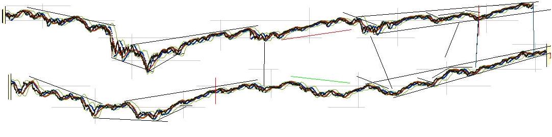
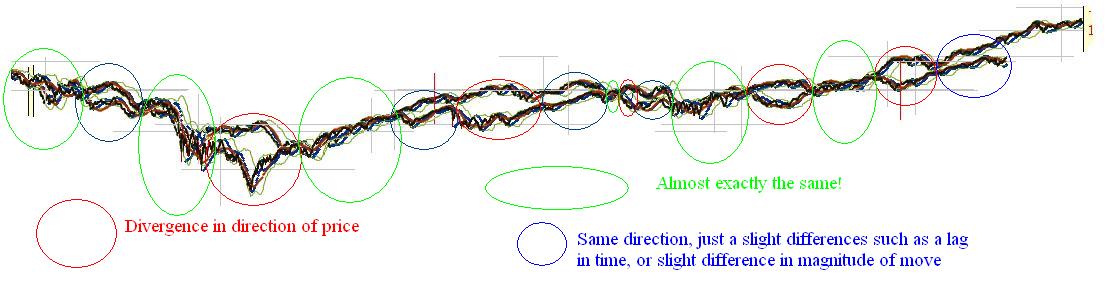
Since I have created this, the dow has declined a bit and diverged in direction as well. Nevertheless, the last time I saw an analog line up like this good was in 2009 near the bottom. There were also decent analog in GOLD and various markets in bear markets that along with the thin volume profile below and heavy volume profile above (as many would be underwater with not enough buying support to sell) allowed me to predict a sharp decline.

In the dow, we rallied from the low the expected 60% but actually kept going. Analogs only work so long. I blogged about this way back. In fact, to access it we have to use the “way back” machine.

http://web.archive.org/web/20090108182333/http://www.ibankcoin.com/peanut_gallery/index.php/2008/11/17/historical-comparisons-part-1-now-vs-1929

Back then it was “now vs 1929” where 2007 lined up with 1929 top basically and 2009 low lined up with the 1929 low. There was a big “bottom” that would have resulted in a 50% increase before it started to diverge from the analog and continued higher thanks to a more elastic money supply and completely different market structure. Now it’s “bringing back 1929” where mid way through 2015 or late 2015 lines up with mid 1929.

If this actually works going forward it is suggesting a huge bullish move as took place between 1927-1929. During that period, stocks went up around 150% depending on where you measure from exactly.

There are other ways to look at potential targets. However the big issue we still have to overcome is the long term trendline of the dow which puts resistance around the general range of 16,000.

16000

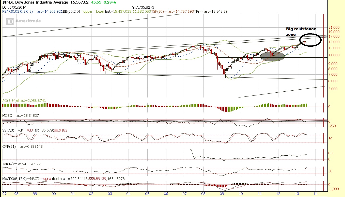
There is support around 13,000 and then 10,500 and then again at 7500 and very, very long term support at 6000 or so. On the other side, the resistance kicks in around 16,000. After that? There is really no reference until around 40,000 on very, very long term resistance.

max target

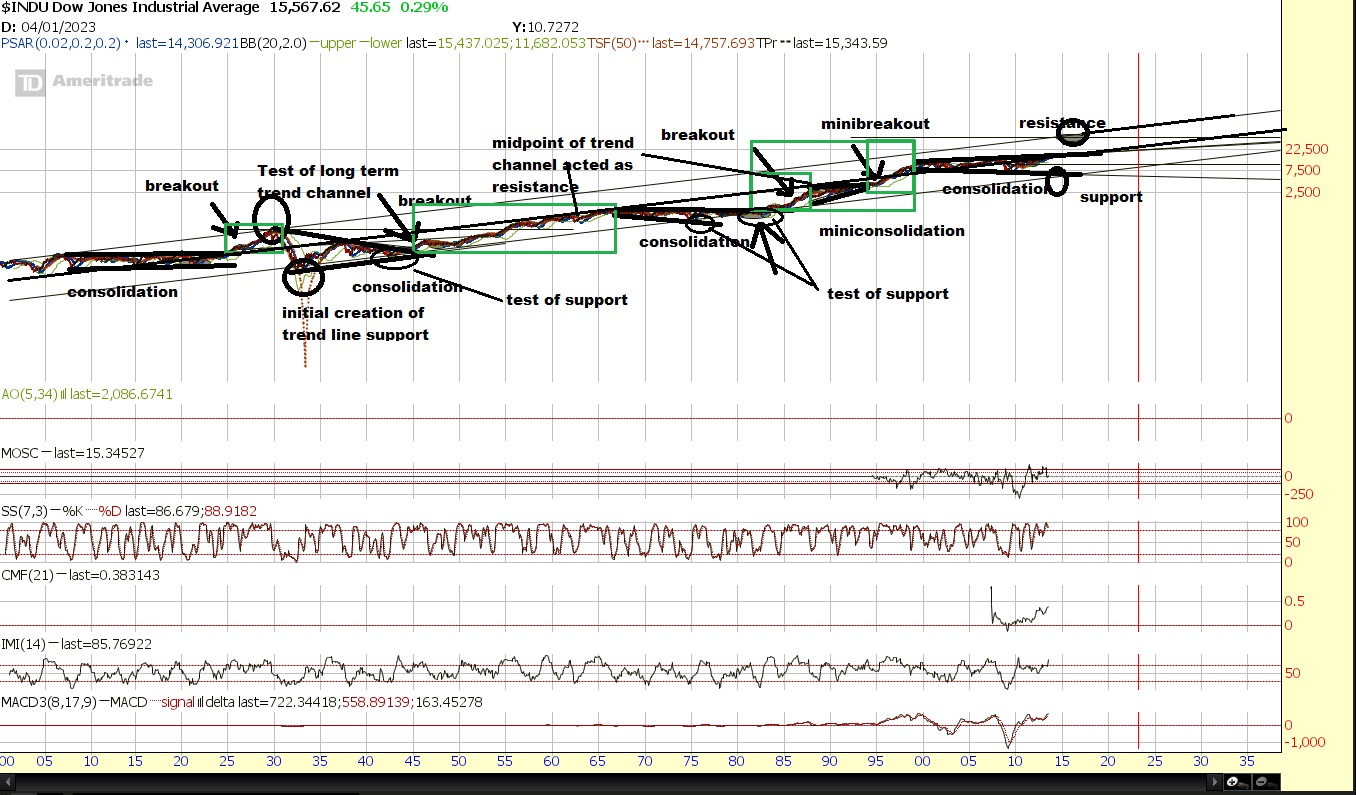
Unfortunately, that’s a very wide net to cast because if it is in fact “2008 all over again” there is still plenty of downside. But I think the easy money will be if/when dow breaks the 16,000 resistance zone.

Ideally, we will soon get a sharp crash in other parts of the world, and the US likely will also get hit initially, which could set the stage for a monster parabolic run, like in 1987 when the US markets crashed and capital concentrated into Japan from 1987 into 1989 peak of… you guessed it, 40,000 (well actually 38,957.44 but close enough). I think that because both 2007 analog also lines up this will convince enough people that 2008 is here as we decline and diverge from the 1920-1926 analog. Then a significant decline will start possibly next month causing people to expect the move only being just starting. At this point, the market will blast off to the upside to ply catch up with 1920-1926 analog leading into the 1929 type of peak, which could easily top out before the late 2016, or diverge and fall short of the target but continue the climb as 1929 declines, diverging.

I actually am crazy enough to think that can happen in the U.S. The “tell” being the recent wreckage in Asia while the US markets stayed near their highs. The shift out of the Nikkei was also likely a global one. Maybe there is another move, coming up, maybe that was it.

Here is what we know:

1)The other markets around Asia also sold off, as well as emerging and frontier markets, indicating it wasn’t just isolated to one country.

2)The currency. After declining 30% from it’s peak, the Nikkei basically doubled from November 2011. So put this in a global investors perspective. The balance sheet was 30% less valuable on average to others around the world, yet the price of those companies are twice as much? Wouldn’t you sell? If you were in Japan and your currency was devalued, you certainly would prefer stocks to cash, so while the buying was probably mostly domestic, the selling was likely global, and hence why it was more than just your typical profit taking correction where the correction is relatively “orderly”.

3)1987 crash in the dow in a single day was a global phenomenon too as the dollar had lost 50% of it’s value from the 1985 Plaza Accord high). Take a look at the action of the Nikkei afterwards. This time it may happen in reverse where another nation such as Japan crashes in a short time frame and the US stocks then are the beneficiary. Perhaps it already happened as Japan dropped over 20% in a few weeks from May-June.

4) Although you can talk about the fundamentals for the dollar when involved in actual trade and exchange and speculation, the dollar is the only global currency with enough liquidity to absorb the international demand of central banks and very large funds who need to park extremely large amounts of capital in the world reserve currency.

5)Although you can talk about how dividend payments are low, compared to the low interest rates in a bank, CD, money market, or even bonds, the large money, particularly pension funds in order to stay solvent will be forced out into more speculative junk bonds, preferred shares, and the like. Interest rates will have to come higher which long term is correlated with major secular bull markets around the world. The hunt for return will chase people out of yield and into speculation, but if they must have yield, they will need to get in high dividend paying “blue chip” stocks real soon while they’re still cheap and yielding a reasonable amount.

6)The global concentration of capital into the US, and shifting out of the bond market in my opinion and opinions of those I respect will likely lead to a secular, if not parabolic run.


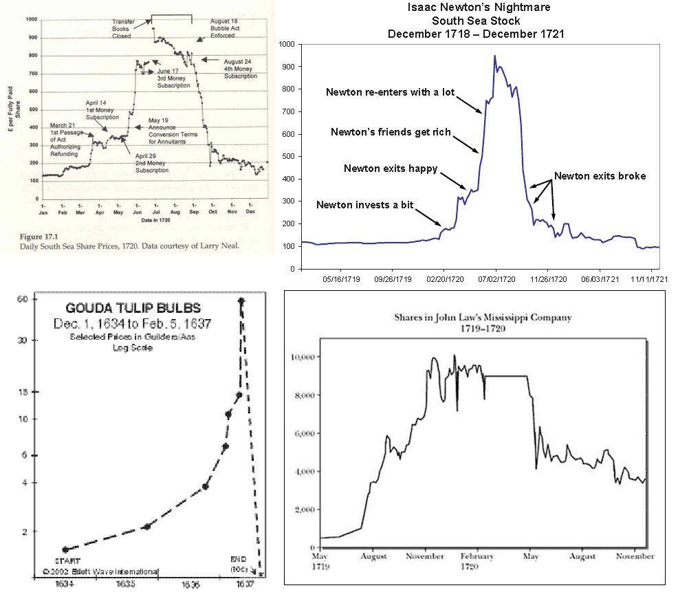
Parabolic runs are nothing new, they are simply a concentration of a large percentage of all available capital into one area (or globally) both for purposes of avoiding other “dangerous” assets, or the simply concept of “herding”. Here are four known “ancient” bubbles. Actually 3, south sea is there twice.

bubbly

and I found this as well which has some other “ancient” stocks.

source:http://www.sciencedirect.com/science/article/pii/S0304405X12002541

“Even the Tulip Bubble, the first contagion post-Dark Age, was a European-wide contagion as tulips even traded in London. There were ancient contagions and panics. Stocks traded in Rome, insurance predated even that, and commodity markets thrived in a boom bust cycle as far back as Babylon.”

Domestic Panic v International Contagion

I do not have the Boom/Bust Bubble charts of Babylon, but regardless, where there are markets, there are price changes, and the potential for “bubbles”.

The fact is that not only that “bubble’s” are ancient, but that it represents a concentration of capital on very large scale levels. It is not simply JUST emotion, as that can only drive the force which causes capital to concentrate. In many cases you need debt and global or at least very widespread interest. A large percentage of the known world economies must become interested and concentrate into one market, particularly near the height of a business cycle top.

Here is japan on 100 year chart to give us similarities with the US one. Not an analog per say but  to show you the structure was relatively “normal”, just as dow 40,000 might be “normal”. (almost no one will look at it that way until it’s too late, as it is only the structure that would be normal, not the perspective)

nikkei

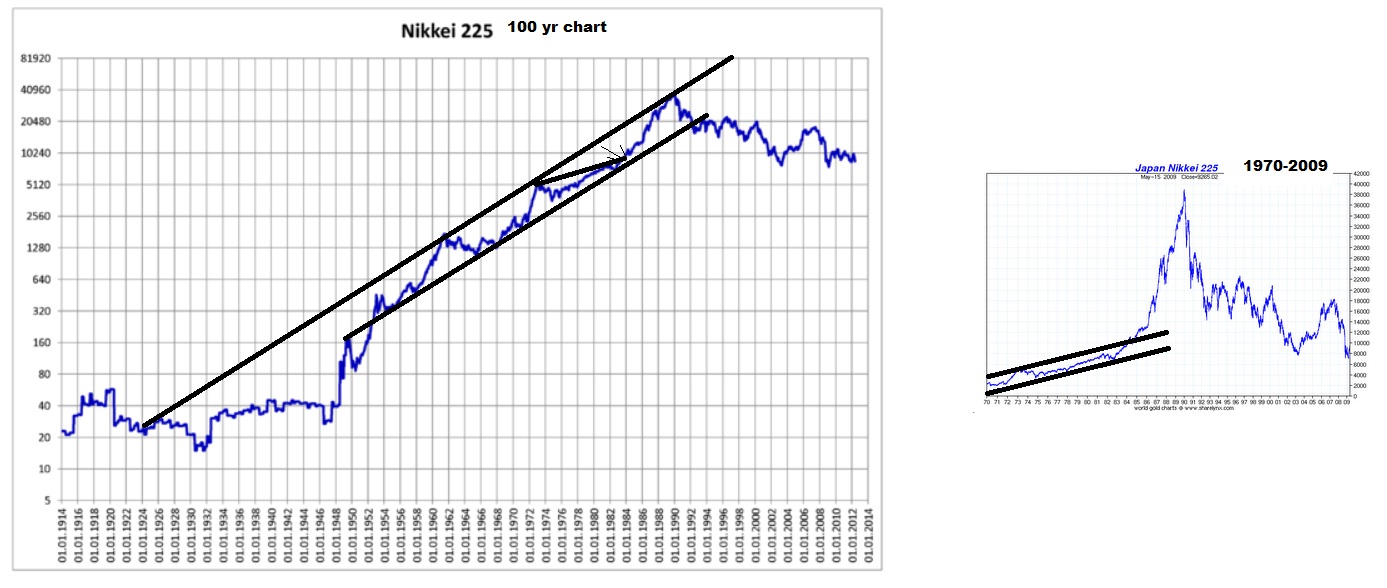
You probably more often see the small chart I included for comparison on the right dating back from 1970 leading to 1989. This appears to be a break of a trendline channel with no reference points and a mania run. And in many ways that’s true but it isn’t without longer term reference and structure that in fact is a bit more predictable than one may think. Look at the chart on the left that truly offers a long enough historical comparison for us to see that 1989 could really just be perceived as a test of very long term resistance on a trend-line, and in that sense is relatively “normal” on a long enough time frame. The same goes for the dow if it goes to 40,000 and tests very long term resistance as I showed earlier with the very long term trend channel with around a 40,000 target.

The view on the left side is what very few are used to seeing. A relatively “normal” rise in a channel and correction that doesn’t actually seem so shocking until you consider the time frame is 100 years and the market went parabolic on a short time frame and the correction has lasted over 2 decades.

Here is another market. First the chart you are probably used to seeing when you look up charts of the 79 parabolic run in silver and gold.

silver and gold

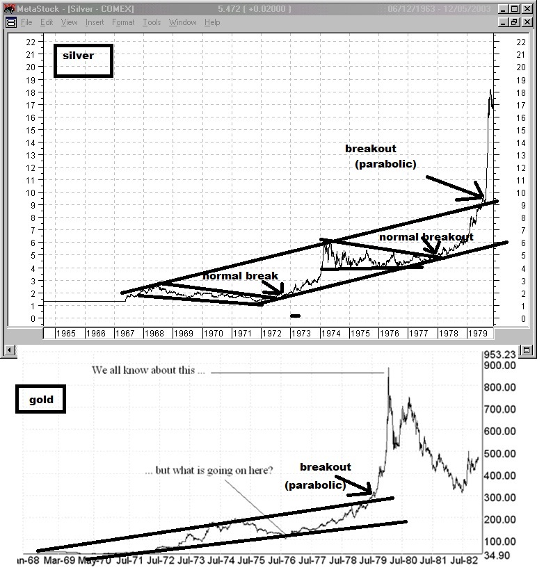
Again, without more data, you would conclude that this has zero context or reference point, and is simply a parabolic run as you would when gold went up to $1900 only recently. But here’s a much greater historical context of data.

200yr gold

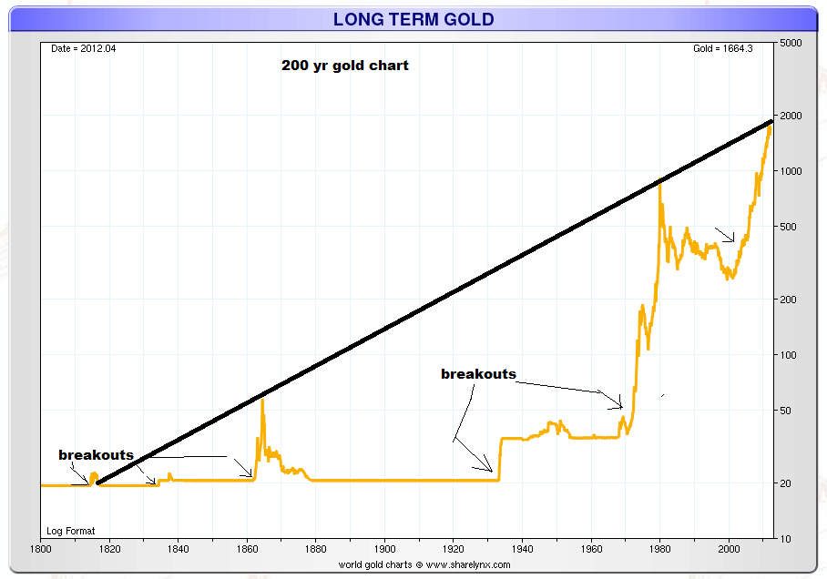
I bet you never thought of gold at 1900 as hitting “long term resistance” before, huh? So gold at 1900 actually was actually just a “test of resistance” Even though, most had no idea that there was ANY to be found. I think the data derived from understanding the total global “allocation” weighting towards each asset class at a given time and factoring in supply would be much better to measure with regards to bubbles to know just how extreme these moves get by asset class. Hence why the trend can be higher, but references of extremes remain somewhat predictable providing the maximum possible swing before capital must revert back to other assets which now will have been neglected. Bubble’s “end” when either the credit can no longer expand at the same rate, and in fixed money supply markets (such as gold standard) where or the allocation weighting cannot shift anymore aggressively towards that asset without completely neglecting and providing ridiculous valuations and opportunity elsewhere. Even sometimes as famously said, “the market can remain irrational longer than you can stay solvent”, it still has boundaries eventually. The 1929-1932 crash was actually a rise of 50% in the dollar from 1920 to 1932 that supports the relatively “normal” 50% decline story that has examples littered throughout history. But also support the history of bubbles popping back to the trendline. The capital inflow and demand of the US dollar first shows global allocation, and support the “normal” constraints of around a 50% decline with an additional increase in the dollar that both inflated the bubble and deflated the decline due to the gold standard (money was fixed to gold so as it could not rise independently on it’s own, everything else had to fall in value with it as capital rotated out of Europe into the dollar and gold).

The gold standard bubbles in gold are instead a flight to cash and represent the slow down of the velocity of money and hoarding of capital, and effectively “deflation” and “flight to quality”. The gold bubbles that occurred where money was not a gold standard, represent a concentration of capital away from the debt markets and currency markets and sometimes stock markets. “inflation” MAY cause gold to rise but actually doesn’t have that much to do with it, but instead a shift away from government and/or private paper. Even so, it’s never that simple because gold is globally in demand and different nations have different money systems but it still behaves with structure, because of the nature of “limits” in how much people can spend, without neglecting other assets to such an extreme it motivates a shift back to the neglected assets, or how fast people can keep money moving to the point where credit can’t expand fast enough to keep an asset growing and the credit cycle must end.

The bubble peaks when buying power cannot sustain the prices and the slightest amount of selling pressure and all the volume that came in towards the end buying “at any price” suddenly end up underwater and want to sell. Everyone who wants to buy already has done so and the price can go nowhere else but down.

But nature of bubble’s aside,  All asset classes can act like that since price is a function of confidence and perception of return relative to all other opportunities. (Liquidity also plays a role as well as it has to be a market that the largest players can get in and out of.)

yields

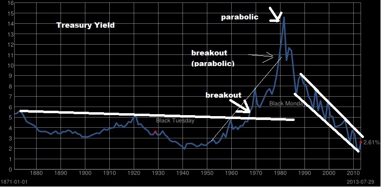
Yields went parabolic even and the other direction you might even look at the decline of yield as a parabolic run in price. There are points in history where bonds of companies and entire governments eventually yield nothing as soverign debt collapses. But when yields first broke-out and some said it started to go parabolic, was measured in decades, rather than years (except the final move at the end). The time frame of such a cycle is much different than stocks or gold. Bond yield “bubbles” or “price yield “bubbles” are very different in nature, since treasury bonds have become currency that pay interest since you can borrow against it, but such a shift in confidence still exists.

We have three great examples of charts of stocks going parabolic here. The roaring 20s, the Nikkei bubble into 1989, and the nasdaq bubble into 2000. (of course the earlier picture also is some of the ancient stocks such as Londan Assurance and South Sea companies going parabolic).

nasdaq

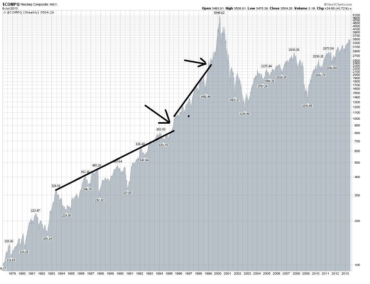
You can see that as a trendline is broken, and it doubles, if during that double it breaks another trendline, the time in which it doubles is significantly less. Actually the move into 1984 was a slight break of the previous trend and after the pullback it basically doubled from 300 to 600 in 8 years first. Then 800 in 1994 to 1600 in 1998 4 years. Then 1999 to 2000 from under 2500 to  over 5000 in 1 and a half years. It’s not so much the magnitude of the move itself but the timing and historically large moves in shorter and shorter periods of time.

When the major break of the trendline is made, the asset often accelerates to it’s peak. In the extreme example like the Nikkei or nasdaq we see it double and then double again.

Perhaps if/when we break the long term resistance it will instead be a “secular” run rather than a parabolic one. Afterall, as I have shown, the returns are possible to continue measured over a long period of time. I am not yet convinced we won’t see a significant pullback first, and we are coming up on the period of time August-October that worries me.

However, the actual very long term resistance probably will still hold, so it’s a question of whether we set up a quick run to extreme historical highs (1929), or a gradual run to large gains over decades (1942-1965, 1982-2000). You could measure from trough to peak, or you could measure from the distance after the breakouts. I have done this in historical look from 1900-2013.

Most relevant right now is “Gains from “breakout” point (This has YET to happen)

1924-1929 104 to 386.1  A 271.25% Gain

1951-1966 235 to 1001.1 A 326% Gain

1983 to 2000 1100 to 11750.25 A 968.20% Gain

(ALTERNATE: 1983 to 1987 1100 to 2746.70 A 149.70% Gain)

(1995 to 2000 4000 to 11750.25 A 193.76% Gain)”

With a breakout point of 16,000 (it’s actually above that), you only need 150% gain to get to 40,000. So the 1983-1987 period would be like 2013 or 2014 to 2017 or 2018.

You can add onto that the parabolic runs of the nasdaq, and the nikkei with minor considerations and even look at a few of gold’s historic runs to get an even more bullish target.

I think ultimately if you think the market is going “parabolic” the very long term upper trend channel that I outlined is the target, which is around 40,000. I think history shows that if you break a long term trend channel, you can see stocks do far more than double in only a few years such as in the nasdaq or Nikkei’s final run up depending on when you measure from.

Then there is the dow in the roaring 20s. Before it broke the long term resistance lets see what it looked like first.

roaring 20s pre breakout

Compare that to the dow right now.
16000

Since we have already identified the extreme similarity of the timeframes aligning 1926 and now, we can project forward and perhaps predict the future if we see what the roaring 20s looked like?
roaring 20s post breakout

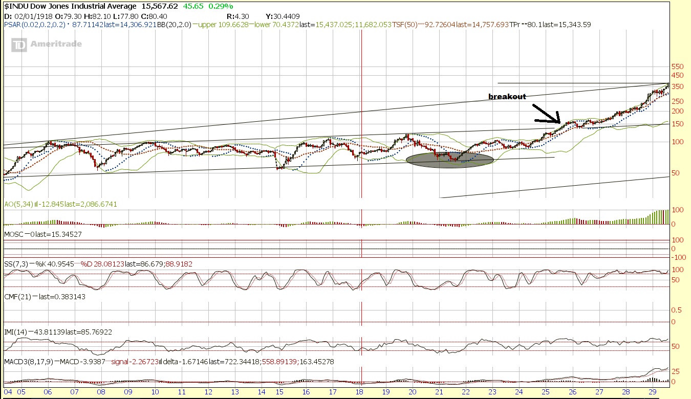
It put in about a 150% gain in 4 years. Where does 150% gain from the breakout point of around 16000 take us? You got it, 40,000 by 2017-2018 depending on if we break now or in 2014.

Or take the nasdaq run. From the 900 to 5048.62 peak it gained at a rate of about 3.02% per month. If the Dow goes on that kind of a run, after breaking 16,000 it will reach 40,000 by early 2016. (I consider that optimistic of course).

Another way to look at it is the Nikkei was at 10,000 in 1985 2 years before the 1987 crash and got to 40,000 in 1989. 2 years before the recent wreckage in Asia, you may recall the dow was actually a little above 10,000.

Well, the odds are not that great that it will go to 40,000 in that short of order, let’s be honest, but it’s the extreme “outside” chance that I see as more possible than many may comprehend and at some point, it is only a matter of time before the extremes of the long term trend channel are tested. I also see a longer term durable secular break that could take maybe 10 years or so to reach that level as a possibility. Of course so is one more cycle top resulting in a decline to retest support setting the stage for a more durable run. But To me, this shorter term bearish phase we may be heading into could very well set the stage for all the shorts to come in and pessimism to make one more strong run setting the stage for the ultimate bear trap before the parabolic run.

Afterall, when do you ever see analysts calling for that type of run before it happens, or even a secular run? While I think the odds are much better that we simply correct a bit first and then perhaps go on a longer drawn out secular run, do not sleep on this possibility.

I think we will see a very strong and sharp correction somewhere that will keep the majority “wrong” both in the short term as they chase the “froth”, and in the long term as they avoid the casino and vow to never return and claim “2008 all over again” at first sign of a minor correction and continue to try to short it. (well until it hits 30,000+ and they can’t help themselves and everyone and their mothers start buying).

It is the type of “sky is falling” type of move that will scare the public from getting in while the getting in’s good, and the type of psychological “aversion” to stocks that create enough pessimism to cause the majority to miss the move until it’s too late, then they are afraid to chase and afraid to chase and finally they think it’s stupid not to and they don’t want to “fight the trend” and they go “all in” when they have hoards of cash that comes from the boom as credit cycle peaks. I am not as convinced that on the long term timeframe we have had  that complete aversion and think that perhaps 2011 was just an aversion on a shorter term run and a prelude to the decade long aversion. But I am open to the possibility that we break to the upside with not much more downside. Personally I think September will be a major shockthat has everyone coming out claiming “stocks are rigged” or “investing in stocks is suicide” to an even greater extent than we saw before. Then as we break out there is major denial and people saying “no way to stocks go higher, then suddenly they realize they were wrong, and the story of stocks to the moon occurs. Dow 100,000/200,000 calls are made near the top.

mediaawareness

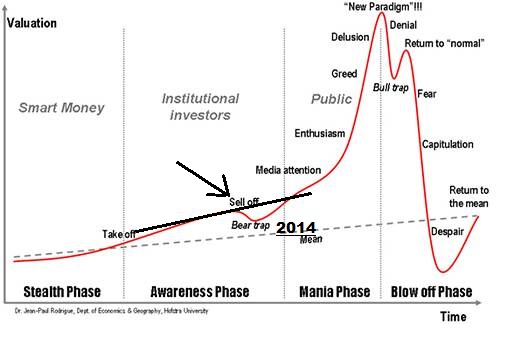
And you’ve all seen the chart Option Addict refers to a lot. I personally think we are entering a bear trap on the above chart and “aversion” into September, but I could be wrong and as he suspects that could have been 2011.

sentiment chart

Although the market may be similar to 1926, the market also looked similar enough to periods near “market tops” or prior to “corrections” for me to continue to be concerned in the very short term, but many of those time periods weren’t too far away from a major secular run after the wreckage was over, and there are a few bullish periods as well.

It’s enough for me to be concerned, especially along with the bearish seasonals into the August-October range, the budget battle in September (deadline of October 1st) and the Germany elections September 22nd and other various headwinds. I think though after that we may be in the clear. Just for kicks, here are all the analogs I consider relevant.

analogs
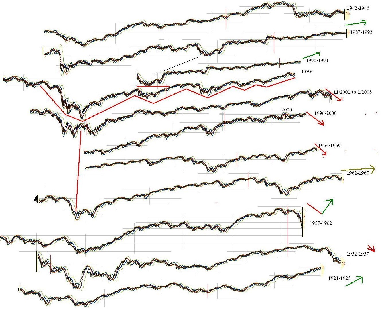
Ultimately, my bias is much, much higher, and the best analog is still probably 1926 but we need to actually break resistance in order to set the stage for a large run, until then I will be a bit cautious, unless we get more of a dip around September setting the stage for a significant buy opportunity.

The strategy if we are going on a strong secular run or parabolic move is probably going to be to consider more of a longer time perspective. If you use options you might go further out in strike price and time and use smaller position size. This way you can have more names with less total capital at work of the “lotto” type of swing for the fences plays… Perhaps on a longer term time frame, and more of a “monthly lotto” which means you probably want to focus on the naes that really can trend for weeks when they go. The swings will be more “momentum” type of moves that just take off and keep going. The duration of swing and actual price movements are likely to be greater and breakouts are likely to carry on and last, pushing stocks to significant momentum extremes. Perhaps moving towards a trend strategy or position trades rather than swing trades.

If you use stocks, you might consider widening your stop and also letting your winners ride for a longer period of time, perhaps using a wide trailing stop.

If you aren’t looking to change your core strategy, you might just grab a ETF or 3x ETF and hang on for a longer term move with a portion of your funds and keep doing what you have been. Or you might consider decreasing your cash percentage. However, it’s very possible the volatility could pick up, shaking people out often enough to keep them in disbelief and keeping others who sold lower willing to chase the same stocks higher and push it up.

Me personally? I have been working on structuring a basic plan that I have figured out conceptually, but that I want to get more specific about. Part of that means finishing my position sizing and expectation spreadsheet. I will when I find the time.


Comments »