iBankCoin
Home / hattery

hattery

Looking For New Industry Leadership

Off of this brief oversold dip we may get a few new leaders to emerge. I want to look for stocks either up on the week or day or both that are rising on above average relative volume. This suggests that either on the dip these names didn’t sell off and may lead the next wave higher, or remain strong, and there is buying demand.

I picked these finviz labeled industry groups

Semiconductor – Integrated Circuits
Biotechnology
Drugs – Generic
Drug Manufacturers – Major
Internet Information Providers
Diagnostic Substances
General Building Materials
Education & Training Services
Semiconductor – Broad Line
Multimedia & Graphics Software
Business Services
Specialty Retail, Other
Rental & Leasing Services
Semiconductor – Specialized

Then I reduce that to the stocks in these groups with possible triangles and falling wedges that show some consolidation developing especially over the last 1 month to week.

http://bit.ly/2mYKEj9

Then I look at risk classification dynamically. If the group is lagging over the last 6 months, I only want to  look at 1s. If it is average to lagging I’ll look at 1s and 2s. If it’s leading I’ll look at 4s and 5s. If it is average to leading I’ll look at 3s and 4s. If there is an error returning information I’ll still include it.

That narrows the list.

http://bit.ly/2mjfdgh

Of those I might look more into these based upon how the charts look and monitor them over the next week or two for an action point or trigger:

http://bit.ly/2lEcjWp


Comments »

Risk Classification

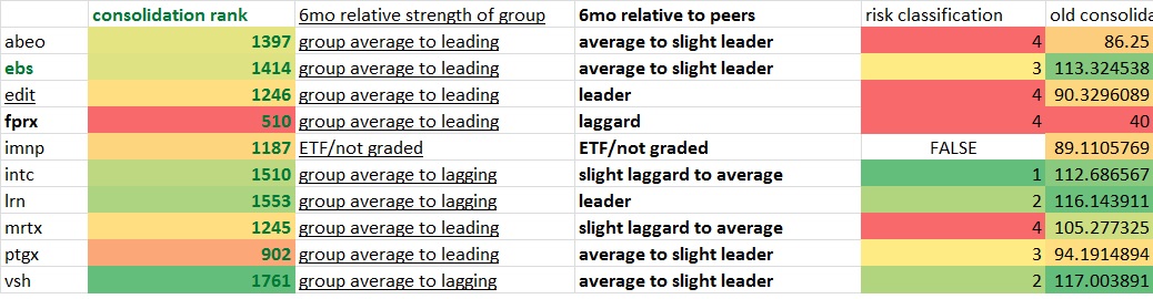
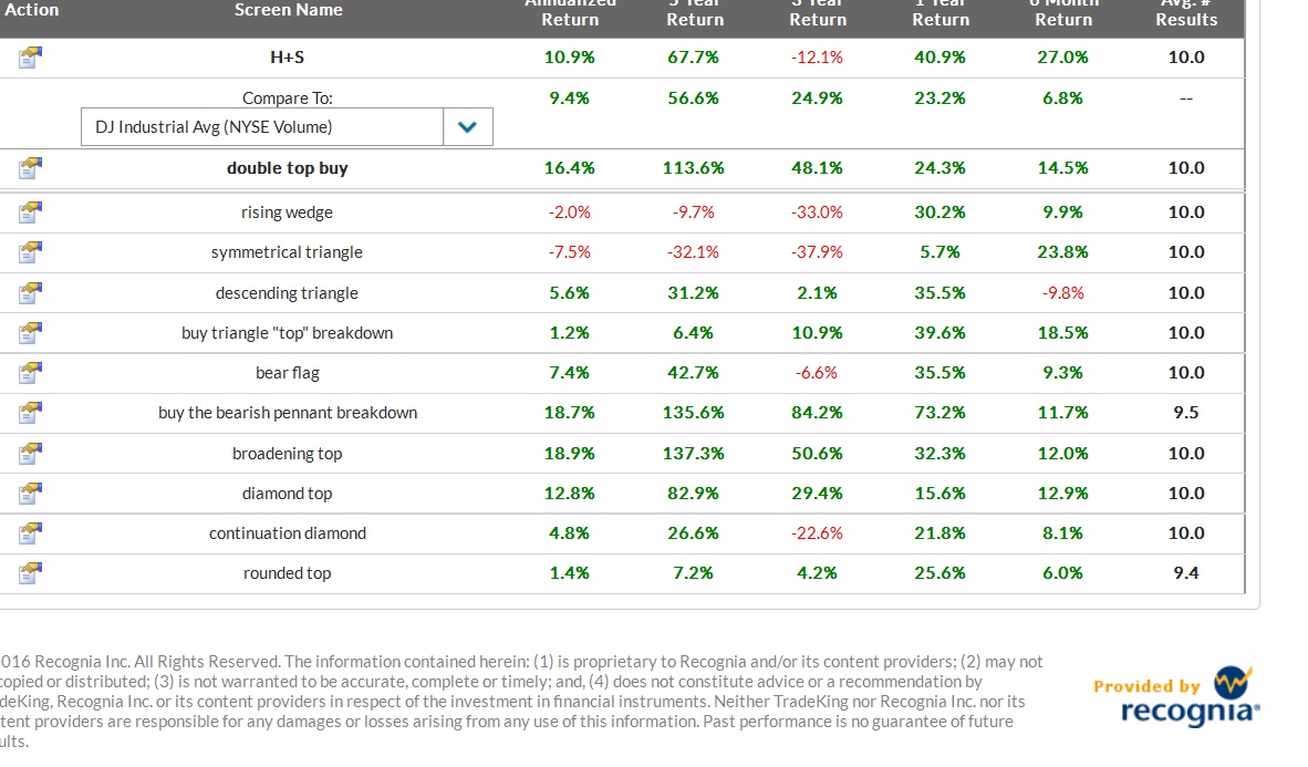
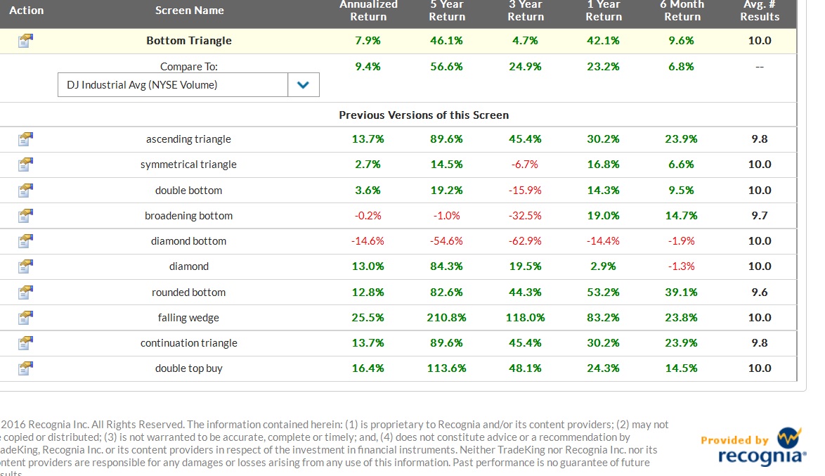
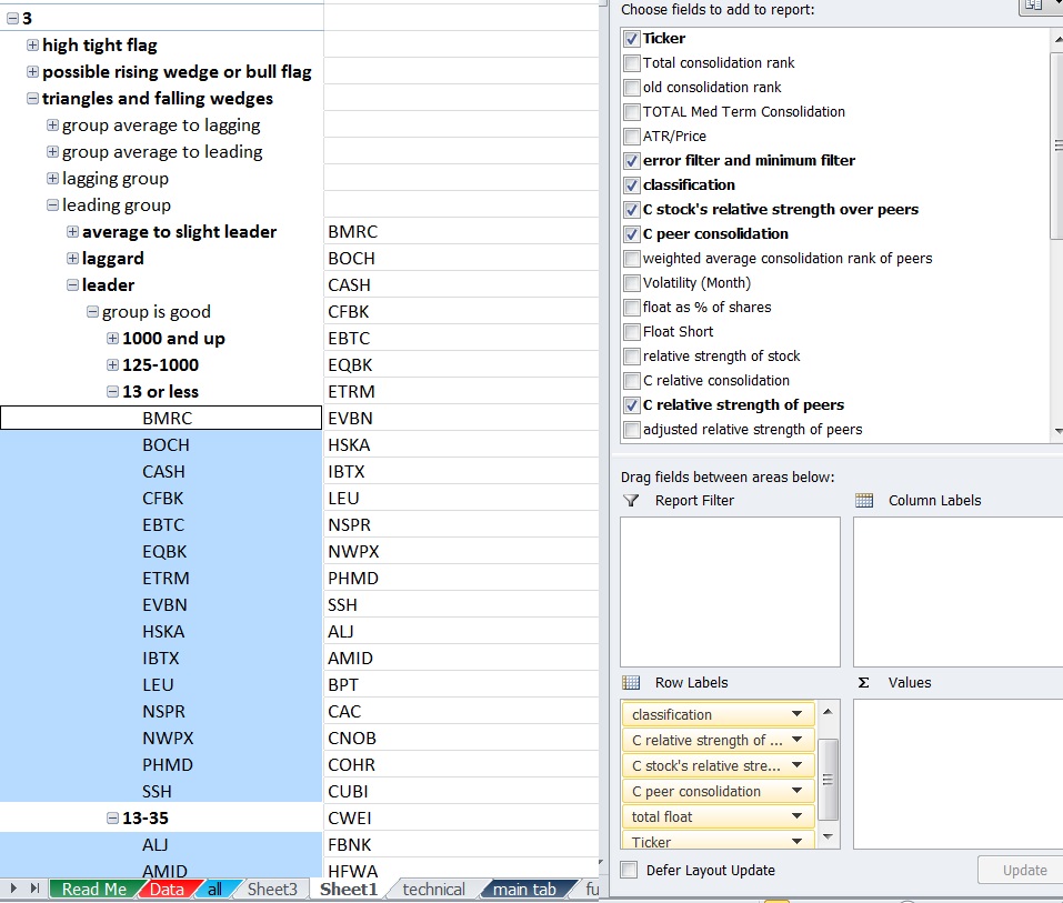
After a lot of work I’ve finally begun creating “risk classifications” like OA talks about.

I basically looked at a combination of variables to give me a risk classification for each variable and a weighted average. I tried to readjust the scores into 5 categoreis based upon the weighted average since it’s rare for numbers to be very close to 5 or 1.

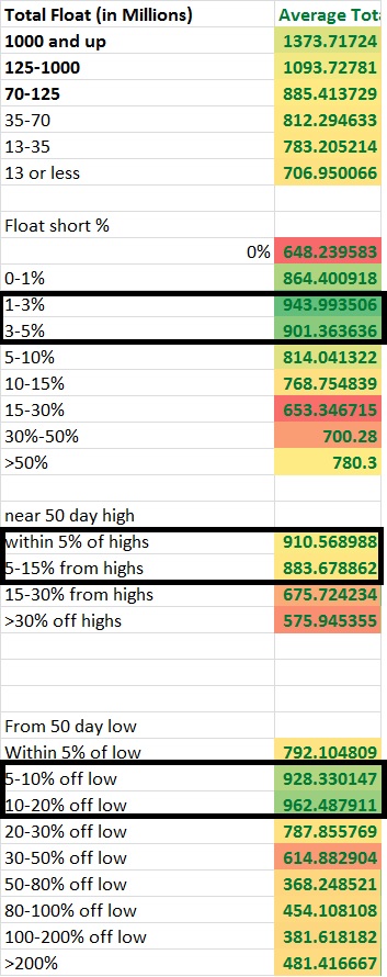
For the time being I’ve ran several numbers factoring into the risk classification such as % off of high, % off of lows, strength vs peers, peers strength vs the market, total float, float short %, risk for what exchange or index the stock is in, risk for total dollar price the stock is. There’s also an earnings composite score which compares: earnings, sales, projected growth and standard deviation of all of the earnings numbers and compares these numbers to the peers. From this I come up with a weighted average factoring in all variables and some others.

There’s a lot more I want to add to some capacity. For example, I still want to add in several other variables going into the risk calculations that will improve this such as: liquidity, beta, beta vs its “peers”, market cap, market cap vs “peers”, and maybe some other fundamentals like ROE, Profit margin, etc…. date since IPO, % institutional ownership. I also want to work on adjusting the weightings until I’m more satisfied with it. Right now it’s more like a working prototype that needs improvement. I think beta and beta relative to the industry is probably one of the more important factors so right now there’s probably significant room for improvement.

For now, here are the the stocks that met qualifying consolidation scores and some signs of falling or sideways consolidation for each “risk number”.
1s.
2s.
3s more 3s.
4s 2nd group of 4s.
5s.
or for the copy and paste crowd:
1s
http://goo.gl/Zr7z4z
2s
http://goo.gl/1E3Kix
3s
http://goo.gl/K1C3Bk
http://goo.gl/DlXNiD
4s
http://goo.gl/MjSChV
http://goo.gl/75CNLx
5s
https://goo.gl/nVwBRc

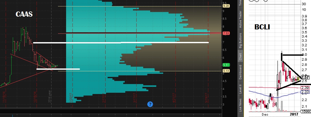
If you generalize you can definitely see a difference in the names, however you certainly do see some stocks that probably don’t belong in a particular category. For instance, BCEI in my opinion is probably closer to a 5 than a 3 but I think when I add in beta and long term consolidation rank to the weighting it will make a big difference.

An interesting thing I noticed is the 5s tend to be near their lows and off of their highs significantly so that at this point if I switch to rising consolidation patterns the patterns actually improve. Here are rising consolidation patterns which usually are about 95% bearish or crap patterns but completely flipped once I excluded them to just the 5s. I wouldn’t necessarily trade bull flags or patterns of this quality in this location, but certainly the patterns that are more bullish than bearish increase substantially from the usual more than 95% crap and I would rather buy dips in these names than sell rips if I had to choose.
goo.gl/fdBIWw

The 4s was pretty close to the same thing with a few more rising wedge patterns since a stock in a perpetual downtrend most begin to show at least some strength before it will round out a bottom.
goo.gl/4FLfFG

The 3s actually still had a few but you’d have to go through a lot of patterns that are not actionable.
The 2s were almost all running up against resistance after falling or at new highs and so I wouldn’t waste my time.
The 1s were mostly mid trend up near or at the highs so I would need to see some sideways work or a sell off at which point they would no longer be labeled rising patterns.

I decided to narrow the lists using a screen requiring more than 25% earnings growth Q/Q, 10% sales growth Q/Q and institutional ownership over 20% then handpicking the ones I liked.

3s
CUDA,FNWB,HOFT
4s
DL,YY,LULU,BZUN,EXA
5s
ACIA,BVX,MEET

This was just a more efficient way to get through the list but it comes at the expense of potentially missing more setups. This is just one way you can narrow the list, you could also do so manually by looking at charts first, long term charts next and maybe volume profiles if you still need to narrow down the list. You may instead want average daily volume above certain amounts. if I used an over 300k avg daily volume filter I could handpick these as an initial list and try to narrow it down manually from there.

3s
CLR,CUDA,EW,EXPE,AN,CPLP,BCEI,CRIS,DDS,OAS,PBR,PIR,PI,SCHN,SCS,SPG,TRP,TTEK
4s
AKR,BKD,DEPO,DO,DRRX,EGY,GGP,GRUB,HIBB,HLX,HZN,IPI,LILA,LTBR,MAC,MNK,NAKD,MVIS,NYRT,REXX,SHLD,SIMO,SINA,TEVA,TWTR,UAN,WPG,WWE,XCO,YY,YUMC,BRFS,LULU,NVFY,ADHD,APTO,BZUN,CASC,THLD
5S
ACIA,BOOT,CPST,CXRX,DCIX,DLTH,EZPW,EYES,GNC,GSAT,MEET,MEMP,MITL,PEI,PLG,TWLO,VNCE,WAC

Could probably narrow that down slightly to:

3S
CLR,CUDA,EXPE,CPLP,BCEI,CRIS,DDS,OAS,PIR,SCS
4S
DEPO,DO,EGY,GRUB,HLX,HZN,IPI,LILA,LTBR,MAC,NAKD,NYRT,REXX,SHLD,TEVA,TWTR,UAN,WPG,WWE,XCO,YY,YUMC,LULU,NVFY
5S
ACIA,TWLO,BOOT,CPST,CXRX,DCIX,DLTH,EZPW,EYES,GNC,GSAT,MEET,MITL,PEI,PLG,TWLO

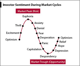
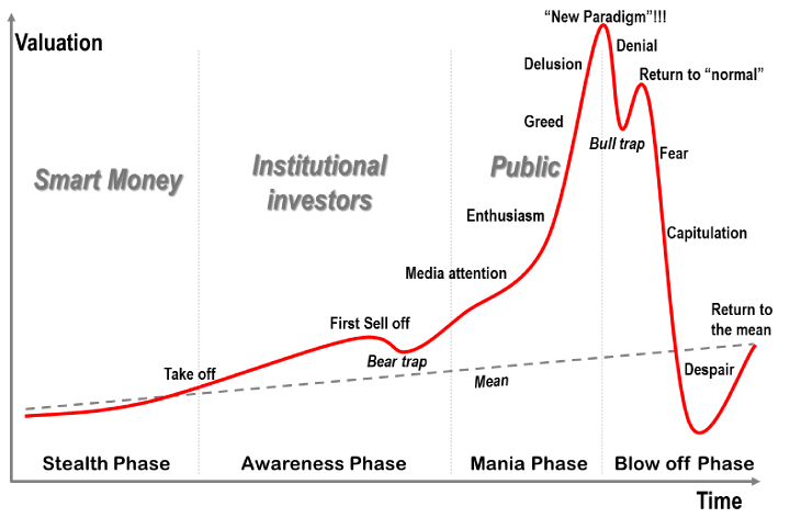
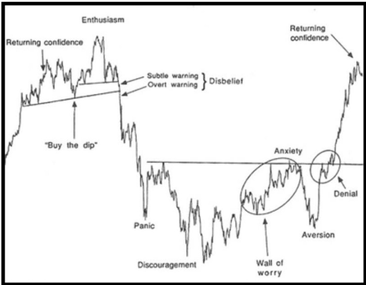
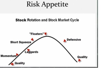
Perhaps the more interesting thing that will happen is when I combine classifications of a stocks peers with the risk cycle and with knowledge of where the market is. For example if I look for industries that are leading the market after this market run is extended I wouldn’t want the 1s or 2s or 3s but the 4s and 5s. If I looked at the industries lagging the market I might want the 1s and 2s because I’m looking for them as a group to begin showing some strength starting with the lower risk names… If I found the industries only slightly leading I may want the 3s and 4s. If I only looked at slightly lagging the market I may want the 3s. When a market first finds its footing off of a correction then I might like the leading stocks in leading groups. The ability to generate dynamic lists is something that will be useful in generating better lists.

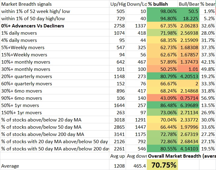
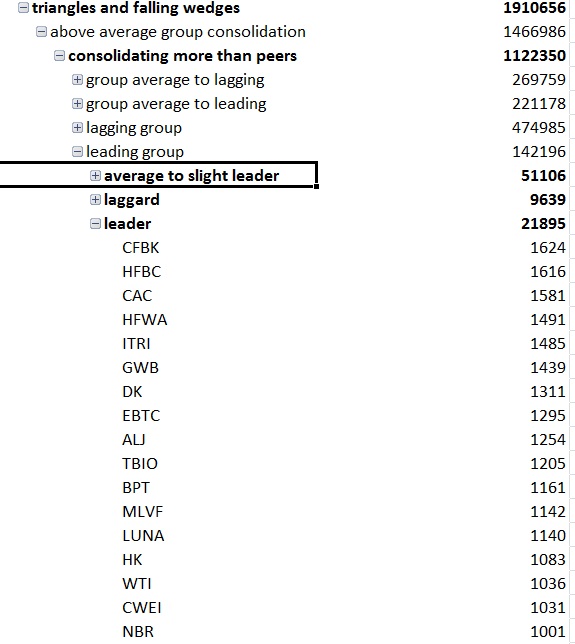
(the below image I think is a couple weeks old)

There’s also the balance of trying to include more information such as what themes are seeing increased buying on increased volume and what themes are working on various timeframes without complicating things too much. Ultimately I want this to be a very simple process and I’m not the most organized person, but I also want to be able to weight all relevant factors at one time and no irrelevant or conflicting ones.

For example, it wouldn’t make sense to average a momentum ranking and value ranking since the best value stocks are the worst momentum stocks and the best momentum stocks are the worst value stocks. A composite average would be pointless. Keeping stocks isolated in various categories and only looking at the relevant categories for the time being is probably the way to go or dynamic programming that will adjust the scoring method based upon group.

Comments »

Your Fundamentals Are Trash

Economic history is a never-ending series of episodes based on falsehoods and lies, not truths. It represents the path to big money. The object is to recognize the trend whose premise is false, ride that trend and step off before it is discredited. — George Soros

When someone has conviction, it is actually usually a sign of weakness. Failing to admit you are wrong can cost you big time. Eventually your emotional state will change and you will have to manage risk somehow or you may even need the money. So many fundamentals that you would think of as a positive are actually just traps. When a trade is too obvious it attracts weak hands and the market will transfer capital from the strong to weak hands even if it needs to move against common sense first to do it. Conviction is a bias of the ego in being unable to see the emotional components of the “id”, which ultimately governs behavior.

The vast majority of capital either has no choice but to try to outperform every single Quarter or they lack the discipline and patience to sit on their hands for a decade. So, most of the time, the best trade is to trap more and more people into bad fundamentals and squeeze every last short seller for as long as possible. Meanwhile they’re forced to neglect or even sell the best values and push them down to greater discounts.

Nearly every time there is a rally in an underperformer, the buying will be sold into. This will continue until the point when all that is left is deep value investors with maximum patience stepping in as everyone else sells. This may happen on bad news and concerns about future prospects so the maximum amount of people sell their shares. Then and only then when a stock has either capitulated or reached severe neglect is when fundamentals may actually matter.

The largest players are waiting for liquidity to accumulate. If they don’t, their demand will drive the stock higher before they can accumulate shares. They won’t create a floor in price until maximum selling allows them an in.

This need not be a conspiracy, but instead a mechanism. When everyone has sold, after selling pressure reaches its maximum, the position is so underowned that there are not enough people left who are willing to sell it to keep prices down. So selling pressure is over and it is not going to trade down. Then, it takes very little buying pressure to form a bottom. Conversely, when everyone has bought, there is no more buying pressure left and it takes maximum buying pressure just to maintain prices.

When a stock has a lot of short sellers because of legitimate reasons to sell while the stock is moving upwards, you are still far from the maximum buying pressure and short sellers must either successfully short a stock to exactly zero, or cover their shorts. Any buying at all can absolutely roast short sellers and that is where new sellers will emerge and either end up under positioned and have to chase, or end up shorting the stock and being vulnerable to placing market buy orders or margin clerks forcing them out later.

Valuation matters, but only at the extreme. When the dot com bubble stopped being able to pump easy money in and all the individual average Joes began to exit, THEN fundamentals mattered and everything overpriced without a sustainable business  model adapted or went to zero all while one of the most neglected securities at the time (gold) bottomed around $200 / ounce. After selling pressure rinsed the market clean of any notion of buy and holding in 2002-2003, perhaps then some fundamentals mattered as that was the opportunity to get a stock at a good price until the market already gave you that fat pitch and then people begun being forced out into trash. Then in 2007 selling all the companies with CDO and CDS exposure and in 2009 buying the classic strong fundamentals for pennies on the dollar.

I recently analyzed a handful of different fundamental readings and I am convinced of these ideas now more than ever.

Methodology

I first wanted to know what percentage of stocks met certain performance threshold. Then I looked at the number of stocks that passed a particular fundamental threshold ane I looked at the percentage of all of those names that were superior performers.

If the fundamental was credible in the current environment, my hit rate should mostly continue to go up as the metric improves. It often didn’t. Even some of the best fundamental indicators reached their limit and the hit rate began declining.

Results

For example earnings growth Q/Q. The “if some is good, more is better” logic simply doesn’t occur. While the percentage of stocks moving up more than 20%, 30% and 50% this quarter seemed to improve when applying the criteria of earnings growth over 25%–it declined above 100% and declined further above 500%. The same was true for projected earnings and past 5yr earnings and earnings this year and past 5yrs sales growth. Higher was not better, it was the obvious and crowded trade that you should avoid and instead seek the moderate growth names as their are fewer amatures and more people passing those names up in favor of higher growth which makes them underowned.

Perhaps even more odd was what happened when I looked at profit margins.

As it turns out, adding criteria such as net profit margins above 0% or above 10% or 30% actually would have hurt your odds of getting a 20,30 and 50% mover in the last 3months vs randomly picking stocks. I actually found that out of all indicators, this was so reliably bad, that betting on stocks with negative net profit margins–or better yet profit margins under -50%– yielded major increases in hit rate. I thought this would be the exact opposite. After all, if a company can’t sell a product at a profit, what hope does it have as a business or as a stock? Perhaps none, but only after credit is inflated and it reaches maximum buying will that matter.

To give you some perspective, with no filter: 3.24% of all stocks this quarter are up more than 50%. 7.4% are up 30% or more. 14.9% are up 20% or more. Q/Q earnings showing more than 25% growth improves our quartler hitrate to 4.258% for >50% movers,  9.46% for >30% movers, and improves to 17.53% for stocks moving up 20% movers. Q/Q sales growth more than 50% saw 6.54% of stocks up 50% or more, 12.53% of stocks up 30% or more and 22.34% of stocks up 20% or more.

But a whopping 12.7% of all stocks that had -50% profit margins or worse were up 50% or more. You nearly quadruple your chance at finding a super performer up more than 50% on the quarter by looking for the worst fundamentals. 18.64% were up 30% or more and 25.42% were up 20% or more this quarter.

Think ROE is a good reason to own a stock? Only if you’re aiming for stocks with negative ROEs. Negative ROE was one of the best after negative margins.

But if sales growth is good, low price to sales should be? No. Over 25 P/S yielded more superperformers.

Conclusion

It is possible fundamentals matter, but apparently not at this stage of the market…. that is, unless you are using them to spot the likely underowned and/or to avoid those vulnerable to bullish conviction and/or to identify those neglected with bearish conviction. The fundamentals that did matter this last quarter are projected earnings growth and earnings growth revisions (provided they are not too high to attract weak hands), sales growth Q/Q and actual earnings growth. The ROE and profit margins were so reliably bad of an indicator that the worst numbers not only performed better, but also outperformed every other fundamental indicator I looked at.

Often times the worst stocks lead near the latter phases of a bull run, so perhaps this speaks to that idea. However, if there is one thing this study shows it is conviction is a liability and holding onto notions that ought to be true but the market says otherwise is a mechanism that will keep you on the wrong side of the trade.

Comments »

How Many Trades Should You Have At Once?

Ever wondered how increasing the number of trades in a period changes your performance? I’m really close to figuring that out to a very specifically defined calculation. The one missing variable is “correlation”. I don’t know how to account for it and how correlation impacts probability.

So for this experiment we’re going to assume binary outcomes of -100% or +250%. I’m going to assume my own variation of the kelly criterion strategy so I can model them at an equal amount of risk(?).

The logic is: If the maximum you can bet to maximize geometric growth at one single bet is 10%, then after a single bet you are left with 90% of cash. If you lose, you will be making a bet that is 9% of your initial capital anyways, so we can allocate 19% for two trades that we hold simultaneously provided there is zero correlation. If we are going to make a 3rd trade we are 81% cash so we can add an additional 8.1% risk and divide the total amount at risk by 3 and so on. It’s possible you can risk slightly more than 19% for 2 but less than 20% because a loss isn’t guarenteed. We will position as if the first position lost due to the possibility of it losing and the nature of overbetting providing less return at increased risk (where as underbetting provides less risk and return only declines slightly)

Background

For some brief background on how the risk amount to maximize growth, see the Kelly criterion. Essentially you are going to take (O1^N1)*(o2^N2) where O1 is the wealth multiplying outcome at the given position size, and N1 is the number of times you produce that outcome. For instance, at 1% position size with 250% gain and 100% loss for outcomes, O1 is 1.025 because a 1% position producing a 250% gain multiplies  our wealth by 2.5% or a factor of 1.025.

This is calculated by

1+(.01*2.5)=1.025

And the loss is .99 which is calculated by

1+(.01*-1)=.99.

So for 20 wins and 30 losses the equation for how much our wealth changes is (1.025^20)(.99^30).

The Kelly criterion reverse engineers the position size to solve for the position size which maximizes geometric rate of return based upon your assumptions over an infinite number of bets. As volatility increases, eventually return decreases. The kelly bet seeks the point at which you can no longer improve the return without much respect for the volatility. In reality, you’d probably wish to respect a fractional kelly strategy if you want to reduce risk. It’s a good way to compare systems at an equal amount of risk. Right now I’m using a modified kelly. It is similar logic as the kelly but not the kelly exactly to increase position size based upon multiple held positions.

You could manually adjust the position size for very large outcomes with a proportional amount of wins and losses until you can’t seem to increase it to approximate the solution, or just use a kelly criterion calculator. You can run more complex calculation with more than 2 outcomes, but for now I’m just using 2.

Optimal Bet Size

So the optimal bet size for a single bet is 9% given 35% chance of a 2.5 to 1 payout.

We can then solve for the optimal bet size for 40 bets assuming zero correlation between trades but with 40 trades held during the same exact time period. There’s an important distinction here. Rather than multiplying our wealth by 1.025 with each win, at this point we are only adding 0.025 to the total portfolio per win because we don’t get the benefits of compounding when the trade is placed. Similarly, if we hold 40 1% positions at once and lose them all, we don’t lose 1-(.99^40)=.331 or 33.1% but instead lose the full 40%. So the first formula is not sufficient in describing what happens to our wealth. This is also where correlation is a bigger liability than the formula currently realizes as the chance of greater drawdowns increases as the correlation increases.

As explained before, we are going to assume a full kelly and then an additional full kelly of risk with the remaining capital for each additional bet. Since the full kelly is 9%, that means the cash on hand remaining is .91 of our portfolio which can be multiplied for each of 40 bets to determine how much cash on hand to keep

or .91^40 to equal 2.3% which leaves 97.7% at risk divided by 40 is 2.4425% per bet.

We can repeat this for 30 bets, 20 bets, 10 bets and 5 bets to construct a table of optimal bet sizes per bet.

Bet size given total number of positions.

50 bets 1.98209% per bet
40 bets 2.44251% per bet
30 bets 3.13649% per bet
20 bets 4.241775% per bet
10 bets 6.105839% per bet
5 bets 7.519357% per bet
1 bet 8.9999999% per bet

Now we can construct a simulator that sums the total % gained per bet over a period for 12 periods and randomizes the outcome according to the probability.

Excel gives us a function =RAND() which delivers a number between 0 and 1. If that number is less than .35 it will deliver a 2.5 times the position size outcome. If it’s more than .35 it will deliver -1 times the position size as the outcome. All position sizes for a period will be summed up and the number 1 will be added and then multiplied to the portfolio size and then the fees for the period will be subtracted. 12 periods will be simulated giving us a yearly total. We can then run through 1,000 different yearly results and see the distribution of results, the average, and even estimate the compound annual rate of return

This way we can see when the benefits of diversification outweigh the costs for smaller 5 figure portfolios where fees eat into profits. I am probably over estimating fees slightly as I used $6 per trade and assumed buys and sells for all trades, where in reality there is only an opening trade for 100% loss trades.

The CAGR is a crude estimate as the simulator only gives me the first 100 results. I am basically taking the returns plus 1 and multiplying them all and estimating X where X^100 equals 1 minus the multiple factor of the first 100 results. The CAGR will be substantially less than the mean outcome. TO illustrate imagine a 25% average return where the results are -50% of your portfolio and then +100% The actual CAGR of an equal amount of -50% returns as 100% returns would be zero, not 25%. The CAGR reflects the loss due to volatility.

I assumed a 20,000 starting portfolio and $6 fees with the assumption that there was both a buy and a sell order for each trade. Trade fees were deducted after each period’s multiplier was applied.

40 trades @ 2.4425% position per bet

30 trades @ 3.1365% position per bet

20 trades @ 4.2418% position per bet

15 trades @ 5.0466% position per bet

10 trades @ 6.1058% position per bet

5 trades @ 7.5194% position per bet

1 trade @ 9% per bet

For 12 independent trades or 1 per 1 month period, the theoretical gain is .97% growth per bet or 1.0097^12=~12.28% growth per year… theoretically. But that’s over the time horizon of infinity and as you can see by the distribution should 1,000 traders have the same exact expectation, the actual results over a year can vary wildly. Also, with only a $20,000 account taking too much risk or not enough can result in problems should losses occur early because of the size of trading fees being a flat amount.

We find we can greatly enhance the return by adding more position sizes, but the benefit of diversification decline with each additional bet.

Adjusting For Correlation

While I think the above can give you good idea for how many trades for a given portfolio size you should hold at once (and we could easily adjust the calculation for half of the initial kelly bet), we still have yet to develop a system that adjusts bet size based upon correlation. What I believe is true is that as correlation approaches one, the total amount risked should approach the single kelly bet. Afterall, if you bet all your capital on multiple trades of the same coinflip, it would be no different than betting a single bet on that coinflip. In other words in our previous example as the correlation increases the total amount at risk should approach 9%. This means that the ideal bet in reality is somewhere between the bet size calculated above at the correlation at zero (that has been calculated as shown in the prior table) and the correlation of 1 which is 9% divided by the number of bets.

For instance, if the correlation was 0.50 across 20 bets.
A correlation of zero suggests [1-(.91^20)]/20=4.241775% per bet.
A correlation of 1 suggests 9%/20=.0045 or 0.45%
Since the correlation of 0.50 is the midpoint between 0 and 1 we can average the 2 and get 2.35%*

*but that’s only an approximation.

Unfortunately the relationship may not be linear, so while we can be sure the optimal bet size for maximizing CAGR across 20 simultaneously held bets is somewhere between 0.45% and 4.241775%, we can’t be sure it is the exact average of 0.0234589 or ~2.35% per bet.

I also want to look at “half kelly” strategies in 2 different ways. One is dividing the per trade bet by 2. So for 40 bets if we calculated 2.44% the half kelly could be 1.22% per trade. That halfs the total amount of capital at risk. The other is using a 4.5% number initially, and so a 0.955^40=~15.85% cash on hand or ~84.15% invested divided by 40 or 2.10365% per trade instead of 2.44%. We can see that that is still much more aggressive than halving the amount per bet.

Normally the half kelly solution provides 3/4ths the return at 50% of the volatility of the full kelly. This is really promising for multiple bets when we can reduce the amount at risked by only a small amount and still be at an equivilent of a half kelly strategy in some regards.

In the future I also want to come up with a different calculation such as solving for the “probability of a 50% decline or more in a year” (or probability of 100% gain for example). This is pretty easy to set up.

If the result is -50% or less in a year, a simple formula will give me a 1. Otherwise zero. The average is the probability of this event. This helps you better model the probability of achieving a certain result (such as 100% return) while measuring it against a probability of a negative outcome (such as 50% loss) so you have a different way to compare risk and reward of position size and number of trades and understand expectations.

For now it seems more bets is better up to a certain point where the quality of opportunities and expectations as well as the fees become problematic. It’s hard to identify where that is, even with thousands of simulations because of the increased “skew” (the expectations become increasingly dependent upon a smaller and smaller probability of a more and more spectacular outcome) as risk and number of trades increases. Also, as your bet size decreases the aggressiveness and increases the amount of trades, the fees should become more problematic which I think we will see in a half kelly and 1/4th kelly simulation. Lowering your position below 0.50% when you have a $20,000 portfolio for example might become a problem and eat into returns too much. As such as we seek to decrease our risk, we will eventually have to decrease our number of trades or else position size will be too small given the fees to provide as big of an edge.

Comments »

Breadth Is A Little Too Strong

breadth

Right now it seems that the breadth reading over various time frames is coming into the range where you need to be cognizant of any potential sell signals. Overbought can stay that way for a long time, but keep in mind that the more overbought a market becomes, the more amount of new buying it requires to sustain the newly established prices. Some strong markets can stay overbought for a long time as people wait for dips that aren’t available and people chase and even go on margin until they are flushed out.

As Charles Ponzi eventually learned, you need increasingly more new money to pay off the old. Don’t get me wrong, I’m not suggesting the market is a ponzi scheme, but that in certain ways the mechanism will operate the same way. More buying demand, higher prices and new investors… but too much buying demand and too many investors to pay off and suddenly prices are unsustainable for the time being. In a ponzi scheme the gig is probably up, but in an actual market backed by earnings the bullish trend can resume after a repositioning period.
The market is backed by solid earnings, but earnings are less important than how the market reacts to them. Price is governed only by buying demand and selling supply, everything else is a rationalization of WHY the buying occurs. It just so happens that strong earnings and valuations happens to be one of the more persuasive rationalizations for people to buy. However, should investors reach a point where they’re all tapped out long and can’t recruit any more buyers, the market will have to rest or sell off until people can come up with more cash and credit or more capital from new money enters the market or shifts from another asset.

In Paul Tudor Jone’s “Trader” documentary I believe he said something about how this occurred throughout the 80s in a strong bull market. It’d rally up overbought as people chased until they were over levered long and then it’d gap down. The market would force everyone to be leveraged long and then the crashes would be bullish as it would flush people out and they’d quickly try to chase after satisfying the margin clerks. PTJ’s take was that the market was governed by private and public debt and margin. Each had a cycle of when payment was due and when cash would leave the system, as well as the introduction of new debt that would inject capital into the system. This eventually lead up to the 1987 crash which many feared was a sign of a new depression on the way until it eventually took out the high.

So to be clear I am not, nor is the breadth predicting a crash, but I’m saying the market is backing itself into a corner where should this buying pressure continue, a selloff is perhaps the only healthy move left, an alternative is a buying mania that gets money off of the sideline and enters a more of a bubble market, or increased debt and margin so that buying persists and the market becomes increasingly vulnerable to a crash. The Feb 1st print of a VIX under 10 also may have signaled complacency.

I’m a little concerned about a correlated selloff ahead as the market has had such little correlation, such low VIX, and so many more stocks moving higher than moving lower over various time frames.

Breadth is usually more of a concern when it begins diverging from the market and showing decreased interest and increased selling under the surface from high levels, but be aware.

Comments »

Climbing The Risk Ladder

The human nature of man is to avoid pain (loss) and seek pleasure (gain). This is an inherent trait that causes individuals to make irrational decisions. We try to make the best decisions but individuals are prone to biases due to emotion.

One of the ways the market reacts to conditions is to look for confirmation of existing emotions and beliefs and ignore information that contradicts those emotions. When collective emotional extremes are met that creates a mispricing due to the way human nature seeks to swing from avoiding pain and seeking pleasure.

risk cycle

One layer of how markets climb the “risk ladder” is the longer term generational time frame shift from savings and bonds to stocks. This is a very, very long process as you can see by the history of 10 year interest rates.
10yr

Note that because assets are priced in relation to each other and the total amount of capital and credit available changes, drawing anything in isolation based upon where interest rates are is probably not a great idea. Speed or rate of change and trend may tell you something about the conditions of the market, but not the pricing itself. Interest rates compared to valuation metrics of the market adjusted for inflation and compared to pricing mechanisms of other assets can potentially tell you which assets are being neglected and which assets wealth has concentrated in. But the point of the illustration is to get an idea of the time frame and to understand how capital shifts and interest rates change.

Side note: There are generations of investors and traders who have never really experienced an uptrending rate of interest rates. That’s the pain trade because a declining number of people have experienced it as market participants, especially from the low point like in 1940’s and 1950s. That requires you to have been in the market for 65-75 years

risk reward

This image is more of a mostly “efficient market” graphical representation (with normally distributed mispricings). I believe there is more of an irrational component. When stocks are underowned and based upon emotional fear of loss, they represent lower risk AND higher reward. When stocks are overowned and priced based upon a manic seeking of gains, they represent higher risk AND lower reward. I believe the markets swing from extremes not only adjusting to interest rates, but also adjusting to the emotional component and using confirmation bias to rationalize their choice after the fact.

It’s not that people make rational decisions, it is that they like to think of themselves as rational creatures who are in fact behaving totally irrational most of the time. Rationalization is the explaining away of a thought in a way that seems legitimate enough to satisfy the ego. Their precious egos won’t allow themselves to think humans are incapable of seeing truth as it is so we literally invent ways to think acting according to our emotions is justified.

Sometimes emotions align with rational decision. For example, someone feels good when they get a good deal so they may choose a lower priced item when the decision is not complicated and there aren’t different features. Or they may avoid the emotional annoyance of traveling too far away to get a better priced one and it happens to be financially better. But when emotion is involved and there are multiple variables, you can be sure that a lot of people will make the emotional decision over the rational one.


sentiment chart

Take for example valuation investing. It seems totally rational to invest in securities with the lower P/Es. It seems totally rational to avoid the markets where the P/Es and P/Bs are high. But I think it’s a mechanism to rationalize herding.

Imagine there’s only $1,000 in circulation because of a huge deflationary vortex. Earnings have mostly gone negative and companies are going bankrupt. The P/Es are either enormously high or negative. Is it rational to buy? According to the “logic” of P/Es it is not rational at all. However, you have the stocks that everyone has been forced to sell and the economy where deflation has kicked in and maximum fear. My irrational filter that says everyone is irrational most of the time would say this is a great time to buy because everyone else is acting irrationally. And in fact 2008-2009 is a great example of when emotions ran high, deflation set in, Lehman went bankrupt and Bear Sterns was bought out for $1 per share. Then price action lead the way higher after several bear market rallies convinced people that there would only be short lasting bounces.

Now let’s say the opposite. The markets have totally inflated future growth expectations as well as most of the current earnings are due to a massive capital concentration into the US. Because of all the capital inflows, there are businesses raking in the cash as people have the highest amount of disposable income they’ve ever had. But the disposable income is based upon cash and credit available due to an inflated market. So any valuations that seem rational are not. Certainly in 1998-2000 there was a period where irrational got more irrational in internet stocks. No longer were prices driven by institution, but instead by the masses crowding into the idea. Because of a history of valuation no longer mattering, and the thesis that the internet would change the world economy (yes eventually it did but only after 15 years of pain) that people convinced themselves was rational, we had a period that extended beyond.

I also believe that at a certain point risk looks more like this:

IMG_0956

But that’s more a component of how you construct your portfolio than the availability and pricing of market securities. You can take the highest risk assets (like stock options) and make them work if you position size correctly. However, this also applies to global economies and how capital is allocated across the world. Initially increased allocation in riskier assets is healthy for a market. But there’s a certain point where allocation is too large and capital concentration becomes a liability, particularly as participants seek risk. Pushing prices to a point where it takes increasingly large percentage of the world’s capital to support it is what results in major tops in assets.

But this climbing of the “risk ladder” occurs on different wavelengths of time and correlates to sentiment.

risk cycle

I am working on slicing up the market into different layers to see what is consolidating. I also want to look at breadth of these ideas in the future to see what is happening now as well as what is setting up. I’ve noticed a bit of a shift happening where the scores have improved in the higher float short %. You can’t necessarily see it completely since I haven’t given you the context of history and while I’ve seen each update I’ve made I haven’t been able to show you how it has changed over time. But anything with a consolidation score above 500 seems to be where there are still stocks worth considering, although it usually seems like only the historically volatile names with the lower scores matter and the lower beta names seem to always score well due to how I’ve constructed the score. Some of that also has to do with the financials and transports and others making a large move and the rest is comparably less volatile than the move in Novemeber.

risk

So far it seems the market is not quite ready for the highest risk stocks, but I have noticed a shift taking place that’s hard to really articulate. It seems that stocks near their highs are coiling (possibly for a second leg up) while the stocks that have sold off and are near the lows are starting to set up while the stocks that have really advanced off their lows have either been resting or have been behaving more wildly, it’s hard to really say without combining the date with performance stats. Meanwhile the market has gained an appetite for slightly higher short interest names and the low float stocks that were once not at all showing signs of consolidation are starting to consolidate more than before.

I’m hoping development of indicators like this will allow me to get a better feel for what’s working, what’s setting up, how the market behaves, and ultimately what’s next.

There is another big project ahead in the future of automating the risk classification of stocks. I don’t know the details but stocks near the highs, higher float, higher market cap, lower short interest, greater institutional ownership higher profit margins and ROE, more consistent earnings, positive earnings and less beta and lower volatility on the long term time frame with a positive trend will provide sort of a “risk profile” and average “risk” level which then can be adjusted by sector and industry average and compared relative to the sector and industry average as well. I want to spot more in detail how the market goes through this risk cycle and when each layer is setting up. I want to look at sectors by risk cycle and look at the consolidation score, and of the industries with enough qualifying stocks I want to identify the setups by risk level and performance by risk level. I want to know what specifically to set up for and whether or not I can identify themes.

Comments »

Trade Review

2-trades

My entries were around the lower range of the day for both of these trades.

My exit for CAAS was made lower. BCLI met the target today so I’ll look for a failure to make new highs or take out a candle low or I may exit on a close below the target.

caas bcli

Maybe a reentry in CAAS?
caas

Comments »

Groups Setting Up

I set up the main tab in Neo to filter out most rising patterns. Bull flags and rising wedges are mostly gone and have been set aside to their own patterns if you should choose to scan for them. I haven’t really optimized this setting. For now anything with week AND monthly movement both up, or day AND week up more than 1%, stock 15% above 20 day moving average or 50% above 50 day moving average is classified separately for scans. Also, anything that has moved more than 60% from it’s 50 day low and has declined less than 50% from the 50 day high with a medium term consolidation range of 1.2x higher than the market is a “possible high tight flag”

I also filtered out exchange traded funds and any “errors”

The “consolidation score” now only relates to stocks that are consolidating sideways to downwards so if a bunch of stocks from the same sectors have higher scores they are much more likely to have a similar correlated setup going on.

As the Option Addict teaches, when you have an uncorrelated market and suddenly a group starts correlating that usually signals stocks ready to move as a group.

So for the first time since implementing these new changes I want to test out OABOT2.0/ Neo’s ability to spot groups setting.

neolearns

If a stock doesn’t have at least 10 names that qualified I chose not to bother looking at it. Perhaps 5 is enough in some cases.

groups

Aside from industries, I can also look at sectors, exchanges, and in the future I hope to be able to look at “short interest” “groups in similar ranges from highs to lows” and by institutional ownership. Some of these I may also add on by group so you can see the average short interest of a group and average institutional ownership… but that’s later down the road.

There’s a little bias towards stocks that generally do not move as I have not yet added in a system to reward stocks with higher than average movement just yet (I do that on my own when I run scans sometimes) The first number is the consolidation score of all those that qualified. The remaining numbers are the short term, medium term and long term for the entire group including those that were filtered out (I haven’t changed these yet). The next number is the average RSI of the group and the final number is the total number of stocks that qualified.

Now we can use pivot tables find the industries and highlight all of these stocks and paste them into finviz. I decided to also include all stocks of that group, not just those with a consolidation score over 1000.
see here.

Since I sorted them by industry, you can just page through the list and if you see any groups with several setups that look kind of the same you can focus on that group.

Apparal and Property Casualty & Insurance seem to be setting up together, but I’ve certainly seen more actionable themes. I’d say these groups may need a little bit more time to consolidate, but that doesn’t mean you can’t be early and find some individual names setting up. I could look down the list.

One potential problem I’ll have to fix that I just realized is I made a huge punishment to sort out stocks that are likely in an M&A situation (buyout offer) so that they don’t show up in my list. I’ll probably need to instead classify them as “possible M&A” and if they’re classified that way they won’t show up in the “falling wedges and triangle patterns” classification.

Aside from that you can just scan for individual setups .

I’m going to put in a slight bias for high short interest.

What I did was take short interest times 1,000 and then if any are above 1500 I capped the score at 1500. I added this to the total consolidation score. Here are the top 400 names in the “possible triangles and falling wedges” category. There may be some other false positives because I haven’t optimized and out of 400 some setups aren’t going to be perfect. Last time I found a record high of 107 names out of 400 that looked interesting enough to put on a watchlist.

Here’s the list. From this list I like to go through it manually. If I wanted to reduce this step I’d crank up a lot of the scoring methods and only look at the top 50… but in the process of eliminating false positives I’d also eliminate a lot of good setups because it didn’t pass one threshold.

Normally I’d post a condensed version of my own manual scan from that list but today I wanted to illustrate the results and provide a reference so I could check them later this weekend.


Comments »

Trading System: Cliff Notes

Rules:

1)Own no more than 20 *active* option positions

2)Own no more than 40 option positions total.

3)1% position size per option with 5 possible exceptions.

4)Those 5 exceptions may all be 2%. max 2 may be 3% and max 1 may be 4% positions.

5)Target max 50% of stock positions ~5 positions of 10% or less.

6)10% income position that is always on except sold to avoid margin.

7)Remaining capital with 1-5% in asset allocation options. (commodities, currency/cash, stocks/short VXX, bonds/income) plus possible 2% hedge.

8)Only take a trade where reward is 3 times the risk or more.

9)Monitor breadth to add more when it’s oversold or when it makes a strong breadth thrust off of oversold, add normally when it’s not overbought, and add proportional to rate of selling or slower when it’s overbought or trending down from overbought (until oversold signal).

*A position that falls 75% below it’s original value you basically write off as a loss.

Watchlist:

-Watchlist is developed through OABOT’s top 400 and manually filtered from there to usually 20-60 names.

-Import watchlist into a spreadsheet with suggested stops and targets and current price

-Reward/risk will automatically update once it’s in the watchlist.

-Trading rules for entry that must follow the above portfolio rules and also an entry checklist which should also be using triggers.

Management:

1)As stocks are bought, input the stop, target, entry price into spreadsheet.

2)Since many of you are already trading, don’t worry about importing a large list of current holdings… just update the next trade until you phase out the old trades.

3)Stock must be below stop 5-10 minutes before trading close to trigger a sell.

4)Stock above target has a separate rules of waiting for the candle to close below prior candle low or failing to close above prior candle high Sell before the following candle’s close.

5)Which timeframe you use when stock is above target depends on condition but in general: With investments you may use monthly or weekly chart. With stock trades and options that have more than a week remaining til expiry you use daily chart. on options expiry week you might use a 1hr or 4hr chart. 1 day before options expiry you may use a 30 minute chart. On options expiry day you may use a 5m chart.

6)Generally update and check spreadsheet every hour. Also monitor watchlist stocks for purchase. On options expiry day check them every 10-15 minutes. One trick with that is if the stock is higher than the last time you checked, you don’t have to look at a chart.


Comments »

Backtesting Patterns And Triggers

Some people like to short breakdowns of bearish patterns or “shorting into the hole”. Let me show you why that has been a terrible idea at least during a bull market.

The following is the results of simply buying the breakdown and holding for 3 months. No stop. No targets. No complicated additional signals. Virtually every bearish “breakdown” reverses so hard it ends up positive and many of them actually beat the market. You could have bought the broadening top breakdown or a bearish pennant breakdown or a diamond top or double top breakdown and end up beating the market.

contrarian buys

These results of course are volatile and ever changing, so don’t expect the future to necessarily resemble the past. Still it’s a good reminder of why fighting bull markets by “shorting into the hole” is probably a terrible idea.

Certainly you might argue that you’ll be in and out much sooner than 3 months, but had I put another criteria on it I’m sure the results would also have been bad for the short. Maybe you’ll find the one exit strategy that works for this strategy, but I’m not going to bet on it.

Let’s look at some bullish patterns of buying after the stock breaks out.(buying late)

bullish

Only falling wedges (which has been an awesome pattern) beat buying the top 3 traditionally bearish patterns after the breakdown.  Some of them didn’t even beat the dow. Buying falling wedges BEFORE they breakout is probably better still.

I don’t know if anything is necessarily actionable here in terms of adjusting your strategy because there was a time when diamond bottoms were one of the top patterns and falling wedges were only slightly above average at least if you bought from the breakout. There also was a time when inverse H+S worked brilliantly and times when it didn’t work very well.

But there is a lesson here.

Be early or don’t bother. (Generally).

Also, since the strategy is to be early, we could work to try to fine tune what exactly triggers an entrypoint and how we prioritize which stocks to enter in a watchlist. We can look at setup quality to some extent but that’s a little subjective and might only help us narrow down a large list to a smaller one.

So we can use backtesting for looking at “triggers”. If you can find a simple signal to trigger a trade within the context of a developing pattern and backtest it, it should beat the market if it’s a better signal than just “randomly” buying.

The bullish hammer candlestick pattern:

hammer

And the RSI(5) crossing below 20 (buying oversold).
RSI(5)

The RSI particularly is not a good signal to use on it’s own even though the results are good. This only backtested S&P stocks which reduces the risk of holding a stock going down to zero as a removal from the S&P would constitute a sell. There’s really no risk management if you’re buying something oversold without likely selling it more oversold. However, if you buy oversold with a developing pattern providing a clear support area, you can manage the stock by selling a failure to hold support and that actually probably makes some sense since there’s still a range of buyers now selling. Also, if we are using OTM options to buy we have a built in risk management mechanism of the full premium so we still have exposure after the pattern breaks down and it still can reverse.

A candlestick pattern can be used on its own in some regards since only holding it for 5 days limits the probability of it going down too far and has a proportional chance at an equal upside. Also, if you had to you could sell on a close below the candlestick pattern low itself or find a candlestick near support of other candles and sell on a close below one of those. Nevertheless, the only time I like using candlestick patterns on their own for a signal is as a hedge. It can be hard to find a bearish pattern worth trading during a bull market unless you have a process to quickly identify one that will at least underperform and reduce risk exposure, if not actually decline in a bull market.

There are other worthwhile triggers from your watchlist to activate a trade.

The purpose of a trigger should be one of the following (or more)

1)To increase chances of the trade working in your favor (the signal should have better than 50% chance of an equal move to the upside as to the downside).

2)To increase the risk/reward (the entry should be lower or closer to support).

3)To decrease the time waiting for the trade to work (The entry should be closer to the breakout point).

4)To narrow down a group of stocks to the one that is most likely to provide the best risk adjusted return.

Aside from RSI oversold or a hammer candlestick there are a few more triggers:
-Buy at support or near support or even below support intraday and exit on a close below support (better R/R)
-Pattern within pattern setup. (momentum of intraday pattern may trigger the actual pattern you’re trading to break out… plus this generally means greater consolidation and greater volatility/range expansion usually results)
-Breakout of pattern within pattern (Rather than buying before the intraday pattern goes you wait until it starts to move and this way you may get it closer to the regular pattern’s breakout point)
-Break above prior day low in bottom half of pattern (usually a move above the prior candle leads to some sort of short term price movement that may trigger a breakout)
-Tight multiday range (volatility compression leads to volatility expansion A.K.A. breakouts)
-Near Apex of pattern (shortens your holding period waiting for the pattern to develop and break)

If you are still having trouble deciding which stock to add from a watchlist, there are other factors you may consider:
-Picking the stock from your watchlist with the highest short interest
-Picking the highest reward/risk
-Looking at the underlying options and finding the option with the best reward/risk

-Using the best reward/risk and calculating the amount you have to pay to get that reward/risk for every remaining stock and putting a good till canceled limit order there and then just watching to make sure the pattern is still in tact and canceling the trade if it breaks.

Not all of these ideas are easily testable with the available backtesting tools, but you should at least have a process that clearly defines or provides rough guidelines for a method to decide which trade to enter, how many trades you can enter with the same expiry, how much max option exposure (current portfolio), max exposure (by initial purchase), max number of purchases in a single day/week/month… and a checklist to go through in the morning before trading and before placing each trade to help you navigate these decisions.

I’m still working on defining this, and I’ve been trading for >10 years so it isn’t a must… but I’m pretty sure I’d have better results if I was more organized and had a more precise process… At a minimum it’d bother me less if I missed a buy… because this way it won’t be because of lack of organization, but instead just because of the way I chose to define the system.

update: Here’s an outline of a trading system I’m working on to more clearly define decisions and to eliminate uncertainty with regards to decisions.

Generally you should aim for the best R/R on the trade you make itself if any one trade is clearly above the others… outside of that.

Here’s a possible priority list:

1)RSI (5) combined with intraday RSI oversold (1m,5m, or 30m) while in the lower half of the pattern and near support.

2)RSI(5) combined with hammer candlestick at support (rejecting breakdown of support)

3)Hammer candlestick at support

4)At pattern support independent of any other signal.

5)RSI (5)

6)Tight day range

7)Hammer candlestick somewhere near support

8)Pattern within pattern

9)Close above prior day

10)Breakout of pattern within pattern

11)Buy the failure of the pattern (breakdown) and wait longer.

12)Breakout of actual pattern but within 3% of breakout point and 10% of low.

I still kind of think that calculating the cost of an option at support at the current day and prioritizing by the risk/reward at that price (and then canceling the remaining orders if you hit your maximum) might be the best approach… but with multiple strike prices and expiry cycles and different targets depending on expiry cycles that can be a little challenging too.

Even having this priority list isn’t really enough to tell you how patient to be waiting for a priority 1 vs whether or not you should just take any one of these triggers. It can tell you if you have 5 stocks you like and only want to buy 2 how to decide which ones to choose, but it is only a small part of the trading system.

Comments »