Americans have never been richer. Household wealth stands at $20 trillion, mostly in the well to do coastal cities of this great steak’d nation. There are some who believe this peak wealth statistic is a harbinger of doom, one that speaks to excess in the financial cycle, disconnected from the economics.
Since 2009, households have seen their holdings of stock and mutual funds nearly double, to $20.6 trillion. Only 6 percent of that gain can be ascribed to new flows of money into the funds or share purchases, according to calculations by Carson, director of global economic research at AllianceBernstein LP in New York. The rest is due to price appreciation.
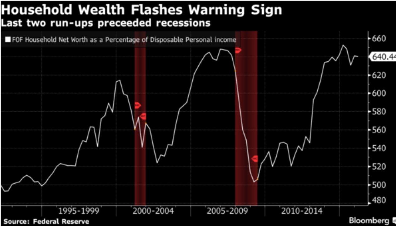
As a share of disposable personal income, household net worth hit a record high 652.7 percent in the first quarter of last year. (For comparison purposes, the high during the housing boom was 648.3 percent at the end of 2006.) It’s since slipped, to 640.4 percent on March 31 of this year, as equity and house price gains have slowed
Does this graph mean anything? Trying to not be such an intolerable cynic here, isn’t it entirely possible that household wealth, the very thing the Fed has been trying to buoy, might continue to surge upwards to new levels? Or, does that way of thinking fall into the ipso facto world of ‘this time is different’, which we both know rarely happens?
If you enjoy the content at iBankCoin, please follow us on Twitter


Amazing seeing the [equity-injection] computers turned on start of session. Nauseating
Hopefully someone reads this [comment] and goes gee that needs to be looked into
Your stock markets are merely programmed U.[Sheep] of A
All [All] runs in prosperity have caps on them
This is the fakest most fraudulent W.E.
[wealth effect] in history
Your comment is the epitome of FIMO.
This graph measn nothing for 2 reasons:
1) Household wealth is strongly correlated with the stock market, so it’s a concurrent indicator that doesn’t predict anything.
2) Peaks cannot be confirmeduntil *well after* they occur. take a look at 1998 for an example of how 1997 looked like a peak in 1997, but wasn’t.
Agree for 99.% of America, wealth is essentially house plus retirement accounts. So this chart is quite the lagging indicator.
The graph itself looks like the spx and Schiller house price index added together in equal proportions.
@showtime- Its only fake if it’s not reflected in your account statement.
Shoot’em up in German mall with some dead.
But not to worry, the EU bureaucrats are safe behind their walls.
Whose household? Perhaps those who lived life and bought with an optimistic outlook, faith and hopeful disposition.
…