iBankCoin
Joined Nov 11, 2007
1,458 Blog Posts

Mr. Denninger is Incorrect

***Update*** For more in-depth research into the matter of the Golden Cross and a falling 200 day simple moving average, go here, after you finish reading this post, of course.

Karl Denninger, owner/operator of  The Market Ticker penned a rather excellent piece, taking Dennis Kneale to task on his The Recession is Over proclamation. You may read Denninger’s missive here.

However, Denninger has erred when making this assertion:

Finally, on your so-called “Golden Cross”; for it to be valid the 200MA and 50MA must be rising.  The 200MA is falling; ergo, it is a false signal.  Go look at some charts; this indicator is no better than a coin toss if the second condition, which you conveniently omitted, is absent.  Better yet, talk to a market technician that knows his butt from a hole in the ground.  I do a nightly technical video available on my forum and pointed this out several days ago.”

Faithful readers of iBC would have immediately noticed that this idea that a Golden Cross is not valid without both MAs rising, is incorrect. I would hate for Kneale to have any ammunition to use against Denninger, and therefore tried to leave Denninger a comment on his forum. Unfortunately my comment was not allowed. I was forced to either wait for an unspecified amount of time (due to being a new registrant), or make a donation, in order to be able to comment immediately.

While I do not have excellent control over my impulses, I do have tight control of my purse strings. I am also fond of instant gratification. Thus, I will post the research that disproves Mr. Denninger’s assertion, right here, and right now.

Testing the Rare Downtrending Golden Cross

I will let Michael Stokes sum up his own results: It would seem that variation one, taking the crossover when it occurred regardless of the direction of the MAs, has been the most effective approach….If the upcoming cross occurs over a downtrending 200-day MA, it deserves the same level of significance as any other.

Let’s Chase the Rabbit:

It is possible that Mr. Denninger, rather than commenting on the absolute return of the Golden Cross setup, is instead commenting on the predictive power of the cross.

We can attempt to tackle that issue.

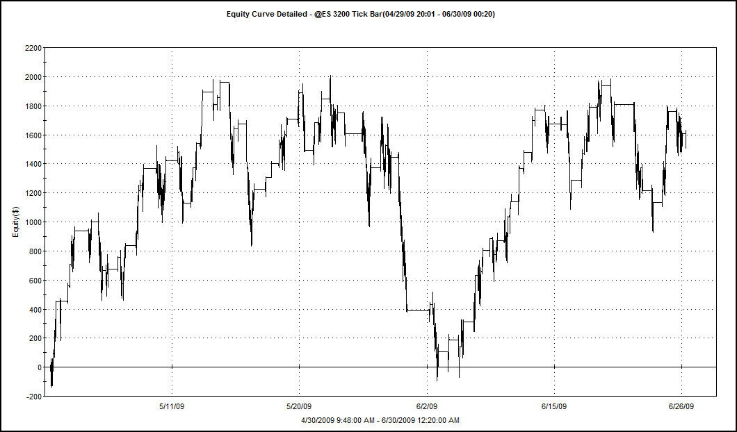
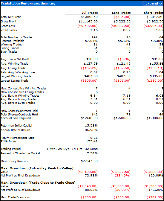
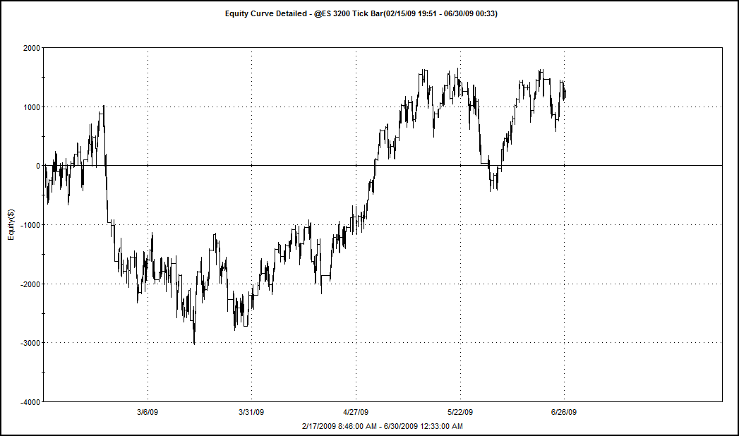
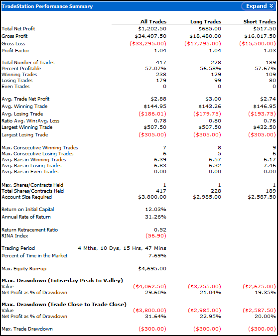
Using all of the data provided by Tradestation for the SPX, below are the results of buying the downtrending Golden Cross, and selling the position once the 50 day moving average has crossed back underneath the 200 day moving average. Commissions and fees are not included.

buying-rare-downtrending-golden-cross

Denninger’s statement, “This indicator is no better than a coin toss…” seems to be incorrect, as demonstrated by the 85% win rate. Furthermore, NOT taking this signal at all would have sacrificied gains of almost 100%. The only losing trade was very very small compared to the size of the winning trades.

To be fair and accurate, there should be some caveats inserted here.

  • Specifically, how do we quantify a rising/falling 200 day moving average? If the average rises one day before the cross but has fallen for 20 days prior, does that count as a rising moving average? In calculating the results above, there was really only one instance where I was unsure whether the 200 day average was rising or falling. I did not include that trade, but it would have captured gains of 55.05%. In other words, including this questionable trade would have helped, not hurt the results.
  • Another weakness of the research is the small sample size. However, the results are not at all ambiguous.
  • Mr. Denninger does not state which index or indices he is referencing. Perhaps he is refering to an index other than the S&P500.

Summary:

Based on the data I have,  Mr. Denninger is absolutely incorrect. For his sake, I hope Dennis Kneale does not read my blog.

Feel free to peruse my other articles on the Golden Cross, housed here:  The Golden Cross.

Comments »

Financial Blogging: The New Bubble?

In case you missed it, Dennis Kneale from CNBC called out the Zero Hedge blog tonight on the air. Zero Hedge’s response can be found here.

I’m not sure what is more strange: Dennis Kneale, “Media and Technology Editor for CNBC’s Business Day programming,” stating the recession is over, or CNBC contacting an anonymous blogger to meet with them on air?

First, Mr. Kneale is no economist. He holds a degree in journalism from the University of Florida. While he may be great at entertaining an audience, I do not see any credentials that would point to him being an expert, or even an authority, on the economy.

Secondly, Zero Hedge’s lead blogger has been adamantly anonymous from the very beginning. Even with the anonymity, Zero Hedge has well over 10,000 readers subscribed to their feed and has received almost 7 million visitors since January of this year. It makes one wonder if CNBC is not a tad envious of the traffic, to the extent that they would give such a platform to an anonymous blogger who was a week earlier still harnessing the free Google .blogspot domain to host his reporting.

The point is, if CNBC were actually bringing sound financial journalism to the investing public, Zero Hedge would have no raison d’etre.  This battle of celebrity versus reality has done nothing except highlight how the majority of media outlets are already obselete. Nothing makes that more clear than CNBC parading their Media and Technology guy out to vociferously proclaim what hundreds of actual economists are still debating. It is not about facts; it is about entertainment. And it may be entertaining if this sort of appeal to authority, or appeal to celebrity as it were, did not carry the consequence of the loss of personal wealth for those who listen.

As this divide between celebrity and reality becomes greater by the day, Dennis Kneale and CNBC are hoping or even praying that there is a bubble in the financial blogosphere. If the bubble is not soon pricked, both will discover that when financial news requires celebrity in order to be presented, it is not really news at all, only entertainment.

As Zero Hedge and other anonymous bloggers have made painfully obvious for CNBC, celebrity is not what people are buying.

Comments »

Checking in on Lazy Man’s ES System

When I last wrote about Lazy Man’s system for trading the S&P E-minis, the system had been optimized on in-sample data and then backtested on out-of-sample data. The out-of-sample results were not very good, but I am always hesitant to write off a system due to a short period of under performance.

I ran a test this evening to see how the system has performed since April 29th, when the out-of-sample results were posted.

lazy-man-es-4_30-to-6_29

lazy-mans-performance-summary

Performance has not been stellar, but has improved. The short trades are out-performing the longs over all metrics. This is odd since the market has had an upward bias during most of this period. I could go through and visually examine all the short trades and hazard a guess as to why the shorts are out-performing, but that is not really the purpose of this post.

The next series of charts show the history of all the out-of-sample data, starting from February 16, 2009, the first date of the out-of-sample test.

lazy-man-equity-curve-out-of-sample

lazy-man-out-of-sample-performance-summary

Compared to the first out-of-sample test, we have seen a small improvements in the system. Both the long and short trades are showing positive expectancy, although the average long trade net profit has dropped while the average short trade net profit has increased. Again, over an even longer term, we are seeing the system shift from out-performing on the long side to out-performance on the short trades.

The win % of both the longs and shorts has varied little since the original test, although (surprise surprise) the shorts have slightly increased their win % while the longs have slightly decreased.

Perhaps the easiest way to measure the system is to determine whether it has been profitable. Indeed it has been profitable, although this has come from short trades, primarily, as the long side has actually lost money since the first test.

Summary:

As this system uses fixed profit targets and fixed stop losses, I believe this system could be telling us that the market is changing, slowly. We would expect some change, even if it is shifting back towards “normal,” after the volatility of 2008. I will let the system continue running with the current settings, and then re-optimize before the next update. An analysis of how the optimal settings have changed since the first optimization may provide some important insights into how the market is changing.

All the posts on Lazy Man’s ES System are housed here: The Lazy Man System.

Comments »

Power Dip Week in Review

pd-ibc-report-6_263

On Friday’s open, the system closed all remaining open positions. There were no new Power Dip signals for Monday’s open, and so the system will sit in cash until the appropriate dip-buying opportunity presents itself. I have decided to begin posting any new buy/sell signals at 9:00 a.m. EST. As soon as the PD gets another signal, I will post it 30 minutes before the open.

For the week, the Power Dip system closed down slightly, losing $282.00, for a percentage loss of 0.27% from last Friday’s close. I find these results to be acceptable, even though the SPY closed down slightly less for the week, losing only 0.22%.

Highlights:

The win % is slowly climbing up to the backtested historical average. I love how often this system wins.

Also, many of the losing trades (but not stopped out) were closed for small losses.

Concerns:

The current Avg. % Trade is of concern me. It will need to triple to get near the backtested historical average. Even a system that wins consistently 70% of the time will not be very successful with a low Avg. % Trade, unless perhaps it trades very very frequently. Anyway, this system does not trade all that frequently and so we rely on an Average % Trade of much higher than 0.35% in order to outperform the broader indices. Imagine how the current results would look if the average % gain on every trade made so far was 0.60% higher.We can run a few quick and rough calculations to approximate what the current results would be had the system performed near the backtested historical norm.

  • 40 trades * $35.00 = $1,400 (at current expectancy of $35 gain on the average trade)
  • 40 trades * $95.00 = $3,800 (at backtested historical expectancy of $95 gain on the average trade)

The historical average trade would have the system up about 3.8% since inception. That is the type of future performance I expect from this system, and if it continues to perform at only 1/3rd of what I expect, I will have to dig around under the hood and figure out whether this is just a normal phase of underperformance or whether there is something more nefarious afoot.

The other concern is with commissions. Commissions are a cost of doing business, and like all costs of doing business, they should be minimized to the greatest extent possible. At the present, commissions have eaten away better than 1/3rd of the total profit. I am using Tradestation’s commission structure which is $0.01/share with a $1.00 minimum up to 500 shares, with every share over 500 costing  $0.006. In the future I may add to the spreadsheet the cost of shares purchased with a fixed commission structure. As the system keeps making money, it will eventually benefit from a fixed commission structure, especially if the system continues to favor low-priced stocks. Traders using Interactive Brokers’ commissions of .005/share can perform some quick calculations to learn how much money they would have saved.

Summary:

While not outperforming, the system is making money. Once the average % trade begins to rise, this system will outperform the broader indices.

Anyone who wants to read more on the Power Dip system, please visit this link which provides access to every post ever written on the Power Dip.

Comments »

Power Dip Portfolio to be Liquidated on the Open

ADCT, DTSI, NTG, TSRA, WRC, and WWW have all received exit signals.

There are no other Power Dips to replace these, and thus, the portfolio will enjoy some glorious days in cash, until the next dip-buying period can begin.

This post will be updated after the open with a spreadsheet of all the final prices for the closed positions.

Comments »

Power Dip Wednesday Update

On Tuesday, PII stopped out. This leaves one open spot in the model portfolio. On today’s open, that spot will be filled by WWW.

As shown in the spreadsheet, the system is in a drawdown. However, if today closes strong, I expect these numbers to improve. In fact I see a few positions that may be closed profitable on tomorrow’s open.

There have been some questions about how stops are calculated. Tradestation asks me to put in my stop in a per-share loss amount. So if the stock gaps lower, my stop is still the same, subtracted from the actual entry price, as the stop was developed using the previous close. However, in backtesting, the stop used has been the (Entry Price – (.10*entry)). From now on, as I want to be consistent with how I backtested everything, the stops will be -10% from the actual entry price.

I will try and update the sheet again this evening, as it looks like the system might swing back into the money.

Comments »

SPX Golden Cross Confirmed-Updated

The Golden Cross is complete as of Tuesday’s close. My Tradestation platform is showing the 50 day simple moving average to be 899.36 while the 200 dsma is 899.02.

Now that the huge short trade (entered on 12/21/07) is closed, I want to examine the statistics on both the long and short side trades (the short signal being a cross of the 50 day average beneath the 200 day average, or The Death Cross).

This was one heck of a trendfollowing trade!

Statistics:

Note that this test buys and sells, shorts and covers on the close of the day of the crosses. The previous tests traded the open the morning following the crosses. Commissions of .008/share was used. No slippage was added. Gains were compounded.

I’ve highlighted the metrics that I think are most important.

First off, the win percentage of 84% for the Golden Cross is impressive.

Moving down the sheet, the ratio of the average win to the average loss is very good for both the longs and shorts. This ratio shows that the winning trades are on average over 4x larger than the losing trades.

Also note that one Death Cross trade was responsible for almost 60% of the gross profit. This huge winner just closed today.

The section of the report that shows the average bars (days) in the trades is very interesting. We can use the statistics to make some forecasts. If this Golden Cross is going to be a loser, on average, another Death Cross will take place in 70 days (3 months). If this Golden Cross turns out to be a winning trade, it means that it will be, on average, almost 2 years before we see another Death Cross.

Finally, we see the metrics that show how this system performs on an annualized basis. We have to compare the Return on Initial Capital to the Buy and Hold return to see that trading the Golden and Death Crosses beats Buy and Hold, but has yielded only 6.45% annualized.

More Charts:

Monthly Underwater Equity Curve (Drawdown)

The system hasn’t had a monthly drawdown greater than 10% in over 10 years. These drawdowns improve a great deal when the system is long only. A series of losing Death Crosses whipsawing the system is likely responsible for the worst of the drawdowns.

Average Profit by Month

The system is approaching two of the worst months, in terms of monthly performance. Isolating the Golden Cross metrics shows that July and August are the ONLY months that lose, on average.

Equity Curve: Trading both the Golden and Death Crosses

Summary:

For the investor/trader with a long time horizon and a buy-and-hold mentality, this setup is tasty.

Using the Golden Cross for forecasting, even with the technicals degrading over the last couple of weeks, it looks as if there may be a chance for the rally to continue sometime over the next several months.

Comments »