My great grand aunt Fanny lived in Ferguson, Missouri. “All the white people there were crazy,” insists her niece. That is her memory from visiting Fanny in the late 60s and early 70s. Fanny’s sister, Ola Pearl, my great grandmother, lived in Decatur, Illinois where she dug goldfish ponds three to four foot deep and coated them in concrete. I used to swim among the goldfish while Ola Pearl pulled carrots out of the garden.
My great grandfather Andrew was a violinist. Perhaps the little musical talent I possess came from this man, Ola Pearl’s husband. He supported the entire extended family during the Great Depression by playing in the symphony for the people who had the financial wherewithal to keep living well as the rest of the country starved. When he died and my grandmother was cleaning out his home, she found a coffee can under the stairs with over 20 grand cash. He never trusted the bankers. The goldfish ponds had been dry for a decade, and I have not been back to Decatur since.
I now sit in a town across the great and muddy Mississippi from Ferguson, celebrating all that my family has accomplished, whilst watching my biscuits float in sausage gravy grease. Despite the splendor surrounding me, I don’t feel safely removed from the tragedy there, and neither should anyone else.
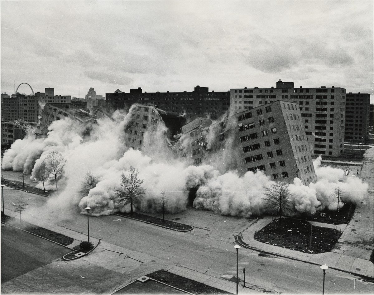
That government, not mere private prejudice, was responsible for segregating greater St. Louis was once conventional informed opinion. A federal appeals court declared 40 years ago that “segregated housing in the St. Louis metropolitan area was … in large measure the result of deliberate racial discrimination in the housing market by the real estate industry and by agencies of the federal, state, and local governments.” Similar observations accurately describe every other large metropolitan area. This history, however, has now largely been forgotten.¹
In 40 years times the informed opinion that government was responsible for deliberate discrimination has been replaced by the informed opinion that government is the solution to the deliberate discrimination by government. Leaders of other large metropolitan areas such as Mayor de Blasio were unavailable to comment. At the time of this writing, De Blasio was comically busy trying to don two hats – one hat for his leadership of the government agencies that practiced deliberate racial discrimination, and the other one as fixer for the same policies he was elected to continue.
What in the fuck, you may ask, does this have to do with me?
Enter Janet Yellen.
Yellen is faced with the same task as the leaders of the large metropolises: wield governmental authority to fix problems caused by government. The St. Louis fed, located 12 miles from Ferguson, published research in 2010 which highlights this conflict:
Some argue that targeted lending also threatens the Fed’s political independence, which is crucial to pursuing a stable monetary policy.²
From the same St. Louis fed research:
Fed officials acknowledge the problems of too-big-to-fail policies, but contend that without another means of resolving the failures of firms that pose systemic risk, policymakers had little choice but to protect creditors from taking losses to avoid catastrophic consequences for the financial system and economy.²
Five years ago it was informed opinion that the Fed was responsible for To Big to Fail. Two weeks ago we had Jamie Dimon and Citibank lobbying Congress to repeal Section 716 of Dodd-Frank. Considering that the Wall Street banks and financial interests have contributed “an average of about $2.3 million…to elect or influence each of the 535 members of the Senate and House of Representatives,” it should be no surprise the Section 716 was repealed.
Government regulators at the local, state, and federal levels failed to halt, indeed they endorsed, discriminatory practices of the real estate and financial sectors that played significant roles in the segregation of housing in St. Louis and nationwide.¹
The results of this practice, where government makes problems and then makes worse problems trying to fix the original problems, has been demonstrated on a small scale in Missouri. The Fed is doing the same thing, except the repercussions will be felt on a much larger scale. If Ferguson was a firecracker, the failure of Federal Reserve policies will be nuclear.
Welcome to Ferguson, Missouri.
¹ The Making of Ferguson: Public Policies at the Roots of Its Troubles
² http://research.stlouisfed.org/publications/review/10/03/Wheelock.pdf
Merry Christmas you filthy animals!
Comments »