There seems to be a bit of a disconnect between reality and fiction, circulating about the interwebs. Just because the market went up in March through mid April doesn’t mean it has yielded positive returns over the past month. A closer look at the recent price action spells out vast deterioration over a wide swath of sectors.
Let’s ferret a few of these out, shall we?
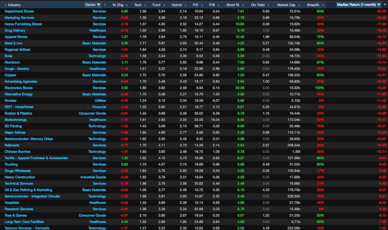
These are the median returns for whole industries over the past 30 days, courtesy of Exodus.
On a micro-level, the price action has been nothing short of deleterious.
Here are some standouts.
LC -54%
ENDP -49%
CHK -36%
FOSL -34%
SHLD -34%
PCRX -33%
SCTY -33%
X -33%
BITA -32%
SQ -31%
GPRO -31%
JWN -29%
VALE -28%
M -25%
Mega cap
AAPL -11%
GILD -17%
CX -11%
SBUX -10%
BHP -13%
LFC -17%
BIDU -13%
AMX -20%
TGT -19%
Hardly inspiring, wouldn’t you agree?
To be fair to the argument, there have been winners. Here are some standouts, which represents the current leadership in the market.
NGL +57%
AMD +44%
TEGP +37%
ONCE +34%
BGS +29%
GNW +29%
Z +22%
NVDA +20%
WMB +19%
Mega cap
AMZN +11%
MNST +15%
BSX +12%
CHTR +11%
VMW +14%
EA +11%
NTES +16%
The losers of -10% or more, whose market caps are greater than $1 billion, outstrip the winners of +10% or more with a 3:1 ratio.
If you enjoy the content at iBankCoin, please follow us on Twitter


From the “you can’t make this stuff up” file:
http://www.nytimes.com/2016/05/20/business/puerto-rico-debt-bankruptcy.html
Now that’s what I call fear.
Rut has been bear on weekly chart. nasdaq is looking to confirm bear market on weekly chart. then comes the mighty spx.
Praise the Lord I’ve been short Chinese Burritos this whole time.