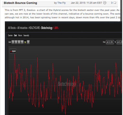
Let me show you a new tool in soon to be released Exodus, the second iteration of The PPT. Our algorithms grade each stock, sector and ETF. We’ve added a lot of visuals to the software, showing stress points and ranges. Last week, inside The PPT, I highlighted how biotech was at the bottom of the range. Now it’s near the top. When I say “range”, I do not refer to stock price, but Hybrid score, which is a combination of technical and fundamental scores, mixed in with lots of sub rosa grading metrics.
Have a look at gold today.
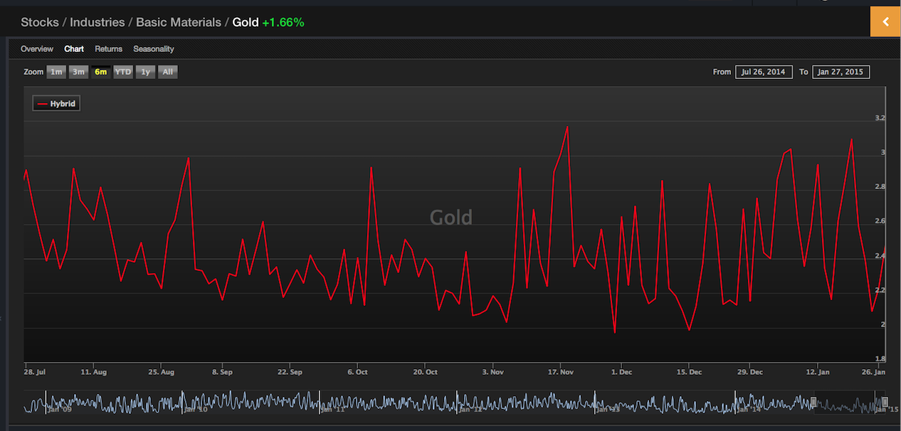
I was going to buy gold yesterday, based on this chart alone. However, I hate gold, deep to the core of my bones, so I was deterred.
As for this sell off: the CAT-MSFT axis of evil cannot be taken seriously. Several of my top positions are up and the dollar is weak, which is good for oil. Gravitate towards commodities today and you should be fine.
If you enjoy the content at iBankCoin, please follow us on Twitter


How do you think SWC health stacks up doctor?
I’m not taking CAT-MSFT seriously at all. Neither of those companies offering weak guidance should be a surprise to anyone. And for as hard as they are getting hit, nothing I’m holding is following them downwards. Anyone shorting here is crazy, you do not short when AAPL is reporting at the end of the day.
very cool for us visual types. Is there a screening or alert functionality that lets a user know when an instrument is heading into what was historically an extreme for the range?
Yes, it is screenable
Are burgers a commodity? Because I feel myself gravitating towards one as noon approaches…
Bought $CVRR
found out this AM I passed Level I, so hooray for me.
Can I offer you a suggestion for user interface?
the gold chart, the most recent data point exactly touches the far right margin. If you could make it so there is a *little* space at the right edge margin, imo, it is much easier to “see”. I may be (but doubt) I am the only person who likes the little space between the data points and the scale
agreed