After having read many market analysis posts over the weekend, I thought I ought to collect a few charts I’ve been blogging about and organize a view point of some longer term factors that have been dictating my blog posts as of late. In other words, this is why the market is telling me it wants to go higher.
Bull cycles run in three phases. Accumulation, participation, and excess. Meanwhile, while these phases occur, there are shorter cycles that take place about every 1-2 years during a bullish cycle. I call this a “cleansing phase.” For example, coming out of 2011 (participant cleanse), you got 2012-2013 (a run that sucks folks back in). Then you get 2014-2015 (participant cleanse). 2008 was more than a participant cleanse, I view that as more of a generational cleanse.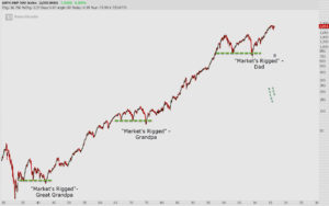 There’s a few ways to separate these cycles, and I like to imagine that there are 3 signals in a cycle that determine where each entry point is within a trend. They usually coincide with the rinsing of the crowd of new experts that surface every two years after the market has conditioned people on how easy it can be to make money. The market has spent the last two years conditioning people for fast sell-offs, destruction in individual stocks, and financial media has done well at prepping everyone for some sort of crash that they all have seen coming. The RBS “Sell Everything” warning is where everything started this year, so I’ll get back to cycles and signals.
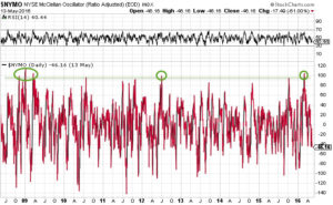
Breadth indicators are usually what I use to isolate accumulation and oversold signals in the market. An accumulation phase will start after a bear market, and will usually be several extreme buy signals consecutively in a short span of time. This happened in late 2008, going into March 2009. You can contrast this with the number of quality stocks that didn’t follow the market down to new lows during that time frame. So many bullish divergences in stocks and various indicators and markets occurred at those lows.
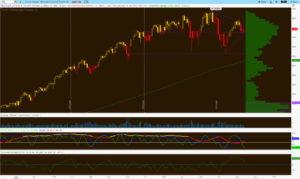
I like to use the $NYMO. There are others that can be used, and can be applied to support this analysis, but here’s the $NYMO going back to late 2008.
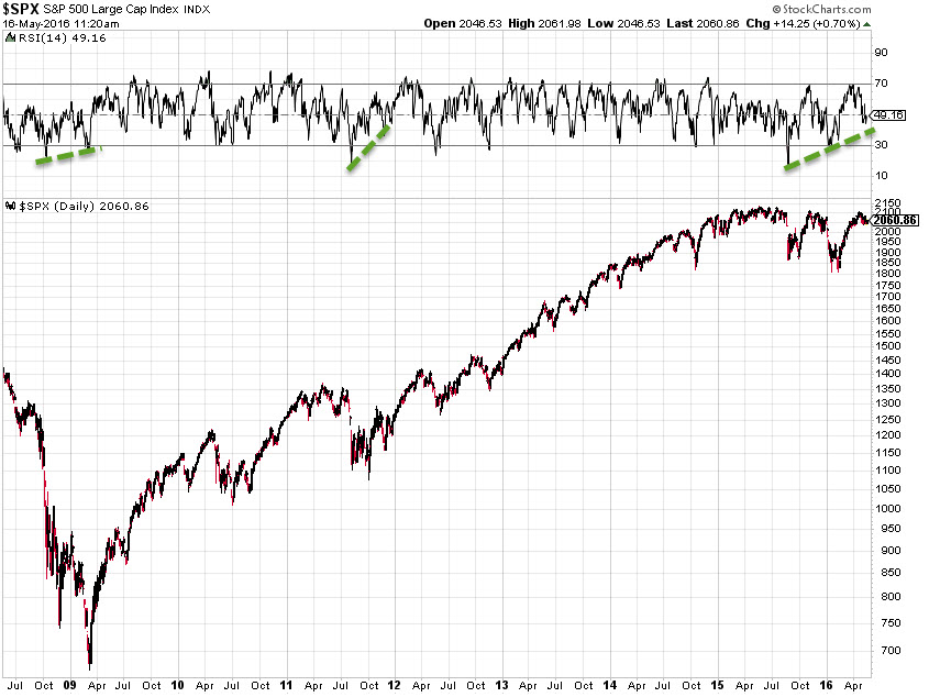
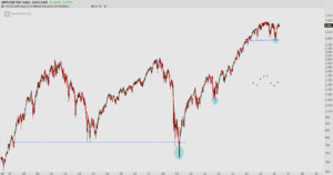
 To help measure accumulation at prior to each of these buy extremes, here are the divergences using a standard RSI.
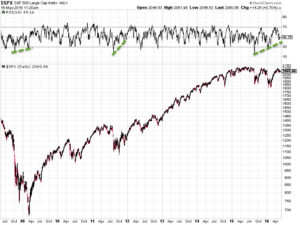
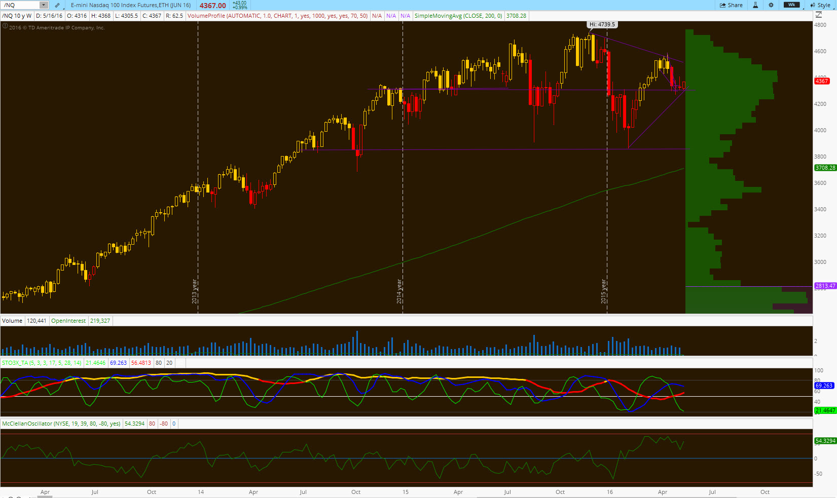
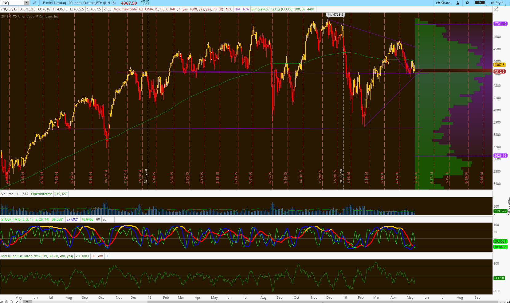
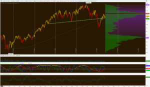
I won’t debate that the Dow and SPX weekly charts look toppy, but I will argue that the Nasdaq and Russell look absolutely compelling here. Considering the equity outflow stats and the profile of these instruments, I’d argue that this is the move you must engage here.
Here’s the weekly and daily /NQ profiles:
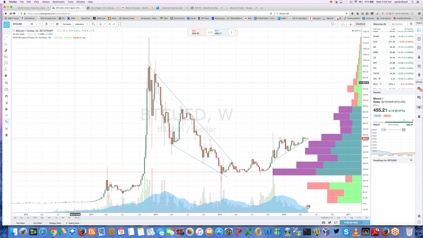
I am absolutely enamored with this chart. Everyone that looks at this chart suggests top, head and shoulders, or the fact that it’s lagging behind here. That just makes it so much more appealing.
The Nasdaq is the only index with its POC in the middle of its multi-year range. See below.

I found it appropriate to point this out back on the 29th, as those prices have held ever since that post. Odd that when you have support under a market, it prevents it from going lower.
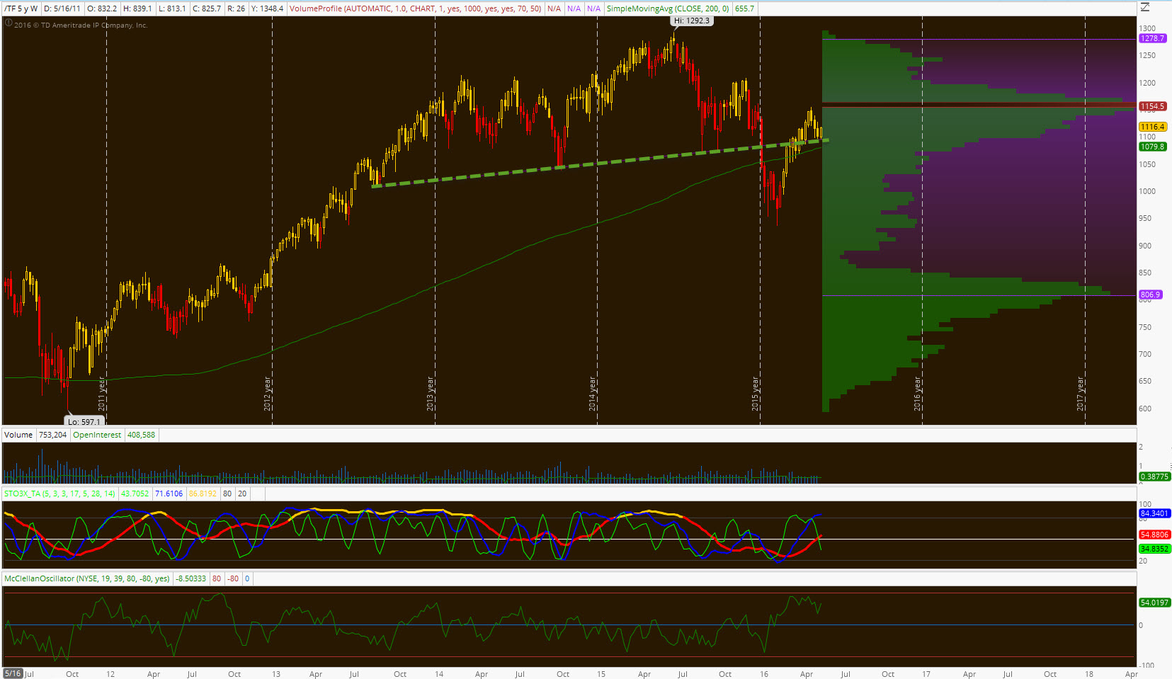
How about the H&S pattern on the $RUT? If the move beneath the neckline results in a thrust back above the neckline, it’s considered a failed pattern. They say from failed moves come fast moves, and I can’t fathom how this location isn’t actionable or attractive here.
The other considerations here might include discussions on critical groups, sectors or market themes. I think the LT analysis I’ve been posting on $IBB is pretty compelling, but also the rotations into risk or growth over value are healthier than they’ve been in years.
It’s been a choppy environment the last two years, but I think that helps to shuffle the deck a bit and get folks short or out of stocks entirely. I’ve often blogged about the large developing short position under this market, but also the stats on how people are getting out of stocks or have left the market altogether. On this two year chop binge, this action propels prices higher over the next few years. If stocks to make a break for it here, the higher we travel those shorts are forced to cover, and the move higher triggers the emotional pain of missing out. The higher it goes, it attracts more folks to chase. Fundamentally, we probably don’t belong up there, but I’d say it has more to do with being improperly positioned, sentiment, or being too early. Markets don’t crash or sell off without that crowd involved and actively engaged. That’s why the bull cycle always ends with a blow off move, or some degree of enthusiasm or euphoria. As I’ve pointed out on longer term sentiment charts, we were at that choppy “buy the dip” stage back in Jan/Feb this year when that record $NYMO reading hit.
So anyhow, that’s my long term take on how constructive this market is, and the reasoning behind my opinion of higher for longer.
All of these tools will be given to you as a checklist in the upcoming boot camp. Sign up today.
OA
Comments »