I’m breaking out in cold sweats when taken to the poll results page spurred on by flashbacks of constantly refreshing a similar page during the iBC Election(s) of 2012.
Good Dr…important men of your stature should not be concerned with such trivial nonsense. Of course the original is the better of the two. That being said, lets talk about BALT. Are we adding here??
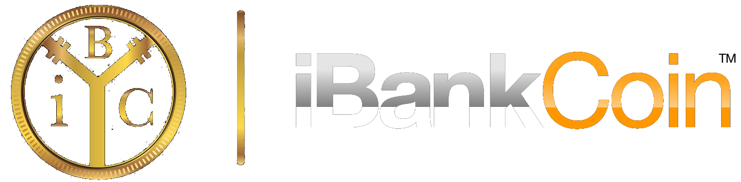







The old logo. Its a good if not great logo, no reason to change.
I will say the new one is not terrible.
I’m breaking out in cold sweats when taken to the poll results page spurred on by flashbacks of constantly refreshing a similar page during the iBC Election(s) of 2012.
Come on. My eight year old could have done the one without the coin. No disrespect to anyone of course 😉
Just taking a poll.
DO YOUR DEMOCRATIC DUTIES WITHOUT CONJECTURE!!
You, Sir, are electioneering!
I voted for the obvious winner. My humble apologies.
Why ask us? FIG
The coin with the text of the second logo would look sharp. A pimp cup would be boss.
Good Dr…important men of your stature should not be concerned with such trivial nonsense. Of course the original is the better of the two. That being said, lets talk about BALT. Are we adding here??
Voted Coin, but I do find the 3 P’s of iBankcoin imagery to be essential. Pelicans, Pipes, & Pyramids
The coin is becoming an international icon right up there with the red can of classic Coke or the Nike Swoosh.Of course the coin.
What if you revamped the coin? Maybe take the shine off so it looks “cleaner”?
Coin already has it’s own pyramid. No?
Seems the coin logo is already iconic. Probably best to keep it, just tweak it if necessary.
The pyramid font is gay.