The bottom on 3.06.09
Note the low, circled on the graphic below. (All graphs will enlarge with a double click).

Today, note below the exact loss of the S&P 500:

Enough said.
Comments »
The bottom on 3.06.09
Note the low, circled on the graphic below. (All graphs will enlarge with a double click).
Today, note below the exact loss of the S&P 500:
Enough said.
Comments »
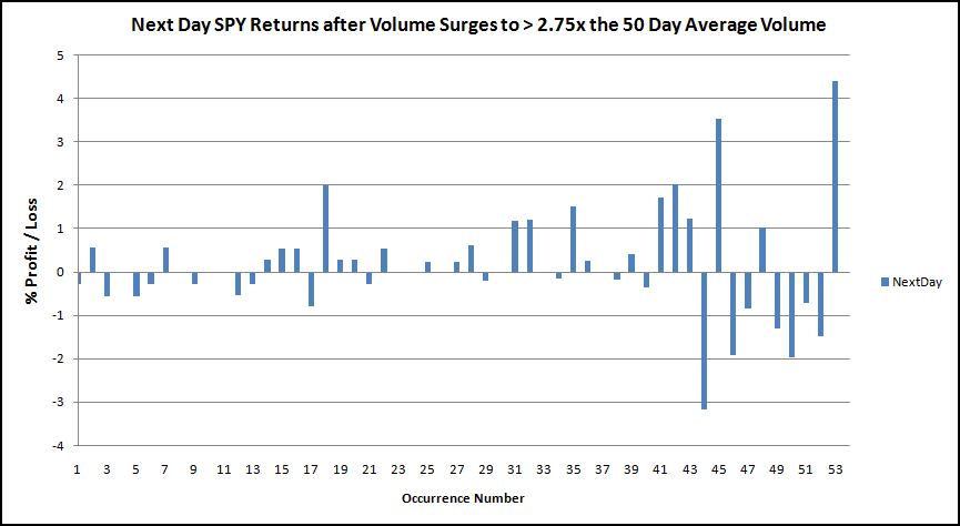
Friday’s volume surge was greater than 2.75 times the 50 day average volume. If we treat volume as an indicator, and ignore all other variables, what does a surge in volume portend for the short and intermediate terms?
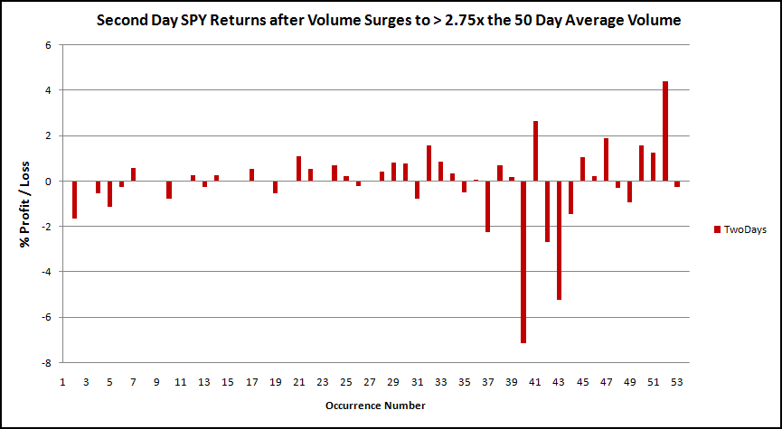
First, since everyone is concerned with the next several days, let’s look at next day, two day, and three day returns. To be clear, I have calculated returns this way: Two day returns is the return on day two after the volume surge. It is NOT the return of the first AND second day after the volume surge. The same calculation is used for the three day return.
Next Day Return
Average Next Day Return = 0.17%
% of Winners = 42.31%
Second Day Returns
Average Second Day Return = -o.08%
% of Winners = 55.10%
Average Third Day Return = 0.14%
% of Winners = 54.35%

Bottom Line:
What SPY does Monday, Tuesday, and Wednesday is hard to predict. History leans towards positive returns, but the edge is not strong. With the S&P downgrade, all analysis of the past might be meaningless.
What stands out is recent performance. Looking at the last 15 or so occurrences, note how volatile the market has become after a surge in volume. I suspect that if I dug deeper we would see that many volume surges occur during bear markets or downtrends, where we would expect a great increase in volatility. Volume just doesn’t seem to surge near tops or during uptrends the way it does during a downtrend or bear market phase.
There is an edge though, but it doesn’t show up in the short-term. It is very obvious in an intermediate term analysis. The chart below was generated by assuming one bought SPY at the close when the volume surged to greater than 2.75x the 50 day average volume. No commissions or slippage were included, and all SPY history was used.
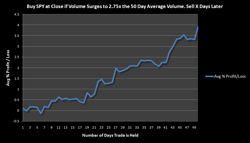
While we are living and trading during what seems to be an unprecedented time, in the past, large volume surges have led to a strong upside edge in the intermediate term.
It is important to remember that the chart above has combined all the trades to create an average. While the average is very bullish, we may find ourselves staring down a -4% to -8% move down over the next few days. I guess we should be optimistic and realize that we could also see a +5% upside move over the next few days. Since a bounce is due, I will go against my gut and lean towards the upside rather than more downside. Again, I’m using past data, absent an S&P downgrade of the credit rating of the United States of America.
Lastly, sustained bear markets are rare events. While they are few and far between, should the market be starting another bear phase, any bounce should be used to go to cash or initiate shorts.
Comments »For today, 8.4.2011, I have $SPX down -4.78% and SPY down -4.68%. Let’s take a look at other times this has happened to see what happened next.
First, let’s examine previous dates when $SPX and SPY lost as much or more than today. I’ve also included the performance for the next day, two days later, and three days later. Keep in mind that SPY is tradeable, where $SPX is not. Also, SPY represents more recent history versus the long-term history of $SPX.


Below is the same information presented in a different format. I think it helps to see what happens after the crash day. Start with each blue bar (CrashDay) and work to the right. Notice the relationship between the blue and red bars. The large -20% loss is Black Monday.


Finally, lets look at what has happened in the intermediate term, after a crash day.
The results assume one bought the close of the crash day and sold X days later, at the close. All trades are averaged to produce the graph.

Bottom Line:
History has shown that the next day after the crash day tends to be positive. However, there are a few examples of the next day losing almost as much (or more, on Black Monday) as the crash day. I know many folks are concerned about what will happen tomorrow.
I want to be deadly serious here. The market is in an extremely precarious and dangerous place. People are scared and may panic more tomorrow. 2008-2009 is no doubt still fresh in the minds of many traders.
The chance that a large, extended move upward will develop any time soon is very very slim. If you choose to hold here and wait for a bounce, understand that you may only get one shot at unloading longs or getting short. If you miss the opportunity, the market could easily slide another 5-10%. It may do that anyway, without a bounce. Over the next few days and weeks, expect another move down and a test of the lows. Volatility will stay very high.
If you are not disciplined and in control of your emotions, this market is going to eat you alive. You must know what you are looking for and you must know what you will do when you see it happening.
Comments »
Today’s candle and volume demonstrate a textbook reversal day. Candlestick analysis calls today’s candle a Bullish Hammer. Modeling today’s action shows that this setup is more bearish than market lore would have you believe.
Today’s action (Bullish Hammer) is what market technicians like to call a reversal. This happens when the market drops and makes new lows but then reverses to close higher than the open. A surge in volume is almost always present. In market lore, these reversal days are seen as being bullish both in the short and intermediate terms. A reversal day is often believed to signal that a change in trend is occurring (from down to up, in this case). This is not to be confused with a key reversal day.
The chart below clearly shows the bullish hammer as well as the volume surge:

What we want to know is if this pattern is truly bullish for SPY. Let’s test it and find out.
The Rules:
Buy SPY if
Sell X days later. No commissions or slippage included. All SPY history used.
The Results:

I’ve got a fair amount to cover about the results, so bear with me. Let’s start with the blue line, which shows the results of using variables 1-4 but not 5.
Now let’s examine the red line, which shows the results of all variables 1-5. Variable 5 is what distinguishes the bullish hammer. Almost all of the setups using variables 1-5 show a fairly distinct bullish hammer. (I will include the trades below so that you can check them out).
Bottom Line: Today’s bullish hammer candle is a bear market phenomenon. It does not typically occur during bull markets. To demonstrate this, I set the backtester to sell the trade on day 26 (note the low on day 26 the graph above). Below are the dates and results of the trades.

My opinion, which is based on these results, is that any bounce that develops over the next few days will be an excellent opportunity to open up a short position.
Those of you who have read me for some time know that I do not often advocate shorting, as the psychology is challenging and the market has a bias to the upside. However, In this case, the market does not appear to be very healthy. Indeud, SPY is trading beneath both the 50 and 200 day moving averages and a Death Cross is looming.
At the very least, position sizes should be smaller and cash should be raised. True bear markets are rare occurrences. But with economic fundamentals deteriorating quickly, the possibility of another extended bear phase should be factored into every trader’s strategy.
Comments »
I had a request to do a Bollinger Band study, since SPY has closed beneath the lower Bollinger Band. Rather than recreate the wheel, I’m going to link to some earlier studies I completed on this topic. Not much has changed since these studies were completed so the results still apply.
The most important thing to remember when trading outside the bands is that it is by definition, abnormal.
SPY Close Beneath Lower Bollinger Band: Bullish?
SPY > 1% Beneath Lower Bollinger Band: Buy or Sell?
SPY Closes Twice Beneath Lower Bollinger Band: Bullish?
Comments »Recent history suggests we should sell any bounce over the next 1-3 days. Recent and long term history both show an edge that develops about 2 weeks after the setup.
The Rules:
The Results:

SPY Results Above
SPY gives a more recent history of this setup with 15 occurrences. The first occurrence was in 1999. Since some of the trades overlap, there are only 9 – 11 trades used to generate the graph above. (I know that is confusing. Ask in the comments section if you need clarification).
SPY history is skewed due to the bear market trades in 2008 and 2009. To illustrate this, I programmed the backtester to sell the trades at the close of the 11th day. As the graph above shows, the 11th day has been the worst. Below are the results of the trade if one sells on the 11th day:

Recent history shows that this has not been a trade that one wants to hold on to for more than a few days. However, if the trade works, a nice gain of 2% of more may be had on any bounce. Most of the gains have come by the 2nd day.
Aside: SPY volume today rose to almost twice the 50 day average. Throughout SPY history, whenever there has been 6 consecutive down days, volume is almost always above the 50 day average on the 6th lower close.
Lets look back farther by using $SPX.

$SPX Results Above
The first trade on $SPX was in 1960 and there has been 167 occurrences of this setup. Between 116 and 64 trades were averaged to make the graph above.
Remarkably, in over 50 years of trades, the 11th day has been the worst day to sell on. I was surprised to see that this stayed the same as with SPY.
Like the SPY results show, the best chance of selling this setup for a profit has come the 2nd day.
Bottom Line:
With the exception of the next few days of trading, this setup has been bearish to neutral. A disciplined trader may be able to trade this setup for profits. It will be important to realize that having to hold this trade for more than 3 probably means that the setup has failed.
While we are not able to look into the future and know exactly when the market has bottomed and is ready for a sustained bounce, this setup has surprisingly found a bottom 11 days later. Perhaps the best trade is to wait a couple of weeks and then re-evaluate.
Really, this is not such a big deal.
Yes, today’s candle is wicked ugly. SPY gapped up to resistance at the 50 day moving average, and then plummeted, slicing its way beneath the 200 day moving average. (Click on chart to enlarge)

However ugly it may be, it is not as bearish as you might think. Here is a previous study which looks at what happens after a close beneath the 200 day moving average.
Fade the Bears and the 200 Day Moving Average
Comments »