iBankCoin
Joined Nov 11, 2007
1,458 Blog Posts

The High Low Logic Index – Digging Deeper, Testing Ranges

As of Friday’s close, the weekly reading of the High Low Logic Index (HLLI) stood at 1.61%. The previous article discusses how this indicator is calculated. Today I want split the indicator readings into ranges and look at what happens a year after the indicator is bought within a certain range.

In case you missed it, here is the jump-off article:  Exploring the High Low Logic Index.

I have split the indicator readings into 6 different ranges: <1; >0.99 and < 2; >1.99 and <3; >2.99 and <4; >3.99 and <5; and >4.99. I was hoping that we might be able to see a clear difference in results based on the range of the indicator.

I used weekly readings to calculate the index metric, used $SPX as the trading vehicle, and started testing in 1985. No commissions or slippage were included and I am still NOT using survivor-free data.

The Results:

As the graph clearly shows, the indicator does a fantastic job for bulls when it is reading < 1%. It has registered < 1% 247 times since 1985. If the trades are held the full 252 days, there were only 12 trades completed.

The middle ranges have many more trades completed since the indicator tends to stay between 1% and 3%.

The highest range, >4.99% has even fewer trades made than < 1%.

I separated $SPX results into 252 day segments, and at day 252, the average profit is 9.29%. This means that the only range would have definitely beaten the $SPX has been < 1%.

As I was in the first post, I am still underwhelmed by this indicator. Unless it is giving an extreme reading of < 1% or > 3.99%,  I’m not sure it has much value.

In the next post I will change it to use daily bars, add survivor-free data, and see what happens…


Comments »

Percentage of Stocks Trading Above Their 50, 200 Day Moving Averages

After such an epic run, I thought that tonight I’d fine some evidence of this run being extended, in terms of the number of stocks above their 50 and 200 day moving averages. In fact, that is not the case.

First, the markets have gone abnormal. I would not short here, with SPY well above its upper Bollinger Band (50,2). That being said, let’s look at a popular measure of market breadth, the percentage of stocks trading above their 50 and 200 day moving averages.

In order to calculate this, I used all major exchange listed stocks.

As seen in the graph, the number of stocks above the 50 day average is 75.07%. While this is high, the market has seen this level many times, and instead of a grand pullback, it has typically led to moderation or consolidation.

Instead of looking for a pullback right here, we should monitor this metric. If we see the percentage of stocks trading above their 50 day moving averages begin to fall as the market continues to rise, we might look for a pullback. At this point, consolidation seems more likely. Note though that this indicator works better at calling bottoms than tops.

The percentage of stocks trading above their 200 day moving averages is consistent with markets coming off of a bottom or a correction. If this metric can climb to 70%, which is consistent with levels reached during typical bull runs, the market will be significantly higher than where it closed today.

Comments »

Exploring the High Low Logic Index

The Miner 49er sent me a link to this article from MarketWatch:


CHAPEL HILL, N.C. (MarketWatch) — Would you be interested in a market indicator that has correctly called every major market top and bottom in recent decades—with few false signals?

Of course you would.

And the good news doesn’t stop there: This exceptional indicator is currently in very bullish territory.

The indicator I’m referring to is the High Low Logic Index, which was devised in the 1970s by Norman Fosback, then the President of the Institute for Econometric Research, and currently editor of Fosbacks Fund Forecaster. The index represents the lesser of two numbers: New 52-week highs and new 52-week lows with both expressed as a percentage of total issues traded.

Higher readings of the High Low Logic Index are bearish, according to Fosback, as they suggest that “the market is undergoing a period of extreme divergence… Such divergence is not usually conducive to future rising stock prices, [since] a healthy market requires some semblance of internal uniformity.”

Interestingly, Fosback found from his research, “it doesn’t matter what direction that uniformity takes. Many new highs and very few lows is obviously bullish, but so is a great many new lows accompanied by few or no new highs.”

Fosback in the 1970s recommended a 10-week exponential moving average of the indicator, and this is the approach taken by Ned Davis Research. The firm each weekend updates a version of the index based on all publicly-traded stocks in the U.S. Its latest value is 1.7%, which is solidly in bullish territory.

In fact, there have been only four other occasions over the last 25 years in which the Ned Davis Research version of the High Low Logic Index has moved from bearish territory above 4.05% to as low as it is today, and all four came close to a major market bottom: Late 1987, late 1990, early 2003, and late 2008.

This last occasion represented the most premature the indicator came in anticipating a bull market, and even then it was only 3-4 months early.

The threshold level that Ned Davis Research has used in its back testing to indicate bullish market breadth is 2.5%.

Whenever the 10-week exponential moving average of the High Low Logic Index is below this level, according to the firm, the S&P 500 index (SPX)  has appreciated at a 17.9% annualized rate. Whenever it has been above 4.05%, in contrast, the S&P 500 index has declined at a 12.5% annualized pace.

Did this indicator anticipate the market’s weakness in August and September of this year? Unfortunately not, which is another way of saying that the message of the indicator is that recent weakness was not the beginning of a major bear market. The highest it ever got to was 3.2%, according to Ned Davis Research, a level that the firm’s back testing has indicated to be a neutral reading.

The last time the indicator was higher than the 4.05% sell threshold was late 2007, just before the Great Recession and associated credit crunch.

The bulls can only hope that the indicator will be as successful this time around as it was on prior occasions.

The indicator sounds pretty cool, so I decided to code it and put it through the paces.

Let’s take a look at what I’ve come up with.

The chart above is weekly chart of $SPX, with the High Low Logic Index (HLLI) beneath it. The MarketWatch article was published on 10.18.11, and it references a HLLI reading of 1.7%. Note that last week’s HLLI EMA was 1.71%. Because these reading match, I feel fairly certain I have accurately constructed the index.

I had originally used de-listed, survivor-free data, but doing so generates reading that do not match the article reference. Since the chart above used only major exchange listed stocks to create the metric, I assume that Ned Davis Research is not using survivor-free data. In future posts on this indicator, I will be using survivor-free data. Since we want to backtest this indicator going back more than 20 years, it will be important that the data be survivor-free.

Let’s Backtest It…

Buy/Sell Rules:

Buy $SPX at the Close if the HLLI is < 2.5%

Sell $SPX at the Close if the HLLI is > 2.5%

No commissions or slippage included. Data used was NOT survivor-free. First trade was 1.2.1985

Results:

The article also states that bearish territory is above 4.05%. Let’s use this level and make a modification:

Buy $SPX at the Close if the HLLI is < 2.5%

Sell $SPX at the Close if the HLLI is > 4.05%

We are now waiting for the bearish threshold to sell, rather than selling as soon as the indicator leaves bullish territory.

Results:

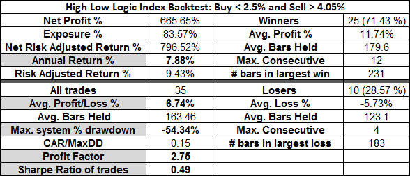
While selling above 4.05% does not significantly affect the annual return, it does significantly lower risk-adjusted returns. The maximum drawdown is also worse, as is the Sharpe Ratio.

On the other hand, staying long beneath 2.5% and in cash above means making almost 5 times as many trades. Commissions will seriously affect these returns.

Buying and holding $SPX over the same time yields an annual return of 7.74% with a maximum drawdown of -56.73%. The first model has a smaller drawdown, but with both models, once commissions are included, they will likely not have beaten buy-and-hold.

These initial tests are not all that impressive, but I do think the indicator is interesting and is worth exploring further. Over the next few days, I will adjust the indicator to use daily bars (rather than weekly) and will test it using various thresholds over survivor-free data. Finally, I have a tweak in mind which I believe may improve results.

Bonus: Below is the equity curve for the Long <2.5% model.


Comments »

Technically Speaking, Gotta Be Bullish Here

On Friday both the S&P 500 and the Dow Jones closed at new 50 day highs. 5 days ago, the QQQ closed at a new 50 day high. Throughout history, new 50 day highs have lead to more gains over an intermediate time frame.

The Rules

Buy the ETF/Index at the Close If

  • It Closes at a New 50 Day High
  • Sell X Days Later

All available ETF data was used.

Index data for the S&P and Dow goes back over 60 years. Data for $NDX starts at the end of 1985.

The Results:

The ETFs represent a smaller data set yet still offer plenty of samples. Let’s look at the index data, which contains substantially more data.

The huge $NDX gains are due to the tech boom. However, both $SPX and $DJI show a solid uptrend after new 50 day highs.

While I am still very concerned about the situation in Europe, I am being very careful not to ignore the strengthening U.S. indices. With positive seasonality coming soon, I’m beginning to think it is time to turn off the brain and just follow the trend.

Comments »

Let’s Go Redbirds!

With family on both sides of the mighty Mississippi, we have been life-long Cardinals fans. I saw my first major league ball game in Busch Stadium.

We have rally jerseys on and are expecting to win game two.

As for the markets, there is some nice consolidation going on just beneath resistance. This looks bullish to my eye. The real story, and the one which is sure to overwhelm any technical patterns, is whether or not Germany and France can pull a rabbit out of the hat. Save for the Germans, I really have no faith in the Europeans. Therefore, I’m expecting more downside when the world figures out that they’ve left the fate of the entire European economy in the hands of some short guy who wears high heels.

In short, the technicals remain bullish while the fundamentals are bearish.

Comments »

ROC Indicator Switches to Long

For background reading on this indicator, go here, or for all posts on this indicator, go here.

As of Tuesday’s close, the ROC indicator is again long.

Here are the results of the four trades made since I started writing about the indicator:

Some of you have wondered how often the indicator switches back and forth before deciding on the side to take for the long term. Below are all the trades it has made.

My best guess here is that the system will continue to gyrate for awhile before settling on one side or another.

Finally, remember that Michael at MarketSci cautions us that the short side of this system didn’t always work as well as it has over the last decade or so.


Comments »

A 50 Day High and a Pullback…Bullish?

On Friday, SPY closed at a 50 day high. Today, the SPY pulled back a little more than -1.9%. Is this bullish or bearish going forward?

The Rules:

Buy $SPX/SPY at the close if

  • Yesterday Makes a 50 Day Closing High
  • Today pulls back more than -1%
  • Sell X Days later
  • $SPX data goes back over 50 years. All SPY data used.
  • No commissions or slippage included.

The Results:

Analysis of Results:

Sample sizes for the baseline setup (blue and red lines) were decent, with 45 $SPX trades held the full 100 days and 20 SPY trades held the full 100 days.

To make the modeling closer to our current environment, I added the variable of a close beneath the 200 day moving  average (MA200). Adding this variable significantly reduced the sample size to 9 $SPX trades and 6 SPY trades.

The bottom line is that even with the market trading beneath the MA200, a 50 day high and shallow pullback is bullish.

I was curious though how allowing for a deeper pullback would change the results. To that end, I required the pullback to be more than -1.9% (much like today’s pullback).

Pullback More than -1.9% Results:

Allowing for a larger pullback significantly reduced sample size to 13 $SPX and 6 SPY trades held for the full 100 days. Adding the variable for a close less than the MA200 reduced samples even further, leaving only 4 $SPX trades and 1 SPY trade held for the full 100 days. The single SPY trade was from 11.7.2002 to 4.3.2003.

While a deeper pullback still yields solidly bullish results going forward, the initial pullback appears to be deeper and last longer than the shallower pullback (to see this effect, compare the first 10 days of each graph).

I added the pullback variable to more closely model recent market action, but it is likely that the most important variable here is the 50 day high. It doesn’t appear to matter all that much whether this high comes in a bull or bear market. After it is made, the S&P 500 has tended to continue higher.

Comments »