


Comments »
Because Fly is soon going to enforce banishment of yours truly to a tenement project for being Southern lazy (in regards to the frequency of my blogging), I thought it would be important to note that I will not be blogging tonight due to having to put down our family dog, Maya.
She was over 16 years old, and may have actually achieved the age of 17, in April. Its hard to say for sure the exact date of her birth. She was the best damn dog a family could ever wish for.

Rest in peace, good girl.
Comments »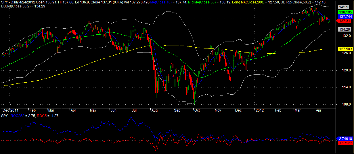
To be long, we want the blue line to be above the red line. Over the long term, using this simple indicator to signal when to be long SPY has beat buy-n-hold and reduced drawdowns by approximately 2/3rds.
Adding short signals to the indicator improves results but the effectiveness of shorting is a relatively new development.
To read more on this indicator, go here.
Comments »After the recent market attempt at a pullback, like most traders/investors, I find it instructive to compare my performance vs. that of the market.
After designing the simple Fidelity Sector Rotational Strategy over two years ago, I decided to start trading it live in February. I also designed a Version 2, which I am not currently trading in real-time. The following is a year-to-date report of both versions.
First, let’s look at the top-ranked funds for both versions.
Version 1 Top Three Fidelity Sector Funds
Version 2 Top Three Fidelity Sector Funds
Version 1 YTD (Assumed that one started trading the system on 1.3.12 based on the signal from 12.30.11).
Version 2 YTD (Assumed that one started trading the system on 1.3.12 based on the signal from 12.30.11).
Version 1 Equity Curve:

Version 2 Equity Curve:

SPY Buy and Hold YTD:
The performance of Version 2 is disappointing, but that is okay as it is still in evaluation mode. We’ll give it a year or so before passing final judgment on it.
Version 1 continues to perform well, which is not surprising to me as it performed well in both backtesting and 2 years of out-of-sample data.
Comments »In all of SPY history, there have only been 8 occurrences of the ETF trading above its 50 day moving average for 75 days or longer. Once it closes beneath the 50 day moving average after trading above it for such a long stretch, is it is good time to buy?
On April 10th, SPY closed beneath its 50 day moving average after trading above it for 75 days. This type of pullback to the major moving average is a popular setup with technical analysts, but is there actually an edge to it?
The Rules:
Buy SPY at the close if
Sell SPY at the close Y days later.
No commissions or slippage included. All SPY history used.
The Results:

The results for >49 days above the 50 day moving average are solidly bullish. The results for <50 days above are neutral to bearish, considering the average gain for SPY over any 50 day period is 1.54%.
Sample Size Matters:
While sample size for the >49 days above data sets is limited, I tend to discount this as I see it representing strong momentum, which has a proven edge.
What I like about this study is that while there is undoubtedly some overlap, the results look completely different from my recent study about a pullback from new highs.
Comments »
Hello folks… I did my best to get my taxes completed by the deadline. Despite starting them in February, alas, I was stymied tonight by a missing EIN for a daycare provider. Much cursing ensued, all gentlemanly, I assure you.
Anyway, I was hoping to publish a study where we look at the number of days SPY has traded above the 50 day moving average and then look at what happens after the first time it closes beneath the 50 day. I think it will be very interesting. I had big plans, but they were waylaid by the coming of the Taxman.
More than likely, I’ll have that new study up some time tomorrow evening.
Until then, I hope you’ll enjoy this scenic panorama I took of our recent trip to West Virginia. This shot was taken from the front porch of the cabin. Click on it to enlarge…

Comments »
We know from previous tests that when a market is making new highs, it continues to make new highs. On April 2nd, SPY made a significant new high and then pulled back, with Friday’s close down -3.3% from its April 2nd high. Is this just a pullback, or the beginning of a significant market top?
Every market top is different. When modeling a top, we want to be sure not to curve-fit the model, mainly because if it is, there will be very few usable samples from the past.
One thing all market tops have in common is that the market recently made a new high. The 2nd thing they have in common is that after the new high, the market begins to move lower. These two elements are very simple ways to describe a market top.
On April 2nd, SPY closed at a new 50, 200, and 500 day high. To make sure we are not curve-fitting our model, we will use the new 50 day high. Friday, April 13th marks 8 trading days since a new high was made. For this test, we will look for occurrences when it has been fewer than 10 days since SPY made a new high. Finally, SPY has fallen -3.3% over the 8 days since making the new high. Therefore, we will look for instances when SPY’s 8 day rate-of-change is <-2.99%.
So there is the model of our current market top. Let’s see what has happened in the past after this setup.
The Rules:
Buy SPY at the Close If:
Sell SPY at the Close X Days Later.
No commissions or slippage included. All SPY history used.
The Results:

Using the new 50 day high parameter, there were 30 trades held for the full 50 days. I have found that to be a decent sized sample for this type of test. For fun, I added the new 200 day high and new 500 day high (200DH and 500DH) to the test/graph. This lowers the number of samples but makes the model more specific to our current environment.
To put it plainly, the results show that it very bullish for SPY to have recently made a significant new high. Even a sizable pullback similar to what we have seen over the past week has not negated the bullishness. After a month or so of consolidation, SPY has tended to begin climbing again.
These results suggest we will likely see an uptick in volatility and some consolidation and range trading over the next few weeks. This makes sense for a market that has not really taken a breather in over 4 months.
As we go forward, I’ll adjust the parameters of the model and report back on any new developments.
Comments »