I kindly request any quants and system developers to let me know if there is any data I present that seems to be out-of-line with your research or not congruent with the results from other similar tests.
When testing how well common indicators work, there must be something to which their performance can be compared. Simply put, a baseline is needed.
Developing a baseline has not been an easy task. I took the path that would allow the most robust results without exceeding the capability of my software, databases, and my free time. Still, these results are nowhere near perfect, although I do believe they will suffice. I will list some limitations of my approach to developing the baseline results in the footnotes.
The Frame:
I am a short-term trader. I typically do not like to hold positions for more than 20 days. Therefore, when I examine an entry as signaled by an indicator, I want to see immediate results. If it takes 10 days for a signal to produce results, then I have lost half of my allotted time-horizon, and my capital has been wasted due to opportunity cost.
In fact, I think that most traders expect that something should happen after any given indicator produces a signal.
Therefore, what we are expecting is that there will be a positive rate-of-change (ROC) produced immediately following a buy/sell signal being issued from any given indicator. Rate-of-change is a commonly used measure that simply calculates in percentage terms how much the value of a security has changed over X days. For example, using the closing price, the ROC1 (one-day Rate-of-Change) for SPY from Thursday to Friday was -0.02%.
Computing the Baseline:
Major Exchange Listed Stocks
If we are using ROC, then what we want to know is what has been the average ROC of all securities on any given day. While this is simple in concept, it is difficult to measure, primarily because the hundreds of millions of data points make the database very unwieldy.
My partner suggested that I use a random number function to randomly select securities from the database. This would, through repeated tests, provide a large sample size, yet each run’s database would not be too large for Excel to handle.
The process worked this way in AmiBroker: The random number function would compile the ROC1 of 5% of securities in my database, listed on any major exchange. The major exchange requirement filtered out OTCBB and Pink Sheets isssues. Each randomly selected security produced all of its history, in terms of ROC1. After each run, what I ended up with was a database of approximately 1 million rows, with each row containing the ROC1 for each day of security’s history.
Simply put, each database contains the complete history, in terms of ROC1 (what a stock did in percentage terms each day of its life) of 5% of the securities listed on a major exchange. I ran this test 20 times, making 20 databases, which provided almost 20 million one-day rates of change.¹ The average of each database was then averaged, which produced the result you will see in the graph below.
- The ROC1 averages across each database did show some variation. The highest average was 0.1223 and the lowest was .0723, which produced a range of .0499
- While the variation is a concern, I ran other tests previous to these, and the results of these tests are very similar to the previous tests, even though the method was different.
- There was very very little variation in the % Up Days.
The bulk of my database goes back to 1985, but there are some securities for which I have older data. As you will see, I have much more history for some of the broad indices.
The Broad Indices
I also want to compare the performance of indicators against the broad indices. For every index except the Dow Jones, I have all history available. For the Dow Jones, I could only go back as far as 1901.
I used the data on the indices exactly the same way as I did with the major exchange listed stocks, which was to figure each day’s ROC, and then average all the days together. I also counted the number of days the index closed up.
The Results:

There are some interesting trends in the above data. It appears that indices with more history exhibit less variation than those with a shorter history. It may also be explained by the law of large numbers, or perhaps it is simply survivorship bias.² Also, the standard deviation of the ROC1 (not published here) grew as the average ROC grew. This should be a reminder that higher volatility will produce a higher rate-of-change.
Throughout testing of the major exchange listed (MEL) stocks, the % Up Days exhibited very little variation. I’m curious as to why the % Up Days on the MEL stocks is much less than the % Up Days on the indices. If anyone can offer an explanation, or even a guess, I would appreciate the input.
Extrapolations:
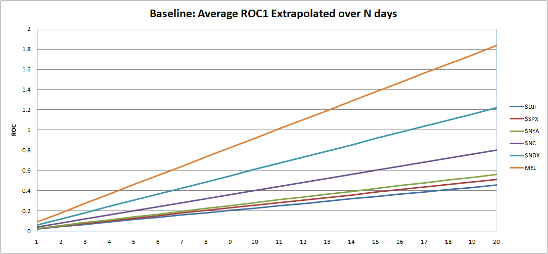
The above graph takes the average ROC1 of each index and adds the ROC1 to itself for each day going forward. I am going to use this graph in two ways.
First, we are going to look for what happens one day after the indicator gives a signal.³ An indicator that can produce ROC1 of .20 will beat the indices by a factor of 8 and will beat the MEL average by a factor of 2. (Imagine an indicator signal that produces a ROC1 of 1%. Now imagine that there are 10 opportunities a day. Theoretically, one could make 10 trades a day, averaging 1% in each trade.) The point is that we want to see the indicator immediately producing a ROC1 that beats the indices and the MEL average. If it does not beat these averages, then perhaps the indicator signal is to be faded.
Secondly, not every indicator is going to produce a high ROC1, right from the start. Perhaps the indicator is signaling that the conditions are ripe for a positive change over time, but not right away. To examine if this is true, I will record the ROC from 1 to 20 days out, and then plot these results next to the indices and MEL average. This may be hard to conceptualize, but once I start plotting the results, it should make more sense.
What’s Next?
I’m going to let this post float around the blogosphere for a few days in hopes that there is some commentary or criticism generated by quant/system trading bloggers. I want to be sure that the foundation of my research is sound before moving forward. If my baseline results are deemed robust, then I will begin testing the MACD, sometime this week.
Footnotes:
¹ I know that some symbols’ histories were randomly selected more than once. It is possible the same stocks were selected three or even more times. It is also likely that some symbols were never randomly selected at all, and therefore their ROC1 are not included in the average. Also, some stocks had histories that may have started in 2000, while others went back much further. Obviously a stock that IPO’ed in 2007 is going to produce an average ROC1 that will be much different from one that IPO’ed in 1990.
Stopping at 20 runs was a somewhat arbitrary decision. I could have run the test 40, 100, or 200 times, and then averaged those averages. I simply did not have the time to do that.
² I do not have delisted data, so survivorship bias is a concern.
³ I will eventually begin discussing ROC as Profits Per Day (PPD), as popularized by BHH at IBDindex. PPD describes what we are looking for, which is how much profits per day are produced by a given indicator over a given period of time.
Comments »


