iBankCoin
Joined Nov 11, 2007
1,458 Blog Posts

Varadi’s Aggregate M Indicator: Get Thee to Cash

It has been a long time since I paid homage to one of the best of the best in this business of making sense (pun intended) out of the market chaos. David Varadi has been been designing the most innovative indicators and providing access to the thinking behind his designs for over a year on his blog CSS Analytics. Do yourself  a favor and make time to digest his thinking and philosophy on his blog (free, but yet priceless) or take the easier (but not quite free) route of just purchasing his indicators. No, I’m not being compensated for my remarks. Sometimes it is just important to take time out to recognize those folks who are very, very talented, yet humble and generous.

In November, 2009, Varadi published his desgin for an indicator he called the Aggregate M. I was impressed with this indicator and have used it ever since its initial publication. I have been watching the performance of the indicator very closely for the past 8 months and am still impressed. I decided that now would be a good time to review its performance as we have finally seen something besides a no-volatility market that goes straight up.

Timing the SPY: Aggregate M and All SPY History

Rules:

Buy the close when Aggregate M crosses above 50 from below.

Sell the long position when Aggregate M cross below 50 from above.

(Current Aggregate M reading on June 14th: 40.28)

Trade Stats:

Equity Curve:

Drawdowns:

So What Has a SPY Buy and Hold Done over the Same Time?

The following stats include .01/share commissions.

SPY Performance over all history: 5.41% with a max drawdown of -56.46%.

Summary:

The performance of the Aggregate M indicator speaks for itself. The indicator has signaled a return to cash on 6/2 and again on 6/11. As the indicator is showing no sign of losing its edge, I find yet another reason to remain cautious with a large cash position.

Comments »

Friday’s Breadth Report

Short-term breadth continues to expand…Long-term breadth is still stagnant.

Summary:

Short term breadth continues to improve. As I stated several posts ago, we must first see an improvement in short-term breadth before we can expect longer-term breadth to improve.

For longer-term breadth, I use the gray histogram in the top pane. This is a measure of stocks in an uptrend. In order to understand how short-term breadth gains lead to longer-term breadth gains, imagine the relationship between the 5 day moving average and an uptrend. Before a stock can be in an uptrend, it must first regain the 5 dma. Once it regains it and trades above it, some oscillation can certainly occur, but as long as it does not spend a significant amount of time beneath the 5 dma, eventually the stock will begin making what most people would consider to be an upward sloping trajectory.

Right now we have 3000+ stocks trading above their 5 dma. This is unsustainable, but good, nonetheless. What we are looking for is that some of these 3000+ stocks firm up and over the next week or so begin making it to the Stocks in an Uptrend count.

We also want to see some marked improvement in 52 Week New Highs and New Lows. As you might imagine, this is a similar measure as Stocks in an Uptrend because if a stock makes a new high for the year, it is hard for it NOT to be in an uptrend.

Over the short-term, I am looking for weakness, perhaps for the next few days. What we want to see is the rally continue after a short pullback. The point is that if the rally doesn’t continue, there will not be any improvement to our longer-term breadth. With a market trading beneath the 200 dma and no longer-term breadth to support an advance, shorting or cash is still the way to go.

The Breadth Report is currently 25% long and 25% short.

How To Read the Breadth Report

Universe Screen: Applies to top three indicators. Does not apply to 52 week new highs and lows.

  • The universe contains any stock trading on average more than 100,000 shares per day with a liquidity of  at least $1,000,000  per day, over the last 50 days.

1. Top most indicator is the measure of stocks in an uptrend (gray histogram) and the number of stocks trading above their 5 day simple moving averages (red line).

  • Buy signal is generated for the open when the SPX is above its 200dsma and the red line crosses beneath 700.
  • Sell signal is generated for the close when the red line crosses above 2500, or the trade is held for 25 days.
  • Short signal is generated for the open when the SPX is trading beneath its 200dsma and the red line crosses above 2500.
  • Cover signal is generated for the close when the red line crosses beneath 700, or the trade is held 25 days.
  • Long trade lasts on average 24 days while short sell lasts on average 10 days.

2. The 2nd indicator is the Advance-Decline line (blue line) with a 50dsma plotted (gray line). My calculation is similar but not the same as Investopedia’s.

  • Buy signal is generated for the next open when the SPX is above its 200dsma and the A-D line crosses beneath the 50 day average.
  • Sell signal is generated for the close when the A-D line crosses back above the 50 day average.
  • The average trade lasts about 15 days.

3. The 3rd indicator is the raw advancers and decliners, with the advancers being the green line and the decliners being the red line. There are also Bollinger Bands (purple) set 1 standard deviation beyond the 20 day average of decliners.

  • Buy signal is generated for the next open after the decliners exceed the upper Bollinger Band.
  • Sell signal is generated for the close when the decliners close beneath the lower Bollinger Band.
  • The average trade lasts 5 days.

4. The bottom indicator is the measure of 52 week new highs new lows (histogram), with a 9dsma (yellow line) plotted over top.

  • Buy signal is generated for the next open after the number of new lows exceeds the number of new highs.
  • Sell signal is generated for the close when the number of new highs surpass the 9dsma.
  • The average trade lasts 3 days.

Comments »

Thursday’s Breadth Report- Sell Short, Report of All Trades

We’ve got a short signal for this morning’s open from the Number of Stocks above the 5 Day Moving Average indicator. The system sold-short the SPY at the open.

A couple of days ago I mentioned that short-term breadth needed to improve before longer-term breadth could improve. This makes intuitive sense. Indeed, that is what we saw on Thursday with the 5DMA indicator (red line, top pane) improving and the 52 Week New High New Low showing similar improvement. The 5DMA indicator is now at a level that usually sees some mean-reversion, thus the short signal.

However, a good measure of longer-term breadth, the Number of Stocks in an Uptrend (top pane, gray histogram) barely budged. This measure must begin to show some strength if these rallys are going last for any length of time. Until we see growth in the number of stocks in an uptrend, it will be hard not to see every rally as a chance to sell.

Caution is still in order with longer-term breadth being weak and SPY trading beneath the 200 day moving average.

Breadth Report Tracker

Below is the spreadsheet containing all trades since the inception of the Breadth Report. Overall, I am pleased with performance thus far. The system gives clear buy and sell signals using only market breadth, and for almost 3 months of in-sample trading, appears to be achieving the results expected from historical backtesting of these indicators.

How To Read the Breadth Report

Universe Screen: Applies to top three indicators. Does not apply to 52 week new highs and lows.

  • The universe contains any stock trading on average more than 100,000 shares per day with a liquidity of  at least $1,000,000  per day, over the last 50 days.

1. Top most indicator is the measure of stocks in an uptrend (gray histogram) and the number of stocks trading above their 5 day simple moving averages (red line).

  • Buy signal is generated for the open when the SPX is above its 200dsma and the red line crosses beneath 700.
  • Sell signal is generated for the close when the red line crosses above 2500, or the trade is held for 25 days.
  • Short signal is generated for the open when the SPX is trading beneath its 200dsma and the red line crosses above 2500.
  • Cover signal is generated for the close when the red line crosses beneath 700, or the trade is held 25 days.
  • Long trade lasts on average 24 days while short sell lasts on average 10 days.

2. The 2nd indicator is the Advance-Decline line (blue line) with a 50dsma plotted (gray line). My calculation is similar but not the same as Investopedia’s.

  • Buy signal is generated for the next open when the SPX is above its 200dsma and the A-D line crosses beneath the 50 day average.
  • Sell signal is generated for the close when the A-D line crosses back above the 50 day average.
  • The average trade lasts about 15 days.

3. The 3rd indicator is the raw advancers and decliners, with the advancers being the green line and the decliners being the red line. There are also Bollinger Bands (purple) set 1 standard deviation beyond the 20 day average of decliners.

  • Buy signal is generated for the next open after the decliners exceed the upper Bollinger Band.
  • Sell signal is generated for the close when the decliners close beneath the lower Bollinger Band.
  • The average trade lasts 5 days.

4. The bottom indicator is the measure of 52 week new highs new lows (histogram), with a 9dsma (yellow line) plotted over top.

  • Buy signal is generated for the next open after the number of new lows exceeds the number of new highs.
  • Sell signal is generated for the close when the number of new highs surpass the 9dsma.
  • The average trade lasts 3 days.

Comments »

How to Adapt to a Volatile Market- Part 2

With current market volatility at levels higher than we’ve seen over the past 12 months, I thought it would be helpful for traders to review a previous post that details a method of position-sizing that allows them to adapt to increased market volatility.

Link to Part 1.

Part 1 established the following:

  1. A stock’s movement is its volatility.
  2. Average True Range (ATR) is a measure of volatility.
  3. ATR can be used to position-size to account for volatility.

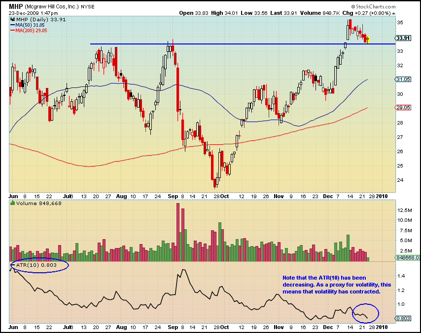
And we examined the chart below and performed some calculations…

Using the ATR(10) indicator in the bottom pane of the chart, we divided the ATR(10) by the close and multiplied that result by 100 to get a percentage.

(.803/$33.91=0.023)*100=2.3%

It is important to for anyone wanting to explore ATR position-sizing to know how to figure out  what 1ATR equals in percentage terms. If 1ATR=2.3%, then 3ATR=6.9%. I’ll jump a couple of steps ahead and say that if a 3ATR stop is applied to MHP, it will be -6.9% beneath its close of  $33.91

We now have most of the information we need to position-size and set a stop using ATR.

Here are the 4 necessary pieces of information to position-size using ATR:

  1. ATR(10) calculation, readily available at Stockcharts. (I prefer a 10 period setting but the default setting is 14).
  2. The ATR multiple, or what number you will use to multiply by the ATR (typically between 1.5 to 5).
  3. The most recent closing price.
  4. How much $$$ to be risked. (We will use 1% of equity as our amount to be risked).

Here is the ATR Position-Size Calculation:

(R/(ATR*M))*C=position-size

Where R=risked amount.
ATR = Average True Range with a period setting.
M= Multiple applied to ATR.
C= Most recent closing price.

Assuming account equity of 100K and 1% risk, our 3ATR position-size calculation for The McGraw-Hill Companies, Inc. [[MHP]] would look like this:

($1,000/(.803*3)) =415 shares

415*$33.91 = $14072.65 position-size

The easy part is that the stop is already calculated- it is simply the ATR multiplied by the multiple (we used 3). So the stop is .803*3 = $2.409

Lets look at another example:

Above is [[TPI]] , which was the The Power Dip System pick on Wednesday evening. Yes, it is another gorgeous pullback, the kind that the The Power Dip System finds daily.

Let’s run through the calculations, using the same parameters, with a 3 multiple for the ATR.

$1000/(.322*3)=1035 shares (We would complete this calculation the night before, and put in the order for that number of shares. Remember that $1,000 is 1% of our equity and the amount we are risking.)

1035*$4.27 = $4419.45 position-size (On Thursday morning, TPI opened at $4.27).

Stop = .966 beneath the entry of $4.27

Let’s Make Sense of It All

Carefully note the following:

Both MHP and TPI used an ATR multiple of 3 to position-size, yet this yielded two completely different sized positions.

For example, the MHP position is over 3x larger than the TPI position, yet the TPI stop is 3x wider than the MHP stop.

MHP position = $14,072 with a -6.9% stop.
TPI position = 4419.45 with a -22.6% stop.

What does it all mean?

The simplest way to understand it is that TPI is more volatile than MHP. Thus, we take a smaller position in TPI and use a wider stop.

Since MHP is less volatile, we might expect it to move 2% in our favor, while we might look for the more volatile TPI to move 6%. (In fact, MHP was closed on 12/24 for a 1.45% gain.)

MHP = 14,072*2% = $281.44 profit.

TPI = 4419.45*6% = $265.17 profit.

Even though the TPI position is smaller, we know that it can earn similar profits to the larger-sized position in MHP.

It is always fun to think about profits, but it is equally important to consider losses. If we took an equal-sized position in TPI as we did in MHP, how would it feel to have TPI move 7-14% against us? It would hurt, yet we should expect that TPI could move that quickly as its average daily range has been over 7%.

Theoretically, building positions that account for volatility help ensure that each position will add the same amount of “heat” to the portfolio. In other words, if you have loaded up with 5 volatile penny stocks, volatility position-sizing will have you buying 5 small positions, leaving a significant amount of cash. Conversely, if you want to fill your portfolio with blue chip stocks (which are typically not relatively volatile), then volatility position-sizing will have you buying a few large positions, and will probably use most of your cash. To see this balance in action, you could buy 7 positions in stocks similar to MHP, using all of your 100K. If you bought 7 positions in stocks similar to TPI, you would have used only 30% of your cash.

Finally, the ATR multiple, be it 1.5, 3, or 5, determines how aggressive your allocations are. A lower ATR multiple will result in larger positions with smaller stops.

Questions and Comments?

If you have any questions or anything I have presented is unclear, please speak up in the comments section.

The The Power Dip System site includes a 2% risk, 3ATR model that earned 64.64% annualized, with an average trade profit of 1.65%.

Comments »

How to Adapt to a Volatile Market- Part 1

With current market volatility at levels higher than we’ve seen over the past 12 months, I thought it would be helpful for traders to review a previous post that details a method of position-sizing that allows them to adapt to increased market volatility.

Customary position-sizing has the trader buy X number of shares and set a stop to so that he does not lose more than X dollars. One drawback of this method is that it does not account for the volatility of the security being traded. Volatility is a measurement of change in price over a given period. It is usually expressed as a percentage and computed as the annualized standard deviation of the percentage change in daily price. The more volatile a stock or market, the more money an investor can gain (or lose!) in a short time.

Consider then that our positions can be built to account for the volatility of each security we are trading. For example, if we have two stocks, both priced at $25, and ABC moves on average 1% per day and XYZ moves 3% per day, do we want to take equally sized positions in both stocks? Do we want to use the same stop level for both stocks? If the answer is not immediately clear, think about this: If we use a $1 stop loss for both stocks, XYZ stock is much more likely to hit the stop, yet this movement may be entirely within a normal range (remember, it moves an average of 3% a day).

We can account for this volatility and position-size accordingly.

The easiest way to do this is to use the Average True Range. ATR is popular as it is readily available in most free charting programs, such as Stockcharts. “The Average True Range (ATR) indicator measures a security’s volatility. As such, the indicator does not provide an indication of price direction or duration, simply the degree of price movement or volatility.”

There is no absolute need to understand exactly how the ATR indicator makes its calculation, as long as there is a basic understanding of what it is calculating. In simplified terms, it is calculating the average daily movement of a security. This is just what we need to position-size for volatility.

Lets take a look at a chart with a plot of ATR(10), where 10 is a user-definable setting. 14 is standard, but I prefer 10.

mhp

Above we have a chart of The McGraw-Hill Companies, Inc. [[MHP]] , which just happened to be one of today’s PDS picks. (Yes, it is a sweet pullback setup. The PDS will find these daily.) In the bottom of the chart, ATR(10) is plotted. We can see that ATR has been steadily decreasing since September. Remember that this means that volatility, or how much the stock moves on average, has been decreasing.

We can complete a quick calculation and get an idea, in percentage terms, of the average daily movement of [[MHP]]. All we need to do is divide  ATR(10) by the price.

.803/$33.91=0.023=2.3%

On average over the last 10 periods, MHP has traded in a daily range of 2.3%. Obviously, using a 2% stop would be foolhardy with this stock.

I’ll quit here to allow digestion of the principles of building positions around volatility using the ATR indicator.

The next post will detail exactly how to use ATR to calculate your stops and build positions that are sized according to the volatility of the stock.

Access to ATR position-sizing and stop models are included in both the trial and full PDS memberships. Plus, PDS automatically calculates the 10 period ATR as a percentage for every stock that is selected for purchase so that users can easily implements the ATR position-sizing model.

Comments »

Tuesday’s Breadth Report

Breadth came off its worst levels, expanding slightly.

A longer term look at how our current breadth environment compares to the past.

As expected, we got a bounce and breadth came off of its worst levels of the year. However, looking at the longer-term chart above, we can see that if breadth does not soon start to improve, it will likely mean that this correction is indeed the start of a new and likely sustained move downward.

At the very least, the red line showing the number of stocks trading above their 5 day simple moving averages needs to start moving back up. This can happen very quickly. In turn, this will pull up the 52 Week New Highs and reduce the number of 52 Week New Lows. Should these measures not show improvement, or at the very least, stabilization, we could be in for another lengthy swoon.

In terms of trading individual stocks, there is nothing about the Breadth Report to suggest that strength and bounces should not be sold into. There is not any breadth strength to support bounces in stocks. It is best to continue to stay in cash or pick select shorts at this point in time.

Overall, breadth remains extended in an area that has in the past led to stabilization. But it doesn’t always stabilize, as we saw at the end of 2008.

How To Read the Breadth Report

Universe Screen: Applies to top three indicators. Does not apply to 52 week new highs and lows.

  • The universe contains any stock trading on average more than 100,000 shares per day with a liquidity of  at least $1,000,000  per day, over the last 50 days.

1. Top most indicator is the measure of stocks in an uptrend (gray histogram) and the number of stocks trading above their 5 day simple moving averages (red line).

  • Buy signal is generated for the open when the SPX is above its 200dsma and the red line crosses beneath 700.
  • Sell signal is generated for the close when the red line crosses above 2500, or the trade is held for 25 days.
  • Short signal is generated for the open when the SPX is trading beneath its 200dsma and the red line crosses above 2500.
  • Cover signal is generated for the close when the red line crosses beneath 700, or the trade is held 25 days.
  • Long trade lasts on average 24 days while short sell lasts on average 10 days.

2. The 2nd indicator is the Advance-Decline line (blue line) with a 50dsma plotted (gray line). My calculation is similar but not the same as Investopedia’s.

  • Buy signal is generated for the next open when the SPX is above its 200dsma and the A-D line crosses beneath the 50 day average.
  • Sell signal is generated for the close when the A-D line crosses back above the 50 day average.
  • The average trade lasts about 15 days.

3. The 3rd indicator is the raw advancers and decliners, with the advancers being the green line and the decliners being the red line. There are also Bollinger Bands (purple) set 1 standard deviation beyond the 20 day average of decliners.

  • Buy signal is generated for the next open after the decliners exceed the upper Bollinger Band.
  • Sell signal is generated for the close when the decliners close beneath the lower Bollinger Band.
  • The average trade lasts 5 days.

4. The bottom indicator is the measure of 52 week new highs new lows (histogram), with a 9dsma (yellow line) plotted over top.

  • Buy signal is generated for the next open after the number of new lows exceeds the number of new highs.
  • Sell signal is generated for the close when the number of new highs surpass the 9dsma.
  • The average trade lasts 3 days.

Comments »

Monday’s Breadth Report

As expected, breadth contracted to near the lowest levels of the year, matching price.

Note that the number of new lows is at a new low for the year.

However, the other indicators are at levels that typically indicate some stabilization or a bounce. Be careful here if you are heavy short. It would be pretty hard for breadth to get much worse today than it was yesterday. Therefore, I am expecting some stabilization.

The system is currently long 25% from the Advance Decline Line, 25% from the Raw Advancers and Decliners (opened yesterday morning), and 25% from the 52 Week New High New Low indicator.

How To Read the Breadth Report

Universe Screen: Applies to top three indicators. Does not apply to 52 week new highs and lows.

  • The universe contains any stock trading on average more than 100,000 shares per day with a liquidity of  at least $1,000,000  per day, over the last 50 days.

1. Top most indicator is the measure of stocks in an uptrend (gray histogram) and the number of stocks trading above their 5 day simple moving averages (red line).

  • Buy signal is generated for the open when the SPX is above its 200dsma and the red line crosses beneath 700.
  • Sell signal is generated for the close when the red line crosses above 2500, or the trade is held for 25 days.
  • Short signal is generated for the open when the SPX is trading beneath its 200dsma and the red line crosses above 2500.
  • Cover signal is generated for the close when the red line crosses beneath 700, or the trade is held 25 days.
  • Long trade lasts on average 24 days while short sell lasts on average 10 days.

2. The 2nd indicator is the Advance-Decline line (blue line) with a 50dsma plotted (gray line). My calculation is similar but not the same as Investopedia’s.

  • Buy signal is generated for the next open when the SPX is above its 200dsma and the A-D line crosses beneath the 50 day average.
  • Sell signal is generated for the close when the A-D line crosses back above the 50 day average.
  • The average trade lasts about 15 days.

3. The 3rd indicator is the raw advancers and decliners, with the advancers being the green line and the decliners being the red line. There are also Bollinger Bands (purple) set 1 standard deviation beyond the 20 day average of decliners.

  • Buy signal is generated for the next open after the decliners exceed the upper Bollinger Band.
  • Sell signal is generated for the close when the decliners close beneath the lower Bollinger Band.
  • The average trade lasts 5 days.

4. The bottom indicator is the measure of 52 week new highs new lows (histogram), with a 9dsma (yellow line) plotted over top.

  • Buy signal is generated for the next open after the number of new lows exceeds the number of new highs.
  • Sell signal is generated for the close when the number of new highs surpass the 9dsma.
  • The average trade lasts 3 days.

Comments »