iBankCoin
Joined Nov 11, 2007
1,458 Blog Posts

Dow Repeats Great Depression Pattern? Maybe?

I was reading this CNBC article featuring this quote:

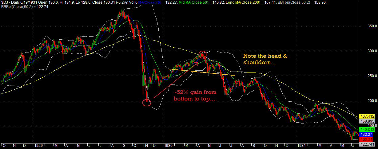
The Dow Jones Industrial Average is repeating a pattern that appeared just before markets fell during the Great Depression, Daryl Guppy, CEO at Guppytraders.com, told CNBC Monday.

“Those who don’t remember history are doomed to repeat it…there was a head and shoulders pattern that developed before the Depression in 1929, then with the recovery in 1930 we had another head and shoulders pattern that preceded a fall in the market, and in the current Dow situation we see an exact repeat of that environment,” Guppy said.

I guess, maybe, this is wisdom, if a loosely quantifiable technical pattern can define a market “environment.” To call it “an exact repeat,” we would need to see the evidence. Let’s take a look. Note that the CNBC article did not include any charts.

Click on the charts to enlarge…

Dow Jones Industrial Average 1929-1931

Dow Jones Industrial Average 2008-2010

Okay, sure, we have a head and shoulders pattern in both charts. Honestly, I see numerous H&S patterns in both charts. But to call this “an exact repeat” is quite a stretch. That doesn’t mean we won’t see a brutal market swoon, a la 1930, over the next several months. There are certainly similarities, but there are also clear differences.

The take-away from this is to be careful when dealing in absolutes (an exact repeat?) and technical chart patterns. Unless the patterns are quantified, there simply are no legitimate absolutes.

Comments »

What you NEED to Know about The Death Cross

Of course your best resource to understanding what the Death Cross may or may not mean will be my post made almost 1 year ago to the day (the first link, naturally), but I have also included some other helpful articles on the Death Cross. Beware the financial pundits who are long on Death Cross market lore but short on statistics.

The Death Cross- Statistics and Stuff

Everyone’s Watching for the Upcoming S&P Death Cross

MarketBeat Q&A: Debunking the Death Cross

A History of the Stock Market’s Death Cross

The Dead Cross

Comments »

Recent Power Dip System Wins

Yes, the market has been in the crapper over the last week, but the Power Dip System has still been racking up wins.

Here is a look at some recent winning trades.

The green up arrow shows the day that the trade was initiated, on the open. The red down arrow shows the day the trade was closed, on the close. All subscribers were alerted to the buy signals the night before and were also given an exit threshold, meaning if the stock was going to close higher than the threshold, then it should be sold at the close, or the next open. Subscribers also receive an email alert at 3:30 which identifies any open positions that are trading above their exit thresholds. Profits shown on the charts do not include commissions or slippage.

The Power Dip System trial is free, and requires only a valid email address.

Comments »

Still Vacationing- Back Soon

The wife and I have been enjoying some much-needed time sans kiddos, meandering around the great state of Virginia.

Soon, I will be back to blogging every day. Expect to see some of the recent wins from the Power Dip System as well as updates to the Market Dissector indicators.

I have to say that trading the Power Dip while on vacation has been a breeze. All you need is a wi-fi connection. Log in to the Power Dip site or check your email for buy/sell updates, place your orders, and go back to vacationing. The next evening, do the same. It is that easy. And believe me, the wife will be much happier with you not on the computer all the time when you are supposed to be paying attention to her!

Comments »

Backtest Report: Stocks Above 5 Day Moving Avg. Indicator

This indicator is very simple. To calculate it, all one needs to do is decide which stocks to include in the universe, and then count the number of stocks trading above the 5 day moving average (5DMA). To be included in my universe, a stock must have a 50 day average volume greater than 100,000 shares and these shares should have averaged greater than $1,000,000 in liquidity.

The rules I have established for this indicator take advantage of mean reversion, meaning it will buy weakness and short strength.

Rules:

  • Buy signal is generated for the open when the SPX is above its 200dsma and the 5DMA indicator crosses  beneath 700.
  • Sell signal is generated for the open when 5DMA indicator crosses above 2500, or the trade is held for 25 days.
  • Short signal is generated for the open when the SPX is trading beneath its 200dsma and the 5DMA indicator crosses above 2500.
  • Cover signal is generated for the open when the 5DMA indicator crosses beneath 700, or the trade is held 25 days.

To be clear, when there are many stocks trading higher than their 5 day moving average, more than 2500, this indicator will be selling. If there are fewer than 700 trading higher than their 5 day moving averages, then the indicator wants to be buying.

Note that all signals are to be acted on at the next open. The indicator does even better closing trades at the close, but this is unrealistic for me and for many other traders. Therefore, I have chosen to sacrifice performance instead of creating something that can’t be re-created in real life.

Results:

All results include .01/share for commissions. The indicator was applied to a variety of ETFs, using all history available for the ETFs.

Note that there are foreign ETFs tested, and that for all of these ETFs, the indicator is using the S&P500’s 200 day moving average. The difference in performance across the ETFs seems to be primarily due to the varying volatility of each ETF, but the short signal does not seem to work as well on the foreign ETFs. This is likely due to the fact that the indicator is using the SPX’s 200 day moving average for short signals. Performance may be improved by using the 200 day average for the ETF being traded rather than that of SPX.

A Look At the Indicator in Action:

As applied to IWM. The red line is the count of stock above the 5DMA. Note that the indicator would be holding an open short position.

Equity Curve for 5DMA Indicator Applied to IWM:

Summary:

In the markets, complexity is not always necessary. This simple indicator, when combined with simple buy/sell rules and basic risk management (25 day time stop) has beat the markets.

You can track the buy/sell signals for this indicator under the posts titled “Market Dissector.”

Comments »

Tuesday’s Breadth Report

Short-term breadth expanded with price while longer-term breadth showed signs of life.

Summary:

My previous statements regarding the need for a quick pullback to take some of the pressure off of short-term breadth and then a resume of the uptrend to build up longer-term breadth was certainly prescient.

“Over the short-term, I am looking for weakness, perhaps for the next few days. What we want to see is the rally continue after a short pullback. The point is that if the rally doesn’t continue, there will not be any improvement to our longer-term breadth.”

The only problem I can see is that there is still not much strength in the longer-term breadth measures. The 52 Week New Highs and New Lows has perked up nicely, and we want to see that measure continue to show more new highs than new lows.

Overall, the market looks vulnerable to a pullback here with short-term breadth extended significantly. This pullback may take the SPY back beneath the 200 day moving average. Again, any pullback will need to be shallow and quick or longer-term breadth will stagnate or deteriorate.

I am hoping to begin swing trading some long positions on this next pullback. The environment is not near optimum for swing trading long positions, but it has improved a great deal from a month ago.

Caution is still in order- meaning smaller position sizes with cash still making up a good percentage of the account is how I will play it. If the market can continue building on its recent strength, then there will be some long exposure. If it can’t, then exposure is minimal.

A final note: The system is close to closing its first Advance Decline Line long trade. For this to happen, the blue line needs to close above the gray line.

We remain hedged 25% long and 25% short the SPY.

How To Read the Breadth Report

Universe Screen: Applies to top three indicators. Does not apply to 52 week new highs and lows.

  • The universe contains any stock trading on average more than 100,000 shares per day with a liquidity of  at least $1,000,000  per day, over the last 50 days.

1. Top most indicator is the measure of stocks in an uptrend (gray histogram) and the number of stocks trading above their 5 day simple moving averages (red line).

  • Buy signal is generated for the open when the SPX is above its 200dsma and the red line crosses beneath 700.
  • Sell signal is generated for the close when the red line crosses above 2500, or the trade is held for 25 days.
  • Short signal is generated for the open when the SPX is trading beneath its 200dsma and the red line crosses above 2500.
  • Cover signal is generated for the close when the red line crosses beneath 700, or the trade is held 25 days.
  • Long trade lasts on average 24 days while short sell lasts on average 10 days.

2. The 2nd indicator is the Advance-Decline line (blue line) with a 50dsma plotted (gray line). My calculation is similar but not the same as Investopedia’s.

  • Buy signal is generated for the next open when the SPX is above its 200dsma and the A-D line crosses beneath the 50 day average.
  • Sell signal is generated for the close when the A-D line crosses back above the 50 day average.
  • The average trade lasts about 15 days.

3. The 3rd indicator is the raw advancers and decliners, with the advancers being the green line and the decliners being the red line. There are also Bollinger Bands (purple) set 1 standard deviation beyond the 20 day average of decliners.

  • Buy signal is generated for the next open after the decliners exceed the upper Bollinger Band.
  • Sell signal is generated for the close when the decliners close beneath the lower Bollinger Band.
  • The average trade lasts 5 days.

4. The bottom indicator is the measure of 52 week new highs new lows (histogram), with a 9dsma (yellow line) plotted over top.

  • Buy signal is generated for the next open after the number of new lows exceeds the number of new highs.
  • Sell signal is generated for the close when the number of new highs surpass the 9dsma.
  • The average trade lasts 3 days.

Comments »