Lots of chatter about how great this earnings season is going so far. I am skeptical, of course, but willing to let a sell-sider do the tabbing work for me. I figure the sell-siders reporting this stuff can’t really fudge the numbers this time around. It’s in the news and recorded in the cloud for all to see, for heaven’s sake. So I gander at the first one I come across.
Turns out it is this thing from JPM dated June 27 and is authored by a team led by Mislav Matejka, some dude with a +44 country code. It has a cute little section on the earnings season so far that starts “Earnings season might not need to disappoint.” I am already put off. Fucking man-up and say whether this season will or will not disapoint. I am the one who is supposed to be wishy-washy, not some mamby-pamby metrosexual greaseball author/analyst in London who may or may not have female aspirations. I am already leaning the wrong way on this note and I haven’t read a word of the only thing that interests me.
Before going further, does anyone know the reason some of these notes have “Cazenove” slapped across the top of the note next to “J.P. Morgan” like it is something special? I sure did not. Shame on me. Turns out JPM bought this company in 2000 that supposedly has a royal pedigree. I am not here to argue whether or not the pedigree is warranted, just throwing it out there that “Cazenove” is supposed to mean something special. It appears this Mister Mislav is supposed to be something special, too. Again, just throwing this out there.
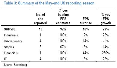
I get to Table #3…
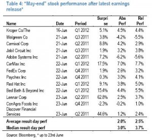
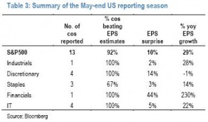 Huh, pretty sure more than 13 have reported so far. The text with the chart says “Out of the 13 companies that have reported, 12 have beaten estimates, by an aggregate of 10%.” I know MU is smack in the middle there and am wondering how this +10% is possible. I think I will make a list to check this out. And then along comes Table #4…
 OK, so he says 13 because he is tabbing through June 23 and, given the presence of LEN, CAG and DFS, including June 23. Let’s look at my list. I count 18 reports through June 23, INCLUDING MU. Wait! It says “May-end,” maybe that’s the reason. Nope, KR’s quarter ended Apr 30. Enough of this shit. I am doing this myself.
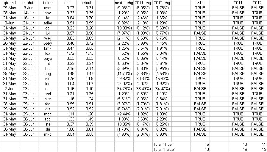
We will tab all SP500 companies that have reported during the month of June. We will note when a company beats EPS estimates for the current quarter based on the data coming from this Marketwatch/Briefing.com website. We will also note how much next quarter, 2011 and 2012 EPS estimates change. This is another reason to use only reporters in the month of June. I want to capture changes since the earnings call – if someone reported in May and we look at “mean % chg past 30days”, we may not capture the right data.
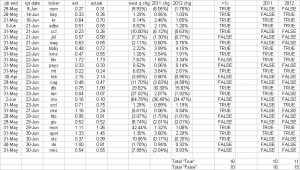
So here we go. It took me all of an hour to put this together and I don’t even get paid to do this. There is a good chance I missed one or two as I thumbed through the earnings calendar on Marketwatch.com, which looked a lot like Briefing.com but whatever. Google works. I come to 26 reports in June.
Because if the market is a discounting mechanism, I could give a rat’s ass if a company beats estimates that may or may not have been adjusted at the end of the quarter and ~30days before the report; a real surprise is one that makes an analyst change his forward estimates. Given how piss-poor analysts have been about revising estimates lately, we can probably give them a mulligan this season and say “Hey Jackass, you really were surprised by last quarter’s results,” but we have already gone over that one previously.
Yeah, I am a little fired up. This is already feeling like the beginning of last summer when BAML came out and increased his 2011 SP500 target by creating a nightmare version of an SP500 non-GAAP EPS estimate – right before the market fell off a cliff (this note was precious – among other things, check out what was tucked neatly at the end of the note’s text on Pg14). I am beginning to feel like this task of “tabbing results so far” was passed around the table and the US-based analysts, with black eyes and arms in slings, said “No way man, I ain’t doing that. I am getting beaten up enough as it is.” It makes it to Mislav’s seat which was occupied by his associate who, fresh off a bender, said “Sure, Ma-aaan, we’ll do it.” Really, it’s the only way to explain such shoddy work.
Finally, let’s define a “beat.” Using the traditional definition of the reported quarter, I propose a beat is better than Consensus by >1c. We have a column for that. Then we have columns for how much next quarter, 2011, and 2012 EPS estimates were revised, and then another set of columns to identify when 2011 or 2012 EPS was revised higher by >1%.
Agreed, on the traditional definition of an EPS “beat,” reports so far are better than expected 16:10. However, when we change the definition of “beat” to refer to a >1% change in 2011 EPS, suddenly we are worse than expected by 16:10. If our euphoria is based on the expectation 2011 SP500 EPS goes higher after this earnings season, we are off to a bad start.
Back to our boy Mislav. He says 12 of his 13 beat estimates by an aggregate of +10%. I come up with 16 of 26 beating for an aggregate of +5.9%. I am sure if we excluded the losers we could get a much better number. Meanwhile, the average 2011 EPS revision is (0.02%). Looks like a wash to me, not something to crow about. Finally, he pops off with the phrase “These stocks that delivered positive EPS surprises were rewarded by the market.” Does that mean if you missed by the traditional measure that you should not be rewarded by the market? Does that mean FDO should not have been rewarded with a 4.3% gain since it missed on all metrics outlined above?
OK, now I am ready for the metrosexual argument that this is all priced in. Bring it on.

