iBankCoin
Joined Nov 11, 2007
1,458 Blog Posts

Breadth Indicators Suggesting a Bounce is Near

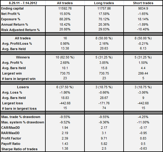
These short-term breadth indicators are at levels which typically signify that a bounce is near.

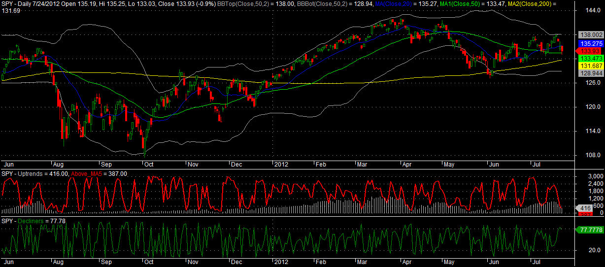
The red line is the number of major exchange listed stocks trading above their 5 day moving averages. Levels below 600 are good for a bounce that may last several days.

The green line is the number of declining issues ranked against the previous days of declining issues over the last year. Long story short, anything over 80 is good for a quick one or two day bounce (or sometimes just a stabilization). It is not quite at 80, but it is close enough to give it due consideration.

While we’re at it, let’s take a look at the percentage of stocks trading above their 20, 50, and 200 day moving averages.

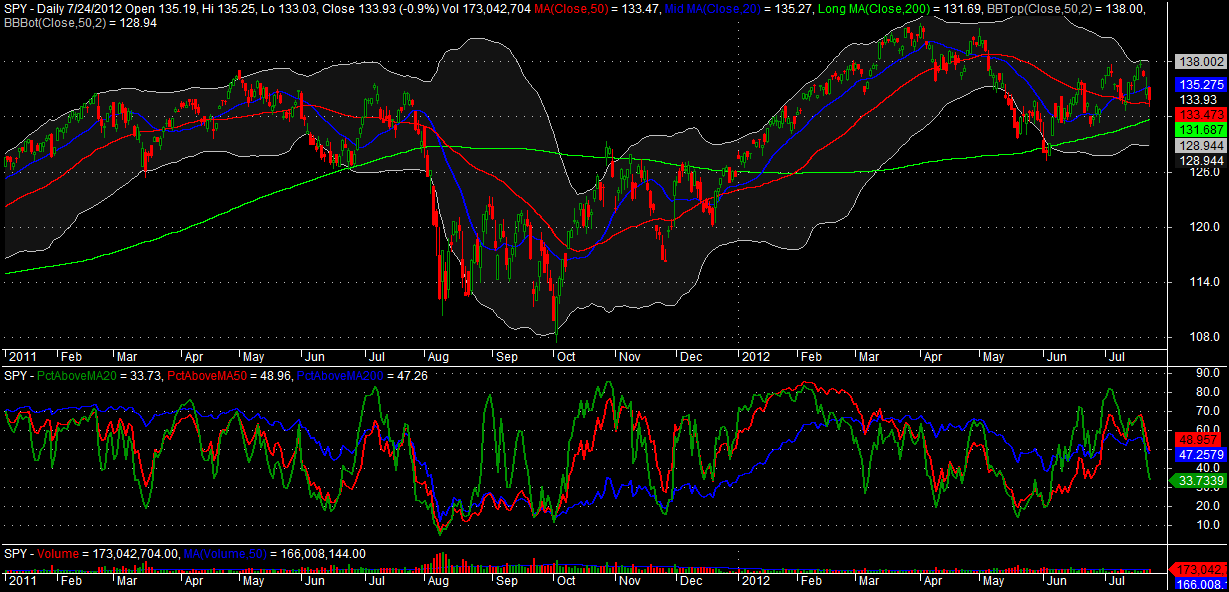
I’m giving the most weight to the green line, which is the percentage of stocks above their 20 day moving averages. It is getting close to a level which may lead to a bounce that can be sustained for a week or more. As a this recent post demonstrated, when the green line dips under 20, sustained bounces often occur.

My best guess is that a quick 1-3 day bounce will occur within a day or two. Beyond the very near-term, I don’t have enough evidence to make a call with any conviction.

Comments »

High Tight Flags for Monday

Friday’s downdraft reduced the HTFs for Monday, although these three are tight.

Funny stuff, STEM. If you haven’t traded stem a time or two over the last decade, you haven’t been trading. Seems like that stock finds a success story to ride on every several years.

CLSN has been a popular HTF recently.

Good trading this week!

Comments »

A Look Back at My May 20th Bottom Call

On May 20th, I published the following piece: Bottom Signal: Percentage of Stocks Above 20 and 50 Day Averages At Historic Lows. As the stats suggested it would be, the May 18th SPY close of $129.74 was within a percentage point from the actual bottom of $128.10, which occurred 10 days later on June 4th. The spread between the bottom call and the actual bottom was even closer on QQQ. I finished that post with this thought: “It is possible that we have not yet had enough capitulation for a bottom, but this study shows that we are likely very near to one.”

I find it helpful to continually review these indicators. In doing so, I’m wondering if the most important data point is the percentage of stocks above their 20 day averages. Thus, we would ignore the percentage of stocks above the 50 and 200 day averages.

Let’s look at the graph with the indicators in the bottom pane.

As we would expect, the PctAboveMA20, the green line, moves the fastest. It is probably the best indicator of this group to use for calling short-term swings. However, I was curious at how well it called bottoms when looking out at an intermediate term of 50 days.

Below are the results of those tests.

When the PctAboveMA20 < 15, the average trade for both SPY and QQQ is near 2% by the 3rd day. Those are pretty decent results over the short-term. Looking out over the full 50 days, the PctAboveMA20 bottom call appears to work well with an intermediate time frame. An average trade of 5-6% using QQQ is not too shabby.

It seems that we may be able to ignore the percentage of stocks above their 50 and 200 day averages, but before I write them off completely I want to run more tests. More on this in the future.

Comments »

High Tight Flags for Thursday

Sunday night’s High Tight Flag post generated a fair amount of interest. Most of the questions went like this: Is this going to go up tomorrow?” And my answer was as always, “I have no idea.” So let me clear that up. The way that HTFs are usually traded is to buy them when they breakout to new highs, not when they pullback. Because I love to buy pullbacks, I can appreciate the questions about what the HTF will do the next day. The point is, it doesn’t really matter because the easiest way to trade them is to set an alert to trigger when they breakout to a new high.

For more reading on the HTF, check out Bulkowski’s site.

Comments »

ROC Indicator – Statistics Dump, Backtested and Real-time Results

The ROC indicator has been doing well of late, which has of course generated some reader interest. I’ve ran various backtests of the indicator and will dump the statistics into this post.

Michael Stokes of MarketSci wrote a helpful piece about this indicator: Woodshedder’s Long-Term Indicator.

Brief Overview:

ROC means rate-of-change.

The ROC indicator works by going long when the ROC252 (252 day ROC)  has been above the ROC5 (5 day ROC) for one day and will again close above the ROC5 and going short when the ROC5 has been above the ROC252 for one day and will again close above the ROC252.

All trades are made at the close and the account is assumed to have started with $10,000.

From 1.1.1994 – 7.14.2012

Equity Curve and Drawdowns:

Okay, so the indicator has done well in backtesting. How about in real-time?

I first wrote about this indicator on August 28th, 2011.  Let’s see how it has performed in out-of-sample, real-time performance since that date.

From 8.29.2011 – 7.14.2012

Equity Curve and Drawdowns:

Real-time results show a net gain of 15.93%, which is annualized at 18.42%. Note that the short side has resulted in a negative average trade.

While the indicator is designed to catch long-term trends (note in the stats that a few LARGE winners provide the bulk of the gains), the indicator has been handling the whipsaws of the past year quite well.

A SPY buy-n-hold since 8.29.11 has yield a net profit of 11.86% and a max drawdown of -10.01%. The ROC indicator, in out-of-sample performance has yielded almost 4% more than buy-n-hold with a slightly lower maximum drawdown.

If we make the system long-only, real-time performance is even better.

Some of you have asked how the indicator works with individual stocks. I’ll look at that next. I will be happy to entertain any other questions in the comments section.


Comments »