I have written extensively about the utility of Logarithmic Scaled charts for monthly timeframes of issues which have appreciated considerably over a period of quarters and years. And Netflix certainly fits that description. Using the Log Scale, for example, would have helped with perspective to avoid getting swept up in the stock’s swoon for much of 2011 and 2012.
At issue now is whether the newfound Netflix bulls have something to cheer about more than the recent violent short squeeze.
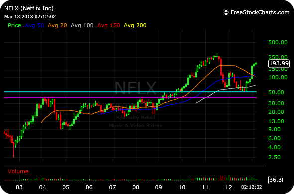
Looking at the updated Log Scaled monthly chart below, we can see a sharp bounce off first major support around the $50 area (light blue line), which you can see marked resistance for much of 2009. The stock avoided a test of major support down at $40 (purple line).
And that lack of a full dive into major support would have to be viewed as a bullish development.
For more on Log Charts, see this post.
________________________________


Hey Chess – thanks for pointing this out. Looking at a similar chart for $AAPL (logarithmic and monthly) looks like the down move has been mild and there isn’t support until $200. Just curious how you would interpret it. Thanks!