
Congrats to possibly the best looking all-around gymnastics gold medalist ever, no matter the country.
Definitely the best name ever. KGB Dad, what were you thinking?
Comments »
Congrats to possibly the best looking all-around gymnastics gold medalist ever, no matter the country.
Definitely the best name ever. KGB Dad, what were you thinking?
Comments »
I’m going to post bullshit for a while in protest of my serious posts being absconded with.
First on the agenda, a shoutout to my home boyz in da 502. Just squeeze your eyes real tight and think “Biggie and Eminem together for the first time!”
Or whatever.
Enjoy.
[youtube:http://www.youtube.com/watch?v=q7E-sCVwIW0 450 300]Comments »
Confound it, I hates when the markets start acting against my “assured biases.” But I’m afraid that in the case of tech, specifically with regard to the Cubes [[qqqq]] and the Composite [[Compq]] , we are looking to head significantly higher ovah heah, if these levels can hold.
Let’s look at the Cubes first, which are my favorite proxy for the tech market. Here’s the long term weekly look with the fibs thrown in:
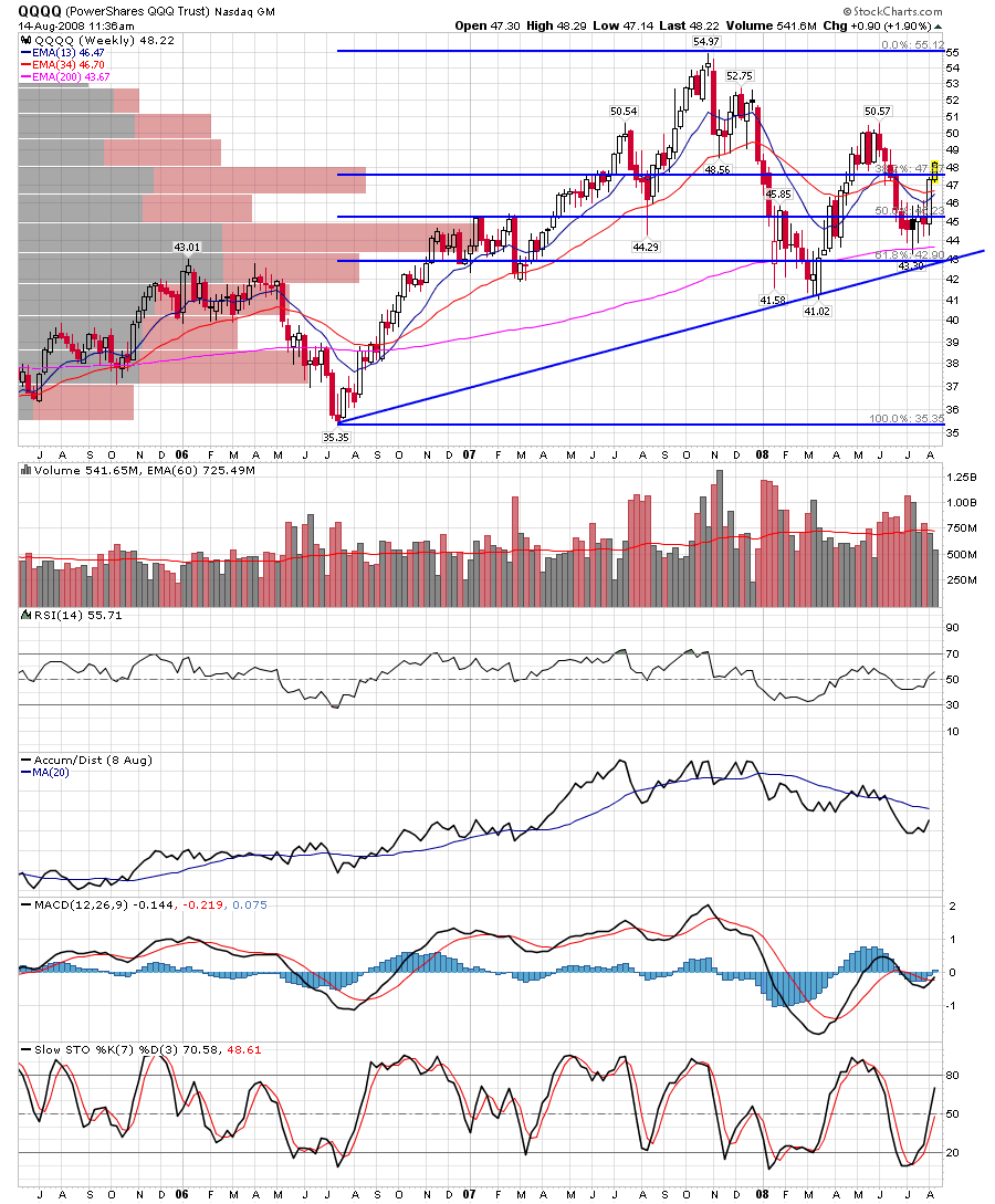
See how even after significant selling volume (red bars below the chart), the Cubes didn’t put in a “lower low” or even revisit the March lows? That’s bullish. Note also the approaching 13-34 week EMA crossover… again bullish on a weekly chart. Last, the long term fib’s 38.2% retracement line looks conquered here. If it can stay that way, the next test is the higher high (over $50) and then the true highs up at $55. This all looks like good news for the tech bulls, even to my bearish old self.
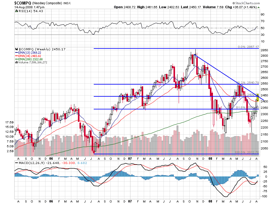
Now look at the Nasdaq Composite weekly chart:
Again, note the similarity and differences to the Cubes. One difference is the Composite came quite a bit closer to revisiting the March lows this last July, before rebounding with the rest of the market. Significant as well, is that is just edging now above the downtrend line that’s been in place since early November of 2007. We’ll need to get above that with some significance here- let’s say 2500 if we want this tech bullishness to really take root. We are already a good distance above the 50% fib retrace at 2039, and that’s a good sign for “da bulls.”
Also, all the bell and whistle indicators (volume, RSI, MACD and slow stochs) are showing more strength to come here, and the weekly just found some support at the uptrending 34 week ema (which remains above the 13 week EMA — a cross of those to the upside would be even more bullish, imho). As usual, I believe the trendline and the 38% fib retrace remain our most important barriers, so keep an eye on 2450 and the 38% fib line at 2541 or so.
My best guess is we will go right to the 38% fib and fail there. We are still in a bear market, remember, but 90 points of Comp strength is better than a sharp stick in the eye, ovah heah.
Ciao.
Comments »

Kind of an interesting chart, no? Bloody Feds… wonder how much oil is in these western puddles, hmmmmmm?
Comments »
Besides my precious metal core holdings (which, like my guns, you will pry only from my cold dead hands) , this bullshit dollar run up also beats down those formerly appetizing “Emerging Market” darlings. [[EEV]] is a nice way to get yourself a piece of that deteriorating action.
I’ve owned this one in size since mid-June, thanks to a heads-up from Le Fly, who I think liked it as a fade on some of these momo Brasilian names like Pabst Blue Ribbon (Petroleo Brasileiro SA (ADR) [[PBR]] ). Guess what? EEV works great as a dollar bull hedge as well. That’s what’s nice about a bear market, as with it’s opposite the bull in “bull times” — there’s always something getting shat upon. In this case, you may want to make a brief visit to EEV in order to hedge yourself on this commodity-dollar smacking. Just be ready to move out when the inevitable happens and the dollar begins to “take the piss” once again, as our English friends might say.
Bonus — we’re above the two year 38% Fibonacci line as of today. Click on the chart for further viewing:
Comments »
Here are some weekly charts I’ve been looking at. I find the weekly chart can sometimes clear away the trend clutter, even as it may not be as helpful from a day to day perspective. A “rudder” if you will, for your long term portfolio direction.
First our friend SKiFfles [[SKF]] ). (Remember, click on the charts to expand them)
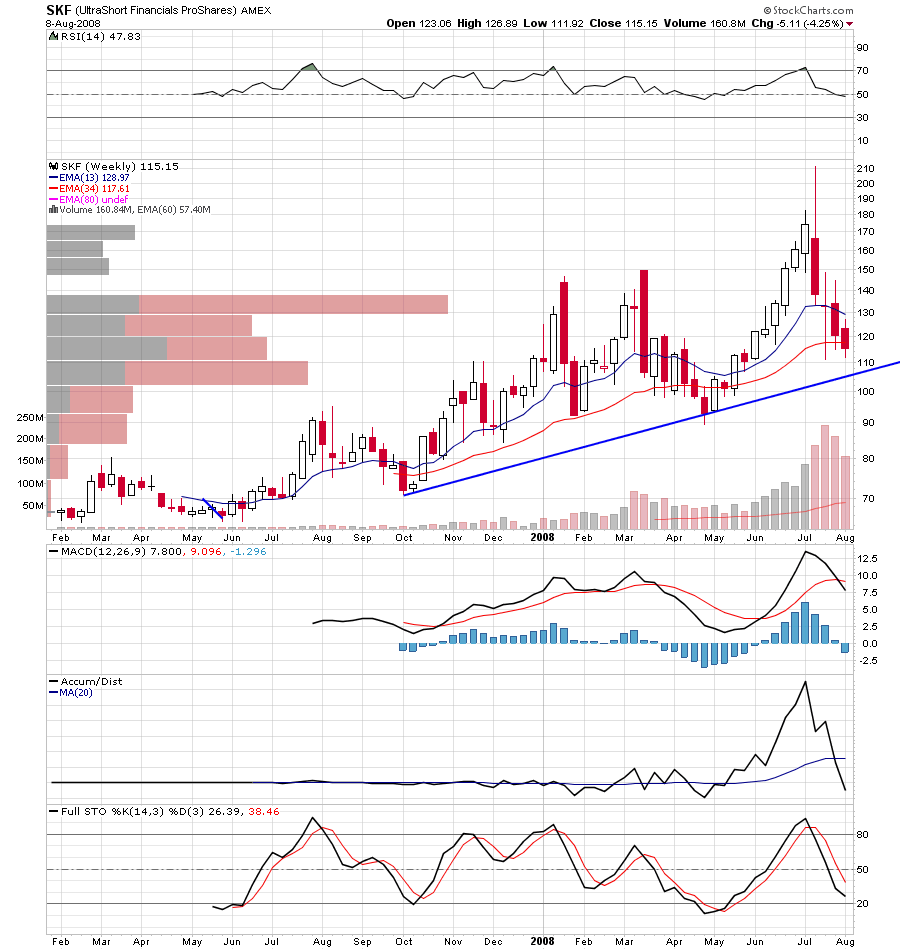
As you can see, our friend is still in the uptrend, despite it’s most recent violent machinations. In fact, it looks like it may have another date with $105 here, heaven help us. Those volume bars are scary too, but as this is a relatively young ETF, I think increasing volume reflects it’s higher profile as a hedging device.
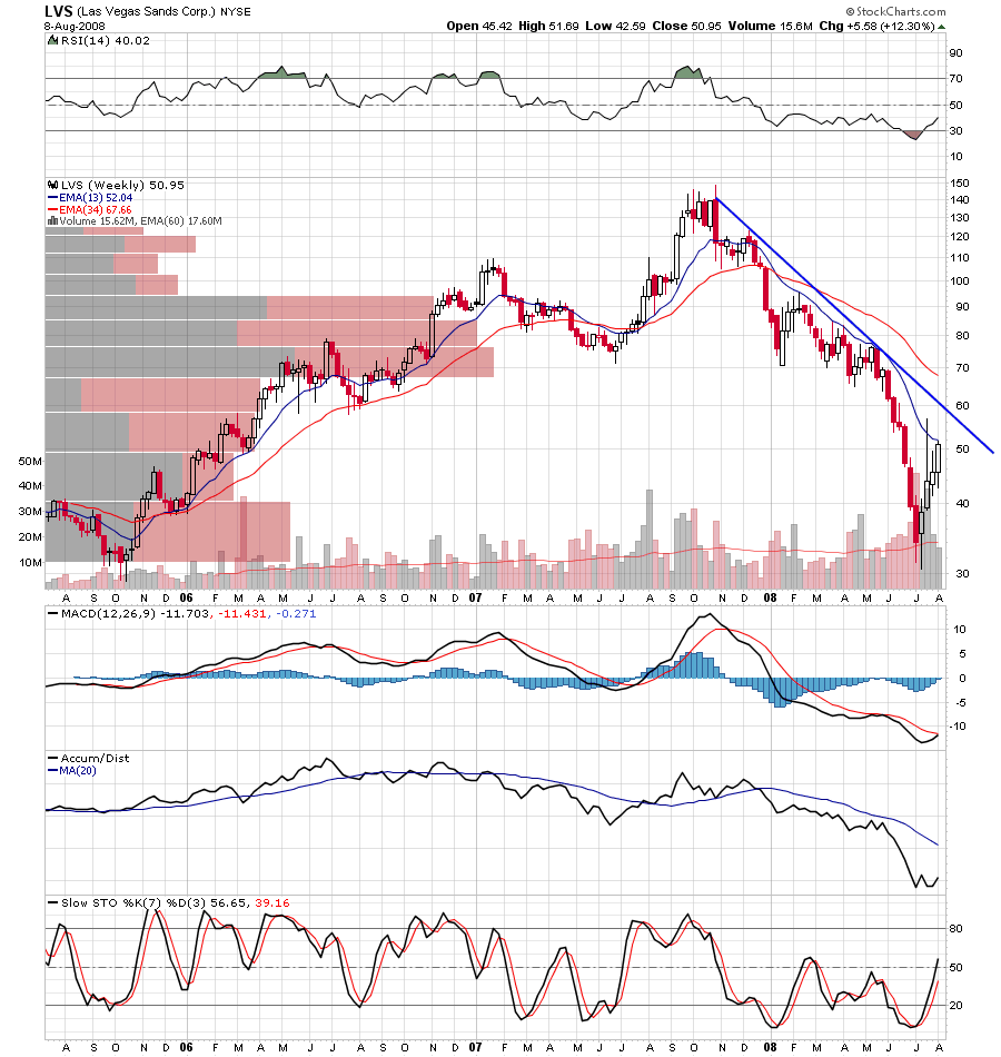
Next up is Las Vegas Sands Corp. [[LVS]] , which has boomeranged into a sharp “V” bounce in the weeklies, but to what end? :
This chart reminds me of a few of those “pre-rescue” bank charts, especially w. regard to the clear indication where to short. The trend line is your friend here.
Last we have newly cracking The Mosaic Company [[MOS]] .
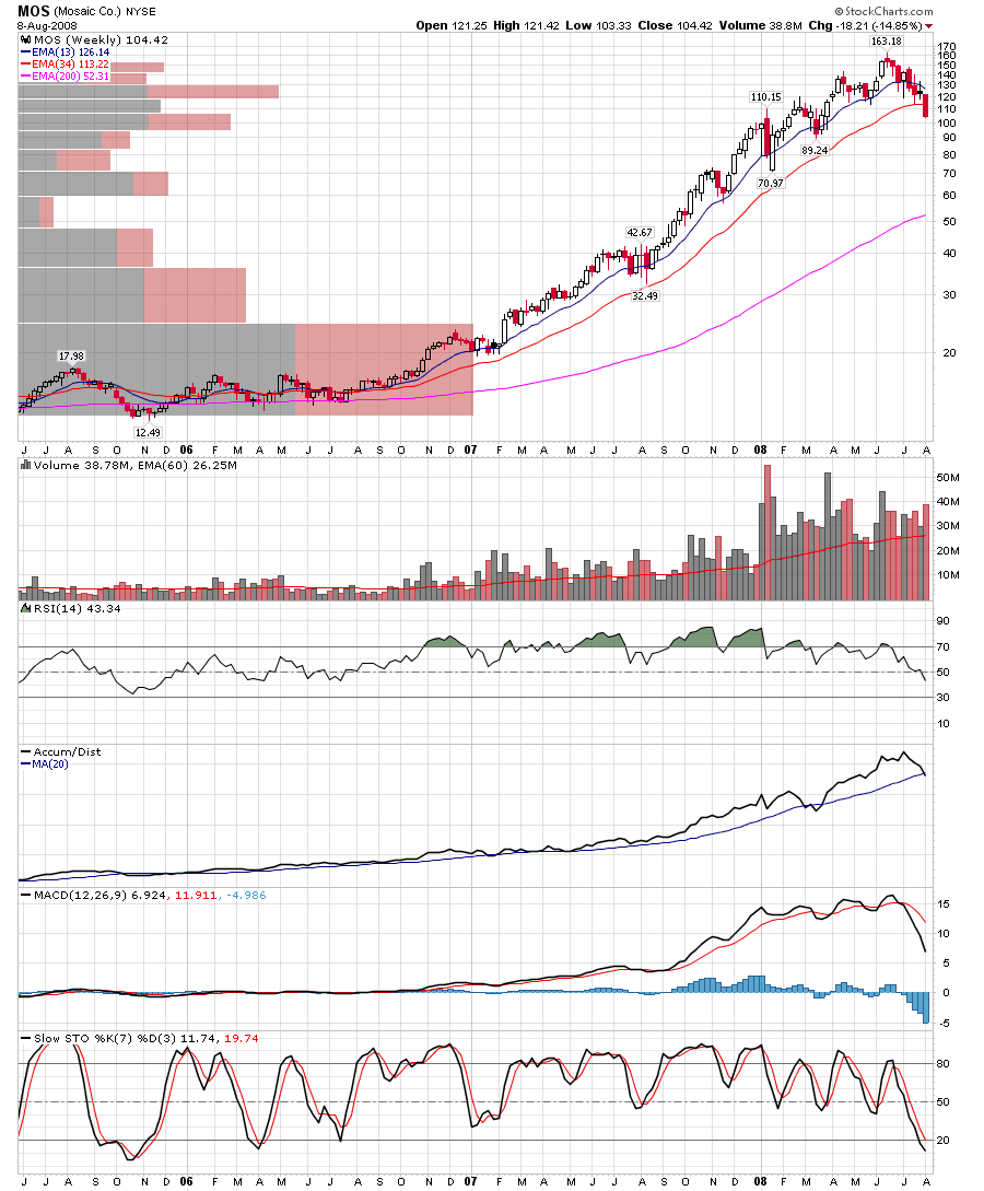
While the 13 week moving average has not yet cut through the 34 week moving average to form the traditional “death cross” short signal, we note with some interest that we’ve finally broken under the 34 week moving average for the first time since July of 2006. This could very well mark the beginning of the end for MOS, and for all the ag stocks, which are all beginning to take on similar characteristics.
Comments »