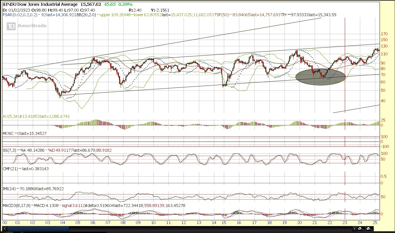
Every now and then when I get the feeling we may be at extremes (I started writing this before the recent pullback but haven’t gotten around to finishing it until now but I will edit the rest of it) I like to check to see if there is any past behavior in the market that can give us a clue. Human nature remains very much the same even as power, leverage and credit shifts, that too is governed by human nature. Charts really are only available since the 1900s so 110 years worth of data perhaps doesn’t really capture the rise and fall of entire nations and how that effects the economy and trade and the growth of technology is a wildcard as well.
Still though, that’s a long time to look for patterns and we should be able to find some time frame in which we recovered from a major low and are years into the recovery. Of all those periods, we should be able to find one that lines up well.
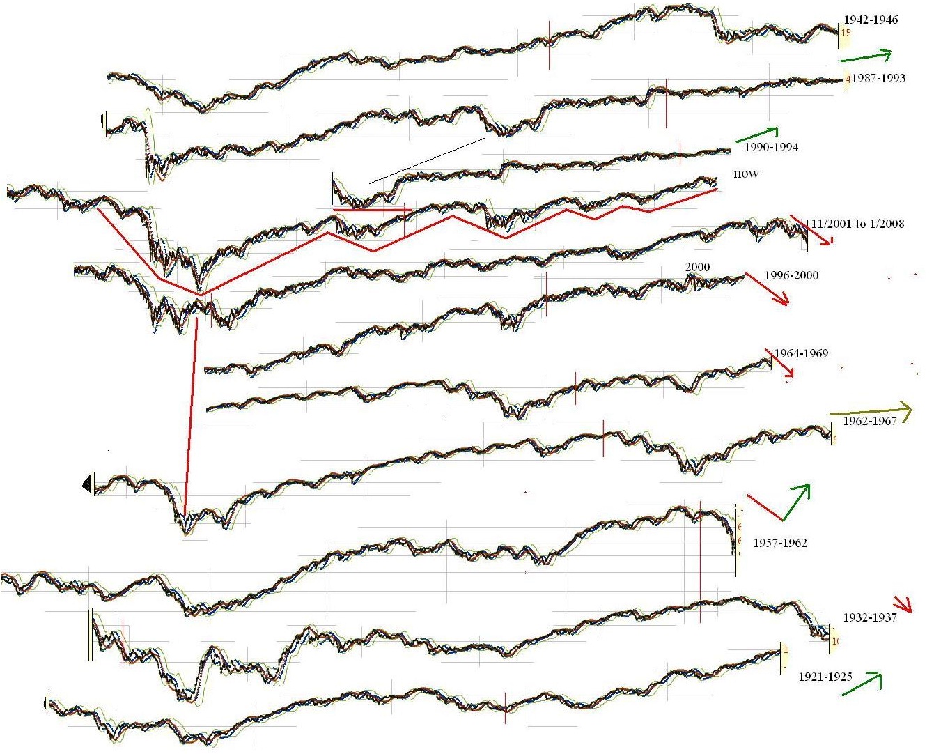
While there seemed to be several periods of time that lined up fairly well, there are really 2 candidates that I really liked that came off a major bottom.
Unfortunately they are polar opposites. The one was 2002-2007. I actually think this similarity is exactly what we need for SOME of the crowd to believe any short term dip is the start of 2008 all over again. Many people get caught “fighting the last war” and it is this that keeps them fearful. 2008 is fresh in our minds, and less likely to happen. I think too many people will be looking the first sign of a minor move down which is all they will need to not believe the rally and create “disbelief”. The one that I think will shock some people is the period of 1920-1926 which lines up well with the current market.


Since I have created this, the dow has declined a bit and diverged in direction as well. Nevertheless, the last time I saw an analog line up like this good was in 2009 near the bottom. There were also decent analog in GOLD and various markets in bear markets that along with the thin volume profile below and heavy volume profile above (as many would be underwater with not enough buying support to sell) allowed me to predict a sharp decline.
In the dow, we rallied from the low the expected 60% but actually kept going. Analogs only work so long. I blogged about this way back. In fact, to access it we have to use the “way back” machine.
http://web.archive.org/web/20090108182333/http://www.ibankcoin.com/peanut_gallery/index.php/2008/11/17/historical-comparisons-part-1-now-vs-1929
Back then it was “now vs 1929” where 2007 lined up with 1929 top basically and 2009 low lined up with the 1929 low. There was a big “bottom” that would have resulted in a 50% increase before it started to diverge from the analog and continued higher thanks to a more elastic money supply and completely different market structure. Now it’s “bringing back 1929” where mid way through 2015 or late 2015 lines up with mid 1929.
If this actually works going forward it is suggesting a huge bullish move as took place between 1927-1929. During that period, stocks went up around 150% depending on where you measure from exactly.
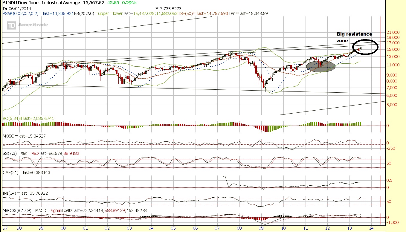
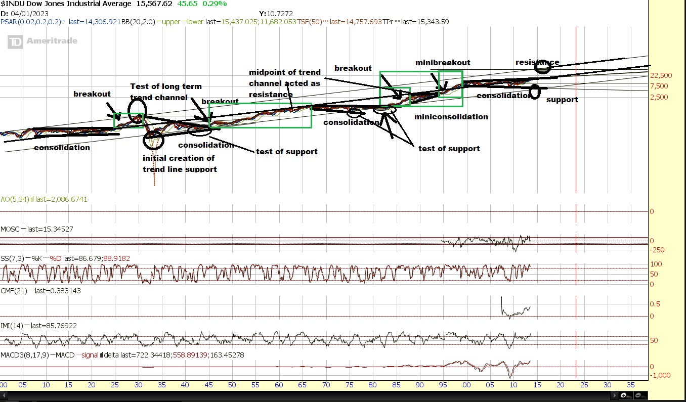
There are other ways to look at potential targets. However the big issue we still have to overcome is the long term trendline of the dow which puts resistance around the general range of 16,000.

There is support around 13,000 and then 10,500 and then again at 7500 and very, very long term support at 6000 or so. On the other side, the resistance kicks in around 16,000. After that? There is really no reference until around 40,000 on very, very long term resistance.

Unfortunately, that’s a very wide net to cast because if it is in fact “2008 all over again” there is still plenty of downside. But I think the easy money will be if/when dow breaks the 16,000 resistance zone.
Ideally, we will soon get a sharp crash in other parts of the world, and the US likely will also get hit initially, which could set the stage for a monster parabolic run, like in 1987 when the US markets crashed and capital concentrated into Japan from 1987 into 1989 peak of… you guessed it, 40,000 (well actually 38,957.44 but close enough). I think that because both 2007 analog also lines up this will convince enough people that 2008 is here as we decline and diverge from the 1920-1926 analog. Then a significant decline will start possibly next month causing people to expect the move only being just starting. At this point, the market will blast off to the upside to ply catch up with 1920-1926 analog leading into the 1929 type of peak, which could easily top out before the late 2016, or diverge and fall short of the target but continue the climb as 1929 declines, diverging.
I actually am crazy enough to think that can happen in the U.S. The “tell” being the recent wreckage in Asia while the US markets stayed near their highs. The shift out of the Nikkei was also likely a global one. Maybe there is another move, coming up, maybe that was it.
Here is what we know:
1)The other markets around Asia also sold off, as well as emerging and frontier markets, indicating it wasn’t just isolated to one country.
2)The currency. After declining 30% from it’s peak, the Nikkei basically doubled from November 2011. So put this in a global investors perspective. The balance sheet was 30% less valuable on average to others around the world, yet the price of those companies are twice as much? Wouldn’t you sell? If you were in Japan and your currency was devalued, you certainly would prefer stocks to cash, so while the buying was probably mostly domestic, the selling was likely global, and hence why it was more than just your typical profit taking correction where the correction is relatively “orderly”.
3)1987 crash in the dow in a single day was a global phenomenon too as the dollar had lost 50% of it’s value from the 1985 Plaza Accord high). Take a look at the action of the Nikkei afterwards. This time it may happen in reverse where another nation such as Japan crashes in a short time frame and the US stocks then are the beneficiary. Perhaps it already happened as Japan dropped over 20% in a few weeks from May-June.
4) Although you can talk about the fundamentals for the dollar when involved in actual trade and exchange and speculation, the dollar is the only global currency with enough liquidity to absorb the international demand of central banks and very large funds who need to park extremely large amounts of capital in the world reserve currency.
5)Although you can talk about how dividend payments are low, compared to the low interest rates in a bank, CD, money market, or even bonds, the large money, particularly pension funds in order to stay solvent will be forced out into more speculative junk bonds, preferred shares, and the like. Interest rates will have to come higher which long term is correlated with major secular bull markets around the world. The hunt for return will chase people out of yield and into speculation, but if they must have yield, they will need to get in high dividend paying “blue chip” stocks real soon while they’re still cheap and yielding a reasonable amount.
6)The global concentration of capital into the US, and shifting out of the bond market in my opinion and opinions of those I respect will likely lead to a secular, if not parabolic run.
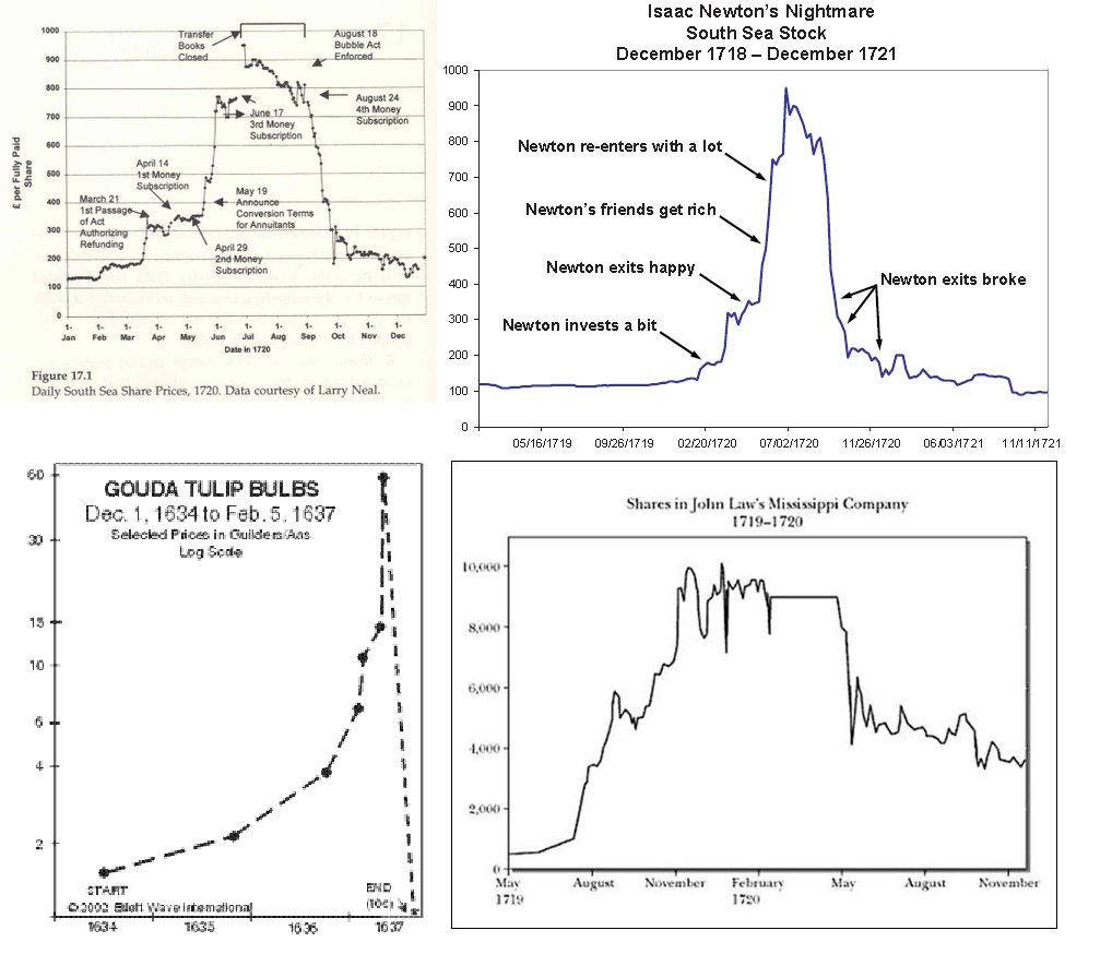
Parabolic runs are nothing new, they are simply a concentration of a large percentage of all available capital into one area (or globally) both for purposes of avoiding other “dangerous” assets, or the simply concept of “herding”. Here are four known “ancient” bubbles. Actually 3, south sea is there twice.

and I found this as well which has some other “ancient” stocks.

source:http://www.sciencedirect.com/science/article/pii/S0304405X12002541
“Even the Tulip Bubble, the first contagion post-Dark Age, was a European-wide contagion as tulips even traded in London. There were ancient contagions and panics. Stocks traded in Rome, insurance predated even that, and commodity markets thrived in a boom bust cycle as far back as Babylon.”
Domestic Panic v International Contagion
I do not have the Boom/Bust Bubble charts of Babylon, but regardless, where there are markets, there are price changes, and the potential for “bubbles”.
The fact is that not only that “bubble’s” are ancient, but that it represents a concentration of capital on very large scale levels. It is not simply JUST emotion, as that can only drive the force which causes capital to concentrate. In many cases you need debt and global or at least very widespread interest. A large percentage of the known world economies must become interested and concentrate into one market, particularly near the height of a business cycle top.
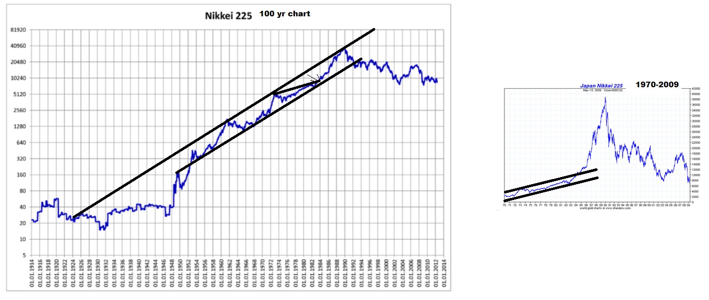
Here is japan on 100 year chart to give us similarities with the US one. Not an analog per say but to show you the structure was relatively “normal”, just as dow 40,000 might be “normal”. (almost no one will look at it that way until it’s too late, as it is only the structure that would be normal, not the perspective)

You probably more often see the small chart I included for comparison on the right dating back from 1970 leading to 1989. This appears to be a break of a trendline channel with no reference points and a mania run. And in many ways that’s true but it isn’t without longer term reference and structure that in fact is a bit more predictable than one may think. Look at the chart on the left that truly offers a long enough historical comparison for us to see that 1989 could really just be perceived as a test of very long term resistance on a trend-line, and in that sense is relatively “normal” on a long enough time frame. The same goes for the dow if it goes to 40,000 and tests very long term resistance as I showed earlier with the very long term trend channel with around a 40,000 target.
The view on the left side is what very few are used to seeing. A relatively “normal” rise in a channel and correction that doesn’t actually seem so shocking until you consider the time frame is 100 years and the market went parabolic on a short time frame and the correction has lasted over 2 decades.
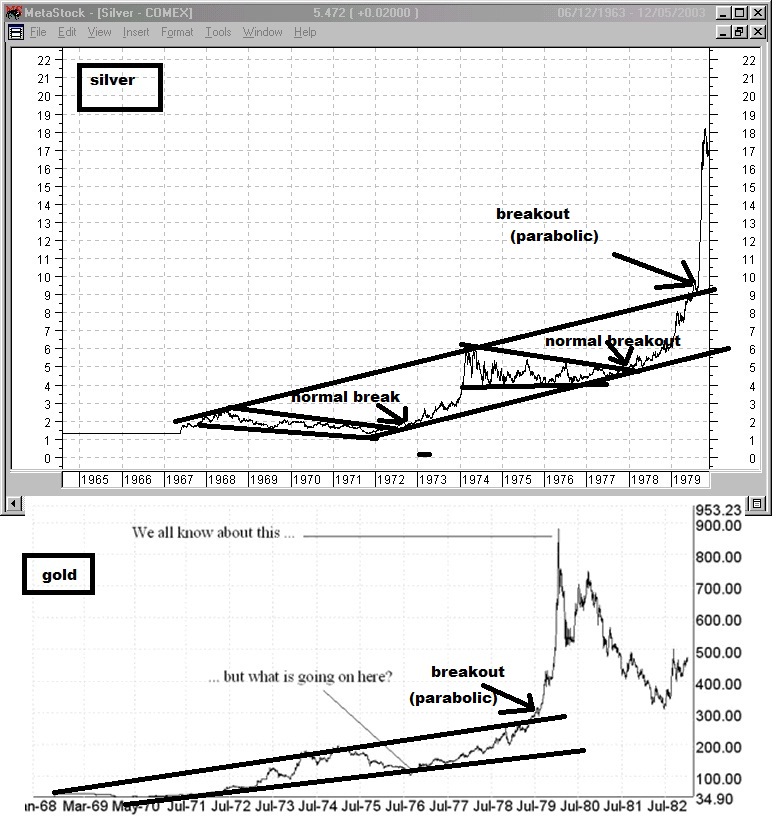
Here is another market. First the chart you are probably used to seeing when you look up charts of the 79 parabolic run in silver and gold.

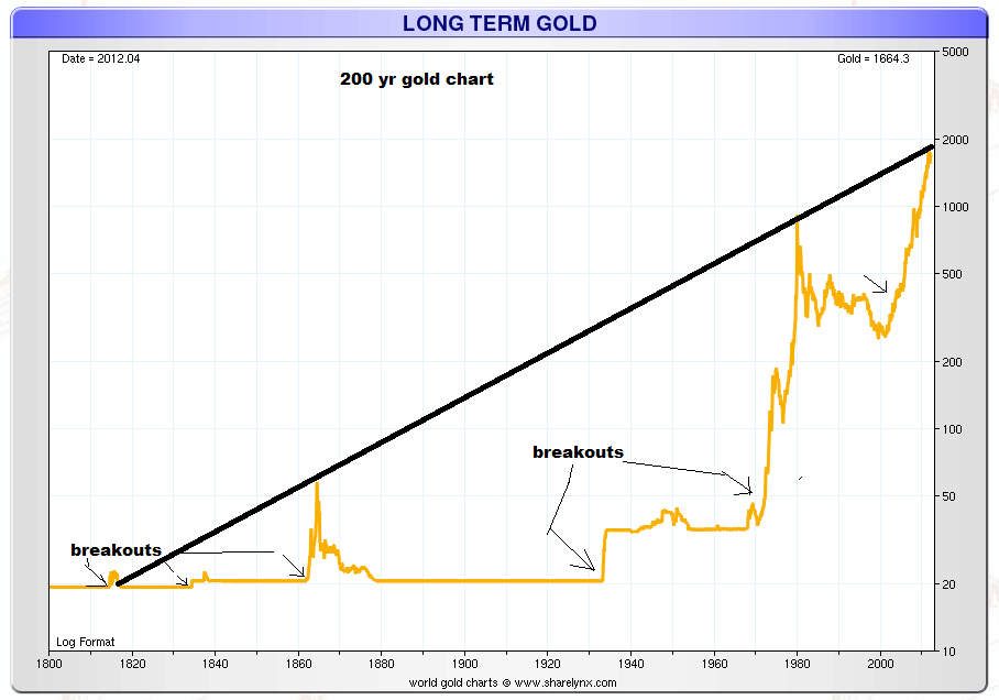
Again, without more data, you would conclude that this has zero context or reference point, and is simply a parabolic run as you would when gold went up to $1900 only recently. But here’s a much greater historical context of data.

I bet you never thought of gold at 1900 as hitting “long term resistance” before, huh? So gold at 1900 actually was actually just a “test of resistance” Even though, most had no idea that there was ANY to be found. I think the data derived from understanding the total global “allocation” weighting towards each asset class at a given time and factoring in supply would be much better to measure with regards to bubbles to know just how extreme these moves get by asset class. Hence why the trend can be higher, but references of extremes remain somewhat predictable providing the maximum possible swing before capital must revert back to other assets which now will have been neglected. Bubble’s “end” when either the credit can no longer expand at the same rate, and in fixed money supply markets (such as gold standard) where or the allocation weighting cannot shift anymore aggressively towards that asset without completely neglecting and providing ridiculous valuations and opportunity elsewhere. Even sometimes as famously said, “the market can remain irrational longer than you can stay solvent”, it still has boundaries eventually. The 1929-1932 crash was actually a rise of 50% in the dollar from 1920 to 1932 that supports the relatively “normal” 50% decline story that has examples littered throughout history. But also support the history of bubbles popping back to the trendline. The capital inflow and demand of the US dollar first shows global allocation, and support the “normal” constraints of around a 50% decline with an additional increase in the dollar that both inflated the bubble and deflated the decline due to the gold standard (money was fixed to gold so as it could not rise independently on it’s own, everything else had to fall in value with it as capital rotated out of Europe into the dollar and gold).
The gold standard bubbles in gold are instead a flight to cash and represent the slow down of the velocity of money and hoarding of capital, and effectively “deflation” and “flight to quality”. The gold bubbles that occurred where money was not a gold standard, represent a concentration of capital away from the debt markets and currency markets and sometimes stock markets. “inflation” MAY cause gold to rise but actually doesn’t have that much to do with it, but instead a shift away from government and/or private paper. Even so, it’s never that simple because gold is globally in demand and different nations have different money systems but it still behaves with structure, because of the nature of “limits” in how much people can spend, without neglecting other assets to such an extreme it motivates a shift back to the neglected assets, or how fast people can keep money moving to the point where credit can’t expand fast enough to keep an asset growing and the credit cycle must end.
The bubble peaks when buying power cannot sustain the prices and the slightest amount of selling pressure and all the volume that came in towards the end buying “at any price” suddenly end up underwater and want to sell. Everyone who wants to buy already has done so and the price can go nowhere else but down.
But nature of bubble’s aside, All asset classes can act like that since price is a function of confidence and perception of return relative to all other opportunities. (Liquidity also plays a role as well as it has to be a market that the largest players can get in and out of.)

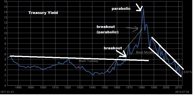
Yields went parabolic even and the other direction you might even look at the decline of yield as a parabolic run in price. There are points in history where bonds of companies and entire governments eventually yield nothing as soverign debt collapses. But when yields first broke-out and some said it started to go parabolic, was measured in decades, rather than years (except the final move at the end). The time frame of such a cycle is much different than stocks or gold. Bond yield “bubbles” or “price yield “bubbles” are very different in nature, since treasury bonds have become currency that pay interest since you can borrow against it, but such a shift in confidence still exists.
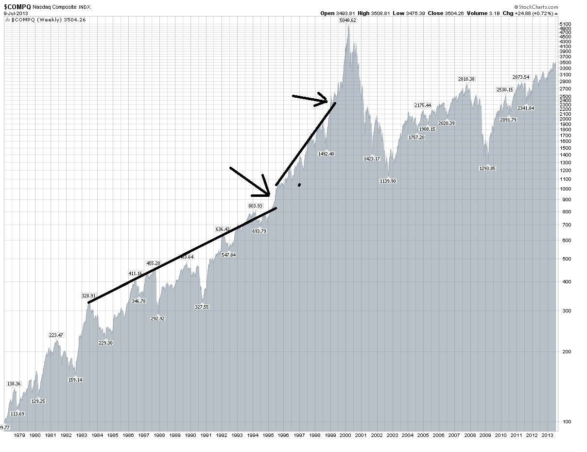
We have three great examples of charts of stocks going parabolic here. The roaring 20s, the Nikkei bubble into 1989, and the nasdaq bubble into 2000. (of course the earlier picture also is some of the ancient stocks such as Londan Assurance and South Sea companies going parabolic).

You can see that as a trendline is broken, and it doubles, if during that double it breaks another trendline, the time in which it doubles is significantly less. Actually the move into 1984 was a slight break of the previous trend and after the pullback it basically doubled from 300 to 600 in 8 years first. Then 800 in 1994 to 1600 in 1998 4 years. Then 1999 to 2000 from under 2500 to over 5000 in 1 and a half years. It’s not so much the magnitude of the move itself but the timing and historically large moves in shorter and shorter periods of time.
When the major break of the trendline is made, the asset often accelerates to it’s peak. In the extreme example like the Nikkei or nasdaq we see it double and then double again.
Perhaps if/when we break the long term resistance it will instead be a “secular” run rather than a parabolic one. Afterall, as I have shown, the returns are possible to continue measured over a long period of time. I am not yet convinced we won’t see a significant pullback first, and we are coming up on the period of time August-October that worries me.
However, the actual very long term resistance probably will still hold, so it’s a question of whether we set up a quick run to extreme historical highs (1929), or a gradual run to large gains over decades (1942-1965, 1982-2000). You could measure from trough to peak, or you could measure from the distance after the breakouts. I have done this in historical look from 1900-2013.
Most relevant right now is “Gains from “breakout” point (This has YET to happen)
1924-1929 104 to 386.1 A 271.25% Gain
1951-1966 235 to 1001.1 A 326% Gain
1983 to 2000 1100 to 11750.25 A 968.20% Gain
(ALTERNATE: 1983 to 1987 1100 to 2746.70 A 149.70% Gain)
(1995 to 2000 4000 to 11750.25 A 193.76% Gain)”
With a breakout point of 16,000 (it’s actually above that), you only need 150% gain to get to 40,000. So the 1983-1987 period would be like 2013 or 2014 to 2017 or 2018.
You can add onto that the parabolic runs of the nasdaq, and the nikkei with minor considerations and even look at a few of gold’s historic runs to get an even more bullish target.
I think ultimately if you think the market is going “parabolic” the very long term upper trend channel that I outlined is the target, which is around 40,000. I think history shows that if you break a long term trend channel, you can see stocks do far more than double in only a few years such as in the nasdaq or Nikkei’s final run up depending on when you measure from.
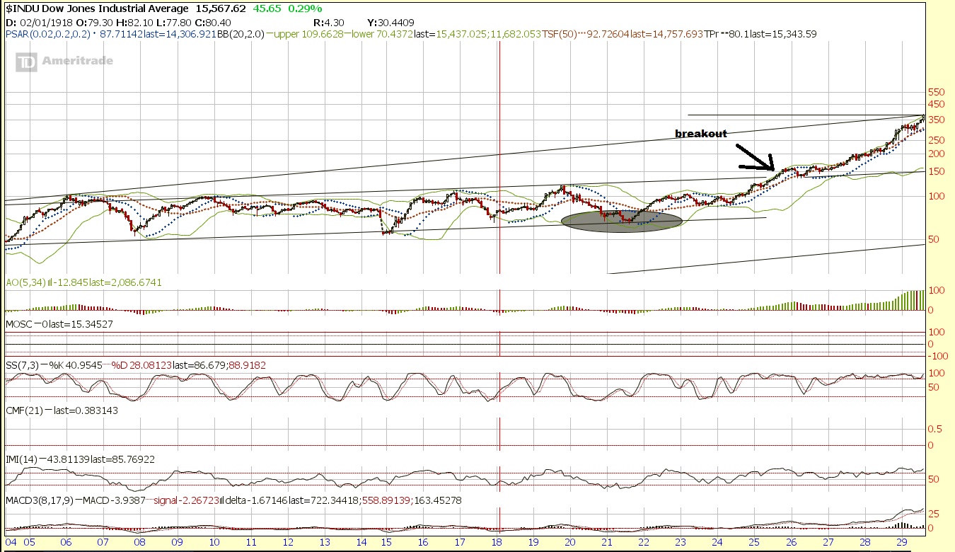
Then there is the dow in the roaring 20s. Before it broke the long term resistance lets see what it looked like first.

Compare that to the dow right now.

Since we have already identified the extreme similarity of the timeframes aligning 1926 and now, we can project forward and perhaps predict the future if we see what the roaring 20s looked like?

It put in about a 150% gain in 4 years. Where does 150% gain from the breakout point of around 16000 take us? You got it, 40,000 by 2017-2018 depending on if we break now or in 2014.
Or take the nasdaq run. From the 900 to 5048.62 peak it gained at a rate of about 3.02% per month. If the Dow goes on that kind of a run, after breaking 16,000 it will reach 40,000 by early 2016. (I consider that optimistic of course).
Another way to look at it is the Nikkei was at 10,000 in 1985 2 years before the 1987 crash and got to 40,000 in 1989. 2 years before the recent wreckage in Asia, you may recall the dow was actually a little above 10,000.
Well, the odds are not that great that it will go to 40,000 in that short of order, let’s be honest, but it’s the extreme “outside” chance that I see as more possible than many may comprehend and at some point, it is only a matter of time before the extremes of the long term trend channel are tested. I also see a longer term durable secular break that could take maybe 10 years or so to reach that level as a possibility. Of course so is one more cycle top resulting in a decline to retest support setting the stage for a more durable run. But To me, this shorter term bearish phase we may be heading into could very well set the stage for all the shorts to come in and pessimism to make one more strong run setting the stage for the ultimate bear trap before the parabolic run.
Afterall, when do you ever see analysts calling for that type of run before it happens, or even a secular run? While I think the odds are much better that we simply correct a bit first and then perhaps go on a longer drawn out secular run, do not sleep on this possibility.
I think we will see a very strong and sharp correction somewhere that will keep the majority “wrong” both in the short term as they chase the “froth”, and in the long term as they avoid the casino and vow to never return and claim “2008 all over again” at first sign of a minor correction and continue to try to short it. (well until it hits 30,000+ and they can’t help themselves and everyone and their mothers start buying).
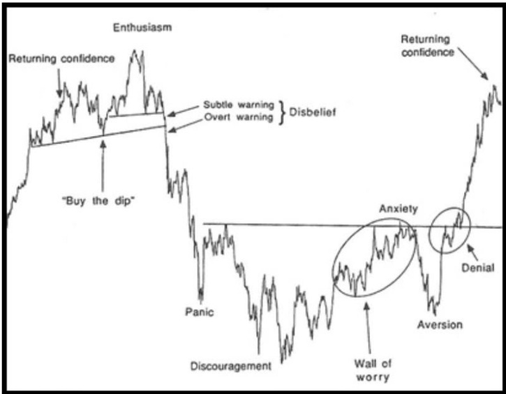
It is the type of “sky is falling” type of move that will scare the public from getting in while the getting in’s good, and the type of psychological “aversion” to stocks that create enough pessimism to cause the majority to miss the move until it’s too late, then they are afraid to chase and afraid to chase and finally they think it’s stupid not to and they don’t want to “fight the trend” and they go “all in” when they have hoards of cash that comes from the boom as credit cycle peaks. I am not as convinced that on the long term timeframe we have had that complete aversion and think that perhaps 2011 was just an aversion on a shorter term run and a prelude to the decade long aversion. But I am open to the possibility that we break to the upside with not much more downside. Personally I think September will be a major shockthat has everyone coming out claiming “stocks are rigged” or “investing in stocks is suicide” to an even greater extent than we saw before. Then as we break out there is major denial and people saying “no way to stocks go higher, then suddenly they realize they were wrong, and the story of stocks to the moon occurs. Dow 100,000/200,000 calls are made near the top.

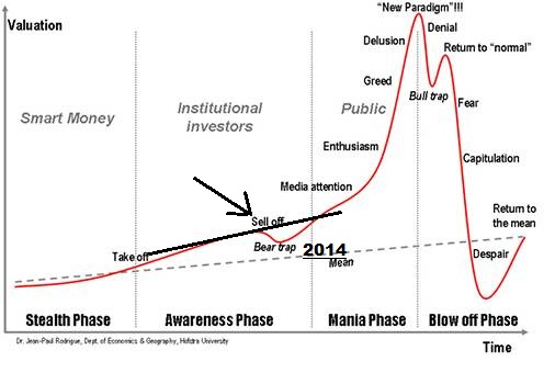
And you’ve all seen the chart Option Addict refers to a lot. I personally think we are entering a bear trap on the above chart and “aversion” into September, but I could be wrong and as he suspects that could have been 2011.

Although the market may be similar to 1926, the market also looked similar enough to periods near “market tops” or prior to “corrections” for me to continue to be concerned in the very short term, but many of those time periods weren’t too far away from a major secular run after the wreckage was over, and there are a few bullish periods as well.
It’s enough for me to be concerned, especially along with the bearish seasonals into the August-October range, the budget battle in September (deadline of October 1st) and the Germany elections September 22nd and other various headwinds. I think though after that we may be in the clear. Just for kicks, here are all the analogs I consider relevant.

Ultimately, my bias is much, much higher, and the best analog is still probably 1926 but we need to actually break resistance in order to set the stage for a large run, until then I will be a bit cautious, unless we get more of a dip around September setting the stage for a significant buy opportunity.
The strategy if we are going on a strong secular run or parabolic move is probably going to be to consider more of a longer time perspective. If you use options you might go further out in strike price and time and use smaller position size. This way you can have more names with less total capital at work of the “lotto” type of swing for the fences plays… Perhaps on a longer term time frame, and more of a “monthly lotto” which means you probably want to focus on the naes that really can trend for weeks when they go. The swings will be more “momentum” type of moves that just take off and keep going. The duration of swing and actual price movements are likely to be greater and breakouts are likely to carry on and last, pushing stocks to significant momentum extremes. Perhaps moving towards a trend strategy or position trades rather than swing trades.
If you use stocks, you might consider widening your stop and also letting your winners ride for a longer period of time, perhaps using a wide trailing stop.
If you aren’t looking to change your core strategy, you might just grab a ETF or 3x ETF and hang on for a longer term move with a portion of your funds and keep doing what you have been. Or you might consider decreasing your cash percentage. However, it’s very possible the volatility could pick up, shaking people out often enough to keep them in disbelief and keeping others who sold lower willing to chase the same stocks higher and push it up.
Me personally? I have been working on structuring a basic plan that I have figured out conceptually, but that I want to get more specific about. Part of that means finishing my position sizing and expectation spreadsheet. I will when I find the time.
Comments »


