Charting December to date against previous Decembers shows that the Santa Rally may have just started a few days early.
Let’s take a look at the S&P 500, starting in 1928, and $SPY, starting in 1993, to chart the average December performance.
I’ve assumed that the $SPX and $SPY was bought on the open on the first trading day of December and sold at the close on the last trading day of December.
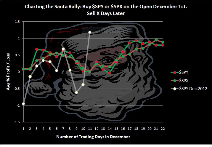
Santa really gets flying about halfway through December. In fact Santa rarely disappoints. We can see how true this is above.
While current December action (white line) is more volatile due to not being smoothed by the averaging process, the month seems to be following a typical December pattern, except that Santa appears to have started his run several days earlier than normal.
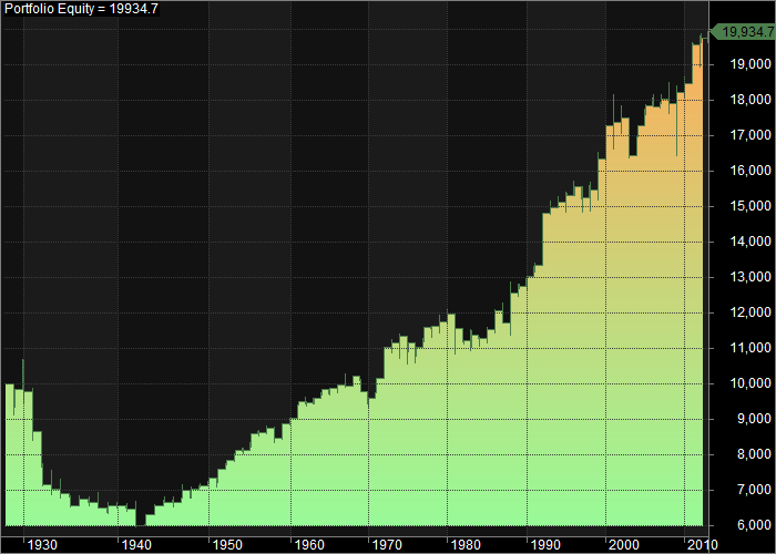
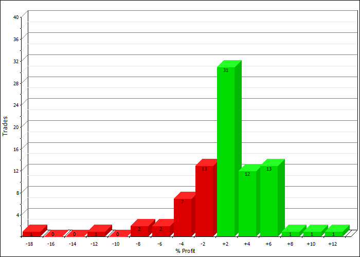
December Statistics (using $SPX)
- Average Monthly Profit/Loss = 0.89%
- Winning Months= 69.41%
- Worst December = 1931 loss of -17.27%
- Best December = 1991 gain of +11.16%
Equity Curve: (using $SPX)
Profit Distributions: (using $SPX)
The Christmas Spirit is really building around my house…Here’s hoping that today’s rally means Santa has fired up his sleigh and is heading your way!