A couple of months ago I posted a blog with two flu stock ideas technically set to trigger. The names were INO and VICL. I have no positions in either of the names, and probably will not initiate one. However, I do like to track these names for my own entertainment. Had I acted on INO, I would be sitting on some fairly hefty gains at the moment.
The first chart is a 5 year weekly of INO. The formation of a tight base is apparent, and it certainly is worth a look now that it has arrived at its actionable trading point. Take a look. 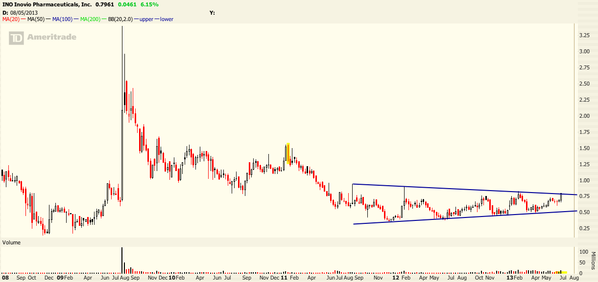
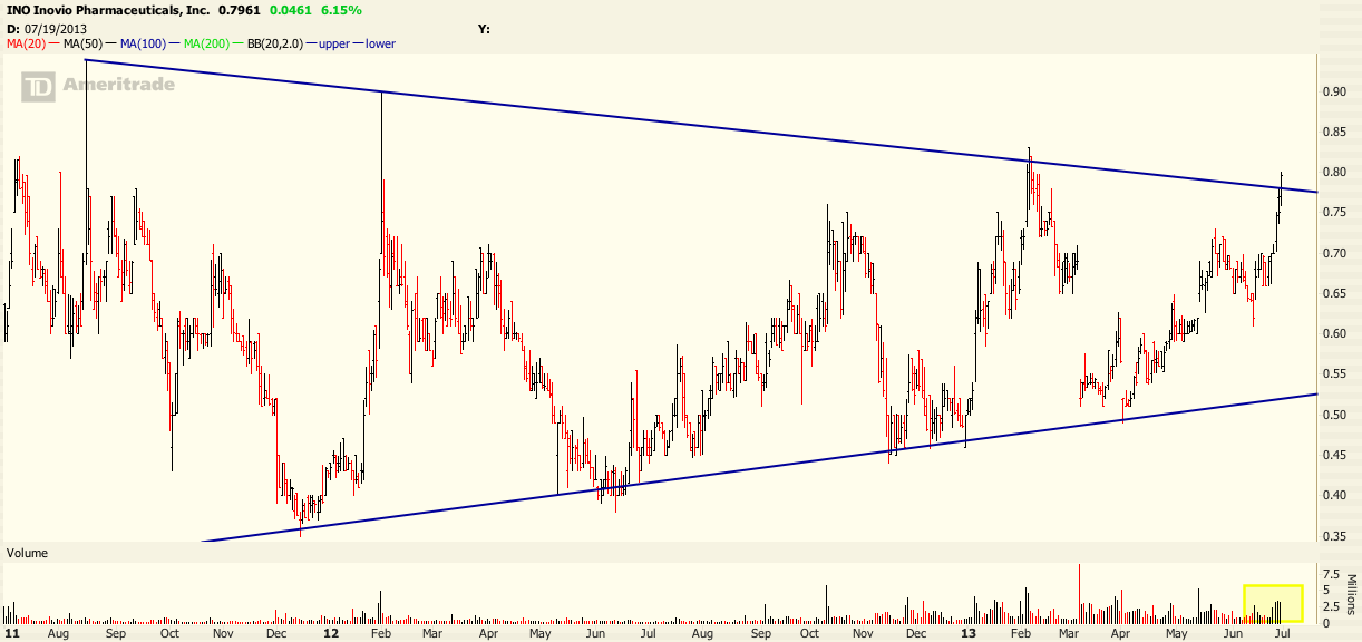
Now take a look at the two year daily chart, and note the strong volume pouring in the past few days.
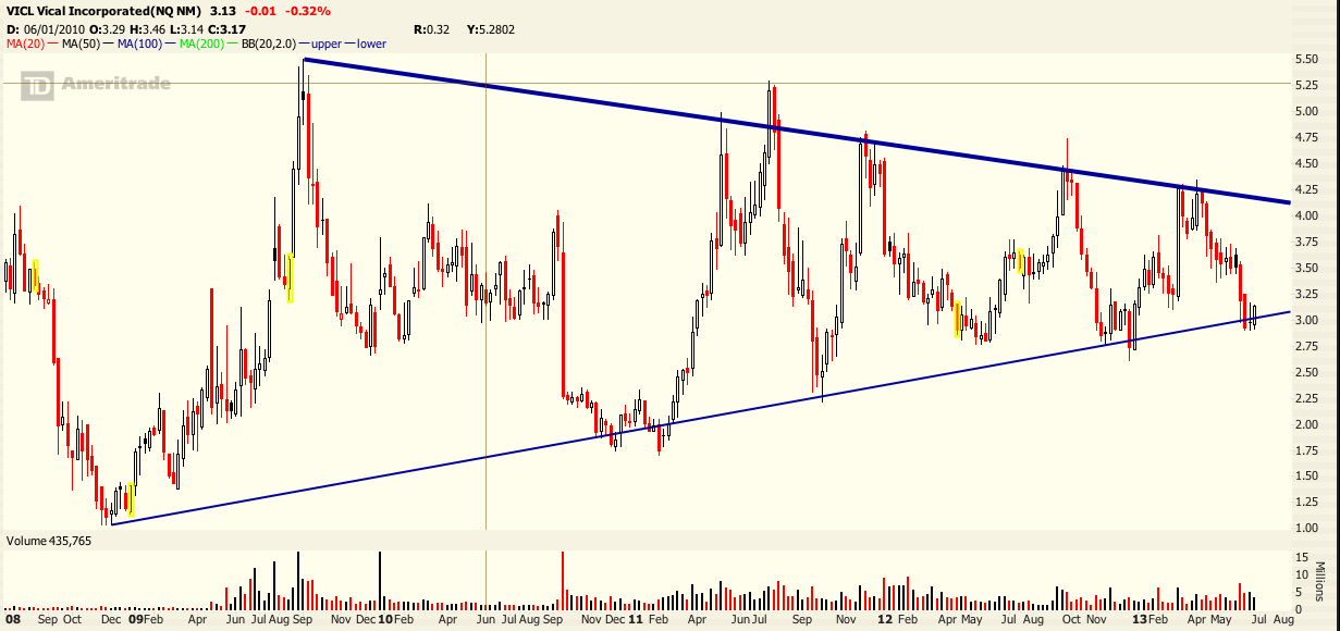
Now take a look at VICL. If you don’t like buying on the breakout, then maybe it’s time to buy this on the dip. The trade is relatively manageable from a risk perspective. Check out the 5 year weekly chart below.
Have a great rest of the weekend! Leave comments below as any discussion is much appreciated.


4 Responses to “Revisiting Influenza Charts”
tpain
This was not supposed to be a flu play, rather it is “revisiting influenza CHARTS” describing the technicals. I agree that the analysis is not robust, which is why I noted that the names are followed for my own entertainment. It’s a light hearted kind of thing. I do not hold positions in either name. Please note though that both of the names triggered with great returns. If you would like more analysis, then by all means go research the names yourself. Thanks for reading.
RNB
Your analysis is weak and amateurish and will yield worthy results.
How can identifying the patterns be considered a flu play?
tpain
I will look into the names, but this post was solely to identify the chart patterns. I did read somewhere that INO was having success recently with two trials.
RNB
I cant buy a chart. Why should I buy those companies?