What charts tell you depends entirely on the questions you ask. There are no absolute answers with charts, only suggestions and hints. Anyone looking for certainty shouldn’t look at charts at all, they only tell what happened in the past, and cannot predict the future.
But patterns recur. The difficulty is spotting them in time for them to be useful, rather than afterwords when you can only say, “Wow, so that’s what happened.” Patterns are imperfect, and they can be rough and ragged and completely unrecognizable. It always takes a leap of faith and courage to take action on an incomplete pattern. As traders, though, that is what we have to do.
Today, I am looking at certain larger, recurrent patterns. Specifically, triangle formations (also known as “coiling”) and how they resolve. The textbooks say that these patterns can resolve in either direction, and that is true. What I am going to do is lay out a case for what is happening in the market now based on past triangle patterns and how they resolved. I chose this formation because I think that is a pattern the market is in right now, and it appears to be close to resolution.
First, let’s look at the largest relevant time frame, the past twenty years, on a weekly chart.
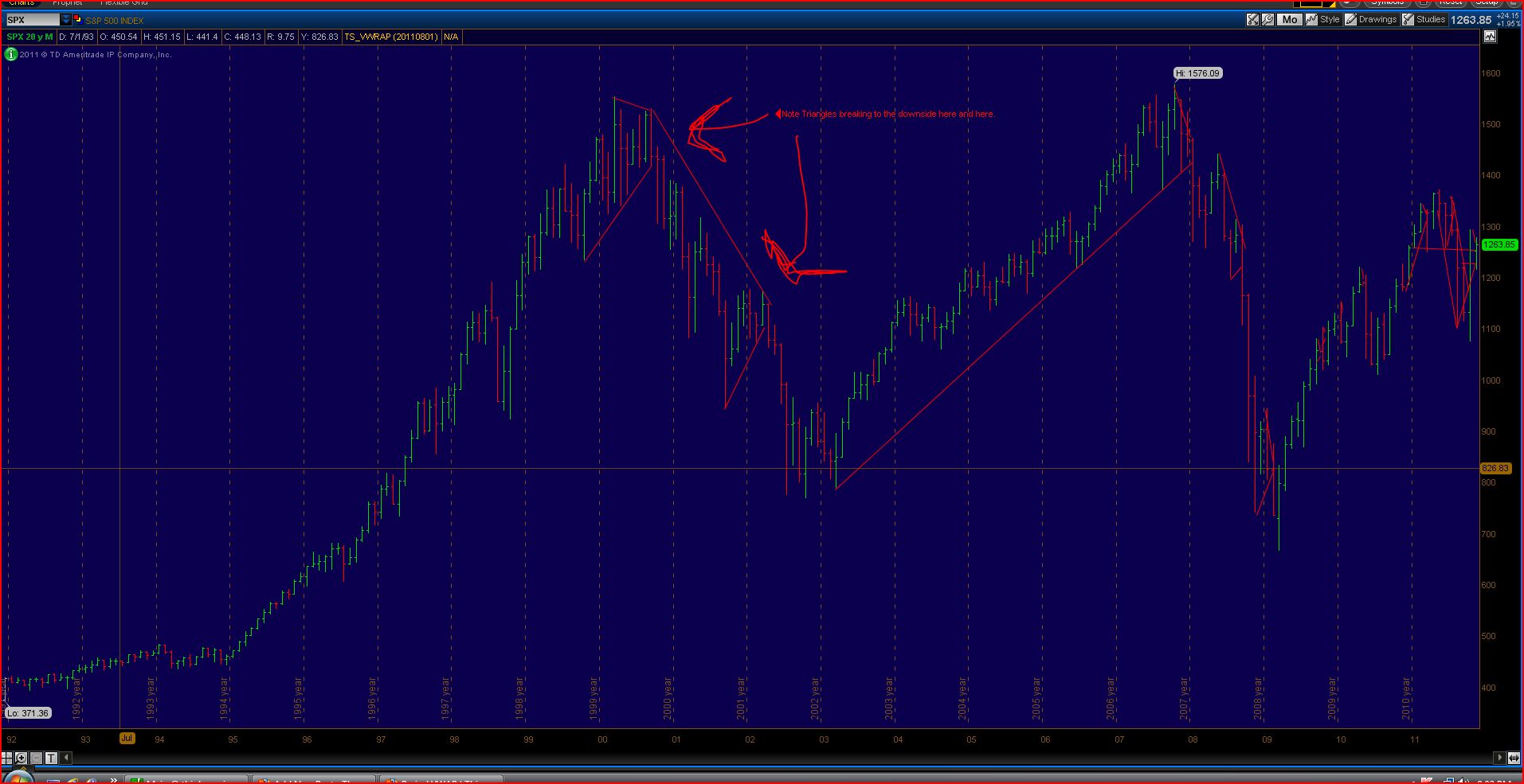
I have pointed out two formations, one in 1999-2000 and the other in 2001-2002. One could say that neither is actually a triangle, but they have two things in common with the general pattern I am zeroing in on: they have declining highs and higher lows over a fairly compact time frame, which if continued would indeed form a point. The thing about these formations is that they don’t usually complete in the absolute sense, they generally will break out before that. Anyway, these two patterns broke out decisively to the downside. Their downside resolution was a function of the heavily overbought Y2K market.
That’s just a warm up. Let’s look at the last ten years, also on the weekly chart:

Again, these are not ideal triangles, but they show the coiling action at work. The triangle in 2002-2003 resolved to the upside, a function of the oversold conditions at that time with the SPX in the low 800’s. The 2007 triangle resolved to the downside, as it was an overheated, overbought market with the SPX in the 1400s.
Next, let’s look at a a couple of triangles in 2008, now shifting to the daily chart.
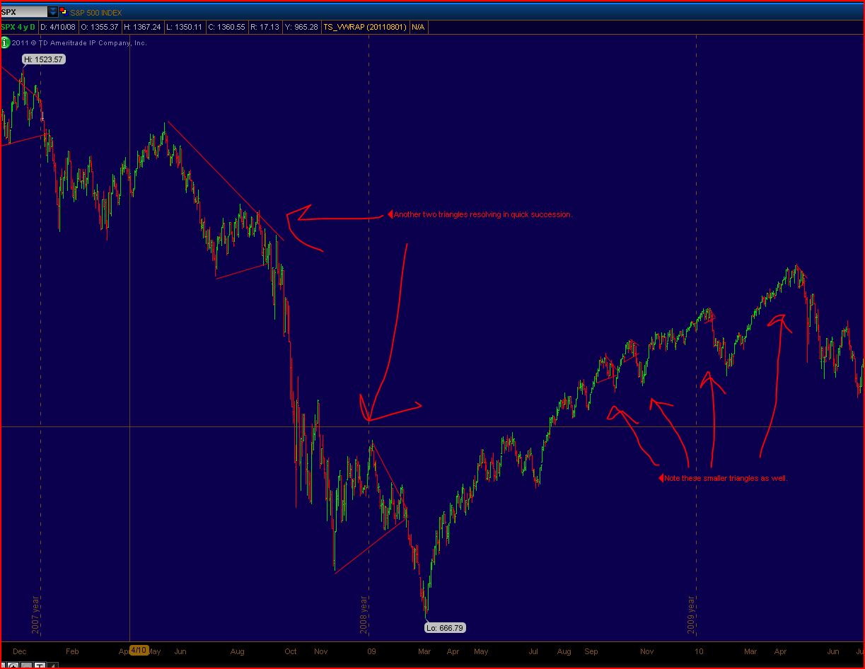
Here I pointed out two major formation, in mid-2008 and 2008-2009. Both resolved strongly to the downside. That was a function of, in the first case, an overbought condition combined with a looming recession and banking crisis. The second was completely a function of the banking crisis and the related TARP bailouts. I also pointed out a few minor triangles in 2009-2010 that all resolved strongly to the downside.
Now, let’s turn to the present on the daily chart.
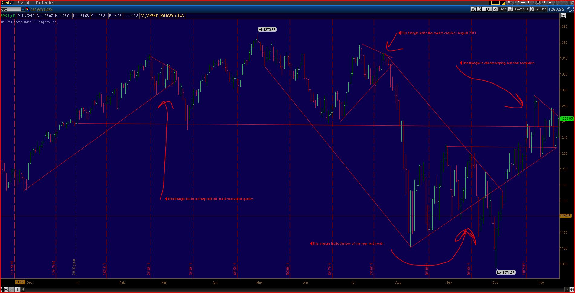
This year is chock full of major coiling patterns. This is a function of the fear that lingers in the market, it is a pattern that thrives on fear and chaos. With the VIX hanging tough over 30, it is clear that fear lingers in the market no matter how much ground the market has recovered in the past month. This remains a volatile market, every day’s price action shows that, with alternating bouts of euphoria and panic.
The chart speaks for itself. Each of the triangles this year resolved decisively to the downside, the most recent one leading to the lows of the year. Today, Friday November 11, was a huge up day that stopped just about perfectly right about at the top trend line of the triangle. November 2011 is showing precisely the same kind of coiling pattern as earlier in the year and in the prior years we looked at. It actually is kind of eerie that the present triangle is using the same trend line that the September coil was using. While it could break out at any time, it may well take a few more days or a week to resolve. If it resolves to the downside, as the majority of the others have, it won’t necessarily lead to the lows of the year, but a break to the mid-1100s would be in light with past breaks.
The triangle pattern reflects uncertainty and fear in the market. It isn’t a coincidence that the pattern in its largest manifestations shows up during major market turns and during years when market turmoil, either on the over-exuberant side (2000) or the panicky side (2008-2011). That the market is on an uptrend and everybody is happy and betting strongly on higher prices doesn’t mean the triangle formation won’t happen, or won’t resolve to the downside, just ask veterans of the Dot.com bubble. Traders increasingly hedge their bets and the market turns inward on itself, with nobody willing to call the turn. Another factor keeping it going is that there is profit to be made in playing the swings, which become nastier and sharper and brutal with time. Note that while today, November 11, was a sharp upswing, it also was curiously contained despite the absolute buying panic based on no real change in news or fundamentals, at +259 stopping well short of the Dow 400+ up days that can appear earlier in these patterns. Ultimately, the triangle runs out of room and the underlying sentiment emerges.
One factor in the breakout direction picked is news. In 2008, it was the banking crisis. In August 2011, it was the European situation and the US debt downgrade. In November 2011, it could be the deepening European crisis, or the US budget deadlock, or any number of other factors. Since overall upward momentum has stalled out, it is unlikely to be a simple uptrend continuation, though one could argue somewhat unconvincingly that recent price action is simply a bull flag in a larger market move. One thing is for sure, this pattern is going to resolve well before the end of the year, one way or another.
Seasonal factor could be in play, though the market had no difficulty going down in, say, late 2000, or late 2002, or late 2007. The “Christmas rally” phenomenon usually involves continuation of an earlier uptrend that, as in 2010, can get overbought and correct violently early in the new year. When the market in one of these patterns did, perhaps coincidentally, finish the year on a relatively up note (e.g., 2007, 2008), it was followed by quite a rough start to the next year which brought the market lower than it had been previously.
The current market, by most technical measures (e.g., percentage of stocks trading over their 50-day moving averages), is more overbought than oversold here. That is one clue on which way this is likely to resolve. The $EURUSD exchange rate also is said by many to be overbought on several time frames, and it sure looks that way on the charts. It has been leading the market (or vice versa) quite closely lately.
I hope this helps you form your trading plan. Good luck.

