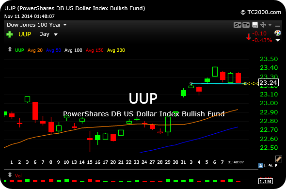
Category Archives: Uncategorized

OXY Looking Foxy

wc_bar

Like many plays in the energy space, Occidental’s monthly chart is a promising reminder about just how non-extended and ripe this sector is to benefit from a capital rotation. One step at a time, though, such as holding the initial breakouts.

But looking at the potentially explosive move up and out of this triangle dating back several years is intriguing, as the breakout appears to just be getting started.

___________________________________

OXY

Silver Bulls Head Out for a Sunday Drive

Before I draw the ire of silver bulls in my comments section, I will say that I do believe a sharp, tradable bounce in the metals and miners is now imminent. I sold my gold ultrashort ETF inside 12631 last week to lock in profits as the initial bottom-fishers have now mostly been flushed.

But now the silver ETF is fast approaching its 2010 primary breakout at roughly $19, where the presumption is that the metal will at least come to terms with that significant price area. The closer and faster it gets there, the better I like the odds of the entire precious metals and miners offering up a far more impressive snapback rally than what we saw late-last month. Having said that, if stubborn dip-buyers prevent a bloody gap lower tomorrow on the SLV instead of stepping aside, I suspect we could be in a for a long slog lower yet.

Either way, we are still looking at a potential multi-year top below $26, which means even the fastest and most furious of rallies are likely to be short-lived.

________________________________

SLV


Signs of Life Amongst the Dead Bodies

9XyKfCh

While other commodities continue to get smoked, natural gas is steadily improving. As you can see on the ETF weekly chart below, natty has made higher lows. $21 needs to hold, but a run art $24 for the big breakout appears to be a viable scenario going forward.

_______________________________

UNG

A Different Breed of Bull

Here is just one subsection of this weekend’s Weekly Strategy Session, which I published and sent out to members earlier on Sunday, which puts the current market’s run in perspective.

Keep in mind, the rest of the Strategy Session is devoted to specific, actionable trading ideas with sector rotations and price levels to watch, in addition to educational material and broad market context in the form of thorough current relevant issue coverage. 

1. The Uniqueness of the Current Bull Run 

To give you an idea of the abnormal and indeed historic nature of the rally we have seen in 2013, let alone since March 2009, let us begin by looking at a quarterly chart of the S&P 500 Index. With this most recent push higher into mid-May, price has now punctured its upper quarterly chart Bollinger Band, which is obviously a very long-term chart spanning several decades (Bollinger Bands can be useful technical indicators for measuring, in part, relative tops and relative bottoms, as well as signs of abnormal strength or weakness).

True, price did “ride along higher” its upper quarterly chart Bollinger Band throughout the middle years of the 1990′s, which is another lesson to drive home that puncturing the upper Bollinger Band on a long-term chart is often a very bullish sign of things to come down the road. But it does mean to not walk away from your computer screen in the short run, as the rubber band can snap back violently at any time in form of an aggressive correction.

What you will notice is that neither during the final years of the 1982-2000 secular bull market, nor throughout the 2003-2007 cyclical bull market did price even touch precisely, let alone puncture through, the upper quarterly chart Bollinger Band.

In other words, the strength we have seen out of this current market is rare and either currently or rapidly approaching long-term overbought conditions of a unique and perhaps unprecedented nature.

So, the rally is too overheated and simply cannot continue on higher next week, right? Well, not quite.

When we zoom all the way in to see the daily chart for the S&P, price is not overbought according to Bollinger Band analysis. There is room to push higher yet next week, before even a reasonable analysis on this timeframe could conclude that the market is “overbought.” While it is true that we need not become overbought before topping out, the powerful and unique trend this year has rendered those types of bearish theses to be null and void…for now.

Furthermore, other technical indicators like the RSI of major index charts, while overbought mildly, are not so dramatically overbought as to justify calling a major top.

In addition, the NYSE McClellan Oscillator (“NYMO”), which is a simple market breadth indicator tool, is also showing a lack of overbought conditions headed into this week. Generally speaking, when NYMO is above zero it tends to indicate bullishness for stocks, and below zero, bearishness. However, extreme readings can indicate overbought or oversold conditions. Above 50 is considered to be overbought, while below -50 is considered oversold.

As you can see on the daily chart of NYMO, last week’s close of 16.61 gives plenty of room for another push higher in stocks before hitting overbought conditions, above 50.

Bears will argue that the above NYMO chart amounts to a bearish divergence to stocks, since NYMO has been falling throughout most of May, while we know the equity markets have rallied to new highs. Furthermore, bears may make the same argument with the longer-term versus short-term Bollinger Band analysis, discussed above. However, as we have seen many times in 2013, these divergences could just as easily resolve in favor of the prevailing trend higher in stocks.

The increased speculation into higher beta, smaller cap, and heavily-shorted issues and sectors (e.g. China stocks, solar, shipping) continues to be consistent with a maturing rally. But just because a market is long-term very stretched with hallmarks of froth underneath the surface does not render declaring an imminent top any easier. Recall that markets which trend higher are uniquely difficult in which to declare a major inflection point at hand, perhaps even more difficult than declaring a bottom in a corrective or bear market. Instead, traders would likely be best served to focus on their risk-to-reward ratios in terms of which stocks and sectors to play and how aggressively to play them as a maturing rally becomes even more stretched.

Thus, the suggested strategy headed into this week remains putting in the work to identify stocks which fit within the template of a sound approach, which we will do in detail in the next several subsections. In other words, swing traders should continue to look for stocks which are setting up properly and not yet extended, instead of throwing all caution to the wind and aggressively chasing issues which have already become too far stretched away from reasonable swing entry points (several days or even weeks extended up past a 20-day moving average, for example).

Please Click Here to Continue Reading

(As a reminder, members of the 12631 Trading Service inside The PPT receive the Strategy Session included in their membership at no additional cost each and every weekend.)

Deepwater Resolution

It has been several years since the Deepwater Horizon oil spill, but BP and even RIG are still in business. Both stocks have drifted away from the spotlight, to the point where they are rarely discussed by traders or commentators alike.

On BP‘s monthly chart, below, note the debate taking place since the spill. Shorts have been reasserting themselves at each lower high, but value investors have supported each higher low.

Eventually, something has got to give. And I believe we are close to that moment with this multi-year symmetrical triangle (light blue lines) at the apex.

_______________________________

BP

The Old Tech Theme Redux

Not only have stocks like CSCO GLW MSFT made headlines of late for bullish price action, something which has been amiss for many years, but consider this post up at statista.com, titled: “Facebook’s IPO Investors Should Have Invested in Yahoo!”

This chart illustrates how a $1,000 bet on Facebook’s IPO compares with other investments over the past year.

Back in February 2012, when Facebook announced its plans to go public, the tech world immediately went crazy. The hype was enormous over what should become one of the biggest IPOs of all time. On May 18, Facebook started trading at $38, giving the company an implied valuation of $104 billion. But what was supposed to be a sure shot investment, turned out to be a dud.

On its first trading day, the stock closed just above its IPO price but only thanks to the company’s underwriters, led by Morgan Stanley, who bought heavily to keep the stock above its offering price. The next week, Facebook’s stock began crashing and it did so until it hit rock bottom at a price of $17.73 on September 4. Those who had bought shares at the offering price of $38 had lost 54 percent of their initial investment in less than four months.

ChartOfTheDay_1107_Facebook_s_IPO_Investors_Should_Have_Invested_in_Yahoo__n

Major US US Futures Europe Asia Commodities 2yr Euro Yields 10yr Euro Yields Oil
  • DOW 15,343.70 -0.07%
  • NASDAQ 3,502.11 0.09%
  • S&P 500 1,667.54 0.00%
  • VIX 13.19 5.94%
  • SPX 500 (CFD) 1,667.40 0.08%
  • DOW (CFD) 15,342.50 -0.08%
  • NASDAQ 100 3,028.20 -0.03%
  • EURUSD 1.286 0.06%
  • UK 6,738.30 0.23%
  • GERMANY 8,432.00 0.40%
  • FRANCE 4,009.30 0.20%
  • SPAIN 8,483.50 -1.15%
  • H. KONG 23,493.00 1.78%
  • JAPAN 15,360.80 1.47%
  • KOREA 1,982.43 -0.22%
  • SHANGHAI 2,299.99 0.75%
  • NAT GAS 4.13 1.85%
  • GOLD 1,355.40 -0.68%
  • SILVER 21.62 -3.26%
  • COPPER 3.32 0.09%
  • FRANCE 2YR 0.19 -10.90%
  • GERMAN 2YR -0.02 34.48%
  • ITALIAN 2YR 2.18 27.59%
  • SPAIN 2YR 2.81 8.21%
  • FRANCE 10YR 1.89 1.45%
  • GERMAN 10YR 1.36 2.34%
  • ITALIAN 10YR 3.90 -2.04%
  • SPAIN 10YR 4.19 -0.33%
  • WTI 95.83 -0.20%
  • BRENT 104.42 -0.21%
  • WTI/BRENT 8.59
  • 321 CR SPR 21.96 10.04%