I just had this chart pass by me, and I think it is worth a strong glance over.
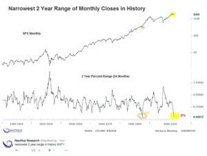 The last time the market was this compressed was in 94-95. Right at the time the Fed went on hits rate hike binge, rattling the bond market and opening the flood gates for money to come back into equities.
End of 2015 I wrote the following about the market coming into the year:
Around this time of year, I’ll usually highlight a chart that is one we’ll reference many times in the coming year. A chart that will define the year, basically. Last year it was $FDN, and how that would be the chart that “defined 2015.” This was simply because its largest weightings were FANGS (Facebook, Amazon, Netflix, Google, Salesforce.com). Cap weighted growth was my favorite theme for 2015, and this ETF covered all of them. Pretty good theme for the year, no?
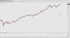
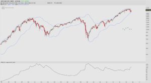
For 2016, there’s a significant amount of compression built up. Here’s a look at the monthly chart I used for the NYC presentation, and another chart that zooms in, and also adds a Bollinger Width indicator, to show you just how narrow this range really is.
Here’s that chart again:
Contracting volatility on any time frame is an important element of my analysis, and this is why I’ve been so steadfast on where the market is headed from here. This is the type of signal that forecasts the fastest market moves…and all things considered, in my opinion, is heading much higher.
This is the best time of the year to learn a little bit about stock picking. As a reminder, the Boot Camp starts on Monday. I’m super excited about this, as I think the timing of it all couldn’t be scripted better. If you have any questions about this, let me know, otherwise CLICK HERE to sign up.
OA
Comments »


