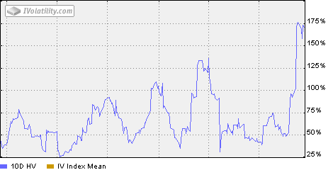
So how about we revisit the “SKF=Fear Index” notion now that America’s Most Insane Inverse Product is on the move again.
The chart here measures 10 Day historical volatility of SKF stock itself. Most historical volatility charts cover 30 days, the same timeframe the VIX seeks to express, and thus the historical chart tends to lag action in the here and now. A 10 day chart clearly has more noise, but also rings closer to how the stock feels.
And this one clearly feels pretty wild.
Now it’s going to compress a little bit, as data from the crazy ranged expiration week moves out of the system. But by the same token, the trend of the last couple days is towards big ranges again.
Bottom line is that once again, the relatively tame VIX on the screen fails to capture the generational fluctuations going on not much below the surface.


