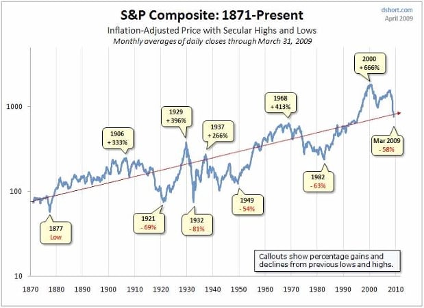
Doug Short has created a nice snapshot of 140 years of market history. It’s a logarithmic chart, so it shows the impact of percentage rather than absolute price moves, and prices have been adjusted for inflation. Note that the chart is price-only: It does not include the impact of dividends.
Key points:
* Bull and bear markets have always been with us (duh)
* The market spends about half the time above trend and half below trend (duh)
* The market has been above trend for about 20 years (ruh roh)
* The trough-to-peak 18-year bull market that peaked in 2000 (+666%) was the biggest in history by a mile (ruh roh)
* In the 5-year bull market in the middle of the Great Depression (1932-1937), the S&P jumped 266% (five years is a long time–don’t want to miss that)
* 20 years after the 1929 peak, the S&P traded at half its 1929 value (ruh roh)


