iBankCoin
Joined Nov 11, 2007
1,458 Blog Posts

May Seasonality on the S&P 500

With all the Sell in May talk, I thought it might be helpful to see how bad May has actually been, seasonally speaking.

May Seasonality

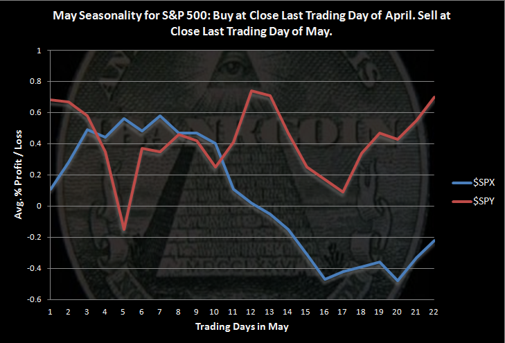
Click on the chart to enlarge. Calculations start at the close of the last trading day of April and end on the close of the last trading day of May.

$SPX data goes back to 1928. $SPY data goes back to 1993. The two sets of data demonstrate how May seasonality has changed recently, if recently is over the last 20 years.

May Statistics for $SPY ($SPX)

  • Average Monthly Profit/Loss = 0.70% (-0.22%)
  • Winning Months= 60.00% (54.12%)
  • Worst May = 2010 loss of -7.9% (1940 loss of -24.1%)
  • Best May = 2001 gain of +6.2% (1990 gain +9.2%)

The data show that May has historically been weak, but over the last 20 years, May has been able to grind out gains.

I want to note that the gap up shown in the $SPY results on the first day in May caught my attention. I thought that there was likely an error somewhere in my code. I have not been able to find any error, and going through charts by hand, it does seem that the first day of May has tended to see a rather large gap up, at least over the last 20 years.

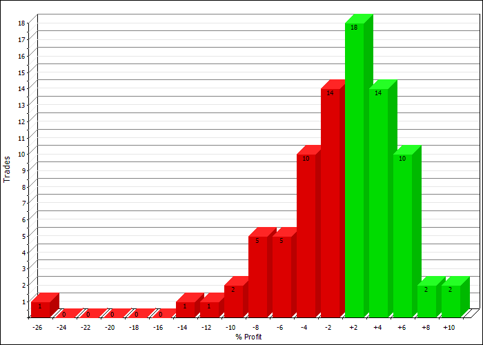
Profit Distributions, Using $SPX Data

May profit Distribution

Equity Curve:

May Seasonality Equity Curve

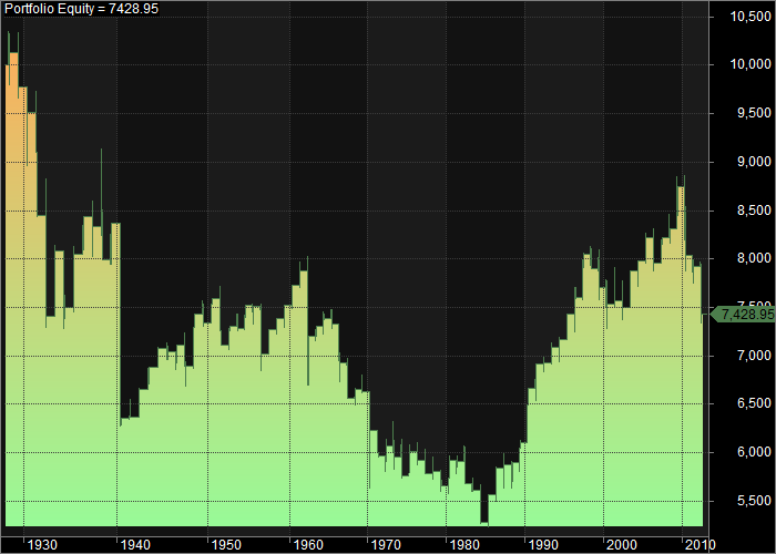
The equity curve shows that May tended to be weak from 1928 to around 1985. Since then, the month has tended to close higher. This shows that one has to be careful blindly following market mantras.

If you are interested in this monthly seasonality type study, Market Sci has recently penned a couple of excellent posts on this subject:

Calendar Month Seasonality Debunked?

“Sell in May” Debunked?

Comments »

Top 5 Fidelity Sector Funds Still More Defensive

The top 5 ranked Fidelity Sector Funds continues to get more and more defensive.

As of Friday’s close, Air Transportation has dropped out of the top 5 and landed in the 7th position. Pharmaceuticals has been rising and now occupies the top 5, and Utilities and Telecom now occupy the top 2 spots.

  1. FSUTX (Utilities)
  2. FIUIX  (Telecom and Utilities)
  3. FBIOX (Biotechnology Portfolio)
  4. FBMPX (Multimedia)
  5. FPHAX (Pharmaceuticals)

Biotechnology is very very close to getting bumped out of the 3 spot by Multimedia, but that is due to Biotechnology being volatile, which gets a fund punished in the rankings.

The Fidelity Sector Fund Rotational System is up 12.8% for the year vs. a buy and hold $SPY return of 11.1%.

Comments »

George Jones Wrote the Best Country Song Ever

Somehow I missed the passing of George Jones yesterday. It seems like so many of the great bluegrass and country legends have passed over the last couple of years.

George’s song “He Stopped Loving Her Today” is perhaps the best country song ever written. No Show Jones unfortunately was not able to no show at his final act. RIP.

Comments »

Optimization of the Caveman Rotational System on the Russell 2K Universe

I’m just starting to explore the possibilities of this Caveman system.

It is very simple, and I like simple. I’m not sure where any of this will lead. For now, I’m just exploring and having fun.

To create the chart below, I ran an optimization using brute force where I tested a minimum number of days to hold each trade against a moving average length.

The system simply ranks the stocks by the number of days they have traded above an X day moving average and holds each trade for Y days before re-ranking and possibly rotating into another stock. There are a maximum of 3 stocks held at one time. If, after the minimum hold time, a stock is no longer in the top 3, it is replaced with the higher-ranked stock. The system goes to cash if the $SPX is beneath its 50 day average and the minimum hold times have been met.

This is simply a proof-of-concept, so no commissions or slippage have been included. Neither has a return on cash. I ran the optimization from 1.1.2007 to 1.1.2010. The Russell 2K data I’m using has been adjusted to included non-surviving stocks.

Click on any of the charts to enlarge…

Optimization Big Picture

This shows the optimization results of the X day moving average (num) against the Y days held (HoldMindDays). While the optimized parameters achieved an annualized return of 51.1%, the space is not at all smooth. All those sharp peaks mean there is a substantial likelihood that the system will be curve-fit and will never produce anywhere near 51.1%. More likely,  we could expect less than half that in real-time. Although since I only ran through 1.1.2010, we will eventually see how the optimized parameter do in out-of-sample testing.

Optimization HoldMinDays

This graph shows a fairly wide space where holding anywhere between 30 and 70 days has been optimal.

Optimization Xdaymovingavgs

The other side of the 3D optimization graph shows that the optimal moving average was the 150 day. We also see peaks around 100 and 50. I again want to emphasize how “peaky” these results are. We hope that these graphs produce smooth, rolling hills rather than sharp peaks and deep valleys.

So for fun, lets use a 50 day minimum hold with the 150 day moving average.

Results:

Russell Caveman Equity and Historic Profits

The system’s compound annual return was 44.54% with a maximum drawdown of -33.83%. It made 53 trades with 66.04% winners and an average trade of 7.05%.

The flat spots of the curve are when the system is holding cash.

While this is a fun exercise, based on the very peaky optimization graph, I’m not so sure there is anyway to trade this system and have any faith that it will continue to perform well in the future. That being said, I’m going to play around with it a little bit more.

Comments »

High Tight Flags for Tuesday

Was that the best pullback the market had to offer? Only time will tell. I’m still leaning more bearish than I have been in the last 6 months. Still, if market is going to keep chugging away, I like to keep an eye on the high tight flags.

DUST

ECTY

HIMX

GST

MERU

CHTP

Comments »