iBankCoin
Joined Nov 11, 2007
1,458 Blog Posts

Are the Trannies Going Down?

Trader Mike called attention to the Transportation Index in a post yesterday. I had been watching it, but forgot about it for a week or so and therefore missed the crash through the 50 day average. The fact that the trannies have been so strong has been a big feather in the bull’s caps. Today, the index tested the 50 day average from beneath, and failed. When I see selling at such a critical junction, it leads me to believe that a breakdown might be in the near future. The uptrend line must be maintained in order to avoid a full-on breakdown.

Above is [[IYT]], the ETF that tracks the Dow Jones US Transportation Index. I’m considering selling it short. It should be noted that anticipating a breakdown is different than trading a breakdown. As long as the trannies hold the uptrend, it is entirely possible that they bounce and resume their climb. I would like to sell this around $92.50 and would look to cover near the 200 day average.

Comments »

Vote Here: Cliff Dive, or Bounce?

Cliff Dive or Bounce?
Over the next 2 days, will the markets cliff dive, or bounce?


Cliff Dive a la January
Bounce
  Current Results

Comments »

Double Inverse ETFs: Born To Lose

I am going to put to rest these issues surrounding whether double inverse ETFs accurately track the underlying indexes.

Editor’s Note: Thanks to Ottnot, I have found that I have erred. I will strike through the errors, explain them, and re-post the corrected spreadsheet.

Here are the facts:

1. If the underlying index has a daily percentage gain, the double inverse ETF (diETF) will lose twice as much as the underlying index gained.

2. If the diETF experiences a one-day percentage loss, then the diETF can never ever recover to break even, relative to the underlying index it tracks. Not true. However, if the diETF experiences multiple days of losses or stays in a downtrend for a length of time, it can be very hard for it to recover to breakeven, relative to the index it is tracking.

Before I show why this is true, there are other issues to clear up. If we are talking about [[SRS]], the diETF for the Dow Jones US Real Estate Index, then we must compare SRS historical data to the historical data of the index it tracks, not to the historical data for another ETF, even though it may be tracking the same index. To compare ETFs to ETFs, instead of an ETF to the actual underlying it is tracking, will compound errors.

This experiment will compare SRS, a diETF, to the index it tracks, the Dow Jones US Real Estate Index, symbol DJUSRE.

Historical data for DJUSRE is available from Dow Jones here: DJUSRE Historical Data. Also, if anyone wants to perform more research on this subject, here is the Dow Jones Indexes website: Dow Jones Indexes.

I have pasted the spreadsheet below. I will do my best to explain what it all means.

*Note* Click on the spreadsheet once, and it will open in a new window. In the new window, click it again, and it will open full size.

Column C has the daily percentage changes for SRS since inception. The sum of all daily percentage changes is 51.77

Column I has the daily percentage changes for DJUSRE during the same period. The sum of all daily percentage changes is -26.82

Ideally, 2(-26.82) would equal 51.77. Obviously it does not. We can see already, by summing the daily percentage changes, that SRS did not track the daily percentage changes of DJUSRE exactly, but this is a small error and is likely due to irregularities in maintainging the swaps and futures. This may also be due to management fees.

Next, look at the last cell in column E and K. This number is the percentage gain or loss since inception. We can see that SRS gained 25.39% over the period, while DJUSRE lost 39.04% Note to self, never ever build a spreadsheet after midnight. I copied the wrong formula over and therefore the sheet calculated an erroneous gain/loss since inception. The corrected numbers are 34.046% for SRS and -28.080% for the DJUSRE

Yes, that is correct. It is erroneous to assume that SRS would be +39.04%. It does not track the annualized percentage change of the DJUSRE, only the daily percentage change. Annualized, SRS has 13.65% less than twice the loss of DJUSRE. It is erroneous to assume that SRS would be +28.080%. It does not track the annualized percentage change of the DJUSRE, only the daily percentage change. Annualized, SRS has gained 5.97 percentage points more than double the inverse of the DJUSRE.

Finally, look at rows 15 and 18 in columns F and L. I have highlighted the cells. These calculations show that even over the short term, if the diETF goes down EVEN ONE DAY, IT WILL NEVER EVER BE ABLE TO GET BACK TO BREAK EVEN. The one known as “Ottnott” is right. Due to the 2x leverage, it will get back to breakeven, although if the losses are built during a sustained downtrend for the diETF, it may be very difficult for it to recover.

Let me explain. Look at the price changes from February 1 to February 23. During this time period, the DJUSRE value has moved up and down. On February 23, the DJUSRE index is almost back to breakeven. Cell L18 shows that the index has lost 0.71668% from Februrary 1 to February 23.

Now look at SRS during the same period. The closing price of the SRS is actually higher than the inception price, as it should be, since DJUSRE is showing a small loss, right? Be very careful here. While DJUSRE has lost 0.71668%, SRS has only gained 1.3246%, relative to its inception value. If we calculate twice the loss of DJUSRE on that date, we would get 1.43336% Observe that the gain of SRS is less than twice the loss of the underlying index.

From February 1 to February 23, SRS has actually lost 0.10876%, and it will never ever be able to make up that loss. In fact, these losses will compound over time.  Had I not been in a hurry making the spreadsheet, I would have went ahead and completed the calculations for the entire row, instead of just a few cells. I would have then realized my error. What the spreadsheet now shows is that when there is no trend, or the diETF trend is down, the leverage tends to work against it. However, once a strong uptrend emerges for the diETF, the leverage really kicks in and it begins to outperform (more than 2x, annualized) the index it is tracking.

The key point to learn here is that it will take a while for the leverage in the diETF to catch it back up to the underlying. Even when the point value of the diETF is showing a gain, in percentage terms, the diETF may still be less than 2x the underlying.

These diETF are certainly great to trade on short time frames, but buying and holding them will guarantee losses. I still maintain that buying and holding the diETFs is a bad idea, due to the fact that any series of losses will compound and make it very hard for the diETF to recover. Furthermore, since most markets have an upside bias, over time, it is reasonable to assume that these diETFs can compound losses due to their 2x leverage to the extent that they may never be able to fully recover.

Please, if you have any questions about how this all works, do not hesitate to ask. I hope that now we can put this issue to rest, once and for all. Now that we understand how diETFs are born to lose, I suggest we begin to figure out how to profit from this anomaly.

I would also ask humbly that you link to this post, and pass it around, if you find it helpful. In my estimation, there is no other resource available on the internet that explains this diETF phenonmenon as well as this article.

Comments »

Nasdaq and QQQQ Test Support

If I did not know any better, I might think that tech is going to make another run. The Composite Index bounced from support at 2430, and in doing so, completed a perfect kiss of the 50 day average.

The [[QQQQ]] also bounced from support at $48.00 and seems to be testing the 50 day and 200 day averages. The long tail on the candles show that buyers were not scared to step in a push these back up off their lows. Notice the Golden Cross forming, as the 50 day average crosses back above the 200 day average from beneath.

As long as both prior support and support from moving averages holds, I am very apprehensive to short much of anything tech related. However, should this support break, the market’s lifeline will be severed, and there will be no area of the market left clinging to any uptrend. If this happens, the decline could be very steep.

Comments »

Building Confidence in a Confusing Market

While I would never expect most market participants to willingly admit the market has confused them lately, it has undoubtably done so to many traders. I too have experienced this confusion during times in the past, and I know that at best, it can lead to a loss of confidence. At worst, confusion can lead one to more existential issues, such as, “Is this trading thing a waste of my time and money? Is this my calling? What was I thinking when I thought I could actually beat the markets!”

I know of only a few ways to recover from this confusion and crisis of confidence. The easiest way (and least beneficial to the ultimate success of any trader) is to experience a run of profitable trades. This typically rejevunates the trader to the point where he forgets all about his previous crisis (and therefore probably learns very little in the process). 

Rather than wait for their luck to turn around (and chance blowing their accounts up in the process), professional traders will typically cut their bets down to very small sizes until they begin to regain their confidence. They may examine their past trades to determine if something about their strategy has changed. Professionals may even examine their personal lives to determine what effect their lives away from the markets are having on their trading.

What I believe makes the recovery process difficult for a lot of traders is that they cannot truly articulate any strategy. To make matters worse, I feel fairly certain most do not keep good records of their trades. Without any strategy to examine, how can one figure out what is wrong? And without good records, how does one really know if their trading was EVER very good? Having harvested good profits in the past, or just not losing their initial investment will not be proof enough should most traders find themselves confused with their confidence shaken.

With this in mind, I would like to suggest a very simple way for traders (especially those who do not like to keep records or tend to shy away from systems or strategies) to build a strong foundation for their confidence. This foundation will provide a good place to fall back on in times of confusion, and should be able to provide objective feedback should their discretionary trades just seem to quit working.

All that is needed is for every trade’s gross profit or loss to be recorded.

Depending on the frequency of trades, most traders should soon be able to develop some very simple statistics which will help build the foundation I speak of. Some traders who have kept good records will have plenty of data to work with.

Meet Joe Sixpack

Joe has been a little confused lately. He is losing confidence in his skills, and is wondering if he should not just give up.

We’ll build some statistics for our trader, Joe Sixpack. As most visitors to this site seem to trade actively, we’ll take a hypothetical period of 1 month and figure that on the average, Joe makes 1.5 trades a day. With approximately 20 trading days in a month, J6P will have made 30 trades.

Now J6P will have to add up his gross profits and gross losses. Joe had a so-so month, with gross profits of $5500.00 and gross losses of $4750.00. This means his net profit (not including commissions) was $750.00

Determining Profit Factor and Win/Loss Pecentage

Profit Factor is determined by dividing the gross profit by the gross loss. J6P then has a profit factor of 1.16 [ 5500.00/4750.00=1.157 ] Any profit factor greater than one means the trades have a positive net profit.

Out of Joe’s 30 trades, 15 were losers, and 15 were winners, giving Joe a win percentage of 50%.

Now, we have everything we need to evaluate Joe’s performance, and help him to build his foundation.

Uh-oh, Here Comes the Spreadsheet

No really, this is the easy, and fun part.

All we have to do is input the win percentage and profit factor, and the spreadsheet will create the equity curve. Even better, it will create another random equity curve every time you hit F9. Go here to check out the spreadsheet: Equity Curve Generator 

This spreadsheet on Google docs will not generate a new equity curve every time you hit F9. I gave the link to show simple the spreadsheet is. However, I will be happy to email the sheet to anyone that is interested.

Now I know you probably need your appetite whetted a bit more before you are ready to figure up your statistics and plug them into the spreadsheet. So let me give you a few equity curves based on the statistics from Joe Sixpack’s trades:
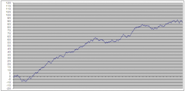
Above, we see J6P has a fairly nice curve. There are a few drawdowns, including one at the very beginning, but it is decent overall.
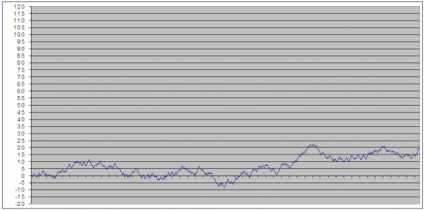
The above chart shows the same statistics: 50/50 win rate and 1.16 Profit Factor. Does not look so good, huh?
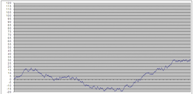
This one has a substantial drawdown.
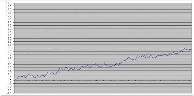
And this one shows a slowly uptrending, rolling, equity curve.

Knowing that these charts represent 4 random generations of J6P’s win percentage and Profit Factor, if you were Joe, would you be very confident? Probably not. Granted, I passed over several more charts to find curves that were more interesting. However, once you play with the win % and PF, you can begin to get a sense of what kind of statistics would make you feel confident.

Ideally, to build a foundation, traders need to trust that, barring really bad luck, their trades will generate steady profits. Drawdowns are part of every system, discretionary or mechanical, and this spreadsheet will give some idea of what drawdowns might be like in worst and best case scenario.

Once the trader has embraced the many different random possibilities his statistics will generate, periods of losing can be viewed objectively as just another drawdown in the equity curve, rather than the beginning of a blow up. If the equity curves are less that desirable, then the trader must accept the limitations and weaknesses of his trades, and begin work on developing a better strategy.

Granted, this is a very basic method of evaluating trades, and there are many more variables that will have to be considered, in the long run. However, thinking of trades in these terms should give most traders a way to build confidence, assuming their win % and profit factor is healthy.

Credit Where Credit is Due

bhh from IBD Index (a fantastic and highly recommended blog) originally sent me the spreadsheet. However, it came to him from John Ehlers. John’s website is Mesa Software. The documentation for the spreadsheet, including instructions for building it, can be found here: System Evaluation

Comments »

Hedging with Leveraged ETFs

Following the footsteps of last week’s post, WTF is Wrong with Leveraged ETFs, I decided to take a look at whether leveraged ETFs can still perform as effective hedges. Also, I am continuing to explore if there are any anomalies to exploit when trading leveraged ETFs.

In my opinion, an effective hedge should not significantly limit possible profits but should significantly limit downside exposure.

For the first experiment, I chose to examine the relationship between [[FXP]] and [[FXI]], as FXP is the double inverse of FXI.

FXP is relatively new, which introduces some weakness into the research. The name has caused some considerable consternation for traders here at iBC. Thus, I decided that the lack of a large data set was not as important as using an example that might actually help traders here make money.

The experiment has one buy $5,000 FXP on the day of the IPO and $10,000 FXI on the same day. The purchases were made on November 8, 2007, and held through the close on June 6, 2008. The experiement has you buy only half the FXP because it is leveraged and should move 2x the daily movement of FXI. From my last piece on leveraged ETFs,  we learned that since FXP tracks only the daily movement of the FXI, we would not expect it to mirror FXI over longer periods of time.

Have a look at the spreadsheet here:  FXP as Hedge for FXI. (There are two charts in the spreadsheet)

Here is the bottom line:

  • At the close on Friday, FXP shows a profit of $63.79
  • FXI shows a loss of $2,525.34

Not much of a hedge, huh?

One interesting note: On March 19, 2008, FXI was showing its worst drawdown of $3,470. On the same date, FXP was showing a profit of $2,674.00.  Still not great, but better than the final result. This just goes to show that these leveraged ETFs typically lose their ability to hedge the longer the relationship is maintained.

Future posts on leveraged ETFs will explore whether or not we should consider shorting the inverse ETFs. While the twist is sometimes hard to wrap the brain around, the results may surprise you. 

Comments »