Another Gold Analysis with some Volatility, Options, and Charts

429 views

Its no secret that gold and the miners (via GDX) took a hit today.  All I heard from CNBC was the looming Death Cross (50sma crossing below 200sma).  Quite frankly it got old and then there was the FOMC Meeting Minutes that caused further selling on volume in the yellow metal and miners.  But was today a capitulation?  That is what many seem to be wondering.  Today many talked about the rise in the VIX and yes it was big on a relative percentage move in comparison to the SPX.

When looking at the VIX-type instrument for gold we look at the GVZ.  Today the GVZ saw a move of 18.03%.  Below is a 1 year daily log chart showing the size of the move.  Something to note is that GLD really saw this down move accelerate last Friday on the gap below 158, but note what the GVZ has done on the Friday & Tuesday moves  in comparison to today:

gvz_0220

Also with that I like to look at what the GLD  implied volatility (IV) has done in the options, below is an excel screenshot of the rise in volatility since the close of Thursday (data from thinkorswim):

gvz_0220a

We can see the larger rise on a percentage basis in the near-dated weekly options verse the monthly option chain.  Next week expiration showed a rise of 4.03 points (29.94%) in the calls and 4.33 points (31.22%) in the puts.  A bigger jump relative to price change than we saw on the previous decline Friday.  Personally I’m liking the idea of selling some front month volatility and buying further dated options.

On a chart and price basis, how big was the move today?  When looking at volatility of the instrument, many use Bollinger Bands and I like to use them as well.  Today it was noted by several on the stream that we closed below the 3rd standard deviation 20 day Bollinger Band.  While traders like to use the fat tails of moves as price has been known to walk the band on the 2 standard deviation setting, this isn’t quite so common with the 3rd standard deviation.  It is a more rare occurrence that often sees a snap back.

I looked at the last 10 years of data for GLD and a close below the lower 3rd standard deviation band has happened twice, both being in 2012 (yellow arrows mark a close below then back inside the band):

gld_0220a

Zoomed in view:

gld_0220b

Below is a chart of GLD going back to when we broke out and GLD went parabolic:

GLD_0220

I have a correlation  to GDX as today it was noted on the stream by several I follow that the metals saw big option buys near the close in ABX, GG, & NEM in the January 2014 chain, search stream with ticker and you will find the posts.  ABX stuck out in my mind as January saw buyers of the 40 calls, noted by @OptionsHawk at his website where there are usually 4 free option notes for each day:

abx_0220


These go all the way out to January 2014 so if you were looking to play off some of this information you will definitely want to go out in time and let the trade work.  The trades today (2/20) were put on for cheap on an option price basis but are also +1million dollar trades.  Either way use diligence if using this info for a trade and keep timeframe in mind.

Thoughts on Divergences

448 views

When going through the timeline last night I came across a post from @AnneMarieTrades that I found interesting:

“Folks, momentum is SLOWING – it dsnt mean we r rolling over. Observe divergence- but don’t trade divergence. Trade price, & price alone $$”

I always like to look for divergences in price with indicators such as the popular MACD, Momentum, or RSI.  When I first started trading I read in books that these can be warning signs.  So what did I do?  Naturally I traded against the trend and in the direction of the divergence that the indicator was pointing to  (often at tops calling for downside).  Needless to say I lost more money than I made.  Sure there were some hits and the psychological feeling was great  but I lost more often than I won.

Then I watched a presentation by Linda Bradford Rashke and she stated that when most people trade divergence they fail to look at the higher time frame.  This is exactly what I failed to do and needless to say I was usually trading against what was a powerful uptrend.  So if you are trading a daily chart and there is a divergence, look at the weekly and what is that telling you?  Same goes if you are trading a 5min, look at the 30min; and if you are trading a 30min, look at the 240min or daily.  I am quite certain you will be surprised at how often you are trading against the bigger picture.  Sure you may catch a top or bottom here or there but those profits will probably go back into the market to the other side.  Now divergences are more of an observation than a trade for me.

Posted below is a daily chart with the Momentum Oscillator, MACD, and MACD histogram (difference below the two lines).  While many traders like the MACD histogram (bottom pane), I personally do not use it and instead focus on the MACD (middle pane) by putting the Value as a histogram (purple) and the Avg as the line (yellow).  If the histogram (purple) is above zero, then it is a bullish signal.  Also I will look for divergences on that histogram alone more so than the MACD histogram (bottom pane).  Below is a picture of the daily chart of the SPX, note that MACD (purple histogram) has not shown a divergence like the MACD Historgam (bottom pane) has:

spx_20130207

Here is the Weekly chart showing the same time frame, highlighted in blue.  I left the lines on price to show as a reference to where they were on the daily:

spx_20130207aWhile the daily is showing a divergence, the weekly is showing a powerful uptrend.  While many can trade the divergence or scale down to a lower timeframe for day/swing trades then that is great as there can be some homeruns with a good entry and scaling plan.  My goal here was to highlight that higher time frame, no matter what time frame you trade on.

Why I Initiated a Short Position on the Russell 2000 w/Options

377 views

It was hard not to get caught up in the euphoria of the market yesterday and the day before if you were long positions already   There were many comments on the stream yesterday and today about chasing and I would agree.  That comment can also be broken down into size as well.  Sure it is unwise to put on a full long position at these levels but if you were to initiate a 33% or 25% position (depending on your scale model) then you may have a great trade.  As for me I have no long positions at this moment but initiated a 1/2 size short position yesterday on the Russell 2000 (RUT).  I believed things became a bit overextended and I was watching two metrics I like to pay attention to:

  • percent above the 10 EMA (1st indicator pane) looking for a 3% extension 
  • points above the 20 SMA (2nd indicator pane) looking at the 30pt mark for warning and 40pt mark for an extreme

I like to look at these two indicators for times like this when the chase is on.  Also when they breach the points it is a warning and a possible time to initiate a position for a trade in the opposite direction.  We all know that overbought or oversold can become overbought-er or oversold-er (please appreciate the humor) so the time in where I will add to the trade is when the RUT trades back under those points.  Below is a 1 year chart with blue highlighted boxes of where the RUT first breached these points and then traded back under (notes on chart):

rut_20130103

The option trade that I chose was the Feb/Jan1 850 Put Calendar for a 13.08 debit.  First here is a chart of the RVX (Russell 2000 VIX) with notes:

rvx_20130103

With that I was looking for a pullback option strategy that took advantage of a pop in volatility and the strategy that came to mind was the Put Calendar as this took advantage of a pullback and was positive vega.  I did screw up in putting this position on in that I sold the Jan1 option (not much time or benefit) instead of selling the next week Jan2 option.  I only collected 0.15c on that Jan1 option instead of the near 2.00 I could have collected for the Jan2 option.  A mistake on my part.  I do believe that it can be recoverable and I do not have a full position on either so the dent to my account is manageable.  But this is a good lesson in taking the time to slow down and actually confirm the order when that pop-up window asks you.

Thoughts on Relative Strength

338 views

One of the most popular indicators of strong stocks is Relative Strength (RS), which measures a stocks performance against the market or selected index.  Sometimes it is confused with Relative Strength Index (RSI) which is a momentum indicator/oscillator made popular by J. Welles Wilder.  I first learned about RS through reading Investors Business Daily when I first got interested and trading in stocks in the summer of 2007.

I am a big fan of RS and if you see charts I post through Twitter/Stocktwits you will see the RS indicator with RS Average of 21-periods (roughly a month) in a pane with volume below it.  Example shown below is a 9-month Google (GOOG) chart with RS pane enlarged.  The green line is the RS and the purple line is the RS average:

goog_20121223

While most platforms will use the S&P 500 to measure the individual stock performance against, I choose to use the Russell 3000.  I like to use the Russell 3000 (RUA) as it compromises of 98% of the market while leaving out that 2% that can display extreme volatility everyday.  I just find this as a perfect metric of the overall market to incorporate all pertinent stocks instead of using the S&P 500, Nasdaq, or Dow.  If I see a stock making a higher RS vs. the previous day then I know it is outperforming the true market (or market of stocks) that is not limited to the the top market cap companies or those specific to an industry.

Now the problem with Relative Strength:

I like to think of RS as a double-edged sword.  Before I get bashed, remember that it is a top indicator of mine.  The problem where traders may rely too much on it is if the market stalls or regains its footing, then it is valuable.  The other side of the sword comes in if the market continues to drop.   I am a believer in a rising tide lifts all boats.  With this, if a stock is holding up against the market firmly (showing strong RS) then that stock may be the most susceptible to a sell-off that hasn’t been displayed yet such as in other stocks.  In other words, if it is a sellers market then these are the stocks to look at and sell for some hopeful big gains.  I am a bull and think it is easier to trade as a bull, but when the market is being liquidated then it is your job to seek these stocks that have high RS or just go to cash altogether.  I have learned that it is difficult to short outside of a swing and I don’t play short trades much and have opted to go to cash instead.  But that is just me.

If you are looking for some examples just look at December 2008 and July 2011 when we saw liquidation and nothing else in the market.  Off the top of my head stocks like JNJ, PG, KMB or those other stocks in the Consumer Staples or Healthcare industries that are deemed to be “safe” also saw selling that was enough to trigger stop losses.  It is important to remember that mutual/hedge funds are supporting those stocks but when they are ready to sell it then no indicator, not even Relative Strength, holds a meaning….liquidation is I want out now and nothing else.

Another Reason for Market Bounce and Today’s Near Death Experience

394 views

Am I the only one overwhelmed with reading bearish articles?  Of course the post-election sell-off didn’t help but as a trader I do not try to figure out the future or trade based off economic data or the effects of political decisions.  I only look at charts and indicators.  As observed by most traders, many charts are broken and the breakout trade is a tough one here.

On the flip-side there are many respectful traders that I follow that post reasons (macro & technical indicator related) for a bounce and I have to agree.  One indicator that I like to pay attention to and have written about before is the McClellan Oscillator (free in many charting packages).  I have previously wrote about it back on June 20, 2012 and July 24, 2012 showing areas where we have bounced.  Usually I like to focus on the -200 level for a bounce but the -150 level (on a closing basis) has also proven to be reliable.  I have included a 1 year chart of the $SPX with highlighted areas of where we fell below the -150 level (yellow line):

It is not my point to make a call of the bottom or a bounce for that matter, but I believe the odds are in the favor of some long positions.  I also think it is a late point to short the market and it may be a sound strategy to dip into some long positions based on your watchlist and theory of “a rising tide lifts all boats”.  In my opinion the winning trader here is the one that understands trade and portfolio risk.  I would be comfortable putting on 1/4 positions here and if they fail (stopped out), the overall loss is acceptable to the portfolio.  Remember no one is forcing you to trade, if you are uncomfortable then stay out and study past trades or continue your education.

I personally attempted a long position in $AAPL via an option spread back on 11/6 and knowing the publicity $AAPL gets you know that I am underwater.  I went into this position accepting a 100% loss on the option spread as my ability to monitor the market would be limited.  Even though I may take a full loss on the option spread, my overall portfolio loss will be around -1.5%.

**Today’s Near Death Experience**

Today while working out in the garage I was on the chest portion of the workout performing reps of 12 within the set.  This is when the craziest thing I have experienced happened.  While I was on the descent of my third rep, my bench came completely apart at the weld where it adjusts for incline/flat/decline.  I was performing incline and went to decline instantly.  At this point the weight bounced off my chest and I still don’t know how but I thrusted with my hips and arms and got the weight over my head (just barely avoiding crushing my head) and then fell off to the side.

This all happened in less than 3 seconds from break of equipment to me laying on my side.  When I got up all I could think was “what the hell happened and I wish I had that on video”.  Below is a picture where you can see the weld break and the now detached bench on the side:

Near death may be a little much but a possibility and definitely a grape-crusher.  Please don’t make fun of the rug I have there.  Gym mats are to be ordered soon.

I Will Not Partake in Tomfoolery; Seeing Conflicting Market Signals

388 views

As the title suggests I have no interest in partaking in this market here.  Right now I have many conflicting signals as far as the direction of the market.  Basically they all same the same thing in that we are oversold, a bounce is expected, but overall the market is not healthy and further downside can be expected.  Last night I posted about a short term technical indicator I watch that shows that a bounce can be expected; I still expect this.

I am truly conflicted here.  I do believe that a bounce is expected but selling into the bounce seems reasonable, notably the 1430 area in the $SPX.  On another note it is hard to ignore the QE stats and that there is usually some ludicrous action after QE announcement followed by a run a higher and that coupled with presidential election year seasonality suggests run into the years’ end.  Many of the macro indicators I watch suggest further downside and room for further downside, they include:

  • Bond:Stock Ratio w/a 65-SMA, this has recently crossed above suggesting downside action
  • US Dollar Heiken-Ashi chart with a 42-SMA, this inverse-market indicator confirmed upside market action on 8/7 and just confirmed downside action today
  • NASDAQ:SPX  ratio with moving averages, this suggested downside action on 10/2 and remains bearish
  • Premium service showing that a majority of the $OEX stocks are in downtrending patterns (measured on pure O-H-C action)
  • Distribution days as measured by Investors Business Daily

Now that the doom and gloom is out of the way there are some things that suggest a bounce is due.  One indicator is a premium service that suggests that we are highly oversold and a bounce is expected, another is the current McClellan Oscillator reading comparing to previous levels, and the $VIX.

As far as the McClellan Oscillator reading, looking at the chart below we can see that we are near levels that have historically recorded bounces.  Look at the highlighted boxes but one thing that is different rather than early on is that we are seeing lower lows instead of higher lows, something to take in consideration:

The other thing that I like to pay attention to is the $VIX and closes outside of the Bollinger Bands.  This essentially measures the volatility of the move on volatility.  I like to watch closes outside the upper and lower bands as extremes.  The chart below shows the $SPX on top and the $VIX below.  The $VIX arrows show closes outside of the Bollinger Bands.  The $SPX shows yellow lines in where the $VIX closed outside of the upper Bollinger Band, essentially an extreme $SPX move to the downside.  Note the $SPX price action after we see consecutive closes outside of the upper Bollinger Bands on the $VIX.  This is a favorite timing indicator and the best way that I use this is to wait for the $VIX to close back below the upper Bollinger Band rather front running an extreme.  As you can see, there are occurrences where volatility continues to “walk” the Bands:

So like I said I am not interested in partaking in the tomfoolery of the market here.  I highly believe in mental capital preservation and today I closed out my positions (previously stated in blog posts) in $AAPL and $GOOG and I am now flat.  This leaves me in a relaxed state of mind and allows me to work on watchlists and track the market without position bias.  If we see more downside action I will stay in cash but not look to short and if we see upside action I will look to see how the breakout stocks are acting (if sticking) and look to get in bullish positions.

I have learned through time that sometimes less is more and right now I am feeling that this thought needs to be put in to practice, at least for me.  Never forget that mental capital can be as precious as monetary capital.

The Forgotten but Effective Moving Average

256 views

In last night’s post I wrote about how AAPL was displaying some of the same characteristics as when the last time it saw a significant correction.  I mentioned that my first buying opportunity to establish some longer holding positions was if (& hopefully) it crossed below the 100 exponential moving average.  Every trader interested in technical analysis knows about the buying opportunity when a stock dips to the 50 or 200 simple moving average.  But one moving average not talked about often is the 100ema.

I have found that in stocks that have displayed superior momentum or have been leaders, the dip to the 100ema can be a great buy opportunity.  I refer to it as the “value” area of a stock in a technical analysis sense.  I have not done any studies or read to many articles on the why, but from a psychological standpoint it looks as if those that gave up when the 50sma has failed or saw above average selling (considered an exit sign) then the 100ema is considered an area in where to buy.  I like to think of it as flushing out some of those at the 50sma, but still carrying enough weight to get in as this is not often the case in momentum names if waiting for he 200sma.

So when when thinking about some former/current momentum stocks some that come to mind are:

  • NFLX
  • CMG
  • GOOG
  • V
  • AAPL
  • PNRA

The list could go on but these came to my mind for now and will provide charts on these.  I am looking at the exponential moving average and not the simple moving average.  Also the 100ema must be trending up for this to be a dip buying opportunity and other averages correctly stacked (50sma>100ema>200sma).  These stocks are not hard to find as they will have been heavily mentioned due to strength on the social stream, in the media, or highlighted by Investors Business Daily (such as the IBD50).  The buy would be if the low crosses below the 100ema and not necessarily a close below the 100ema.  Also the stop would be at your discretion based on your risk tolerance, I have not optimized and backtested this but it is just going off what I have noticed through the years.  Examples being 20% allocation with 10% stop (representing 2% on portfolio); or for more wiggle room a 10% allocation with 20% stop (same 2% portfolio risk).  Either way you get the idea.

Below are the charts of those stocks above with a yellow arrow  marking when the low crossed the 100ema.  The reader will have to judge if the 100ema was in an up-slope or not.  I didn’t cherry pick these but just listed some that came to mind and included the time period of some of their best moves.  GOOG didn’t look all that great but also found that when it did cross the 100ema the 100ema was rolling over, so would the trade be taken or not?  All hindsight in my opinion when you know the right side of the chart.  It’s all about risk tolerance here.  This is not a trading system but more of an awareness to how price responds to the 100ema.  The trader could add other filters as see fit.  I encourage you to go back look at any chart that was a momentum name and see how the 100ema.

Netflix

Chipotle Mexican Grill

Google

Visa

Apple

Panera

Keep Perspective On What Has Worked, Not News or Emotions

367 views

What a day today as the market opened it was definitely a trend down day.  If you were overly long then you felt some pain to your portfolio.  The summer has marked a buy the dip and sell the rip environment.  I think the key to staying sane here is not to overweight yourself to any one side.  Me personally I am in a buy-the-blood mindset.  Does that mean going 50-75-100% long? No!  I am talking about dipping in with no more than 25% of my portfolio to the long side as we can still see selling.  But here are some things I am looking at as a reason for me to have some long exposure.

Below is an SPX chart with the McClellan Oscillator which I have talked about before in this post.  In the chart you can see that when we have a -200 reading (highlighted areas) there is a good chance that we bounce.  Also when there is a divergence between price and the oscillator after it hits -200, we move higher and a longer rally has occurred.  But also make note that when we do hit -200, it does not mean an immediate bounce.  Instead it tells me that I should start scaling out of shorts I may have had and scale into longs.

(click on chart to enlarge)

Could we have another scenario like August of 2011?  Of course we could, that’s why I emphasize scaling in and going no more than 25% or my preferred 20% long exposure at this juncture.  Also another indicator I am looking at is on a more narrow time frame.  I always look at the RUT and /TF (emini Russell) charts.  I like to plot the RUT with Weekly Person Pivots and the /TF with Daily Person Pivots.  I have found that when we go around 15-20 points below the Weekly Person Pivot, this often marks an extreme move and a basing or bounce is imminent.  I have highlighted these points in a prior post.  As you can see in the chart below we are currently -10pts below the Weekly Person Pivot and hitting the bottom of the Daily Person Pivot.

So what does all of this information tell me?  With AAPL earnings out today and where the futures are currently trading, I believe we may see a gap down tomorrow.  This is a perfect scenario to me as I believe this could push the McClellan Oscillator to oversold territory (-200 or further) and couple that with possible extreme moves in the RUT and /TF parameters in regards to the Person Pivots; I have no problem having some long exposure on, especially to stocks that have displayed Relative Strength this week.

In my opinion it is not a time to add to shorts as this market during the summer has been  a buy the dip and sell the rip type market.  The only advice I can give is to ignore news, doomsday scenarios, etc. but go in with a game plan.  Am I uber-Bullish?  Not by any means but from a risk perspective I would be looking to reduce short exposure and add to long exposure…or go cash with a wait-and-see mindset as that saves you capital, physical and mental.

A Risk Indicator I Watch

1,065 views

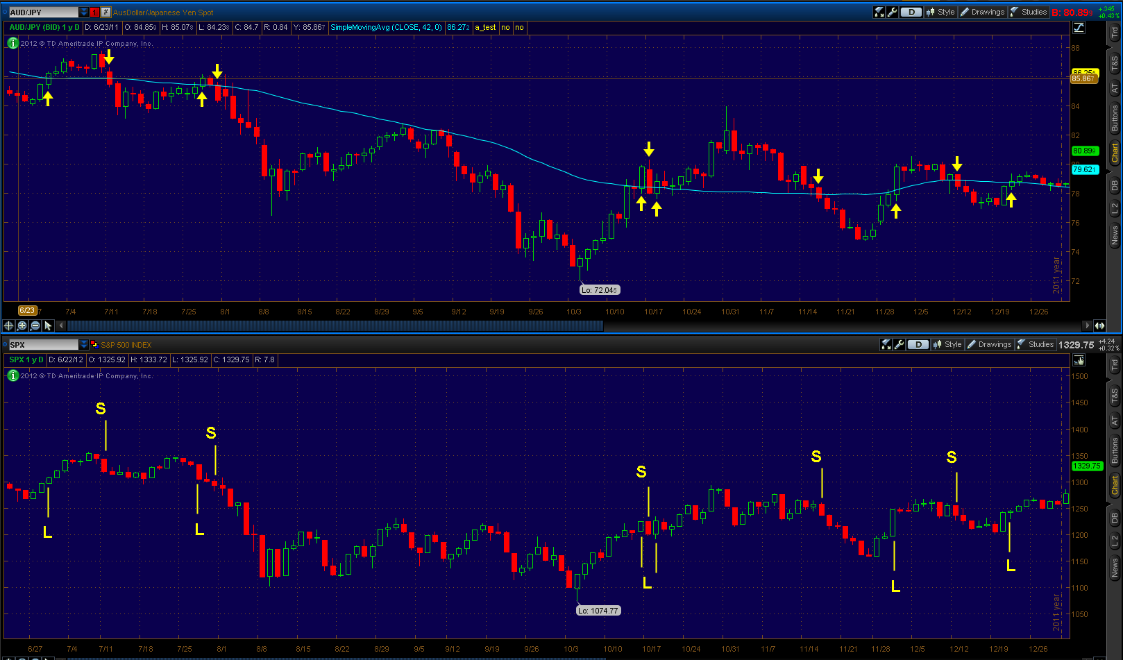
If you have been reading @chessNwine’s blog posts lately you have read about risk currencies and the charts he provides with comments. One pair that has been mentioned is the AUD/JPY or Australian Dollar and Japanese Yen. This involves buying the AUD and selling the JPY. The carry trade involves borrowing the low interest currency and investing in the currency of high interest rates. I am by no means a currency expert and I would encourage the reader to research the carry trade or click the links below for a better explanation. Explaining the carry trade, risks, and how to trade it could be a long blog post and more. All I have is a basic understanding and I do keep watch of the AUD/JPY chart as a measure of risk appetite. This is not the only pair as the carry trade could involve selling any currency of low rates to buy currency of high rates, its just my preferred pair and common among others.

Below are two charts showing the last two years with the AUD/JPY chart on top with a 42 period moving average and the bottom being the SPX. I use this as a measure of risk and when the AUD/JPY is above the 42 SMA, then traders are accepting a higher risk environment and when it is below the 42 SMA, then traders are taking on less risk. With that, it is important to keep your style and timeframe in mind. Would I pay attention to this for daytrades, no I personally wouldn’t as my holding period doesn’t align with this indicator. I keep this as a supporting factor among other risk measures and lets me know that I have a higher probability of being on the right side of the overall trend.

Chart #1 shows from June 2011 to the beginning of 2012. Arrows signify above/below the SMA with SPX Long (L) and Short (S) signals below.

Chart #2 shows from the last “L” signal of 2011 to June 22, 2012.

Its important to remember that this is not a perfect indicator or a buy/sell system. I use it to show me the appetite for risk as the currency market is way bigger than our economy and I think it does a decent job of catching trends.

Also I like to look at the slope of the 42 SMA too. If I get a “L” signal but the 42 SMA is sloping down, I will take this as an alert and wait for the 42 SMA to turn up for a confirmation. This pair is just one thing I watch and anyone can look at it and plug different things in and make it their own.

Links for the month of June to @chessNwine’s blog posts that include information/analysis about the AUD/JPY pair:

Risk Currencies Might Be Sniffing Something Out (June 4)
The Attack of the Short-Killer Hot Tips (June 5)
Risk Rally Climbing Higher (June 10)
Update on Risk Currencies (June 13)
Risk Rally Still Chugging (June 17)
Nodding Along with the Aussie (June 19)
Intraday Look and Analysis: Leave the Punditry to the Fed Watchdogs (June 20)

References explaining the carry trade:

The carry trade explained (video included)
The Forex Carry Trade Explained (video included)
How to trade the carry trade


Day Didn’t Work Out But Took A Short Trade Instead

625 views

Today did not work out the way I wanted.  Last night I named some stocks that I liked in a post naming AAPL, ADI, AMZN, CMG, EAT, & V.  Waking up I saw the SPX trading near +13pts and I just laughed and said “well there goes that plan”.  The only stock that saw weakness was EAT.  Seeing weakness in this name in a strong tape I decided to just stand aside and wait until the end of day to see how it performed, in which it formed a nice hammer after 3 strong up days.   The other stocks were acting well and I missed the morning dips in AAPL, AMZN, & V.  I will still be focusing on the hourly chart in these names to look for some type of entry.

With my focus stocks running I stood aside and instead towards the end of day I took a short position in SPY via puts.  I still maintain my bullish outlook but also believe that a dip is warranted and look to make some coin off this dip while adding some long positions.  That’s the plan anyway.  One indicator that I like to pay attention to for overbought/oversold markets is the McClellan Oscillator.  I like to look at the +200/-200 levels for extremes and having these be stalling or retracement levels.  Below is a chart of the SPX for the last year with highlighted points in where the McClellan Oscillator reached the +200 level.

So with the evidence in the above chart and the nice rally we have seen I decided to try to capitalize on a retracement while maintaining my bullish stance and looking to get in some long positions.  I decided to keep it simple by adding some SPY July puts to my account that was all cash.  The position remains small compromising 5% of my overall account as tomorrow we have Bernanke and the FOMC minutes and I have no desire to allocate a larger short bias position.

Another Gold Analysis with some Volatility, Options, and Charts

429 views

Its no secret that gold and the miners (via GDX) took a hit today.  All I heard from CNBC was the looming Death Cross (50sma crossing below 200sma).  Quite frankly it got old and then there was the FOMC Meeting Minutes that caused further selling on volume in the yellow metal and miners.  But was today a capitulation?  That is what many seem to be wondering.  Today many talked about the rise in the VIX and yes it was big on a relative percentage move in comparison to the SPX.

When looking at the VIX-type instrument for gold we look at the GVZ.  Today the GVZ saw a move of 18.03%.  Below is a 1 year daily log chart showing the size of the move.  Something to note is that GLD really saw this down move accelerate last Friday on the gap below 158, but note what the GVZ has done on the Friday & Tuesday moves  in comparison to today:

gvz_0220

Also with that I like to look at what the GLD  implied volatility (IV) has done in the options, below is an excel screenshot of the rise in volatility since the close of Thursday (data from thinkorswim):

gvz_0220a

We can see the larger rise on a percentage basis in the near-dated weekly options verse the monthly option chain.  Next week expiration showed a rise of 4.03 points (29.94%) in the calls and 4.33 points (31.22%) in the puts.  A bigger jump relative to price change than we saw on the previous decline Friday.  Personally I’m liking the idea of selling some front month volatility and buying further dated options.

On a chart and price basis, how big was the move today?  When looking at volatility of the instrument, many use Bollinger Bands and I like to use them as well.  Today it was noted by several on the stream that we closed below the 3rd standard deviation 20 day Bollinger Band.  While traders like to use the fat tails of moves as price has been known to walk the band on the 2 standard deviation setting, this isn’t quite so common with the 3rd standard deviation.  It is a more rare occurrence that often sees a snap back.

I looked at the last 10 years of data for GLD and a close below the lower 3rd standard deviation band has happened twice, both being in 2012 (yellow arrows mark a close below then back inside the band):

gld_0220a

Zoomed in view:

gld_0220b

Below is a chart of GLD going back to when we broke out and GLD went parabolic:

GLD_0220

I have a correlation  to GDX as today it was noted on the stream by several I follow that the metals saw big option buys near the close in ABX, GG, & NEM in the January 2014 chain, search stream with ticker and you will find the posts.  ABX stuck out in my mind as January saw buyers of the 40 calls, noted by @OptionsHawk at his website where there are usually 4 free option notes for each day:

abx_0220


These go all the way out to January 2014 so if you were looking to play off some of this information you will definitely want to go out in time and let the trade work.  The trades today (2/20) were put on for cheap on an option price basis but are also +1million dollar trades.  Either way use diligence if using this info for a trade and keep timeframe in mind.

Thoughts on Divergences

448 views

When going through the timeline last night I came across a post from @AnneMarieTrades that I found interesting:

“Folks, momentum is SLOWING – it dsnt mean we r rolling over. Observe divergence- but don’t trade divergence. Trade price, & price alone $$”

I always like to look for divergences in price with indicators such as the popular MACD, Momentum, or RSI.  When I first started trading I read in books that these can be warning signs.  So what did I do?  Naturally I traded against the trend and in the direction of the divergence that the indicator was pointing to  (often at tops calling for downside).  Needless to say I lost more money than I made.  Sure there were some hits and the psychological feeling was great  but I lost more often than I won.

Then I watched a presentation by Linda Bradford Rashke and she stated that when most people trade divergence they fail to look at the higher time frame.  This is exactly what I failed to do and needless to say I was usually trading against what was a powerful uptrend.  So if you are trading a daily chart and there is a divergence, look at the weekly and what is that telling you?  Same goes if you are trading a 5min, look at the 30min; and if you are trading a 30min, look at the 240min or daily.  I am quite certain you will be surprised at how often you are trading against the bigger picture.  Sure you may catch a top or bottom here or there but those profits will probably go back into the market to the other side.  Now divergences are more of an observation than a trade for me.

Posted below is a daily chart with the Momentum Oscillator, MACD, and MACD histogram (difference below the two lines).  While many traders like the MACD histogram (bottom pane), I personally do not use it and instead focus on the MACD (middle pane) by putting the Value as a histogram (purple) and the Avg as the line (yellow).  If the histogram (purple) is above zero, then it is a bullish signal.  Also I will look for divergences on that histogram alone more so than the MACD histogram (bottom pane).  Below is a picture of the daily chart of the SPX, note that MACD (purple histogram) has not shown a divergence like the MACD Historgam (bottom pane) has:

spx_20130207

Here is the Weekly chart showing the same time frame, highlighted in blue.  I left the lines on price to show as a reference to where they were on the daily:

spx_20130207aWhile the daily is showing a divergence, the weekly is showing a powerful uptrend.  While many can trade the divergence or scale down to a lower timeframe for day/swing trades then that is great as there can be some homeruns with a good entry and scaling plan.  My goal here was to highlight that higher time frame, no matter what time frame you trade on.

Why I Initiated a Short Position on the Russell 2000 w/Options

377 views

It was hard not to get caught up in the euphoria of the market yesterday and the day before if you were long positions already   There were many comments on the stream yesterday and today about chasing and I would agree.  That comment can also be broken down into size as well.  Sure it is unwise to put on a full long position at these levels but if you were to initiate a 33% or 25% position (depending on your scale model) then you may have a great trade.  As for me I have no long positions at this moment but initiated a 1/2 size short position yesterday on the Russell 2000 (RUT).  I believed things became a bit overextended and I was watching two metrics I like to pay attention to:

  • percent above the 10 EMA (1st indicator pane) looking for a 3% extension 
  • points above the 20 SMA (2nd indicator pane) looking at the 30pt mark for warning and 40pt mark for an extreme

I like to look at these two indicators for times like this when the chase is on.  Also when they breach the points it is a warning and a possible time to initiate a position for a trade in the opposite direction.  We all know that overbought or oversold can become overbought-er or oversold-er (please appreciate the humor) so the time in where I will add to the trade is when the RUT trades back under those points.  Below is a 1 year chart with blue highlighted boxes of where the RUT first breached these points and then traded back under (notes on chart):

rut_20130103

The option trade that I chose was the Feb/Jan1 850 Put Calendar for a 13.08 debit.  First here is a chart of the RVX (Russell 2000 VIX) with notes:

rvx_20130103

With that I was looking for a pullback option strategy that took advantage of a pop in volatility and the strategy that came to mind was the Put Calendar as this took advantage of a pullback and was positive vega.  I did screw up in putting this position on in that I sold the Jan1 option (not much time or benefit) instead of selling the next week Jan2 option.  I only collected 0.15c on that Jan1 option instead of the near 2.00 I could have collected for the Jan2 option.  A mistake on my part.  I do believe that it can be recoverable and I do not have a full position on either so the dent to my account is manageable.  But this is a good lesson in taking the time to slow down and actually confirm the order when that pop-up window asks you.

Thoughts on Relative Strength

338 views

One of the most popular indicators of strong stocks is Relative Strength (RS), which measures a stocks performance against the market or selected index.  Sometimes it is confused with Relative Strength Index (RSI) which is a momentum indicator/oscillator made popular by J. Welles Wilder.  I first learned about RS through reading Investors Business Daily when I first got interested and trading in stocks in the summer of 2007.

I am a big fan of RS and if you see charts I post through Twitter/Stocktwits you will see the RS indicator with RS Average of 21-periods (roughly a month) in a pane with volume below it.  Example shown below is a 9-month Google (GOOG) chart with RS pane enlarged.  The green line is the RS and the purple line is the RS average:

goog_20121223

While most platforms will use the S&P 500 to measure the individual stock performance against, I choose to use the Russell 3000.  I like to use the Russell 3000 (RUA) as it compromises of 98% of the market while leaving out that 2% that can display extreme volatility everyday.  I just find this as a perfect metric of the overall market to incorporate all pertinent stocks instead of using the S&P 500, Nasdaq, or Dow.  If I see a stock making a higher RS vs. the previous day then I know it is outperforming the true market (or market of stocks) that is not limited to the the top market cap companies or those specific to an industry.

Now the problem with Relative Strength:

I like to think of RS as a double-edged sword.  Before I get bashed, remember that it is a top indicator of mine.  The problem where traders may rely too much on it is if the market stalls or regains its footing, then it is valuable.  The other side of the sword comes in if the market continues to drop.   I am a believer in a rising tide lifts all boats.  With this, if a stock is holding up against the market firmly (showing strong RS) then that stock may be the most susceptible to a sell-off that hasn’t been displayed yet such as in other stocks.  In other words, if it is a sellers market then these are the stocks to look at and sell for some hopeful big gains.  I am a bull and think it is easier to trade as a bull, but when the market is being liquidated then it is your job to seek these stocks that have high RS or just go to cash altogether.  I have learned that it is difficult to short outside of a swing and I don’t play short trades much and have opted to go to cash instead.  But that is just me.

If you are looking for some examples just look at December 2008 and July 2011 when we saw liquidation and nothing else in the market.  Off the top of my head stocks like JNJ, PG, KMB or those other stocks in the Consumer Staples or Healthcare industries that are deemed to be “safe” also saw selling that was enough to trigger stop losses.  It is important to remember that mutual/hedge funds are supporting those stocks but when they are ready to sell it then no indicator, not even Relative Strength, holds a meaning….liquidation is I want out now and nothing else.

Another Reason for Market Bounce and Today’s Near Death Experience

394 views

Am I the only one overwhelmed with reading bearish articles?  Of course the post-election sell-off didn’t help but as a trader I do not try to figure out the future or trade based off economic data or the effects of political decisions.  I only look at charts and indicators.  As observed by most traders, many charts are broken and the breakout trade is a tough one here.

On the flip-side there are many respectful traders that I follow that post reasons (macro & technical indicator related) for a bounce and I have to agree.  One indicator that I like to pay attention to and have written about before is the McClellan Oscillator (free in many charting packages).  I have previously wrote about it back on June 20, 2012 and July 24, 2012 showing areas where we have bounced.  Usually I like to focus on the -200 level for a bounce but the -150 level (on a closing basis) has also proven to be reliable.  I have included a 1 year chart of the $SPX with highlighted areas of where we fell below the -150 level (yellow line):

It is not my point to make a call of the bottom or a bounce for that matter, but I believe the odds are in the favor of some long positions.  I also think it is a late point to short the market and it may be a sound strategy to dip into some long positions based on your watchlist and theory of “a rising tide lifts all boats”.  In my opinion the winning trader here is the one that understands trade and portfolio risk.  I would be comfortable putting on 1/4 positions here and if they fail (stopped out), the overall loss is acceptable to the portfolio.  Remember no one is forcing you to trade, if you are uncomfortable then stay out and study past trades or continue your education.

I personally attempted a long position in $AAPL via an option spread back on 11/6 and knowing the publicity $AAPL gets you know that I am underwater.  I went into this position accepting a 100% loss on the option spread as my ability to monitor the market would be limited.  Even though I may take a full loss on the option spread, my overall portfolio loss will be around -1.5%.

**Today’s Near Death Experience**

Today while working out in the garage I was on the chest portion of the workout performing reps of 12 within the set.  This is when the craziest thing I have experienced happened.  While I was on the descent of my third rep, my bench came completely apart at the weld where it adjusts for incline/flat/decline.  I was performing incline and went to decline instantly.  At this point the weight bounced off my chest and I still don’t know how but I thrusted with my hips and arms and got the weight over my head (just barely avoiding crushing my head) and then fell off to the side.

This all happened in less than 3 seconds from break of equipment to me laying on my side.  When I got up all I could think was “what the hell happened and I wish I had that on video”.  Below is a picture where you can see the weld break and the now detached bench on the side:

Near death may be a little much but a possibility and definitely a grape-crusher.  Please don’t make fun of the rug I have there.  Gym mats are to be ordered soon.

I Will Not Partake in Tomfoolery; Seeing Conflicting Market Signals

388 views

As the title suggests I have no interest in partaking in this market here.  Right now I have many conflicting signals as far as the direction of the market.  Basically they all same the same thing in that we are oversold, a bounce is expected, but overall the market is not healthy and further downside can be expected.  Last night I posted about a short term technical indicator I watch that shows that a bounce can be expected; I still expect this.

I am truly conflicted here.  I do believe that a bounce is expected but selling into the bounce seems reasonable, notably the 1430 area in the $SPX.  On another note it is hard to ignore the QE stats and that there is usually some ludicrous action after QE announcement followed by a run a higher and that coupled with presidential election year seasonality suggests run into the years’ end.  Many of the macro indicators I watch suggest further downside and room for further downside, they include:

  • Bond:Stock Ratio w/a 65-SMA, this has recently crossed above suggesting downside action
  • US Dollar Heiken-Ashi chart with a 42-SMA, this inverse-market indicator confirmed upside market action on 8/7 and just confirmed downside action today
  • NASDAQ:SPX  ratio with moving averages, this suggested downside action on 10/2 and remains bearish
  • Premium service showing that a majority of the $OEX stocks are in downtrending patterns (measured on pure O-H-C action)
  • Distribution days as measured by Investors Business Daily

Now that the doom and gloom is out of the way there are some things that suggest a bounce is due.  One indicator is a premium service that suggests that we are highly oversold and a bounce is expected, another is the current McClellan Oscillator reading comparing to previous levels, and the $VIX.

As far as the McClellan Oscillator reading, looking at the chart below we can see that we are near levels that have historically recorded bounces.  Look at the highlighted boxes but one thing that is different rather than early on is that we are seeing lower lows instead of higher lows, something to take in consideration:

The other thing that I like to pay attention to is the $VIX and closes outside of the Bollinger Bands.  This essentially measures the volatility of the move on volatility.  I like to watch closes outside the upper and lower bands as extremes.  The chart below shows the $SPX on top and the $VIX below.  The $VIX arrows show closes outside of the Bollinger Bands.  The $SPX shows yellow lines in where the $VIX closed outside of the upper Bollinger Band, essentially an extreme $SPX move to the downside.  Note the $SPX price action after we see consecutive closes outside of the upper Bollinger Bands on the $VIX.  This is a favorite timing indicator and the best way that I use this is to wait for the $VIX to close back below the upper Bollinger Band rather front running an extreme.  As you can see, there are occurrences where volatility continues to “walk” the Bands:

So like I said I am not interested in partaking in the tomfoolery of the market here.  I highly believe in mental capital preservation and today I closed out my positions (previously stated in blog posts) in $AAPL and $GOOG and I am now flat.  This leaves me in a relaxed state of mind and allows me to work on watchlists and track the market without position bias.  If we see more downside action I will stay in cash but not look to short and if we see upside action I will look to see how the breakout stocks are acting (if sticking) and look to get in bullish positions.

I have learned through time that sometimes less is more and right now I am feeling that this thought needs to be put in to practice, at least for me.  Never forget that mental capital can be as precious as monetary capital.

The Forgotten but Effective Moving Average

256 views

In last night’s post I wrote about how AAPL was displaying some of the same characteristics as when the last time it saw a significant correction.  I mentioned that my first buying opportunity to establish some longer holding positions was if (& hopefully) it crossed below the 100 exponential moving average.  Every trader interested in technical analysis knows about the buying opportunity when a stock dips to the 50 or 200 simple moving average.  But one moving average not talked about often is the 100ema.

I have found that in stocks that have displayed superior momentum or have been leaders, the dip to the 100ema can be a great buy opportunity.  I refer to it as the “value” area of a stock in a technical analysis sense.  I have not done any studies or read to many articles on the why, but from a psychological standpoint it looks as if those that gave up when the 50sma has failed or saw above average selling (considered an exit sign) then the 100ema is considered an area in where to buy.  I like to think of it as flushing out some of those at the 50sma, but still carrying enough weight to get in as this is not often the case in momentum names if waiting for he 200sma.

So when when thinking about some former/current momentum stocks some that come to mind are:

  • NFLX
  • CMG
  • GOOG
  • V
  • AAPL
  • PNRA

The list could go on but these came to my mind for now and will provide charts on these.  I am looking at the exponential moving average and not the simple moving average.  Also the 100ema must be trending up for this to be a dip buying opportunity and other averages correctly stacked (50sma>100ema>200sma).  These stocks are not hard to find as they will have been heavily mentioned due to strength on the social stream, in the media, or highlighted by Investors Business Daily (such as the IBD50).  The buy would be if the low crosses below the 100ema and not necessarily a close below the 100ema.  Also the stop would be at your discretion based on your risk tolerance, I have not optimized and backtested this but it is just going off what I have noticed through the years.  Examples being 20% allocation with 10% stop (representing 2% on portfolio); or for more wiggle room a 10% allocation with 20% stop (same 2% portfolio risk).  Either way you get the idea.

Below are the charts of those stocks above with a yellow arrow  marking when the low crossed the 100ema.  The reader will have to judge if the 100ema was in an up-slope or not.  I didn’t cherry pick these but just listed some that came to mind and included the time period of some of their best moves.  GOOG didn’t look all that great but also found that when it did cross the 100ema the 100ema was rolling over, so would the trade be taken or not?  All hindsight in my opinion when you know the right side of the chart.  It’s all about risk tolerance here.  This is not a trading system but more of an awareness to how price responds to the 100ema.  The trader could add other filters as see fit.  I encourage you to go back look at any chart that was a momentum name and see how the 100ema.

Netflix

Chipotle Mexican Grill

Google

Visa

Apple

Panera

Keep Perspective On What Has Worked, Not News or Emotions

367 views

What a day today as the market opened it was definitely a trend down day.  If you were overly long then you felt some pain to your portfolio.  The summer has marked a buy the dip and sell the rip environment.  I think the key to staying sane here is not to overweight yourself to any one side.  Me personally I am in a buy-the-blood mindset.  Does that mean going 50-75-100% long? No!  I am talking about dipping in with no more than 25% of my portfolio to the long side as we can still see selling.  But here are some things I am looking at as a reason for me to have some long exposure.

Below is an SPX chart with the McClellan Oscillator which I have talked about before in this post.  In the chart you can see that when we have a -200 reading (highlighted areas) there is a good chance that we bounce.  Also when there is a divergence between price and the oscillator after it hits -200, we move higher and a longer rally has occurred.  But also make note that when we do hit -200, it does not mean an immediate bounce.  Instead it tells me that I should start scaling out of shorts I may have had and scale into longs.

(click on chart to enlarge)

Could we have another scenario like August of 2011?  Of course we could, that’s why I emphasize scaling in and going no more than 25% or my preferred 20% long exposure at this juncture.  Also another indicator I am looking at is on a more narrow time frame.  I always look at the RUT and /TF (emini Russell) charts.  I like to plot the RUT with Weekly Person Pivots and the /TF with Daily Person Pivots.  I have found that when we go around 15-20 points below the Weekly Person Pivot, this often marks an extreme move and a basing or bounce is imminent.  I have highlighted these points in a prior post.  As you can see in the chart below we are currently -10pts below the Weekly Person Pivot and hitting the bottom of the Daily Person Pivot.

So what does all of this information tell me?  With AAPL earnings out today and where the futures are currently trading, I believe we may see a gap down tomorrow.  This is a perfect scenario to me as I believe this could push the McClellan Oscillator to oversold territory (-200 or further) and couple that with possible extreme moves in the RUT and /TF parameters in regards to the Person Pivots; I have no problem having some long exposure on, especially to stocks that have displayed Relative Strength this week.

In my opinion it is not a time to add to shorts as this market during the summer has been  a buy the dip and sell the rip type market.  The only advice I can give is to ignore news, doomsday scenarios, etc. but go in with a game plan.  Am I uber-Bullish?  Not by any means but from a risk perspective I would be looking to reduce short exposure and add to long exposure…or go cash with a wait-and-see mindset as that saves you capital, physical and mental.

A Risk Indicator I Watch

1,065 views

If you have been reading @chessNwine’s blog posts lately you have read about risk currencies and the charts he provides with comments. One pair that has been mentioned is the AUD/JPY or Australian Dollar and Japanese Yen. This involves buying the AUD and selling the JPY. The carry trade involves borrowing the low interest currency and investing in the currency of high interest rates. I am by no means a currency expert and I would encourage the reader to research the carry trade or click the links below for a better explanation. Explaining the carry trade, risks, and how to trade it could be a long blog post and more. All I have is a basic understanding and I do keep watch of the AUD/JPY chart as a measure of risk appetite. This is not the only pair as the carry trade could involve selling any currency of low rates to buy currency of high rates, its just my preferred pair and common among others.

Below are two charts showing the last two years with the AUD/JPY chart on top with a 42 period moving average and the bottom being the SPX. I use this as a measure of risk and when the AUD/JPY is above the 42 SMA, then traders are accepting a higher risk environment and when it is below the 42 SMA, then traders are taking on less risk. With that, it is important to keep your style and timeframe in mind. Would I pay attention to this for daytrades, no I personally wouldn’t as my holding period doesn’t align with this indicator. I keep this as a supporting factor among other risk measures and lets me know that I have a higher probability of being on the right side of the overall trend.

Chart #1 shows from June 2011 to the beginning of 2012. Arrows signify above/below the SMA with SPX Long (L) and Short (S) signals below.

Chart #2 shows from the last “L” signal of 2011 to June 22, 2012.

Its important to remember that this is not a perfect indicator or a buy/sell system. I use it to show me the appetite for risk as the currency market is way bigger than our economy and I think it does a decent job of catching trends.

Also I like to look at the slope of the 42 SMA too. If I get a “L” signal but the 42 SMA is sloping down, I will take this as an alert and wait for the 42 SMA to turn up for a confirmation. This pair is just one thing I watch and anyone can look at it and plug different things in and make it their own.

Links for the month of June to @chessNwine’s blog posts that include information/analysis about the AUD/JPY pair:

Risk Currencies Might Be Sniffing Something Out (June 4)
The Attack of the Short-Killer Hot Tips (June 5)
Risk Rally Climbing Higher (June 10)
Update on Risk Currencies (June 13)
Risk Rally Still Chugging (June 17)
Nodding Along with the Aussie (June 19)
Intraday Look and Analysis: Leave the Punditry to the Fed Watchdogs (June 20)

References explaining the carry trade:

The carry trade explained (video included)
The Forex Carry Trade Explained (video included)
How to trade the carry trade


Day Didn’t Work Out But Took A Short Trade Instead

625 views

Today did not work out the way I wanted.  Last night I named some stocks that I liked in a post naming AAPL, ADI, AMZN, CMG, EAT, & V.  Waking up I saw the SPX trading near +13pts and I just laughed and said “well there goes that plan”.  The only stock that saw weakness was EAT.  Seeing weakness in this name in a strong tape I decided to just stand aside and wait until the end of day to see how it performed, in which it formed a nice hammer after 3 strong up days.   The other stocks were acting well and I missed the morning dips in AAPL, AMZN, & V.  I will still be focusing on the hourly chart in these names to look for some type of entry.

With my focus stocks running I stood aside and instead towards the end of day I took a short position in SPY via puts.  I still maintain my bullish outlook but also believe that a dip is warranted and look to make some coin off this dip while adding some long positions.  That’s the plan anyway.  One indicator that I like to pay attention to for overbought/oversold markets is the McClellan Oscillator.  I like to look at the +200/-200 levels for extremes and having these be stalling or retracement levels.  Below is a chart of the SPX for the last year with highlighted points in where the McClellan Oscillator reached the +200 level.

So with the evidence in the above chart and the nice rally we have seen I decided to try to capitalize on a retracement while maintaining my bullish stance and looking to get in some long positions.  I decided to keep it simple by adding some SPY July puts to my account that was all cash.  The position remains small compromising 5% of my overall account as tomorrow we have Bernanke and the FOMC minutes and I have no desire to allocate a larger short bias position.

Previous Posts by redman59