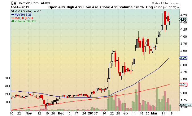
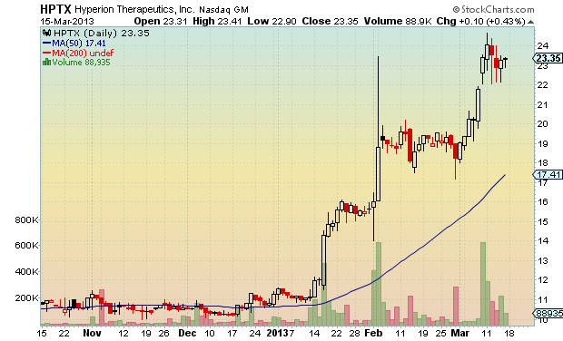
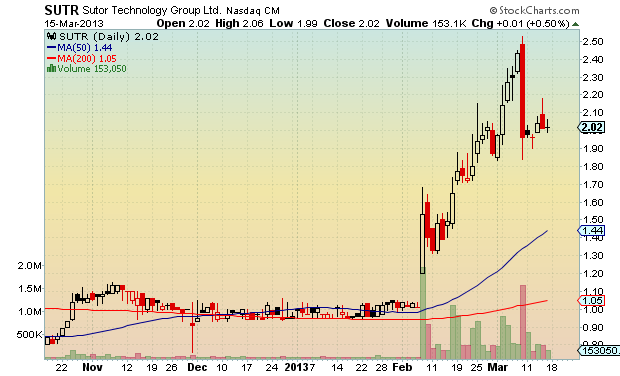
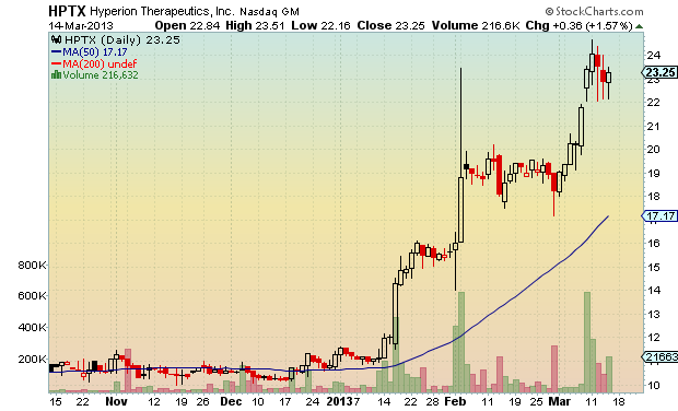
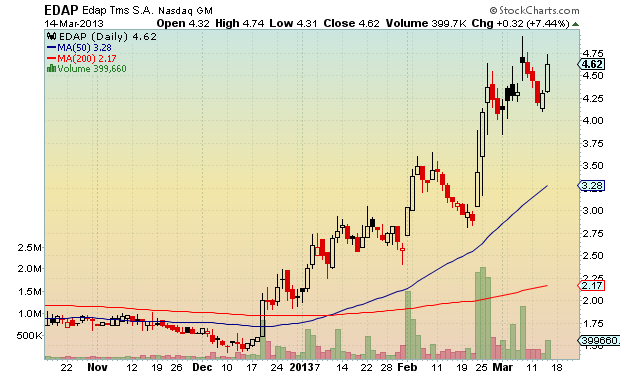
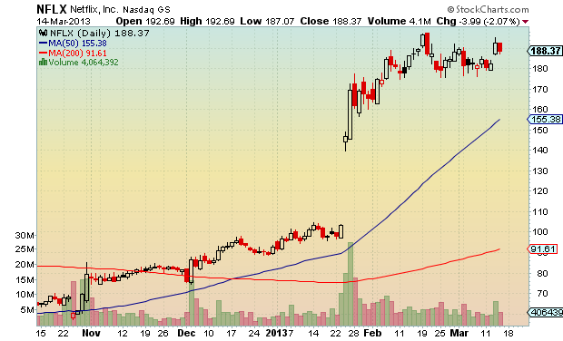
Some sweet looking flags here.
Have a great week trading!
Comments »Relative Strength Index (RSI) – Test Results (An Absolute MUST READ – Wood)
What’s the Best Length for a Moving Average
I Have Never Met a Rich Technician
How Did I Miss “The Golden Dilemma”?
New Industry Research on Returns to Activist Filings: 16% Outperformance over Subsequent 15 Months
Some of these articles, and more, can be found over at The Whole Street: Quants
Comments »
The system closed today up 5.3% for March.
$SPY returns during same period are 2.4%.
In the past, this system has tended to gain on the major indices when the indices were in steep drawdowns and the system is in cash. It is interesting to see it outperform simply by holding sectors that are outperforming the indices (mainly transportation).
For 2013 the system is up 9.9% 11.55%. Over the same period $SPY is up 6.7% 9.42%.
I have not included commissions or slippage as there are neither associated with trading these Fidelity funds.
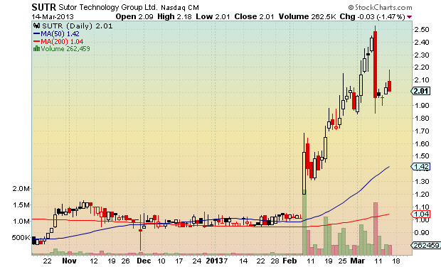
Comments »Long day. Not much to say except most of these high tight flags look fantastic.
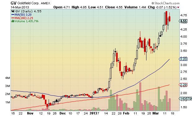
Happy Friday, and have a great weekend!
Comments »The financial pundit class is abuzz with Dow Jones histrionics. Let’s break the history out into some graphs and stats to see what all the fuss is about.
The Rules:
The Results:
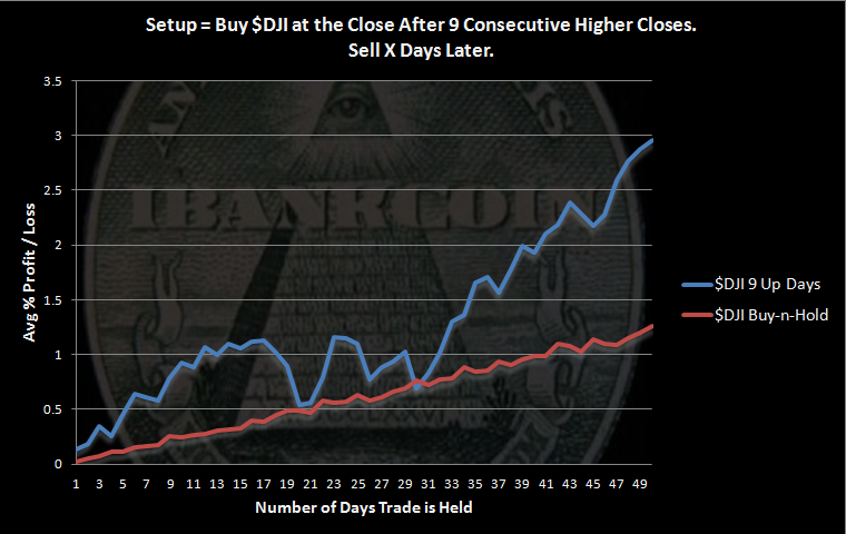
The results are incredibly bullish.
The graph above is constructed by taking all of the trades and averaging them together. This allows us to see what has happened, day by day, after this setup occurred in the past. There were 45 setups with 34 held the full 50 days.
Note that below I list that there were 66 instances of 9 consecutive higher closes. The graph above only uses 45 because some the setups were followed by a 10th higher close, which also doubles as another instance of 9 consecutive higher closes. The trade would have already been on when the 10th consecutive higher close was made. In other words, the graph above is generated by buying the 1st instance of 9 consecutive higher closes and holding that trade for 50 days. Each of these trades are then averaged together.
Some stats:
What happens if we trade this as a system, buying after the setup and holding each trade for 50 days?
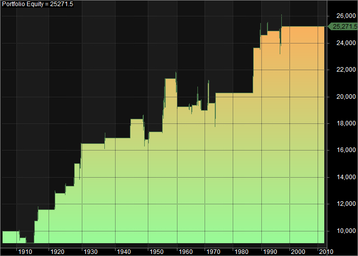
That equity curve shows a fairly consistent bullish edge over a 100 year period!
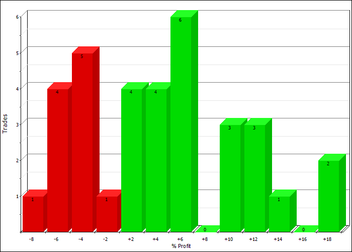
Some more stats:
Trade Distributions:
The bottom line is that the $DJI making 9 consecutive higher closes is incredibly bullish.
What a fantastic time to be involved in the markets. This is the first time this has happened in the 21st century. The last time it occurred was on 11.14.1996.
Comments »Hopefully you learned from my previous post that a relentless bull market can cause bloggers who are tired of making money or are not making money (for whatever reason) to begin calling tops. Actually, I didn’t write that in that post, but I think there may be some truth to it. Luckily, I am not in either of those camps.
But what else do I write about during a raging bull market except a possible top?
Exactly.
So here we go. When we start to examine markets to try and gauge when exhaustion might begin, one of the ways I like the most is to count the number of days above a major moving average and then use that as a buy setup. It is very simple, easily re-created, and there are usually plenty of samples with which to work.
With that in mind…
The Rules:
The Results:
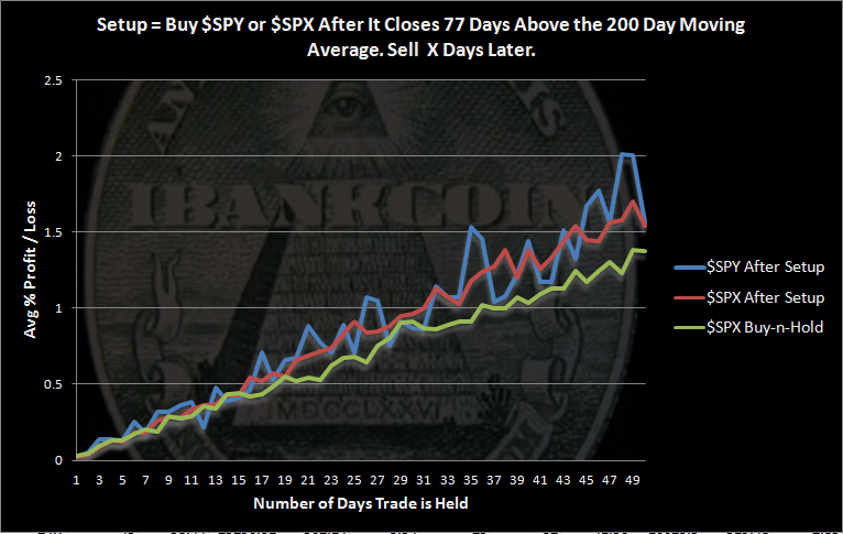
The results surprised me. Even though I have become inured to backtests that almost always show an upward bias, I was really expecting these results to show some increasing volatility, at the very least.
And I can’t even use sample size as a limiting factor for this study. The results are bullish and I feel comfortable saying so.
Some stats:
At this point in the market history, with $SPX 77 days above its 200 day moving average, the market was higher 50 days later every 2 out of 3 trades. And on the downside, the losing trades were not very large relative to the winning trades.
Finally, lets take a look at the equity curve generated using $SPX:
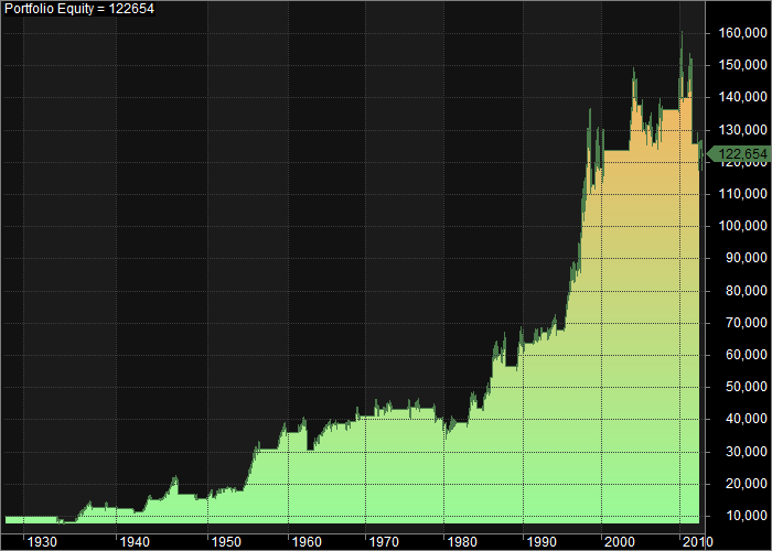
The system occasionally catches huge winning trades: 1950-1960, 1980-1990, and 1990-2000.
Let’s look at the drawdowns:
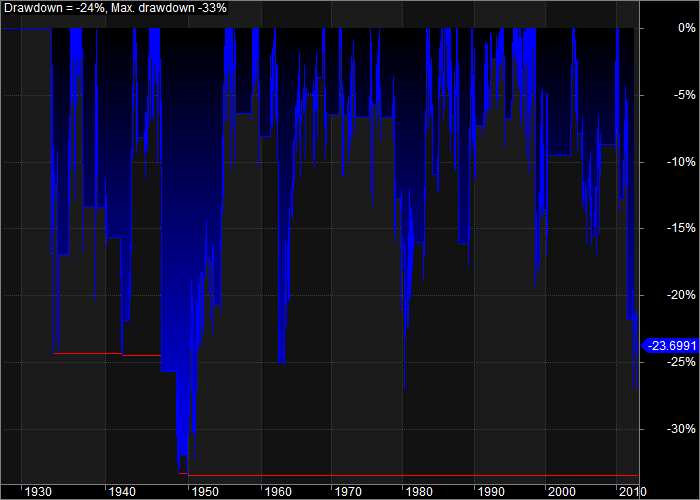
The setup has been in a fairly significant drawdown since 2010. There has only been one other instance during the 1940s where the drawdown got worse. Should we expect that the current trade may be the one that begins erasing the drawdown rather than increasing it? If that is the case, this bull has much farther to run.
Comments »I’ve been keeping a close eye on these rankings to try and get some advanced notice on any sector rotation. So far, not much has changed. For over two months, transportation related funds have been ranked at or near the top. Brokerages and alternative energy have also stayed near the top.
I remain curious about FSLEX as I believe these types of companies may do well due to the political environment. Here is the Fidelity page which shows the holdings for the fund: FSLEX Composition
Comments »