iBankCoin
Home / Woodshedder (page 2)

Woodshedder

Stocks Up or Down 25% in a Quarter

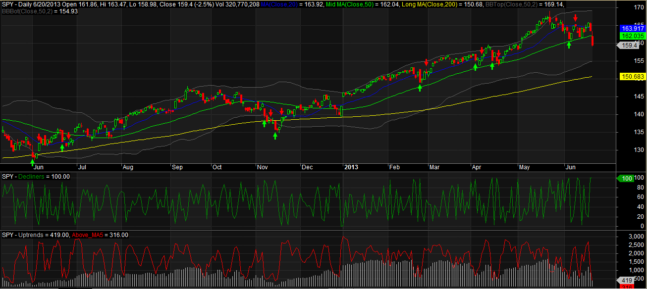
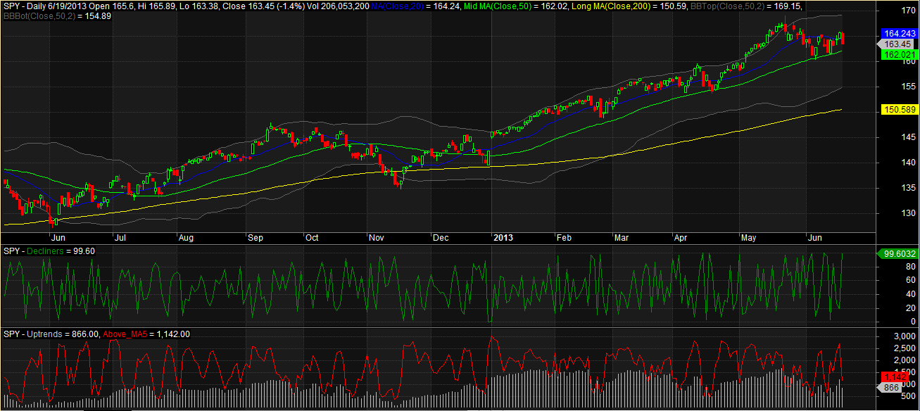
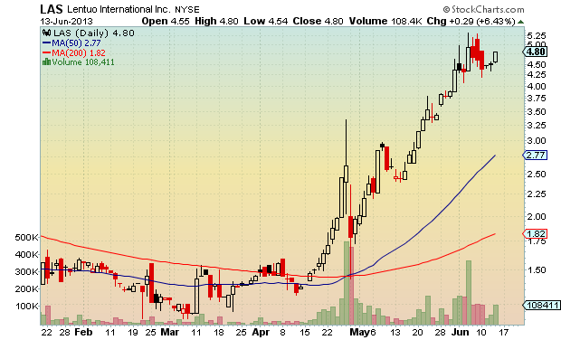
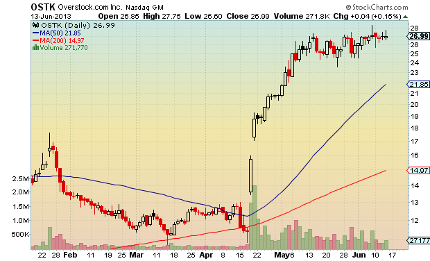
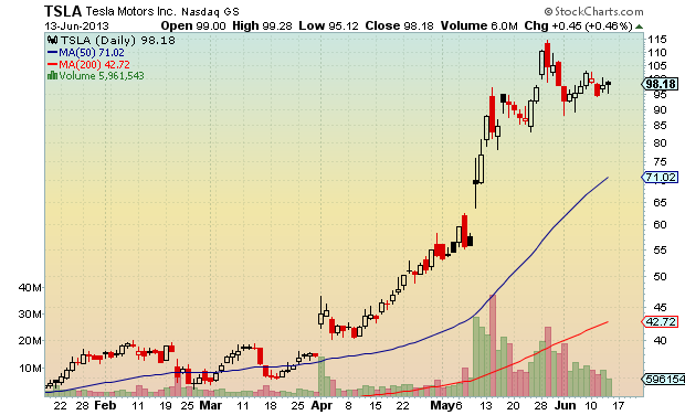
There is a breadth measure that I’ve been keeping an eye on. It is simply a count of the number of stocks that are up and down 25% or more in a quarter. Here is a good primer on this breadth measure: How to Use Market Breadth to Avoid Market Crashes.

Let’s take a long-term look at how this particular breadth measure has performed (click to enlarge):

Up or Down 25 pct in a quarter

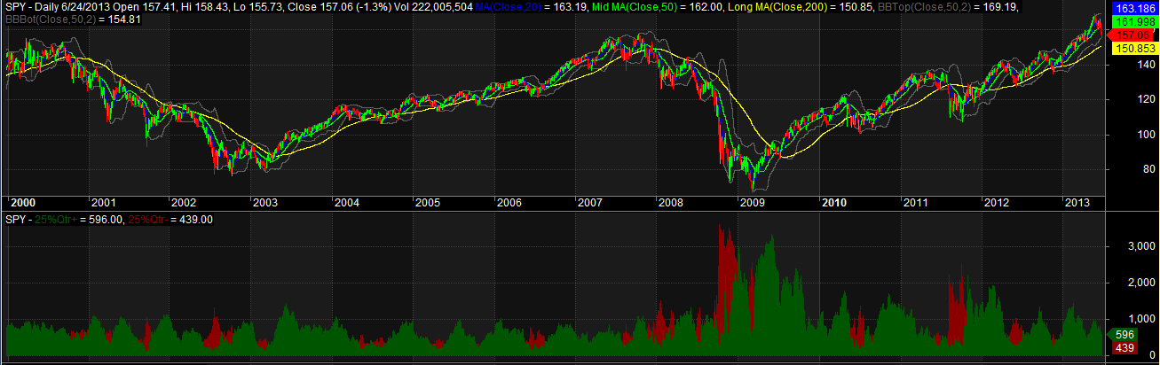
The red is the number of stocks down 25% or more in a quarter (65 days) and the green is the number of stocks up 25% or more in a quarter. What is obvious is that every crash or bear market was preceded by the red measure growing and the green measure shrinking.

I like this indicator, and I think it will work, but I’m not quite sure how to use it, yet. I need to do some backtesting and figure out what it looks like to be in cash when there are fewer stocks up 25% or more in a quarter then the number of stocks down 25% or more in a quarter. Also, most times that the red is higher than the green, nothing major happens, and the market resumes the uptrend. Does this indicator give any clues that something more than a normal correction is ahead? I don’t know, but I’m going to poke at it a little bit and see what happens.

The good news is that the current reading shows that there are 596 stocks up 25% or more and only 439 stocks down 25% or more. This lends weight to my current stance that we are just experiencing a normal market correction.

Comments »

Looks Like a Tradeable Bounce Ahead

Keeping with my recent theme of using two indicators to gauge market swings, the bloodbath of the last two days has again aligned these indicators so that they are suggesting a tradeable, 3 – 5 day bounce is ahead. Let’s take a look…


6_20 Breadth

The green Decline Line Indicator is maxed out at 100.

The red Number of Stocks Trading Above Their 5 Day Moving Averages Indicator is reading 316, which is well below the preferred threshold of 650.

As shown in the chart, when these indicators align, a tradeable bounce tends to occur. I set the arrows up to reflect a 3 day hold time after the signal.

The wildcard is of course that we are in a downtrend, which changes things. You’ll note that most of the bounces on the chart above have come during pullbacks in an uptrend. Because of the strength of this sell-off, I’m looking for a bounce that will rise only to the 50 day average. From there, I’m expecting we’ll see the old Bears at the Honey Hole routine.

How $SPY behaves on this bounce (if it does bounce) will help me decide what to do with my long-term $SPY long position.

Comments »

Falling Under the 50 Day Average on Thursday?

Exactly one week ago I wrote the following:

My best guess is that we see some stabilization around the 50 day average. I would not be surprised by another quick and small bounce. But ultimately I am expecting $SPY to trade beneath the 50 day average, within a week.

That prognostication came at the end of a series of posts where I explained how I used a couple of breadth indicators to predict and gauge the strength of bounces.

I was wrong about the $SPY trading beneath the 50 day average within a week, and the bounce was stronger than I expected. However, it appears as if the correction will continue, and $SPY looks as if it may close beneath the 50 day as early as tomorrow (Thursday). So maybe I was off by a day. The most important point is that these breadth indicators do a nice job of calling short-term market swings.

The indicators by themselves help a lot, but they should be combined with experience for the best results. Since I believe that we are in a corrective phase, my experience tells me that we will see less trending and more mean reversion until the correction is over. This means that up and down swings are to be expected, which is why I figured the market would be headed back down, within a week.

Another way of looking at this is to consider that today’s move was less about Bernanke and more about the market being in a corrective phase. Trending markets don’t move up and down + or -1% several times a week. Markets in a corrective phase do experience the large swings.

All that being said, what are the breadth indicators indicating?

6_19 Breadth

The very short term Decline Line Indicator (green line) is reading 99.6, which means that stabilization, or a bounce, is imminent.

The short-term Number of Stocks Beneath Their 5 Day Moving Average Indicator (red line) is at 1142. This indicator needs to be beneath 650 in order for me to expect a tradeable bounce.

I’m still expecting a close beneath the 50 day average, but the extreme Decline Line Indicator reading means we may see a pause tomorrow, with the correction resuming shortly thereafter.


Comments »

Fidelity Sector Funds Rotational System Update

Year-to-date the system is up 13.5% vs. the $SPY gain of 15.5%. This does not include any dividends paid out on from the Fidelity Funds or from $SPY. It also does not include any commissions incurred on the $SPY purchase. There are no fees or commissions incurred when trading the Fidelity Sector Funds, as long as the funds are held for 30 days before selling.

The system is down 2.02% from its recent equity high while $SPY is down 1.63%. It appears that the system may be in the process of catching back up with $SPY.

The top 5 Fidelity Sector Funds, as currently ranked by the system:

  1. FPHAX (Pharmaceuticals)
  2. FSPHX  (Health Care)
  3. FSPCX  (Insurcance)
  4. FSDAX  (Defense and Aerospace)
  5. FBIOX  (Biotechnology)

It is worth mentioning that FSDAX has moved into the top 5 for the first time this year. It closed today at a new all-time high. I’m not sure what that says about Syria, or the sequestration, etc., but I believe it is worth thinking about.

The system is currently long FSPHX, FPHAX, and FDFAX. Unless FDFAX can surge back into the top 3, it will be sold in the next few days.

Comments »