Trade Distributions
It will probably be helpful to cross reference these graphs with the trade statistics published in the previous post. To make that easy, here is the link: Trade Statistics from the New ETF Trading System.
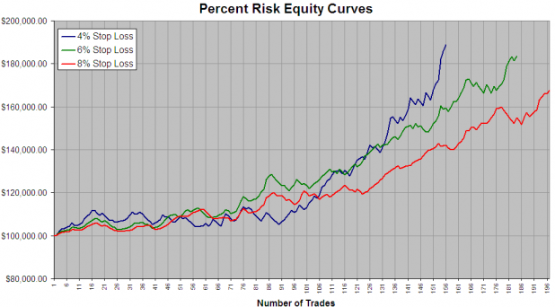
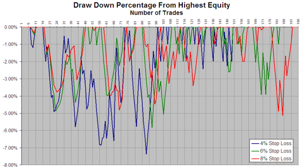
I think everything here is fairly straightforward. The equity curve does a good job of showing how the system stayed flat for over the first year we tested. Trading the strategy with a 6% stop and 1% risk may be a good way to get outsized gains with minimal drawdowns. The 4% stop is obviously the way to trade this if one can stomach larger drawdowns and is looking for absolute returns.
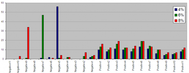
To interpret the trade distributions, “Positve 1” covers from 0 – 1%; “Positive 2” covers from 1.01- 2.00%
Feel free to ask any questions in the comments section. I hope the statistics and graphs I’m posting are demonstrating a more deliberate method for analyzing one’s trading, even if it is a discretionary system.


Whoops, forgot to include commissions in the spreadsheet, so the equity curves do not reflect commissions or slippage. Commissions and slippage were included in the statistics of the previous post.
I just want to know if that shit told you to get long and strong SSO, QLD and UWM today at 3, like my Spidey Senses told me to.
Otherwise, it ain’t shed.
_______
Nope, it didn’t.
Jake, I’m utterly appalled that you got long here. You and I were perhaps the first bears on iBC, and I’m devastated that you’ve switched sides and left me a lonely bear.