Humans are lousy at pattern recognition.
There is a ton of cool research on this topic. The studies have names like the Clustering Illusion and the awesomely graphic Texas Sharpshooter Fallacy. They all say essentially the same thing: Humans underestimate randomness. We miss obvious clues and find patterns where they don’t exist, especially when doing so fits our existing beliefs.
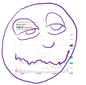
This glitch in our mental Matrix explains the appeal of charts like this one making the rounds yesterday:
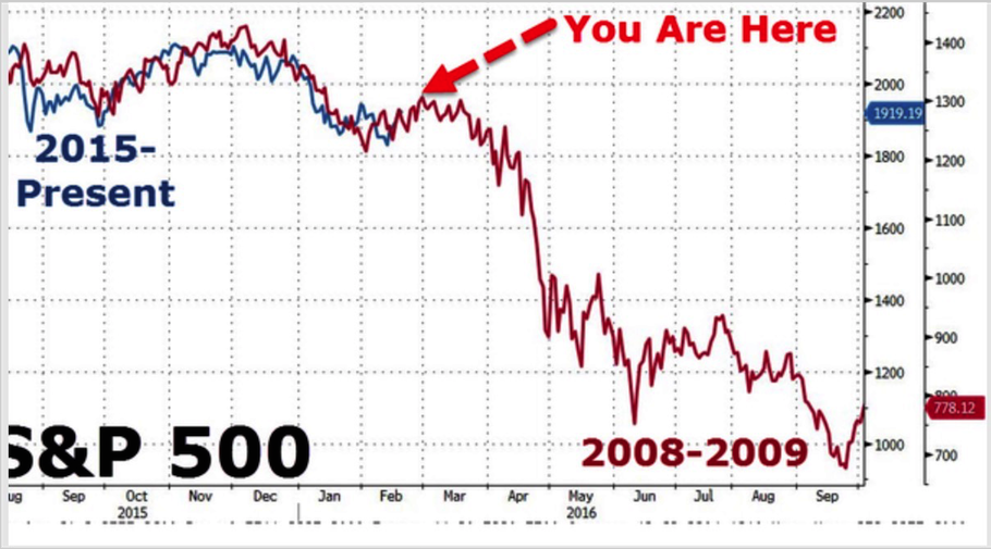
It’s the S&P500 chart from two different time periods. The blue line is the index from 2015 through yesterday. The red line is the S&P 500 during 2008 and 2009.
In the off chance the bright red “You Are Here” arrow wasn’t clear, the suggestion is the stock market is on the cusp of a total collapse. The S&P500 fell more than 38% in 2008. Bad times.
This is great charting in the sense that it’s a nice visual and viral as hell. It punches all the right emotional buttons (fear, recency, the desire to not feel stupid about missing the 4 day rally). It’s a shot of dopamine in graph form. That’s what makes these things so popular.
A few years ago we were on the verge of “another 1929”. According that Doomsday chart the early stages of 2014 were the summer of 1929: the last exit ramp before hell:
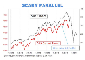
The prediction turned out to be bullshit. Stocks have yet to repeat the 90% decline following the 29 crash. (Remember… I said “yet”.)
We don’t need to work this hard to be scared.
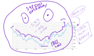
You want a frightening and far more likely trading analog? Today could be another Groundhog Day. Again:
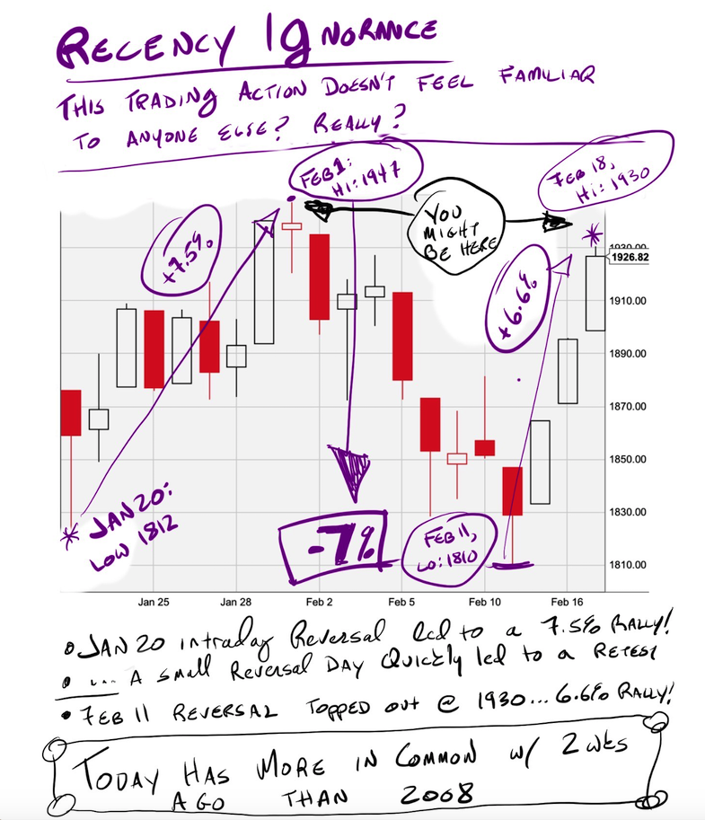
From January 20th to February 1st stocks rallied more than 7%. 8 trading days later (last freaking Thursday in case you just got here) stocks made new intraday lows then reversed once again.
In fact, the action near the lows in January and February was so similar I used the same basic graph twice:
I wasn’t being lazy but ironical. I was making fun of the fact that the job of financial punditry is to watch basically the same things happen over and over again and pretend like it always matters. It was also gallows humor; a personal favorite and staple of market crashes throughout time.
It’s a clickable story to compare this period to 2008 but a far better, scarier, explanation is sitting right front of us. Last week’s rally left us near the top of a mean-ass range and are about to plunge back to 1800.
Such an outcome would be just as my dog foretold the last time stocks were fighting to stay above 1920…