MGA MGA MGA!

387 views

Ok, so the title is a pathetic play on Italian-American grandmothers everywhere who overtly try to shove “death strands” (aka pasta) down our throats.

But we aren’t here (today at least) to speak about how foodstuffs made from modern wheat are poisoning our society.  No, I want to talk about Magna International (MGA) and how it is close to flipping from a “watch” to a “buy”.

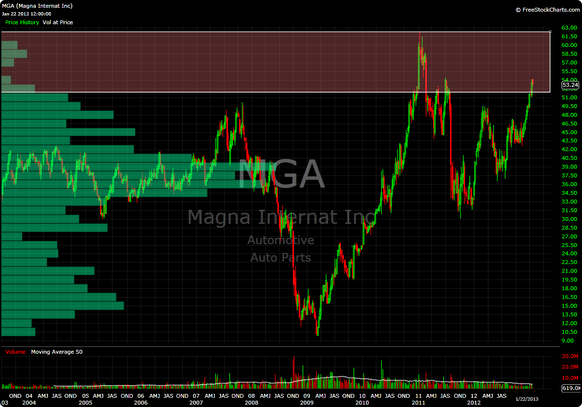
Yesterday the stock gapped higher only to sell off throughout the session.  I’m okay with that, as this could lead to a much higher probability setup whereby I can initiate a position upon a break of this range that seems to be forming between 53 and 54.

Looking at the weekly shows that over 51 could be considered a low volume area.  Additionally, price stalled just over 54 (much like yesterday) on the attempted rally back in July 2011, which adds a little extra punch to my conviction to get long this stock on a break of this range (should it form constructively).

Should this happen, my target (and position sizing) will be based on a move to the highs from early 2011 around 62.  Should we get there, I will take profits and let whatever I have left ride into the void.

Keep an eye on this one, you know I will be:

-EM

VMC: BEAST MODE

348 views

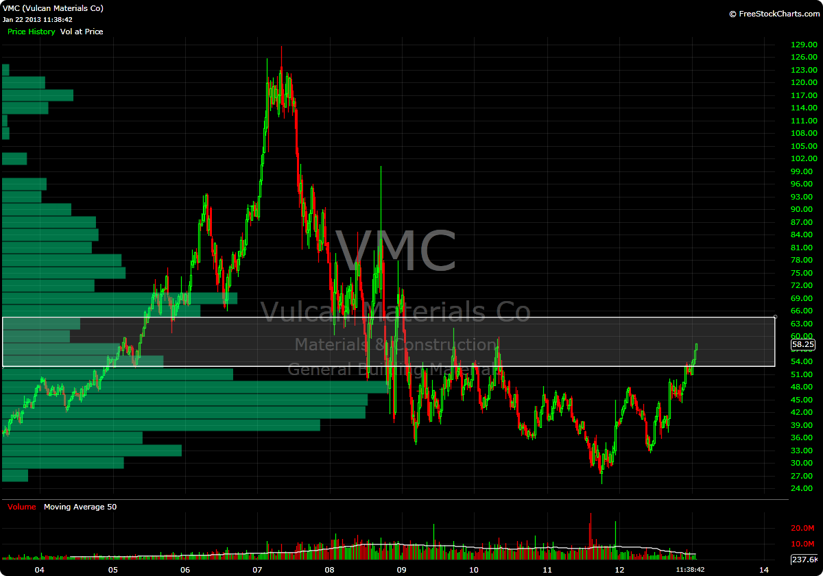
Housing play VMC has decided to go “beast mode” this morning and has risen through my second buy point (one day after blowing through buy point #1). Who am I to argue with the superb momentum this stock is exhibiting?

The window on this stock is a little bit smaller than others;  therefore if it can remain above 58.1, I will look to add to my position near the close.

Here is a weekly chart highlighting the volume pocket:

-EM

Using Price by Volume to Define Resistance in PHM

557 views

The other day I posted a watchlist of stocks that I am monitoring following “The Fly’s” bullish call on housing here in the “United Steaks”.  My watchlist was distilled using Price by Volume analysis, and as is the custom, target buy prices were established.

Reader “Narwahl” posed the following question in the comments section:

“How much potential upside before they hit resistance after they’ve reached the volume pocket? Specifically phm.”

Excellent question.

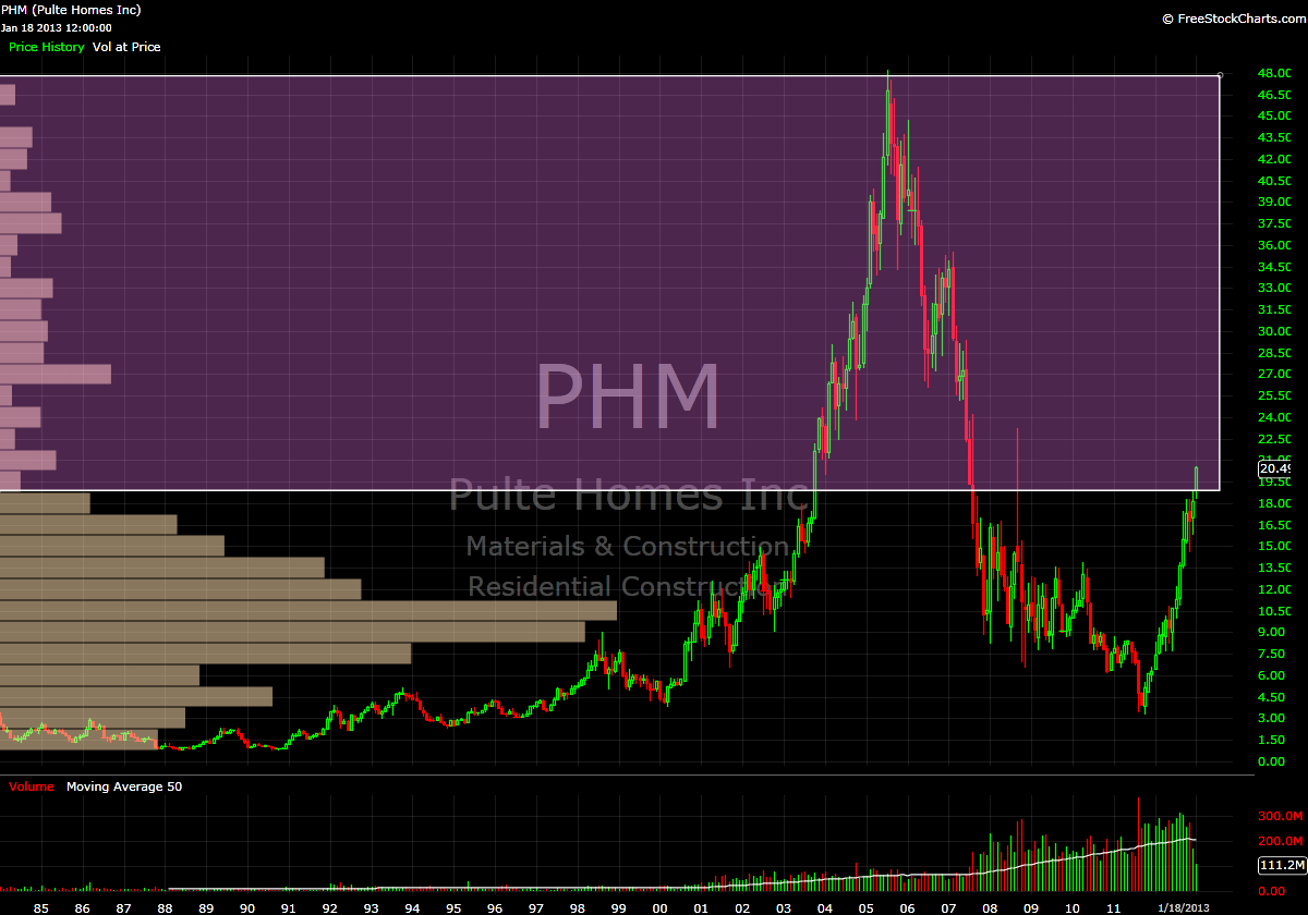
Coincidentally, PHM provides us with an interesting example.  In viewing the charts, there really is not what I would consider to be a traditional “volume pocket”.  A traditional VP moves from a region of high volume nodes into a region of low volume nodes then back into high(er) volume nodes.   Instead, PHM has a near volume “void” from the current price (20.49), all the way to all-time highs, which reside around 48.

Don’t believe me?  Take a look at the monthly and weekly charts:
Since this example is a bit unorthodox, I will try to answer “Narwahl’s” question through hypothesizing what I think these volume profiles signify.

In a ‘normal’ volume pocket scenario, I would typically define “potential upside” as where the volume pocket returns to a heavier volume node in the profile.  One thing that I have come to appreciate about using the volume pocket to analyze price is the ability to gauge a potential price target.  Obviously, this is an ideal circumstance, but by using the volume profile, you can see where, historically speaking, buyers and sellers have reached a state of agreement on price (as evidenced by longer bars on the volume profile).

In a stock like PHM, clearly there is very little in the way of what could be considered proper “value” of the stock from the current price all the way to 48.  From a strictly Price by Volume perspective, there is limited resistance all the way to the top, so when determining my buy point, I set the 2005 high of 48.22 as the top end of my range.

Sure, this may seem like an preposterous proposition, but there were shares of stock that were transacted at that price and every price in between, so simply saying “you’re being ridiculous, it could never return to that level” is, in my opinion, a bit short-sighted.

Remember, in areas with limited volume history, there is little in the way of rational valuation.  There exists a limited supply (historical volume) high demand (momentum).

Nevertheless, from a volume profile perspective, the chop in mid 2007 which found support in the mid 26’s and was rejected around 29.5 would provide a conservative “first target”, but the bump in volume in that region is still minor compared to even the smallest volume bar in the ‘base’ from 3-17.

Lastly, I need to mention: keep in mind that using Price by Volume to define support and resistance is a dynamic process.  As more shares of a stock trade at a certain price the volume profile will change to reflect these transactions.  So, what a volume profile looks like today will likely be very different from what it will look like 1 month, 3 months, 9 months, etc from now.

Bottom line, with my buy point set at 21.90, I am willing to let the price come to me to try and get in on the “meat” of this move.

As always, if you have Questions/comments, feel free to ask, we’re all trying to learn here.

-EM

Reader Request: GNW

502 views

Reader “Jworthy” commented on this post with the following:

I have been enjoying your Volume at Price approach since you were elected. And I think your oracle could indicate quick upside for $GNW…

But I don’t *quite* have a handle on it yet – despite following your posts closely for the last week-ish. So… Assuming fundamentals are improving… Do you think my GNW can keep running, or pull back?

Would really appreciate your thoughts if you get the time.

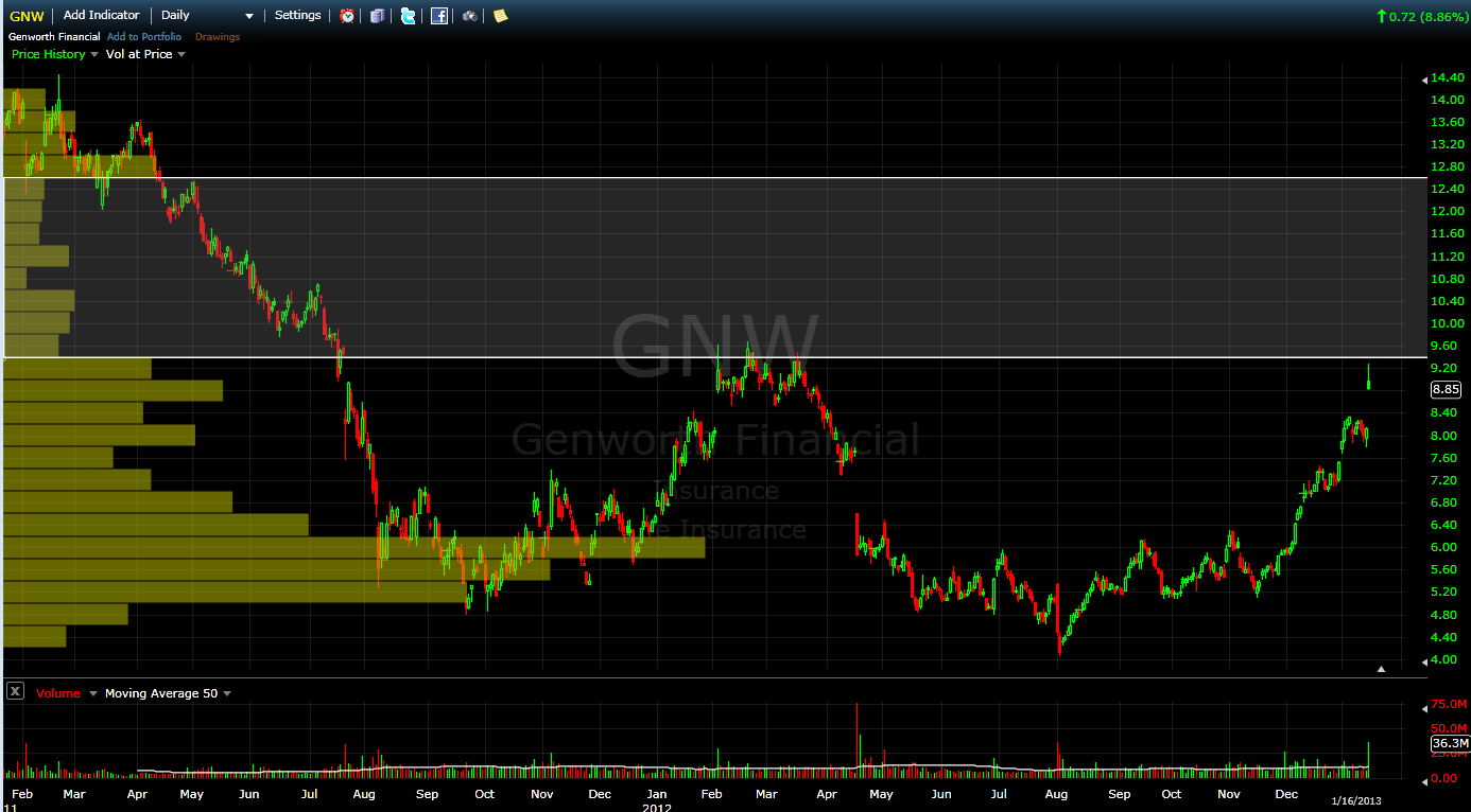
Well, let us take a look at this stock, shall we?  GNW provides an interesting example of how using Price by Volume to analyze a daily chart can lead to one conclusion, only to be somewhat refuted when taking a larger timeframe into consideration.  Let’s start with the daily:

This looks like a very nice Low Volume Node (LVN) immediately above yesterday’s high.  If the stock can clear the highs from early 2012, one could say that there isn’t much in the way of resistance until the mid 12’s.  Lots of pricing disequilibrium in this area on the daily chart…that’s not to say that it won’t form, but, historically speaking…it’s not there.

On the daily, traders and investors clearly felt that the most ideal representation of value was in the 5-6.25 area.  There is much higher pricing indecision where we currently reside…on the daily.  Let’s now move to the weekly:

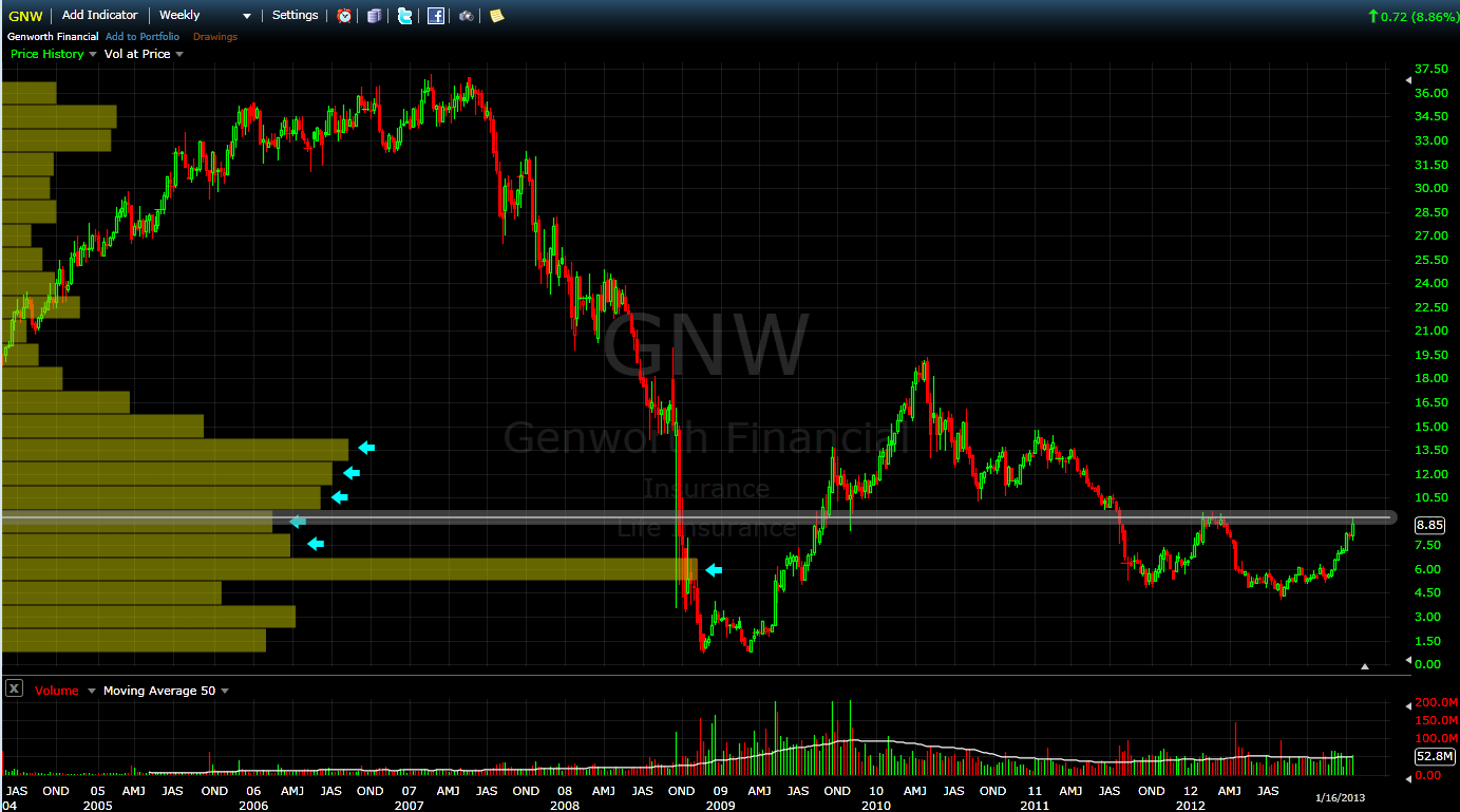
First, take notice of that area we determined as “value” earlier between 5-6.25 still has the largest amount of volume even when taking the entire history of this stock into account.  Of course mentioning that information is merely for the sake of using this tool to visually make these types of determinations.

That said, if you are currently trading this stock, that is kind of irrelevant.  What is relevant is the blockade of higher volume nodes immediately overhead.

The daily that I presented earlier encompasses two 2 years.  As you can see on the weekly, there was significantly more “action” in the area between 9.5 and 12 in the years prior, with the stock basically spending the better part of 18 months in this range.

Since, presumably, we want this stock to go up, what those volume bars indicated with the blue arrows signify is a ‘headwind’.  There is nothing that says price cannot blow through those areas, but the simplest interpretation of that (to me at least) is that there are many people who may have bought or sold in this region in the past…therefore the stock reaches an easier state of equilibrium from a supply/demand perspective.  i.e., There will likely be plenty of supply for those looking to buy shares and vice versa.

What this means to me is that the chances for a runaway momentum event (where supply and demand are in disequilibrium), is much more unlikely.  Now, if we can get into the high teens or 20 area…that’s a different story….you can see the lack of historical volume in that region, all the way to the all-time highs around 37.  I’d be much more inclined to join the party there.

Basically, my verdict is this: trade what you see.  If you are seeing something that you like, by all means trade it.  There are a billion ways to make money in the stock market, Price by Volume is just one analytical tool that I currently use to try and improve the probability of a profitable trade.  It makes sense to me…and it forces me to be patient and take a large amount of data into consideration prior to putting on a trade.  Those elements are extremely valuable to me.

I hope this helps, and I hope it doesn’t dampen your enthusiasm about the trade, it certainly looks like a winner at present.

-EM

Chicago Bridge and Iron

855 views

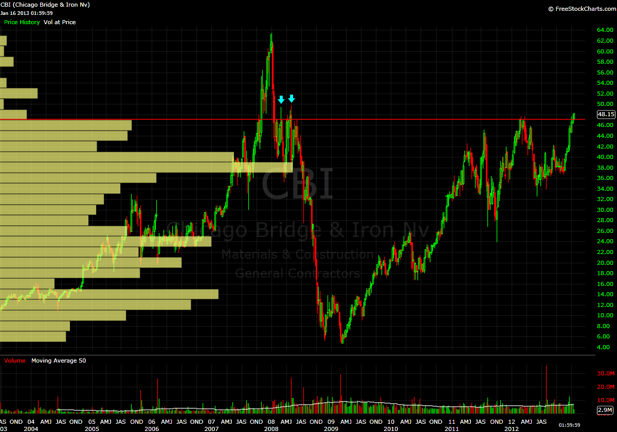
aka CBI has entered the thin air of the low volume void.

My previous analysis of Tempur-pedic (TPX) and Redwood Trust (RWT) focused on stocks that had formed low volume nodes (LVN) in areas that were thinly traded in the middle of their historical pricing structure.  Today’s look concerning CBI is quite different from those two.  Here is the weekly showing nearly 10 years of price and volume data:

The only meaningful resistance remaining is represented by the two blue arrows found in February and May of 2008.  Above 50, I foresee a push to all time highs in the low 60’s.  While it is not likely to get there in a single swift move higher (i.e., stairs up, elevator down), there is little in the way of historical pricing equilibrium in this area to stop an advance.

My initial buy point is around 49.50.  After that, I’m ideally looking to add chunks of shares and go the distance to an all-time high.

-EM

Searching for Crisp, Clean Air Amongst the Redwoods

479 views

In yesterday’s watchlist update, I mentioned that Redwood Trust Inc. (RWT) was within 2% of my initial buy point.  After reader “bobbin4apples” sarcastically commented about how useful said update was, I figured it was time to take a peek under the hood and hopefully provide some clarity about why I’m interested in buying some shares in this company.

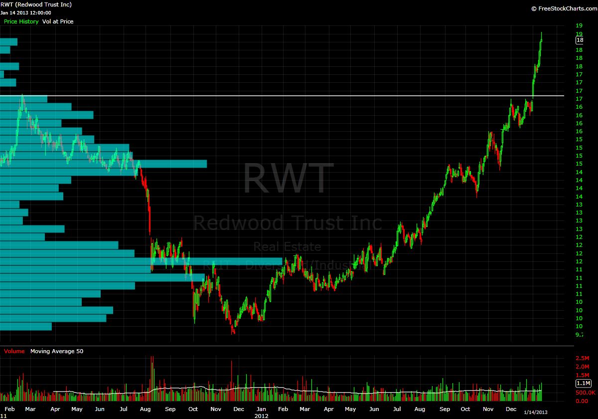
This will be similar to my analysis of Tempur-pedic (TPX), however this time I would like to start with a view of the daily chart.  This is backed out to show us the last two years of trading:

Here we can see that price initially stalled as it bumped up against previous resistance from early 2011 at 17.  This can also be seen in the volume profile on the left…as there was a a ‘bulge’ of volume that existed and was expanded upon when the stock meandered back and forth in this area throughout most of December.

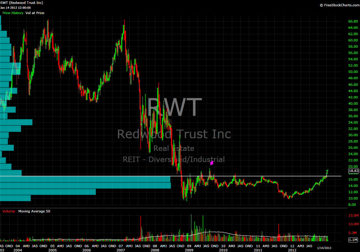
So we can conclude: “wow, this stock looks like it’s taking off to all-time highs”, right?  As Lee Corso is apt to say: “not so fast my friend” (I actually ran into Lee in an elevator at the Biltmore Hotel in LA when he was there for the USC/Oregon game in 2010).  Now, let’s take a look at the weekly chart.  This will give us nearly 10 years of price and PbV data.

Wait.  What?  So this company was obviously taken to the woodshed along with most other REIT’s in 2008.

However, since then what has taken place could be viewed as the formation of a massive (4+ YEAR) bottoming pattern.  Clearly, we have broken above the area of volume resistance and are now into the crisp, clean air of the low volume vacuum.

Currently my by point sits at 19.40 (which also coincides with the high from the bottoming formation, seen by the magenta arrow).  Instead of jumping in immediately upon a break from a high volume region into a low volume region, I instituted the placement of a buffer to avoid getting shaken around by possible resistance.  This modification was instituted because I am looking to catch the ‘meat’ of a move, not every single single tick from the bottom to the top.

If this stock can clear 19.5, what is to stop it from going to 30?  Sure, one could say “common sense and logic”…and that would be a reasonable hypothesis.  But we are also entering the “no logic” zone where demand far exceeds supply.

This being an REIT, there is likely going to be a decent dividend…which at these prices, RWT yields around 5.3%…so we have that going for us as well.

I hope this helps to provide some insight into the the stocks I’m maintaining on my watchlist.

Yes, these trades will take time to materialize and are not going to light your hair on fire with excitement.  Maybe this shit is boring you to death…and that’s fine by me.  I’m here to make money, not to entertain you with high-speed cocaine-addled trading.  Check back in with me in December and we’ll see what I was able to accomplish.

I had enough hair raising excitement in 2012 to the tune of beating the shit out of my account balance…so I have decided to take a much more conservative and patient approach in this new year.

My best to you all

-EM

Interested in Buying AAPL Here?

723 views

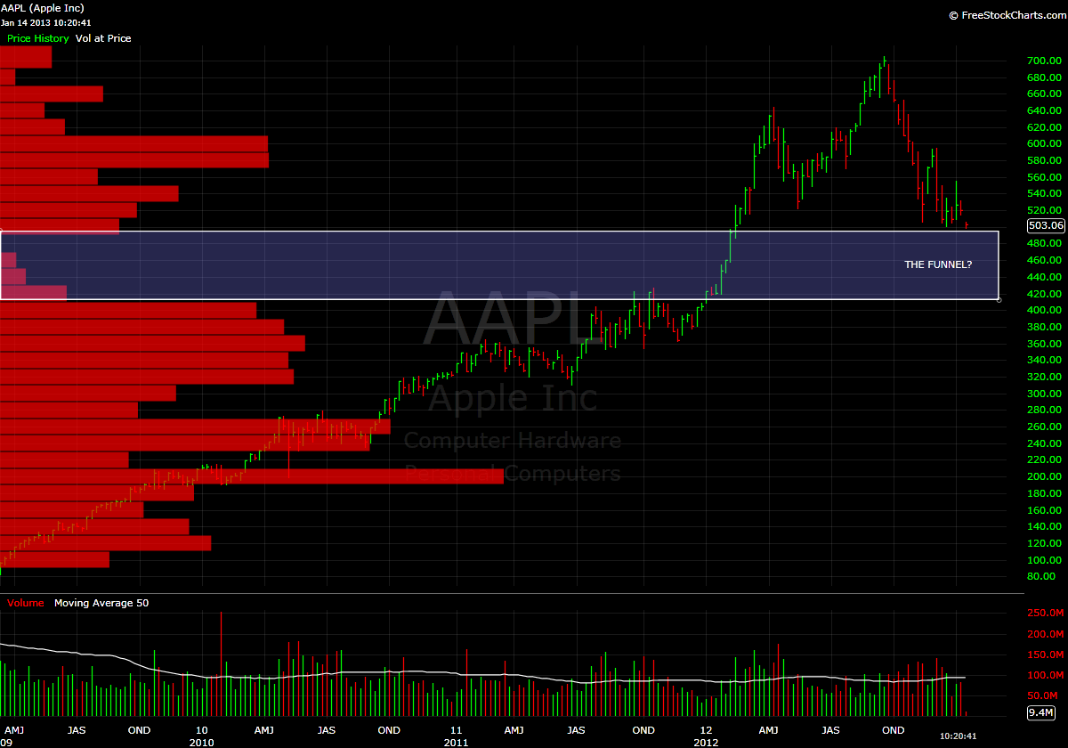
If so, I offer you the following chart as a “heads up”.  The time frame analyzed here is since AAPL went “full retard” to the upside in March 2009.

I suck at shorting, so I just try to avoid it (mostly because I have found no way to adequately interpret charts for shorting)…but the lack of historical volume in the range from about 420 (fvvvvheheheheh) to 500 is pretty remarkable for such a heavily traded stock.

If you are long and/or are looking to buy, it would appear that 500 is a good line in the sand.  Below that, we could see a swift drop directly to the low 400’s in short order.  There are literally very few people who bought in this region defend their position.

Tread with caution and do your best to avoid getting sucked into the funnel below 500.

-EM

Price by Volume Request: TPX

1,083 views

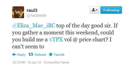
This afternoon, my colleague Raul3 (aka @TwoSmuth) kindly asked the following:

Of course I said that I would oblige, but unfortunately these quality Saturday night NFL playoff games (and my 1/2 drunk idiotic shit -talking on Twitter) put a bit of a crimp in my plans to sit down and get some work done.

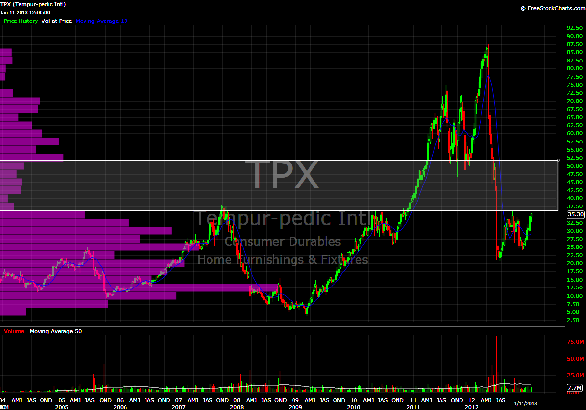
In keeping with my love and appreciation of fractals, I was going to start with an analysis of the monthly chart, move to the weekly…well, TPX went public in late 2003, so the weekly chart that I use encompasses that entire timeframe.

Here is what we are looking at:

My friend, as you can see, we are just about to get into a very thinly traded area…a classic “LVN”.

I’m measuring about a $15/share window there; therefore I think a reasonable goal is to try and position yourself to catch about 10-12 bucks (60-80%) of that area.  I would err on the side of caution and wait for the bottom side of the LVN to confirm more than I would in regard to the top, as, relatively speaking, there is far more historical volume below 35 than there is above 50. Plus, if it gets there ($50) you will likely be buying Tempur-pedics for extended family at that point anyway.

On the daily, I see there is that giant gap to fill, which, should it happen, could certainly work as resistance.  That’s still in the low 40’s, so one could build a position and monitor to see how price reacts around the gap.  You could probably be up $3-4/share at that point.

I hope this provided some of what you were looking for…nice find btw.

-EM

“Promised Land”

455 views

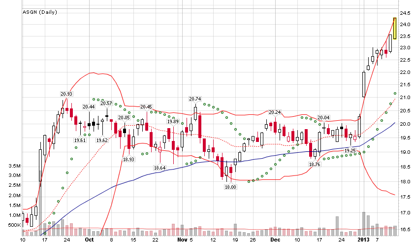
I have been yapping about this on Twitter, but the price action this morning in ASGN really has me intrigued.  This is an example of a stock that is currently trading in a “volume free” vacuum at all time highs.

What is to stop this stock from going higher?  If everyone who has ever owned a single share is making money, where does the resistance come from?  Is this a valuation thing?  I doubt it…when stocks get to this place they seem to eschew common sense and valuation metrics for euphoria.  Basically there is a extreme demand for something that is in limited supply.

A top priority of mine going forward is to devise a strategy for managing risk and trading these events.

Just look at this thing!

-EM

Another Look at Herbalife

729 views

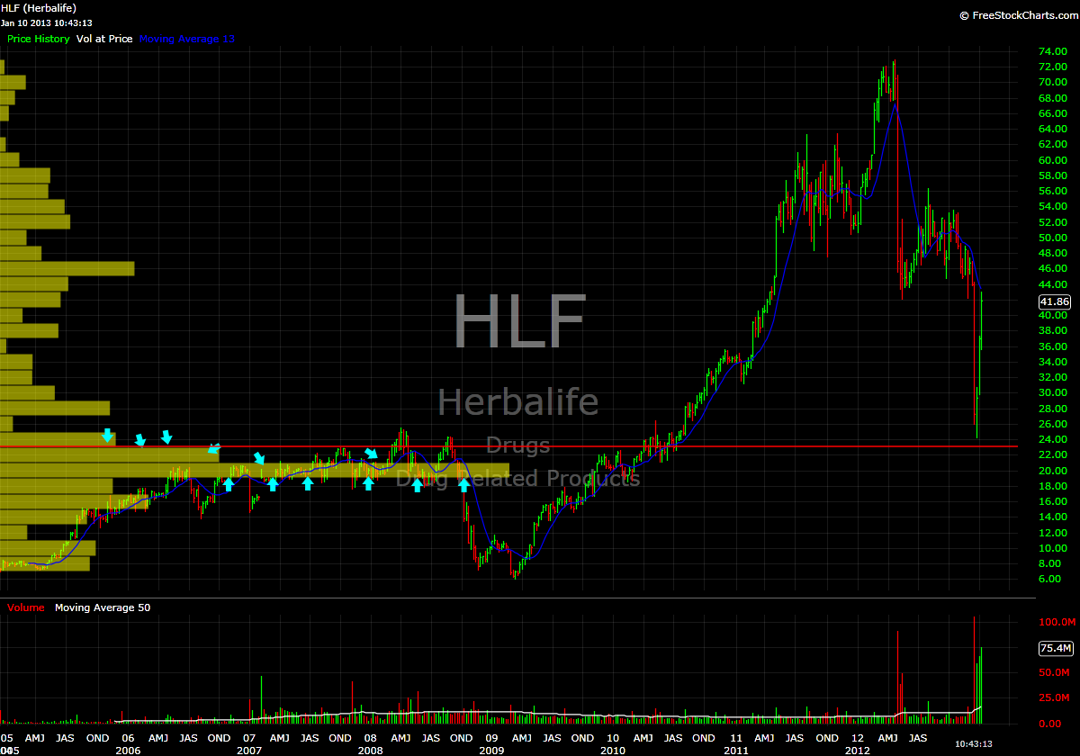
Some may be sick-and-fucking-tired of my incessant writing regarding my new found love of using Price by Volume as an indicator…but chess’s post earlier led me to check out how one could have viewed HLF from a PbV perspective.

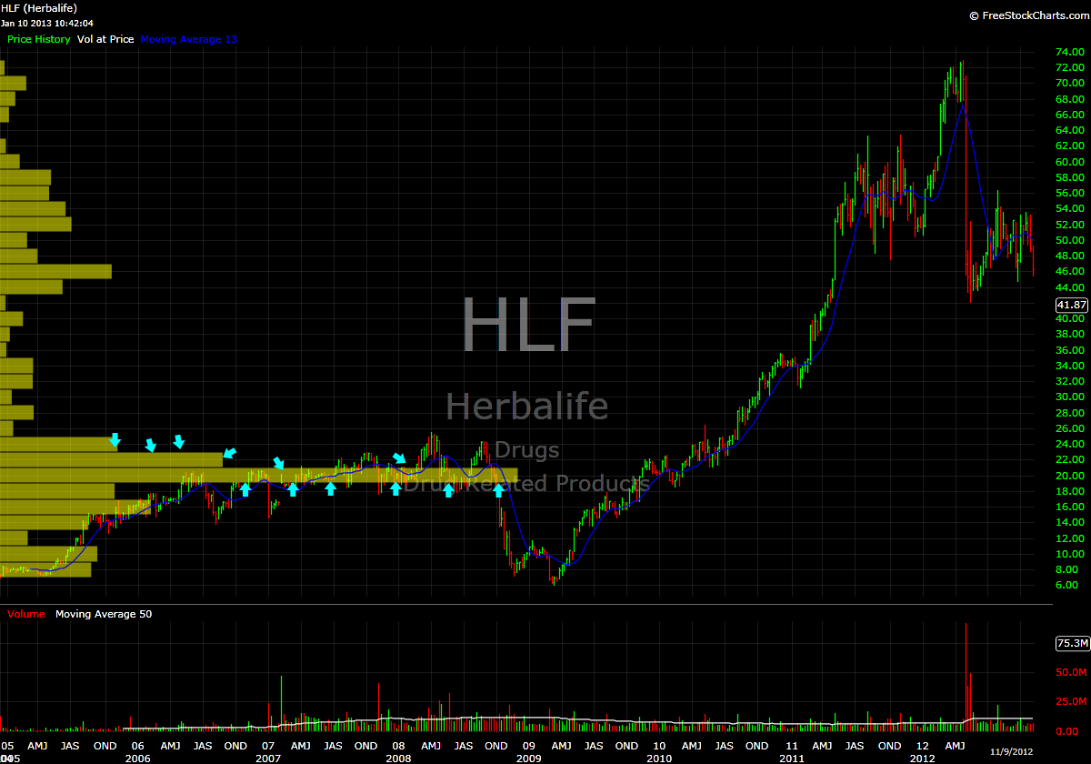
First I will post an HLF chart from mid November, the second is present day.  Pardon the excessive use of arrows, but I needed to emphasize my point.  These are weekly charts.

Price does indeed have memory.  Oh, and Price by Volume FTW.

-EM

MGA MGA MGA!

387 views

Ok, so the title is a pathetic play on Italian-American grandmothers everywhere who overtly try to shove “death strands” (aka pasta) down our throats.

But we aren’t here (today at least) to speak about how foodstuffs made from modern wheat are poisoning our society.  No, I want to talk about Magna International (MGA) and how it is close to flipping from a “watch” to a “buy”.

Yesterday the stock gapped higher only to sell off throughout the session.  I’m okay with that, as this could lead to a much higher probability setup whereby I can initiate a position upon a break of this range that seems to be forming between 53 and 54.

Looking at the weekly shows that over 51 could be considered a low volume area.  Additionally, price stalled just over 54 (much like yesterday) on the attempted rally back in July 2011, which adds a little extra punch to my conviction to get long this stock on a break of this range (should it form constructively).

Should this happen, my target (and position sizing) will be based on a move to the highs from early 2011 around 62.  Should we get there, I will take profits and let whatever I have left ride into the void.

Keep an eye on this one, you know I will be:

-EM

VMC: BEAST MODE

348 views

Housing play VMC has decided to go “beast mode” this morning and has risen through my second buy point (one day after blowing through buy point #1). Who am I to argue with the superb momentum this stock is exhibiting?

The window on this stock is a little bit smaller than others;  therefore if it can remain above 58.1, I will look to add to my position near the close.

Here is a weekly chart highlighting the volume pocket:

-EM

Using Price by Volume to Define Resistance in PHM

557 views

The other day I posted a watchlist of stocks that I am monitoring following “The Fly’s” bullish call on housing here in the “United Steaks”.  My watchlist was distilled using Price by Volume analysis, and as is the custom, target buy prices were established.

Reader “Narwahl” posed the following question in the comments section:

“How much potential upside before they hit resistance after they’ve reached the volume pocket? Specifically phm.”

Excellent question.

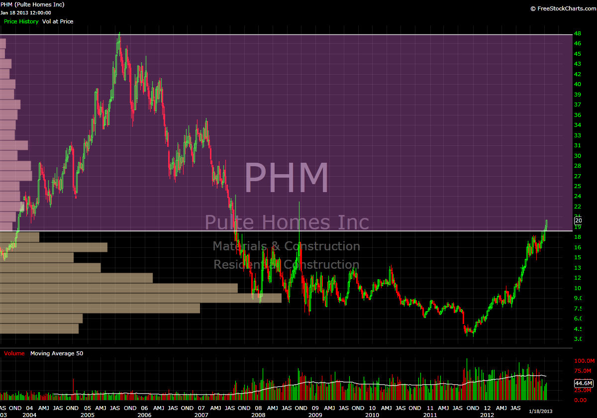
Coincidentally, PHM provides us with an interesting example.  In viewing the charts, there really is not what I would consider to be a traditional “volume pocket”.  A traditional VP moves from a region of high volume nodes into a region of low volume nodes then back into high(er) volume nodes.   Instead, PHM has a near volume “void” from the current price (20.49), all the way to all-time highs, which reside around 48.

Don’t believe me?  Take a look at the monthly and weekly charts:
Since this example is a bit unorthodox, I will try to answer “Narwahl’s” question through hypothesizing what I think these volume profiles signify.

In a ‘normal’ volume pocket scenario, I would typically define “potential upside” as where the volume pocket returns to a heavier volume node in the profile.  One thing that I have come to appreciate about using the volume pocket to analyze price is the ability to gauge a potential price target.  Obviously, this is an ideal circumstance, but by using the volume profile, you can see where, historically speaking, buyers and sellers have reached a state of agreement on price (as evidenced by longer bars on the volume profile).

In a stock like PHM, clearly there is very little in the way of what could be considered proper “value” of the stock from the current price all the way to 48.  From a strictly Price by Volume perspective, there is limited resistance all the way to the top, so when determining my buy point, I set the 2005 high of 48.22 as the top end of my range.

Sure, this may seem like an preposterous proposition, but there were shares of stock that were transacted at that price and every price in between, so simply saying “you’re being ridiculous, it could never return to that level” is, in my opinion, a bit short-sighted.

Remember, in areas with limited volume history, there is little in the way of rational valuation.  There exists a limited supply (historical volume) high demand (momentum).

Nevertheless, from a volume profile perspective, the chop in mid 2007 which found support in the mid 26’s and was rejected around 29.5 would provide a conservative “first target”, but the bump in volume in that region is still minor compared to even the smallest volume bar in the ‘base’ from 3-17.

Lastly, I need to mention: keep in mind that using Price by Volume to define support and resistance is a dynamic process.  As more shares of a stock trade at a certain price the volume profile will change to reflect these transactions.  So, what a volume profile looks like today will likely be very different from what it will look like 1 month, 3 months, 9 months, etc from now.

Bottom line, with my buy point set at 21.90, I am willing to let the price come to me to try and get in on the “meat” of this move.

As always, if you have Questions/comments, feel free to ask, we’re all trying to learn here.

-EM

Reader Request: GNW

502 views

Reader “Jworthy” commented on this post with the following:

I have been enjoying your Volume at Price approach since you were elected. And I think your oracle could indicate quick upside for $GNW…

But I don’t *quite* have a handle on it yet – despite following your posts closely for the last week-ish. So… Assuming fundamentals are improving… Do you think my GNW can keep running, or pull back?

Would really appreciate your thoughts if you get the time.

Well, let us take a look at this stock, shall we?  GNW provides an interesting example of how using Price by Volume to analyze a daily chart can lead to one conclusion, only to be somewhat refuted when taking a larger timeframe into consideration.  Let’s start with the daily:

This looks like a very nice Low Volume Node (LVN) immediately above yesterday’s high.  If the stock can clear the highs from early 2012, one could say that there isn’t much in the way of resistance until the mid 12’s.  Lots of pricing disequilibrium in this area on the daily chart…that’s not to say that it won’t form, but, historically speaking…it’s not there.

On the daily, traders and investors clearly felt that the most ideal representation of value was in the 5-6.25 area.  There is much higher pricing indecision where we currently reside…on the daily.  Let’s now move to the weekly:

First, take notice of that area we determined as “value” earlier between 5-6.25 still has the largest amount of volume even when taking the entire history of this stock into account.  Of course mentioning that information is merely for the sake of using this tool to visually make these types of determinations.

That said, if you are currently trading this stock, that is kind of irrelevant.  What is relevant is the blockade of higher volume nodes immediately overhead.

The daily that I presented earlier encompasses two 2 years.  As you can see on the weekly, there was significantly more “action” in the area between 9.5 and 12 in the years prior, with the stock basically spending the better part of 18 months in this range.

Since, presumably, we want this stock to go up, what those volume bars indicated with the blue arrows signify is a ‘headwind’.  There is nothing that says price cannot blow through those areas, but the simplest interpretation of that (to me at least) is that there are many people who may have bought or sold in this region in the past…therefore the stock reaches an easier state of equilibrium from a supply/demand perspective.  i.e., There will likely be plenty of supply for those looking to buy shares and vice versa.

What this means to me is that the chances for a runaway momentum event (where supply and demand are in disequilibrium), is much more unlikely.  Now, if we can get into the high teens or 20 area…that’s a different story….you can see the lack of historical volume in that region, all the way to the all-time highs around 37.  I’d be much more inclined to join the party there.

Basically, my verdict is this: trade what you see.  If you are seeing something that you like, by all means trade it.  There are a billion ways to make money in the stock market, Price by Volume is just one analytical tool that I currently use to try and improve the probability of a profitable trade.  It makes sense to me…and it forces me to be patient and take a large amount of data into consideration prior to putting on a trade.  Those elements are extremely valuable to me.

I hope this helps, and I hope it doesn’t dampen your enthusiasm about the trade, it certainly looks like a winner at present.

-EM

Chicago Bridge and Iron

855 views

aka CBI has entered the thin air of the low volume void.

My previous analysis of Tempur-pedic (TPX) and Redwood Trust (RWT) focused on stocks that had formed low volume nodes (LVN) in areas that were thinly traded in the middle of their historical pricing structure.  Today’s look concerning CBI is quite different from those two.  Here is the weekly showing nearly 10 years of price and volume data:

The only meaningful resistance remaining is represented by the two blue arrows found in February and May of 2008.  Above 50, I foresee a push to all time highs in the low 60’s.  While it is not likely to get there in a single swift move higher (i.e., stairs up, elevator down), there is little in the way of historical pricing equilibrium in this area to stop an advance.

My initial buy point is around 49.50.  After that, I’m ideally looking to add chunks of shares and go the distance to an all-time high.

-EM

Searching for Crisp, Clean Air Amongst the Redwoods

479 views

In yesterday’s watchlist update, I mentioned that Redwood Trust Inc. (RWT) was within 2% of my initial buy point.  After reader “bobbin4apples” sarcastically commented about how useful said update was, I figured it was time to take a peek under the hood and hopefully provide some clarity about why I’m interested in buying some shares in this company.

This will be similar to my analysis of Tempur-pedic (TPX), however this time I would like to start with a view of the daily chart.  This is backed out to show us the last two years of trading:

Here we can see that price initially stalled as it bumped up against previous resistance from early 2011 at 17.  This can also be seen in the volume profile on the left…as there was a a ‘bulge’ of volume that existed and was expanded upon when the stock meandered back and forth in this area throughout most of December.

So we can conclude: “wow, this stock looks like it’s taking off to all-time highs”, right?  As Lee Corso is apt to say: “not so fast my friend” (I actually ran into Lee in an elevator at the Biltmore Hotel in LA when he was there for the USC/Oregon game in 2010).  Now, let’s take a look at the weekly chart.  This will give us nearly 10 years of price and PbV data.

Wait.  What?  So this company was obviously taken to the woodshed along with most other REIT’s in 2008.

However, since then what has taken place could be viewed as the formation of a massive (4+ YEAR) bottoming pattern.  Clearly, we have broken above the area of volume resistance and are now into the crisp, clean air of the low volume vacuum.

Currently my by point sits at 19.40 (which also coincides with the high from the bottoming formation, seen by the magenta arrow).  Instead of jumping in immediately upon a break from a high volume region into a low volume region, I instituted the placement of a buffer to avoid getting shaken around by possible resistance.  This modification was instituted because I am looking to catch the ‘meat’ of a move, not every single single tick from the bottom to the top.

If this stock can clear 19.5, what is to stop it from going to 30?  Sure, one could say “common sense and logic”…and that would be a reasonable hypothesis.  But we are also entering the “no logic” zone where demand far exceeds supply.

This being an REIT, there is likely going to be a decent dividend…which at these prices, RWT yields around 5.3%…so we have that going for us as well.

I hope this helps to provide some insight into the the stocks I’m maintaining on my watchlist.

Yes, these trades will take time to materialize and are not going to light your hair on fire with excitement.  Maybe this shit is boring you to death…and that’s fine by me.  I’m here to make money, not to entertain you with high-speed cocaine-addled trading.  Check back in with me in December and we’ll see what I was able to accomplish.

I had enough hair raising excitement in 2012 to the tune of beating the shit out of my account balance…so I have decided to take a much more conservative and patient approach in this new year.

My best to you all

-EM

Interested in Buying AAPL Here?

723 views

If so, I offer you the following chart as a “heads up”.  The time frame analyzed here is since AAPL went “full retard” to the upside in March 2009.

I suck at shorting, so I just try to avoid it (mostly because I have found no way to adequately interpret charts for shorting)…but the lack of historical volume in the range from about 420 (fvvvvheheheheh) to 500 is pretty remarkable for such a heavily traded stock.

If you are long and/or are looking to buy, it would appear that 500 is a good line in the sand.  Below that, we could see a swift drop directly to the low 400’s in short order.  There are literally very few people who bought in this region defend their position.

Tread with caution and do your best to avoid getting sucked into the funnel below 500.

-EM

Price by Volume Request: TPX

1,083 views

This afternoon, my colleague Raul3 (aka @TwoSmuth) kindly asked the following:

Of course I said that I would oblige, but unfortunately these quality Saturday night NFL playoff games (and my 1/2 drunk idiotic shit -talking on Twitter) put a bit of a crimp in my plans to sit down and get some work done.

In keeping with my love and appreciation of fractals, I was going to start with an analysis of the monthly chart, move to the weekly…well, TPX went public in late 2003, so the weekly chart that I use encompasses that entire timeframe.

Here is what we are looking at:

My friend, as you can see, we are just about to get into a very thinly traded area…a classic “LVN”.

I’m measuring about a $15/share window there; therefore I think a reasonable goal is to try and position yourself to catch about 10-12 bucks (60-80%) of that area.  I would err on the side of caution and wait for the bottom side of the LVN to confirm more than I would in regard to the top, as, relatively speaking, there is far more historical volume below 35 than there is above 50. Plus, if it gets there ($50) you will likely be buying Tempur-pedics for extended family at that point anyway.

On the daily, I see there is that giant gap to fill, which, should it happen, could certainly work as resistance.  That’s still in the low 40’s, so one could build a position and monitor to see how price reacts around the gap.  You could probably be up $3-4/share at that point.

I hope this provided some of what you were looking for…nice find btw.

-EM

“Promised Land”

455 views

I have been yapping about this on Twitter, but the price action this morning in ASGN really has me intrigued.  This is an example of a stock that is currently trading in a “volume free” vacuum at all time highs.

What is to stop this stock from going higher?  If everyone who has ever owned a single share is making money, where does the resistance come from?  Is this a valuation thing?  I doubt it…when stocks get to this place they seem to eschew common sense and valuation metrics for euphoria.  Basically there is a extreme demand for something that is in limited supply.

A top priority of mine going forward is to devise a strategy for managing risk and trading these events.

Just look at this thing!

-EM

Another Look at Herbalife

729 views

Some may be sick-and-fucking-tired of my incessant writing regarding my new found love of using Price by Volume as an indicator…but chess’s post earlier led me to check out how one could have viewed HLF from a PbV perspective.

First I will post an HLF chart from mid November, the second is present day.  Pardon the excessive use of arrows, but I needed to emphasize my point.  These are weekly charts.

Price does indeed have memory.  Oh, and Price by Volume FTW.

-EM

Previous Posts by elizamae