I meant to post this a while back in order to point out something I missed on the monthly chart analysis of Ford I did a few months ago. I had argued that the head and shoulders topping pattern (purple lines, below) would likely prove to be a trap before Ford continued on higher.
A reader then pointed out the massive inverse head and shoulders bottom (light blue lines) with a clear neckline. This is compatible with the original thesis that Ford is putting in a massive bottom with enormous upside potential, if it can crack that neckline above. The measured move would take it well into the $30’s.
________________________
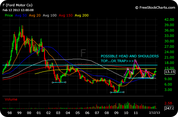


I’d be a happy camper at $30!
You should be able to find at least two patterns in any given chart, but this is pretty amazing. I believe Ford is very undervalued on the fundamentals, so this is an interesting data point. Great post.
Fundamentals… begs the question, what are they? China increasing in importance, USA profitable, and Europe to be profitable by 2016 (maybe). Writeoffs galore and an increasingly more competitive Yen.
Thanks for the charts Chess, they look good (and clear).
HI Chess, you have also been writing about GE and yesterday’s news has given the stock a decent lift in pre-market.